

NOTE: This is an archived version of the first incarnation of Brand New. All posts have been closed to comments. Please visit underconsideration.com/brandnew for the latest version. If you would like to see this specific post, simply delete _v1 from the URL.
Thanks to Dave McCanless for the tip.


Jump to Most Recent Comment
Plamen’s comment is:
Honestly, I do not dig any of the "Best of Awards". They could possibly be good branding efforts, but the graphic executions are nothing special.
On Mar.05.2009 at 08:27 AM
Lost’s comment is:
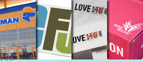
is it me or does love 146 completely miss the point?
I like dedeman except when the dog is on organe
On Mar.05.2009 at 08:53 AM
lost’s comment is:
orange ** lol
On Mar.05.2009 at 08:53 AM
Ben’s comment is:
A lot of great applications and unique marketing.
Not a lot of great graphic design at the core.
Paulo Pereira’s comment is:
Good inspiring stuff. For the most part I agree with the winners of ReBrand 100 Global Awards.
Thanks for posting this.
-P
On Mar.05.2009 at 09:11 AM
David H’s comment is:
I haven't heard of most of these companies, so both the "Before" and "After" stages were new to me. Is it bad that I often preferred the originals?
On Mar.05.2009 at 09:29 AM
Craig’s comment is:
Check out MTK in the distinction category.
On Mar.05.2009 at 09:58 AM
Andrew Klein’s comment is:
maybe they took into account the difference between the original and rebrand - some of the originals where really bad. The original Justice for Children print collateral is using Arial and Papyrus.
On Mar.05.2009 at 10:58 AM
Josh’s comment is:
I agree with Andrew. Unlike a lot of recent branding, all of these are pretty large steps up.
For a company to DROP the marble in the last year is pretty shocking (as well as very welcome) I definitely think that these are all nice steps up, even if they miss the point or aren't as well executed as they could be (not a fan of Love146 at all, but it's much better than the original)
On Mar.05.2009 at 11:12 AM
lyndi’s comment is:
great link! overall very refreshing when comparing old to new.
but as always i have a lot to say about them all...
loved: Alburquerque Youth Symphony, Bags, the guerilla ads for Howe, Estravel system - felt like it has been done before but still enjoyed it, digging the execution of TVOT on enviro graphics and collateral - very nice. LOVE KNOLL & PATCRAFT, since i work in an architectural, interior graphics firm i am very partial to their collateral and such from interior reps...they to me have some amazing stuff - such GREAT design work. I try to steal all of the cool stuff for myself when they come in:). Workamajig - same feel as bags but still loving it.
no too crazy about Aviva or Fire + Flavor. even though the packaging for Fire + Flavor was nice, logo lacked. felt that Triumph ads and imagery looked liked hanes her way. do not like Ireland National Lottery - feels very childlike - do children play the lottery over there?? ITS - BORING.
On Mar.05.2009 at 11:41 AM
Anonymous’s comment is:
How overdue was Smokey Bones - not a home run, but anything is better.
On Mar.05.2009 at 11:55 AM
paige’s comment is:
Is is just me, or was VTC a terrible adaptation of taking the iconic, Pink Floyd's "Dark Side of the Moon" record album, and turning it into a logomark? In addition, it seems to me to be a bit of a stretch to relate the concept of a prism to a vocational education and training institute so literally.
On Mar.05.2009 at 12:35 PM
Char’s comment is:
Umm not very inspiring.
The best awards are definitively nothing innovative... they dont feel fresh.
They feel like a lot of marketing but very little design.
Char’s comment is:
ok, my bad... I didnt notice that there was an "before" and "after."
Some of theseare pretty good, actually. I have to admit it.
lyndi’s comment is:
YES! totally see VTC as pink floyd's album cover...
On Mar.05.2009 at 01:15 PM
Imelda Suriato’s comment is:
Nice collection of work but not many total redesign. Lots of makeup/facelift work. I do find it useful to show my designers what's out there and what is/not great transformation.
On Mar.05.2009 at 01:23 PM
Stereo Radiation’s comment is:
Props to Dedeman, Energisa, & Estravel. Lots of great work.
On Mar.05.2009 at 01:58 PM
Myles Dumas’s comment is:
I enjoyed the ICFJ identity system the most out the winning selections, the others really didn't do much for me. It wasn't too hard to improve on most of the original logos, some of those made my eyes bleed. Anytime a shiny ass 3D sphere is killed, is a great day in my book.
On Mar.05.2009 at 04:38 PM
fonzie’s comment is:
Dedeman - what a wonderful example of moving forward while retaining the heart and soul of a brand.
On Mar.05.2009 at 04:49 PM
Kirk’s comment is:
Ireland Lottery borrowing from Super Mario Brothers? or Carl's JR?
also i noticed the font in the LOVE 146 and in the Albuquerque bumper stickers looks the same.
On Mar.05.2009 at 05:07 PM
TheMaster’s comment is:
Eh.
Some good ones. Very very corporate, so you can't get too critical with the design. We all know that the good things get thrown overboard first.
A lot of mediocre concepts, even more weak design.
Very interesting to see though!
Thanks.
On Mar.05.2009 at 05:26 PM
Kirk’s comment is:
yea you have to do something everyone likes.. and "everyone" is a moron, so the designs are lame usually.
here's to "everyone"
On Mar.05.2009 at 05:43 PM
jRod’s comment is:
Favorites: Smokey Bones, North Face
On Mar.05.2009 at 05:56 PM
t-bone’s comment is:
how:annoying:are:the:colons:in:tv:of:tomorrow:?
On Mar.05.2009 at 07:14 PM
Mr Posen’s comment is:
Who judged this news worthy?
Apart from a few exceptions, the work shown here is completely subpar, and definitely not worth bringing to our attention.
A waste of a click.
On Mar.06.2009 at 12:11 AM
Serviceburo’s comment is:
Maybe it's just me, but it really seems like the upper-level graphic design world has become just like high school yearbook (sorry if the reference is lost on non-americans). That is, it's really just a popularity clique where everyone hands out awards to each other and lavishes praise on mediocre work. Everyday I see amazing work being put out by artists/designers who survive on the fringes, like Markus Schaefer and Cristina Couceiro. While I realize that this blog is here for different purposes, why are we all so willing to laud something so banal as Pentagram?
On Mar.06.2009 at 12:49 AM
Nisio’s comment is:
Can I point out the competition name is rebrand, not redesign. Agreed there is a lot of great design work out there, however a rebrand is a more complex process underpinned by clear strategic goals, the graphics developed on rebrands are in essence tools to communicate these strategic goals. It's not just a set of pretty pictures.
Having said that I can't help but notice 3 of the 5 winners had some level of representation on the Jury...
but there I go with the conspiracy theories again. :)
On Mar.06.2009 at 04:54 AM
Yves’s comment is:
Am I missing something? Gary McCavitt (Director of Brand Identity, Cisco Systems) is in the jury panel, and the quite uninspired (enough with futura-like lowercase pepsi already) Cisco WebEx rebrand for which Gary McCavitt was the Creative Director gets the "best of award"?
Overall, a disappointing list of mostly uninspiring designs. I'm sticking with underconsideration.com's blog for my rebranding readings.
On Mar.06.2009 at 05:04 AM
Mia Parparita’s comment is:
The Re-brand Awards have always been a joke, everyone knows this (except BN, it seems).
Look a the jury, hilarious, it's my dads boss and his fishing buddies.
On Mar.06.2009 at 11:45 AM
MIRANDA D’s comment is:
"Having said that I can't help but notice 3 of the 5 winners had some level of representation on the Jury..."
Whaaaaaat!
That is just shameful.
On Mar.06.2009 at 07:23 PM
Armin’s comment is:
> A waste of a click.
> The Re-brand Awards have always been a joke, everyone knows this (except BN, it seems).
It's pretty narrow minded to dismiss the work shown so blatantly. If you can't take any and all opportunities to learn about strategies and design executions from others' work you are simply doing a disservice to yourself. Regardless of the quality of the awards and the incestuousness of the judges and winners, there are some solid examples from which to learn both good and bad things. If you think you are above it, you have some self-reflection to do.
On Mar.07.2009 at 05:48 AM
Matheus’s comment is:
the CEC bank is the most impressive by far
On Mar.07.2009 at 05:00 PM
Andrei Gonzales’s comment is:
Strange list.
They're improvements, but they're not the best rebrands of late.
On Mar.07.2009 at 08:06 PM
Everton’s comment is:
@matheus: CEC bank redesign looks dated already. granted, their before felt empty and lacked presence, but the new branding is too overwhelming.
On Mar.10.2009 at 02:41 PM
Mr Posen’s comment is:
Agree Armin, "> A waste of a click." was a little blunt, I apologize, but it is how I honestly felt.
"If you can't take any and all opportunities to learn about strategies and design executions from others' work you are simply doing a disservice to yourself."
Yes true, though I also feel if average design work is being lauded (sometime by the same people who created it??) as award winning, the best, then in my opinion that is wrong. I think it is important for our industry to be critical, particularly here in the States where there is too much self congratulatory posturing.
As you mentioned, we can learn from bad work, though I would prefer to learn from good work.
On Mar.12.2009 at 12:12 PM
Mr Posen’s comment is:
I should also reiterate, there are some very nice pieces too, particularly the NZZ, Knoll textile, ICFJ, and Aviva.
Patrick Curda’s comment is:
There are times when it's best not to say anything...
On Mar.14.2009 at 07:50 PM
Héctor Muñoz’s comment is:
I have to say I'm not very surprised by the level of graphic execution amongst the winners altough I work in one of the distinction awarded companies.
On the other side of the coin I see all of the graphics improving at least in a satisfactory way and succesfully supporting a branding strategy.
On Mar.21.2009 at 01:24 PM
Comments in Brand New, V1.0 have been closed.


