

NOTE: This is an archived version of the first incarnation of Brand New. All posts have been closed to comments. Please visit underconsideration.com/brandnew for the latest version. If you would like to see this specific post, simply delete _v1 from the URL.
![]()
Without going too deep into the history of this Dutch company, Getronics’ first order of business, in 1887, was to establish “a technical installation company for public utilities and the ship-building industry.” 122 years later and it seems only the technology and the scope of its projects have changed as Getronics has grown into the largest provider of information and communication technologies (ICT) in the Benelux (the economic union between Belgium, the Netherlands, and Luxembourg). And since becoming part of KPN, the main provider of telecommunication services in The Netherlands, Getronics has grown even more, with more than 14,000 employees and operations in more than a dozen countries. Certainly, the old logo (despite the Global Swoosh) didn’t quite stand up to its company.
The previous look and feel of Getronics.
Designed by Amsterdam based Koeweiden Postma, the new identity revolves around the idea of making the invisible, visible and established the brand positioning of Getronics as Architects of the Invisible. The “o” acts as the frame through which the invisible, in this case the colorful “information streams,” can be seen. Be sure to hit play on the video below.
Koeweiden Postma / Getronics on Vimeo.
![]()
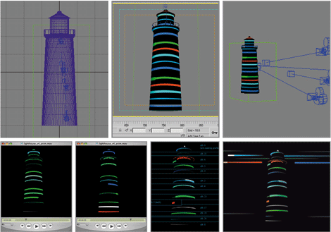
The making-of of the three-dimensional imagery.
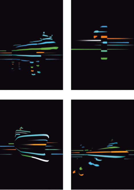
Rendered imagery, which help illustrate case studies of Getronics’ work in industries like dairy (hence the cow) and aviation.
This is all a really fantastic identity. While the real excitement comes in the moving identity, as it appears on the web site or in video, the static logo and printed applications manage to capture that dynamism and energy. The volumized “o” also acts as a non-cliche visualization of the proverbial globe. And the typography is simple and bold.

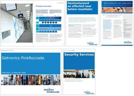
The new look and feel of Getronics. [Click image for bigger view]


Jump to Most Recent Comment
Skythe’s comment is:
Wow. Really inpressive idea.
Not sure if it's always readable at all distances but good job on the identity!
On May.15.2009 at 08:06 AM
Saylor’s comment is:
The whole package is incredible. It's great to see this logo implemented into the rest of the identity so well. It's actually more impressive in the motion work. I wonder which came first... logo or motion work.
On May.15.2009 at 08:17 AM
David’s comment is:
Should be Benelux not Belenux.
On May.15.2009 at 08:37 AM
Ryan Adair’s comment is:
Amazing. Brilliant. The secondary usage of the colors and graphics system is genius. The transition into motion is superb.
Only crit is that the typography in the static mark looks a bit lonely. Like an afterthought. And that I would like the "a KPN company" to be half the size it currently is.
A+
On May.15.2009 at 08:37 AM
thedesigermike’s comment is:
the 'O' is brilliant especially in the motion graphics, but I agree the rest of the typography isn't anything special, in fact it is very dull and boring, which gives the impression of it all being a bit under done.
I think they may have got a bit carried away with the 'O' and forgot to fine tune the rest of the identity.
On May.15.2009 at 08:47 AM
thedesigermike’s comment is:
and as cool as the motion graphics looks, the whole identity has a very 80s feel about it to me.
On May.15.2009 at 08:49 AM
Robb Irrgang’s comment is:
Conceptually strong but whatever that sans serif is kind of kills it for me. It looks better in the "real world" photos but otherwise it feels like free font from somewhere.
On May.15.2009 at 08:56 AM
Anonymous’s comment is:
I call cliche on this one. After AT&T nobody is allowed to do globes, especially in telcom.
On May.15.2009 at 09:04 AM
Smirker’s comment is:
Hmmm... really nice imagery but the logo's really undercooked. It's not necessary to replace the 'O' with the sphere. If the logotype was in a nicer typeface and the 'O' was a nicely locked up mark this would be a real winner. That'd give them more opportunity to use the globe on its own.
On May.15.2009 at 09:16 AM
Chris’s comment is:
Concept is great, as said above, but does anyone agree with me that those colors are awful? They're dull and uninspiring. A high-tech solution like that needs some modernity in its colors.
On May.15.2009 at 09:23 AM
Proverbial Thought’s comment is:
I think it's totally COMCASTIC!!!

David Sanchez’s comment is:
At first impression I get hints of retrogression, however when I saw the applications I was sold on it.
On May.15.2009 at 09:50 AM
Thomas’s comment is:
A couple of weeks ago over at Dutch online design magazine Fontanel.nl we also did a special about the rebrand of this new identity. We had an interview with the designers and also some more identity visuals.
It's in Dutch though, so for the English readers check out google translate.
On May.15.2009 at 10:01 AM
Chad Garrett’s comment is:
How is the O not a rip off of AT&T? It's not just a sphere, it's got uneven stripes through it. Very reminiscent of the old AT&T logo.
On May.15.2009 at 10:02 AM
matt’s comment is:
The new is better than the old, but I find it dated and uninteresting.
On May.15.2009 at 10:18 AM
jRod’s comment is:
this is really good. its a HUGE step up from the previous identity and takes a new direction in brand development. I wonder how well it works on a white background, if it works at all.
The typeface is wonderful, but the "t" confuses the eye a bit.
On May.15.2009 at 10:21 AM
Mike’s comment is:
The idea behind the three dimensional imagery is very strong. The rest I think is a poor translation of a good idea. The logo is quite a confusing read and I think is going to feel dated really soon. The type seems hardly considered, especially the "a KPN company". I do like the motion application...but overall I don't think that this was pushed far enough.
On May.15.2009 at 11:15 AM
BJN’s comment is:
I think the typography is clunky and the letter forms overwhelm the "o" in static forms. It would be generous to call the logo mediocre.
The data stream illustrations and animation are nice, but the logo is forgettable. I can't call any ID successful if it's not strong in static print and signage applications.
On May.15.2009 at 11:37 AM
Michael’s comment is:
I tend not to point out typos, but your posts are so well written that I assume you'll care: the third word in the first sentence of the write-up needs an extra o.
On May.15.2009 at 12:15 PM
Armin’s comment is:
Michael, thank you. I do care! I tend to write these posts early in the morning (6:00 am) so sometimes the caffeine hasn't kicked in yet.
On May.15.2009 at 12:23 PM
Stefan Carlsson’s comment is:
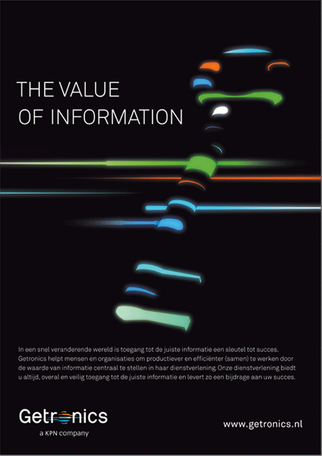
Love the typography of "The Value of Information" in the second-to-last image. The typeface and the thin white-on-black effect give it a coursing, energetic feel in line with what the beams of light are meant to evoke.
On May.15.2009 at 01:48 PM
V as in Victor’s comment is:
While I'm not a huge fan of the logo (I think it's so many colors on black that sit weird with me), I have to say I LOVE the implementation of everything. The imagery is outstanding and really supports the logo itself. This is a great example of carrying your brand's look into all aspects of the advertising.
On May.15.2009 at 01:52 PM
Mark Holtmann’s comment is:
FANTASTIC! Koewijden kicking ass as usual.
I have to admit its hard to find a recent project of Koewijden that is not up to scratch.
Blaise’s comment is:
bravo!
On May.15.2009 at 02:50 PM
Mark’s comment is:
I like it, it's simply brilliant!
I like how they use the colors in the advertisements, etc. So the colors aren't just stagnant or static. They're made to be useful for something
Well done.
On May.15.2009 at 03:30 PM
Amanda B’s comment is:
Wow, I absolutely love the 3d neon objects set... The ship and cow look especially neat! What a great way to carry the look of the logo into the rest of brand.
On May.15.2009 at 03:55 PM
Morgan Smail’s comment is:
very nice work.
it's refreshing to see and idea executed well instead of the usual BS "after-the-fact" explanation.
kudos
On May.15.2009 at 07:12 PM
Colin’s comment is:
Definitely a recent highlight. Beautiful execution overall.
On May.15.2009 at 09:07 PM
Derrick’s comment is:
The font lets this one down really badly. It's trying to be techno but it looks like an awful monospaced version of Helvetica. Change the font and this branding is golden.
On May.15.2009 at 10:33 PM
b.r.o.o.d.y.’s comment is:
It's a marble shape... That's very cliche, specially for this sort of company. Luckily the applications are far more interesting than the logo itself. Cool execution. It's not the first time I see a seemingly underwhelming logo being exploited so well.
On May.16.2009 at 01:58 AM
colin a’s comment is:
the logo lacks personality in my opinion, just another globe logo but i guess it went through a lot of executives meetings..
still better than the old one though. The whole idea of the globe is of course one of the biggest cliche of all times (volumized or not..), but then again it works and can be quickly understood by anyone..
and then again it becomes more interesting when animated. They could sell, computers, be in communications, be an airplane company, who knows.. you got a globe on your logo, you're a winner!
On May.16.2009 at 05:32 PM
Virginia’s comment is:
With regard to the typography, I think even a simple change to Akzidenz Grotesk would give it more energy. The 's' here is particularly bothersome to me; it seems like an abrupt ending compared to the liveliness of the o. The non-horizontal terminals of A.G. would give it a bit more openness and movement.
(cf. Armin Hoffman's Giselle poster.)

Other than that, though, very nice!
On May.16.2009 at 09:54 PM
Scott J’s comment is:
I actually like the logo in the applications without the typography. It feels much more fresh than when tied with the type. I enjoy the thought that went into how to bring the mark to life in opportunities other than print. The old identity didn't have much going for it, that's for certain.
On May.16.2009 at 09:57 PM
Sanjay Basavaraju’s comment is:
Brilliant concept. It seems like they had to make motion graphics and environmental graphics first to convince the client about the logo.
Design today has to effectively translate across various mediums. Although the identity is exciting when it is set in motion, it fails miserably when it is on print. It looks ugly when it is seen as a logo.
On May.17.2009 at 06:41 AM
Fabian ’s comment is:
Very cool.Love the whole concept, the 3D imaginary is outstanding.
On May.17.2009 at 10:41 AM
Marcin’s comment is:
Now, that's just great.
Impressive.
On May.17.2009 at 03:54 PM
tez’s comment is:
Nice one! probably should be up there as one of the best so far this year!...
On May.17.2009 at 07:39 PM
The Frankl Project’s comment is:
The typography is nice, and so is the identity as a conceptual whole. But I am a bit unimpressed with how the magnifying glass "o" looks as an image. It is a great idea, and beautiful as a motion graphic. But I find it awkward, clunky, and boring in a "Windows 95" kind of way. Anyone else think so? overall a solid identity though.
On May.18.2009 at 04:20 AM
Giles’s comment is:
I wonder how it would work as one colour, it amazes me when clients or agencies push for 3D renders of a mark, when often, the core values need them not. For example:
http://www.jkr.co.uk/design-gazette/2009/05/ask-jeeves-re-brand-%E2%80%93-butler-or-banker/
koyo’s comment is:
" Saylor’s comment is:
The whole package is incredible. It's great to see this logo implemented into the rest of the identity so well. It's actually more impressive in the motion work. I wonder which came first... logo or motion work. "
The logo is not such a brillaint thing but I agree with Saylor.
On May.18.2009 at 09:50 AM
Anonymous’s comment is:
The 1970's called and they want their typography back. And AT&T called and they want their globe back.
On May.18.2009 at 10:58 AM
Carlo’s comment is:
AT&T changed their name?
On May.18.2009 at 03:40 PM
Martin’s comment is:
Like it.
Ironic it reads TRON in the center. lol
Comments in Brand New, V1.0 have been closed.


