

NOTE: This is an archived version of the first incarnation of Brand New. All posts have been closed to comments. Please visit underconsideration.com/brandnew for the latest version. If you would like to see this specific post, simply delete _v1 from the URL.
![]()
I think I can get this right, but please excuse my lack of acquaintance with the world of open source software for mobile devices. Originally developed in 1998 by Symbian Ltd., the Symbian Operating System has (I think) powered much of the software in phones for Nokia, Ericsson and Docomo and has remained largely unknown to users. Last year, Nokia purchased the Symbian Ltd. and its OS in order to contribute it to the newly formed Symbian Foundation, which aims to provide the software platform as open source to all of its members. So, more or less, that’s the story. In other words, Symbian Foundation is attempting to feel highly approachable and transparent doing it in a back-to-basics, can’t-we-all-just-get-along, no-fuss way.
They have designed an identity that truly captures this approach. At first glance, the yellow heart logo and its blocky typography look unfinished and childish as if they had gone back to the very, very basics and just learned how to draw and write. But the visual execution is by no means unintentional. It portrays a sense of innocence in an industry (mobile devices) governed by shiny, overconfident designs and it’s a nice change of pace — even if they remain behind the scenes in contrast to the Ericssons and Nokias of the world.
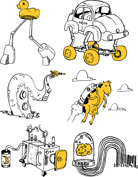
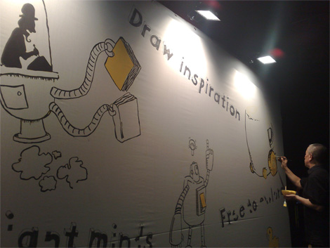
What completes this identity is the range of fun and wacky illustrations that express the idea of innovation and exploration. This Flickr set has all the illustrations, which are amusingly named with monikers like “jetpack moo.” The photo at the bottom here shows the illustrator at a party drawing up a storm. Anyone know who he is?
Thanks to Pauli Ojala for the tip.


Jump to Most Recent Comment
Chris Campbell’s comment is:
Love it! Is that blockhead font?
On Apr.09.2009 at 07:46 AM
thehappyhuskie’s comment is:
At first glance, this didn't seem like a fit for me. The market is becoming saturated with these "hand drawn" fonts in an effort to come across as wacky, personable and grass-roots(ish).
That said, it was the illustrations that kept me interested, and the tagline "draw inspiration" that sealed the deal.
I think I might just be open (woooo! pun!!!) to this one after all.
On Apr.09.2009 at 08:24 AM
don’s comment is:
Personally, I am not a big fan. Sure, the illustrations are nice, but what does the logo say about operating systems or open source? What does it say about mobile phones?
I agree it gives off the folk-y plan-it-x records kind of feel, but I just don't see the relevance of this method of execution.
On Apr.09.2009 at 08:59 AM
emily’s comment is:
it certainly stands out. i am so sick of the "orange brand" in every segment (cingular, pnc, etc), so yellow is very refreshing.
On Apr.09.2009 at 09:05 AM
M. ’s comment is:
Juno: The Operating System
On Apr.09.2009 at 09:06 AM
UV’s comment is:
Nice illustrations.
Nice brand language.
But that is not a logo, period.
Armin’s comment is:
> But that is not a logo, period.
Sorry, but how is this "not a logo"?
On Apr.09.2009 at 09:52 AM
jRod’s comment is:
it looks like they developed the entire marketing effort on small napkins while they sat around drinking black coffee and munching on crullers.
and it seems to have worked. great job... its nice to see smaller illustrators get some pub.
On Apr.09.2009 at 10:25 AM
Serviceburo’s comment is:
I'm pretty indifferent to the logo overall, to be honest it looks like an icon someone would use for their Etsy store. But from a technical standpoint, that typeface is a nightmare when you start considering how it would reproduce at small size. The extrusion element in the letters would be too mangled for it to make any visual sense.
The illustrations are fine (matter of taste) but they in no way convey any of the ideas that they are claimed to.
If they want me to feel that their technology is "accessible" then make it that way. It isn't the logo that does it - it's the way the device operates.
On Apr.09.2009 at 10:25 AM
John McCollum’s comment is:
Love the illustrations. Don't love the logo -- feels like it was given less thought than any of the individual illustrations. And that feels a bit backwards to me.
On Apr.09.2009 at 10:42 AM
designscene’s comment is:
Illustrations really nice. Logo not so great. It doesnt say much, and it looks like all the time went on doing the illustrations.
On Apr.09.2009 at 11:35 AM
Andrew Sabatier’s comment is:
For those of you still living in logoland, this project demontrates why, when handling brand identities, we need to think in terms of brand marks. These marks are delightful. Every one is literally a mark of the most personal kind. I'd love to see this approach span the whole Symbian brand and not just the Symbian Foundation.
These illustrations ooze personality. The sensitive, open and fresh drawing style is a very sophisticated take on the playful but serious world of software development, which can only realistically survive in an opensource arena. This brand identity is a clear invitation to all who can match the level of technological creativity on show.
The casual relationship of the type to symbol in the brandmark tempers my aversion to the overdone heart trend in contemporary corporate communications. I've been there myself. Hearts are very tempting when an overall approach doesn't isolate any one conceptual device to represent the whole brand. Each and everyone of these skillfully handled marks represent Symbian and they all work to cue a very unique brand experience. This is a huge creative win for a corporate brand of this calibre.
Personally, I love it.
A.
Harper’s comment is:
And to think, in terms of cell phone operating systems, Symbian is clobbering everyone else for market share.
Apple, Microsoft, RIM, Google, Palm: they're all getting clobbered by an OS that has a yellow heart for a logo.
There's something wonderfully ironic about that. I think the logo gives me a chance to root for a company that until now felt rather like a large faceless corporation.
On Apr.09.2009 at 11:51 AM
john.q’s comment is:
is this a sequel to Nick & Norahs Infinite Playlist?
On Apr.09.2009 at 11:53 AM
Lauren ’s comment is:
Love the illustration, love the colors, idea is nice, but I'm very hung up on the logo.
The white of the 3D text on the yellow is irritating, as is my perceived lack of balance. Letters are dimensional but the heart is very flat. I'm sure this was all intentional but the initial effect is that somebody doesn't care about tidy details, or didn't know any better.
It looks like the logo was conceived separately - whoever did the drawings has great concepts and illustration skills. The logo looks like it took decidedly less skill.
On Apr.09.2009 at 11:56 AM
radio_babylon’s comment is:
"...take on the playful but serious world of software development, which can only realistically survive in an opensource arena."
LOL! thank you, that made my morning :)
On Apr.09.2009 at 11:58 AM
Lauren ’s comment is:
Additionally, the paths on that heart look a little questionable... I hope it's compression.
On Apr.09.2009 at 11:58 AM
Kay’s comment is:
I applaud the intention to differentiate in that particular market, though this feels more like a temporary campaign to me, rather than brand ID. My feeling is the hand drawn look is close to being played out, I think by next year this will look old.
Well documented here: Hand Job
On Apr.09.2009 at 12:17 PM
Nathan Sarlow’s comment is:
I agree with Andrew. This needs to be thought of as a 'brand' and not just a 'logo'.
I think people think a little too narrow about what they expect from a brand because the modern trends seem to follow the annoying trend of 'icon that explains the business + type'.
I wish i had more clients willing to break from the traditional boring mould.
As John mentioned, I think the execution maybe seems a lot less 'creative' than their other illustration work, but I think it captures the spirit of the brand really well - and that's the important part.
Very nice.
Nathan
andyRespire’s comment is:
Logo 3D extrusion lines:
Looks like they may have taken them out for final - or just for the small versions. Logo from Symbian.org
![]()
Andrei Gonzales’s comment is:
Am I the only one that seems bothered by how close this is to Microsoft's current online branding direction with their MS Office software?
On Apr.09.2009 at 12:24 PM
Bill Dawson (XK9)’s comment is:
Me gusta.
www.shadowplaystudio.com
Inspiration? Movement?
On Apr.09.2009 at 12:33 PM
Bill Dawson (XK9)’s comment is:
Me gusta.
Inspiration? Movement?
On Apr.09.2009 at 12:36 PM
Amanda B’s comment is:
Oh I love the illustrations! They are so fun. I think the logo is fun too, and I like that it correlates with the images and starts to form a cohesive brand. I guess I just don't really understand how phone software works and where this logo will end up being applied...
On Apr.09.2009 at 01:34 PM
Clint Tseng’s comment is:
This is uncannily similar to Microsoft's Hey Genius college recruiting campaign: http://www.microsoft.com/college/default.mspx
On Apr.09.2009 at 02:21 PM
John McCollum’s comment is:
"For those of you still living in logoland..."
Wow. Condescending to colleagues much?
On Apr.09.2009 at 02:26 PM
John McCollum’s comment is:
Sorry, but just struck me wrong...
On Apr.09.2009 at 02:27 PM
Lester’s comment is:
I love the illustrations, and I love that the logo ties in cohesively to them, but that typeface looks like something a high school student would download for free from dafont.com or something. I think they could have the whole quirky illustrative look while still using better typography, in my opinion.
And the typography looks even worse on that wall of illustrations. It's like when I was in middle school, and I once typed an entire essay in a font that was designed to look like it was carved out of blocks of cheese.
The illustrations are awesome, though.
On Apr.09.2009 at 03:44 PM
Gustavo Cadar’s comment is:
I like the simplicity and innocence of the logo, but the typography goes to the wrong direction. It's not simple, it's not flat, it's not even cool or contemporary, it won't work printed in small sizes or in tiny lcd screens. I think it's a good attempt to do something different and it might work in some ads or huge banners (the overall identity is cool), but the logo failed.
obs: the font used on the wall (among the illustrations) seems to be nicer than the one used on logo. Note that the 3D is less deep.
On Apr.09.2009 at 04:05 PM
Calvin Buchanan’s comment is:
I really like the look of the illustrations. I like the idea behind the type, but it seems too deep. Overall, good stuff.
On Apr.09.2009 at 04:38 PM
Ryan Adair’s comment is:
Great. Great. I love it.
Wow, a what a novel concept. A corporate client actually doing something creative. That's insane.
Whether it "is or is not a logo" doesn't really matter, does it? At least they are doing something fun and fresh and INTERESTING. Helllllllllllo.....
On Apr.09.2009 at 04:47 PM
derrick’s comment is:
Actually, I think the cow or even the brain from the illustration would have made for a stronger brand than a generic heart, but I do kind of like the hand-drawn aspect. It looks cool.
On Apr.09.2009 at 05:19 PM
Aditya’s comment is:
Hand made is old news, soooooo last year, fresh this is not.
On Apr.09.2009 at 05:42 PM
M.’s comment is:
Also - not far off the McDonalds' Menunaire campaign.

Roma’s comment is:
One of the worst logos I have ever seen. Almost looks like some guy picked a font and a shape, didnt really care about how it went together or what it looked like.
AHHH, the client wants his company to have a lot of heart and to have a hand done touch.
go it I will go on to Dafont.com look up the top hand done font and make a heart shape. logo = done
m
symbian or
v
I just made you a better logo in 5 sec
enjoy and smile
On Apr.09.2009 at 11:18 PM
Chuck Spidell’s comment is:
This brand reminds me of the Zune launch. Either way, it's got potential. I heart robots.
On Apr.10.2009 at 06:35 AM
alexandra’s comment is:
I love it. I think the work was done by Landor.
On Apr.10.2009 at 12:17 PM
Josh’s comment is:
Love the execution more than the identity. I think in partial agreement with all sentiments, the identity could have been a little less loose in execution, as what do you do when you change communication strategies in the future? In this case you'd almost have to change the identity, in order to build around it again.
Much like talk about Apple, I'm more in love with the idea that the services or products you make and provide should sell themselves. They should be useful to your target audiences. This nets sales and market share. Symbian may have the largest share, but only because they had a head start ala Microsoft.
I've never much liked mobile OS's till Apple released the iPhone. Thoughts of WinMobile, BlackBerry, Symbian and the rest make me shutter.
I'm glad that Apple changed the game. Perhaps with this rebrand will come with a pursuit to challenge Apple and its race to the top.
On Apr.11.2009 at 03:54 PM
William Sauce’s comment is:
i have mixed feelings about this one. perhaps this is fresh—relatively speaking or in the context of its use. however, in terms of its visual language, i do not think this qualifies as fresh. awkward hand rendering has been around since at least the latter part of the last decade.
beyond that, the execution of this style (and as mentioned above, yes landor is responsible) feels more or less generic to me. there isn't anything unique about it that makes it memorable when considered alongside other similar works. on the other hand, symbian's competitors identity's are probably not among those similar works.
on it's own, the logo feels like something i've already seen, and i'd rather that not be the case. i appreciate the attempt, but on its own, the end result feels uninspired.
i do agree w/ the many who have noted a preference for the illustrations. good stuff.
On Apr.13.2009 at 11:49 AM
Roby Fitzhenry’s comment is:
Happy to see this brand take on a bold new look. Unhappy to see they completely failed to roll this look into their web presence. See for yourself ...
On Apr.13.2009 at 12:01 PM
Symbian Illustrator ’s comment is:
the guy in the pic isnt the illustrator! he just copied my stuff from my sketch book, as i couldnt make it!
glad u all like the illustrations!
D
Matt Fouty’s comment is:
Reminds me of the movie Juno
On Apr.16.2009 at 12:25 PM
Mobile Observer’s comment is:
Is this "designed" by a developer?
On Apr.21.2009 at 10:11 AM
Mark’s comment is:
very interesting, definitely out of the box, I like it.
On Apr.22.2009 at 02:43 PM
Jessie’s comment is:
I really like the use of just the yellow to emphasize certain parts/objects.
On Jul.10.2009 at 02:04 PM
Comments in Brand New, V1.0 have been closed.


