

NOTE: This is an archived version of the first incarnation of Brand New. All posts have been closed to comments. Please visit underconsideration.com/brandnew for the latest version. If you would like to see this specific post, simply delete _v1 from the URL.
![]()
One of the worst things about being sick to your stomach — whether it was because of some bad fish tacos or exposure to an ugly logo — is the prospect of having to take Pepto-Bismol to cure it. Sure, you could take other things, but somehow Pepto-Bismol is a default, widely available, mainstream choice that is easy to recognize either in your medicine cabinet or as you sweat your way through the aisles looking for a cure. Pepto-Bismol looks like pink goo, it smells like pink goo, it tastes like pink goo. It is pink goo. Magical pink goo that more often than not works. Or, like a match that you light to overpower a powerful Number Two, it at least makes you think of what an awful thing you have just swallowed and allows you to forget your upset stomach for a few seconds. As if the product itself wasn’t enough of a reminder of its pinkish gooeyness a new logo and packaging have been designed to emphasize that the stuff you are about to intake is pink and gooey. The logo now oozes, its typography melting at the mere sight of the pink goo that lies beneath it. Pink. Goo. Everywhere.
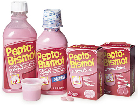
Old packaging.
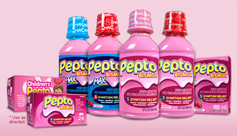
New packaging.
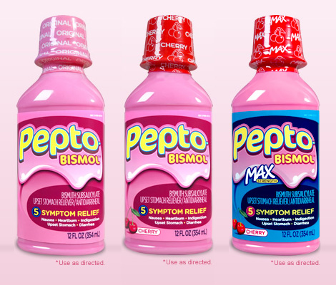
New bottles.
Thanks to Gabriel for the tip.


Jump to Most Recent Comment
Doug Bartow’s comment is:
I don't feel so well all of the sudden...
On May.27.2009 at 11:02 AM
DougC’s comment is:
Nobody likes the product - why would they emphasize the thing on the label ? Methinks a more medicinal-like label would be better - no one touches this stuff for fun, why make the lable playful - you're fooling no-one ...
On May.27.2009 at 11:03 AM
Erik at Logo Critiques’s comment is:
The logo feels sick and looks like it is spewing pink goo. Can't say I like this one...
On May.27.2009 at 11:08 AM
Amanda B’s comment is:
I like the old logo/bottle combo much better. At least it was familiar reliable pink goo. Now it looks like the logo for a sugary chewing gum, along the lines of bubbalicious.
On May.27.2009 at 11:09 AM
johncolucci’s comment is:
Notice how they emphasize the word Pepto now, and not so much the "Bismol." I guess they are fighting for keyword space. "Drink too much Pepsi and eat too much Pizza? Get some Pepto!" I think the real colors should be black and pink because thats the color your tongue becomes the next morning when you wake up and its still there in your mouth after brushing.
On May.27.2009 at 11:12 AM
Minder S.’s comment is:
How dangerous is it for a kid to drink Pepto-Bismol (because that definitely looks like a bottle of candy juice)? There is something nostalgically "80's" about the old packaging - it kind of reminds me of when, years ago, Burger King updated their logo and added that blue swoosh (Burger King was never as appetizing after they added that blue to the logo). Also, this kinda looks like Bubble-Tape packaging:
jRod’s comment is:
yeah, both logos are making me feel nauseous.
i do recognize the need for an update though, as the current logo (or at least a variation of it) have been around a long time.
their more recent ad campaign keeps mentioning how it "coats" the stomach (although it would take an entire bottle of it to coat like that) and i would think thats where the pink goop wrapper comes from.
On May.27.2009 at 11:18 AM
jRod’s comment is:
oh yeah... the blue outline around the text is bugging the heck out of me.
On May.27.2009 at 11:20 AM
Pamela’s comment is:
LOL! Someone HAS to have a sense of humour on this one. I chuckled when I saw it.
I'm guessing they wanted to emphasis the "coating" it's known for. I mean, jeeze! Look how thick that illustration looks! I can taste it already in the back of my throat.
Yes, I agree that the blue line could go...it kinda vibrates.
Seriously, though, I think this will grow on me.
And I'm sure the new branding will PUNCH on the shelf!
Bill Dawson (XK9)’s comment is:
Yuck. The makers of Pepto Bismol apparently do not care if you consider their product a serious remedy or not. It's a yummy candy coating for your upset tummy. Now doesn't that feel better?
On May.27.2009 at 11:31 AM
Ryan’s comment is:
It looks like Strawberry Milk for Active Kids!
On May.27.2009 at 11:32 AM
David H’s comment is:
I think it's funny that the new adult dose packaging almost has a more childlike text treatment than the Children's Pepto packaging.
The new packaging looks like it's for candy.
On May.27.2009 at 11:34 AM
Hibryd’s comment is:
Yeah, I think they're playing off the "coating your stomach" imagery that has been in the commercials for as long as I can remember.
At least, that was the VERY first thing I thought of when I saw the new look.
On May.27.2009 at 11:35 AM
Michael’s comment is:
Reminds me of something off of "You Can't Do That On Television" or Nickelodeon.
On May.27.2009 at 11:38 AM
Beth’s comment is:
Maybe I'm the only one who likes this stuff? When I was a kid, I would pretend to have an upset stomach just to have some...
The new logo looks much better in action on bottle packaging. Doesn't do it for me solo, or in print on chewables box.
On May.27.2009 at 11:38 AM
Nisio’s comment is:
Somebody call the ghostbusters...
I can get they are probably trying to poke fun at the product, but maybe that positioning would be better served through a clever advertising campaign, let the packaging be the straightman and then the ads can play off that.
Who you gonna call? DaDa DoDa-DoDa, Dee-Te-Dee Do Da-Da
On May.27.2009 at 11:39 AM
dollface’s comment is:
this isn't making the product look any better unless you are under the age of 10. It needed an update either way people will still buy it!
On May.27.2009 at 11:45 AM
MP’s comment is:
Pepto Abysmal.
James Re’s comment is:
web 2.0 meets the inside of your stomach. man thats gross. I have to agree i like the old logo better. Pepto isn't fun why try to make it look fun... i think a more medical clinical touch would have worked better personally.
On May.27.2009 at 12:04 PM
Doug’s comment is:
I'm thinking opposite of most of you. Pepto Bismol is trying to keep a market share on shelves FULL of acid reducers, acid controllers, antacids and other stomach remedies. Nearly all of them are very clinical and sedate, design-wise. PLUS, Pepto is also battling the store brand of their own product, which is presented even more blandly than the brand competition.
The Pepto Bismol ad campaigns have been focused on silliness and fun (which are usually the causes of most stomach ailments, anyway), so this branding matches. They emphasize the vernacular for the product - Pepto and differentiate the variations in the product line with color.
I find it effective.
On May.27.2009 at 12:09 PM
Jamie’s comment is:
I LOVE Pepto Bismol! Yummmmm!!!!!
And I agree with Doug's comments, although the red behind the "pepto" text is bothering me.
On May.27.2009 at 12:27 PM
coda’s comment is:
I'm not at all familiar with this brand. The new packaging is definitely much more friendlier and fun, and looks more like something made to digest than it previously did. Given the choice however, I don't think I'd grab a bottle off the shelf - there's nothing fun or silly about medication and I would opt for the more conservative and clinical brands that take themselves seriously.
On May.27.2009 at 12:33 PM
Amanda’s comment is:
Pepto Bismol is just instant dehydration anyway. That's how it works.
It is a terrible product and probably deserves terrible packaging.
This is just comical in my opinion. It looks like candy. It will pop off the shelf — but I would buy tums before I bought this.
On May.27.2009 at 12:40 PM
Jason’s comment is:
I'm going to be the odd one here. I like it. Though I agree that it may be a little to "kid friendly." Mmmm...pink goo.
On May.27.2009 at 12:51 PM
Josh’s comment is:
This is one the one time a go-to Swiss default template should be in order. That or just discontinuing the product.
On May.27.2009 at 12:54 PM
Paul Riehle’s comment is:
Way to childish, showing that your product is pretty much pink goo is not appealing to someone who is about to barf. Bad change in direction.
On May.27.2009 at 01:04 PM
Daniel Bertalotto’s comment is:
As a designer, I'm really appalled, but I'll bet it will be a hit. It works alongside the rest of their branding as a populist remedy. But does it make it right? It definitely isn't my personal taste, both literally and aesthetically, and turns me away as a consumer. I'd be interested to see what else their demographic purchase model is like. Their campaigns suggest the self-overeating of processed foods, such the same as Tums and other antacids.
Oh, well. That's America.
On May.27.2009 at 01:16 PM
koyo’s comment is:
I don't know if it's good for my stomach but I wanna taste it! LOL
This new one look it's nicer than older one. The old logo look like an ugly, old, medical drink.
On May.27.2009 at 01:38 PM
enna.’s comment is:
Wow. I have never seen a logo that makes me sick to my stomach. I don't know if it's stupid or brilliant.
On May.27.2009 at 01:43 PM
Andrew Klein’s comment is:
Wow...what's with all the negative critique?
I love the product and packaging. Actually, just seeing that shade of pink makes my stomach feel better.
I don't think it's too childish, what is childish anyway- bubbly letters? It's a bright pink stomach relief product that has advertising with a catchy song and dance singing out the symptoms it treats, last of which is diarrhea, and then the people in the commercial hold their butt! , what do you want, Trade Gothic?
I don't think a "swiss default template" or "clinical" approach would speak to the brand at all. One could make the functional argument that it looks too much like a yummy drink a kid could pick up by mistake, but I guess that's what parents, medicine cabinets, and child proof caps are for.
It's an honest delivery and representation of the product and brand, typography is fun, a little quirky but appropriate. It's a nice departure from a lot of pharmaceutical packaging. Looks like something I could keep in my pantry (next to the salsa) for convenience.
On May.27.2009 at 01:46 PM
RSG’s comment is:
If the goo was shaped like a shield, with the lowest descending ooze centered under the second P, it would evoke goo as protective agent, not goo that I feel like wiping off the bottle.
On May.27.2009 at 01:47 PM
Anonymous’s comment is:
Yup That's America! Sounds like a great tv show title right there.
Anyway I like the new treatment they gave the logo. It pops out from among the myriad of products it will share shelf space with. Crowded shelves mind you. If you don't like the product.. chances are whatever they do to the logo isn't going to agree with you. Is the logo to EVERYONE'S liking? Nope.. but it was to the head honchos at Pepto central and they are paying the bill.
The more I peruse this and other graphic design sites the more I discover that a lot of graphic designers come across as a snotty bunch of people. "Well.. it's NOT to MY liking!"SSheesh...
On May.27.2009 at 01:51 PM
Dan Warner’s comment is:
It's rare to see the plastic cap wrap on packaging BE the major "flavor" distinction point. I could have grabbed the first two easily and not known there was a difference if it didn't have the red cap / pink cap.
But overall, this makes me think perhaps the intended market is a new generation of blimpy, obese little kids rolling around, with their mommy's and daddy's forcing pepto down their throats for reflux after the kids have gorged themselves to sickness...
On May.27.2009 at 01:59 PM
tinpot Dictator’s comment is:
If I'm hungover, miserable and ejecting in all directions. Do I want to feel morose and clinical or happy and cheerful?
I'm looking for something whose cheerful promise of relief practically jumps off the shelf, and hoping I can get it paid for before I chug the bottle. Then I'll worry about the branding...
As art, it sucks; as a brand it sucks, but it's going to suck all the way to the bank.
On May.27.2009 at 02:09 PM
pepto bismol’s comment is:
I like the new design. The position of MAX strength, messes with the 3d effect of the goo. you can't have 2d "Max strength" on top of a 3d effect. Either move it down or photoshop it to conform to the contour of the goo.
On May.27.2009 at 02:16 PM
Jonathan Carnehl’s comment is:
I think people are taking this one a little too seriously. Sure, it might not be very sophisticated, but they obviously aren't going for that. They are playing off of their wierdness, and look, they got people talking about it. I think it's fun.
On May.27.2009 at 02:28 PM
V as in Victor’s comment is:
I have to say I prefer the original look. It had an 80s professional clinic feel that I've trusted for years. The new version seems more active and kid friendly. I'd call this one a draw. For pink goo that tastes icky but makes you feel better, the new version of the logo makes sense.
On May.27.2009 at 02:44 PM
NicKLAUS’s comment is:
Maybe they purposely designed it to make people's stomachs turn whenever they see it, this way the Pepto-consumption ratio would go up. Its a vicious cycle and a brilliant idea.
All kidding aside I owe my life to "the pink drink". If I didn't have pepto by my side when I was going through college, I wouldn't have survived. Pepto Bismol helped wean me off of "homemade cooking" and helped my stomach get used to consuming pizza pops, instant coffee and beer.
I personally think they should just go without a label at all and just let the glowing aura of the pinkness do all the talking when its on the shelf.
On May.27.2009 at 02:55 PM
Anonymous’s comment is:
After seeing this fun logo, I feel the need to chug a bottle of this stuff for dessert, even if my stomach isn't queasy!
Kids will want to chug this by the gallon! Screw "use as directed!"
Really, Pepto Bismol? Fun, quirky logo that (as pointed out before) looks like bubble gum wrapper does not equal increased consumption.
On May.27.2009 at 03:00 PM
Josh’s comment is:
I actually like Pepto. Believe it or not, it's a miracle. It works almost every time and you can avoid some unnecessary upsets with the stuff. Granted, it tastes like crap - but it does the job, so what more can you ask for? It's medicine. Get over it.
I was actually surprised at the new logo when I picked up a new bottle the other day. I kind of like it.
On May.27.2009 at 03:30 PM
Diane’s comment is:
I believe that this is a direction the brand has been heading in for a while. Looking at their silly commercials, with goofy, singing Pepto-lovers, then going in a more 'clinical' packaging would not have made sense IMO.
That being said, I am not a big fan of the teal/blue stroke surrounding the letterforms. I feel the type a holding shape were fun and playful enough. The blue is a distraction.
Oh—and I also like that they are playing up the large 'Pepto' and smaller 'Bismol' since it's becoming commonly known as just 'Pepto.'
On May.27.2009 at 03:33 PM
Proverbial Thought’s comment is:

Sandy’s comment is:
It's so childish. I thought it was for kids. Please tel me this isn't the direction we're taking as a society.
If I'm sick, I take medicine. I'm not a child and don't need it to sing and dance for me.
Proverbial Thought’s comment is:

I think you get the point.
On May.27.2009 at 03:41 PM
rico’s comment is:
Actually, I don't get the point....
On May.27.2009 at 03:53 PM
Nick ’s comment is:
Can't agree with most of you
They OWN pink goo, there is no reason why they should distance themselves from it. I bet it is one of the easiest medicine to find at the pharmacy because of it's color and it's non-clinical look.
if they have child-safe caps, I have no problem with it looking amusing.
I wonder if their letterheads/stationary stuff is all covered with pink goo. that'd be wicked!
On May.27.2009 at 04:11 PM
BJN’s comment is:
The red-purple fill color for the holes in the "p" and "o" have create an unfortunate fleshy orifice in addition to gooey pinkness of it all.
On May.27.2009 at 04:21 PM
Ricardo’s comment is:
Off is the word. Off brand, off category, off mission and off target. At least its consistently off?
I really don't think Kids are the purchase driver, Moms are. I don't see this look appealing to Moms looking for assurance and trust in a medicinal category product. But hey thats just my 2¢
On May.27.2009 at 04:48 PM
Bart’s comment is:
Are you sure the big P is the most recent packaging before this new pink goo one? I've seen this before which doesn't have the big P and does have a more-subtle goo:

damon’s comment is:
mmmm, looks fun to drink!
they just need a mascot now. I'd call him Barfo, he's a little stomach with wild googly eyes and flailing hands who playfully reminds you to drink your goo if you know whats good for you.
On May.27.2009 at 05:34 PM
Sean Sedgwick’s comment is:
I guess I'm the only person in the world that actually really likes the taste of Peptol Bismol.
=\
On May.27.2009 at 05:48 PM
Alex’s comment is:
eww. It looks like molten bubblegum.
On May.27.2009 at 07:30 PM
Rob O.’s comment is:
Yup, the new design is nauseating. They should've swung the other way, opting for a more clinical or medicinal look. The bubble-gum styling of the logo is inappropriate and I'd have a hard time believeing that it's netting more sales within the target demographic.
On May.27.2009 at 09:00 PM
Tim Resudek’s comment is:
I like the new look. Their marketing over the past couple of years has been sort of tongue-in-cheek, we-know-what-you-think-of -us. I think this new logo celebrates the pink goo for what it is and I think the use of shadowing on the bottle makes it pop.
In terms of marketing, they could probably put no label on the bottle and we'd all identify it. So, why play it safe?
On May.27.2009 at 09:35 PM
Chad Kaufman’s comment is:
Why was I on the Snuggie site today? Your guess is as good as mine, but I was.

Love the lush, smooth Pepto blanket in their header.
On May.27.2009 at 10:26 PM
john’s comment is:
That's just nasty.
On May.27.2009 at 11:25 PM
Scott’s comment is:
Whoa, where's the analysis here?
Only ONE comment so far about the red center of each of the letters? That's most striking to me to better understand what's going on with it (just plain bizarre design to me).
Similarly, Bart makes a nice comment about about the more "refined" dripping pink goo on a recent label. To me, it's more appropriate. The new version, which is kinda clever, is way overkill b/c of the pink goo ... you'd think with a pink bottle it would be unnecessary. Strangely fun design, but seems to me to be an absolute graphic design no-no from an academic standpoint.
On May.28.2009 at 12:07 AM
Ross’s comment is:
Well... I like the taste, and the medicine has always worked out for me. The new treatment fits their off beat commercials. It's almost a meta logo. Who doesn't like a medicine with a sense of humor?
On May.28.2009 at 12:08 AM
Mira’s comment is:
I think what's bugging me about the logo is either the "e" or second "p" in pepto. The "e" seems squished and rotated strangely, and the p, it's too big and not curved like the rest of the letters, and it throws off the drop shadow behind the word. Actually the "o" on the end is more off in terms of the drop shadow, there seems to be more of it showing than with the rest of the letters. I think the second "p" is the way it is, because it's suppose to be a perspective thing as it wraps around the bottle, but flat for print, it looks off.
Hope that made sense :-)
On May.28.2009 at 01:36 AM
Mira’s comment is:
Oh, and I agree with Scott's comment about the strange red behind the letters. It's really striking and make you wonder why they did that. Is it suppose to be like the inside of a stomach/intestines? that would make sense, but they didn't push that far enough (and this goes back to the "e" being strange for me, the counter of the e is too small, causing the blue outline to almost eliminate that red back there. )
On May.28.2009 at 01:46 AM
Chuck Spidell’s comment is:
Beware of The Blob.
On May.28.2009 at 06:16 AM
Caryn’s comment is:
I'm also one of those people that like Pepto Bismol. I actually love it. It is the only thing that never fails when I have an upset stomach. I do not however like this branding. The old logo and packaging look dated, but I think it works better as it looks as though it has a history and will pull through for you. This new one looks like a joke. Kind of reminds me of the Nickelodeon slim show. Immediately made me think of children and I wondered why they are trying to market it to kids. Not sure it is good for little kids to take anyway. Should have gone a different direction.
On May.28.2009 at 09:23 AM
Eric’s comment is:
Love the logo. Reflects the CGI they have used in the past of the sauce coating the stomach lining.
Adam’s comment is:
I love this for totally selfish and personal reasons. It reminds me of the Garbage Pail Kids cards from my childhood, which is appropriate considering those cards would probably make some people sick to their stomach...t
hey have some cross nostalgia working on me.
Glenn Sakamoto’s comment is:
This design is perfect. It gives me diarrhea.
On May.28.2009 at 02:08 PM
Anonymous’s comment is:
I pray and hope that they've changed the taste along with this new packaging. If there's really a change in taste, and the taste IS good, I'd swallow this 'most horrendous packaging of the decade' anyday.
On May.28.2009 at 11:57 PM
Randy’s comment is:
Well now, when I see Pepto, I can think "smoothie!".
On May.29.2009 at 12:03 PM
Wünderwoman’s comment is:
Silly wabbit! Pepto's for kids!
On May.29.2009 at 02:56 PM
Panasit’s comment is:
Wow, I read the comment and like, 4 people like it?
I like it too. I think this is a very great redesign.
And as far as it being too colorful the kids may want to drink it AND also comparing to gum packaging, to be fair, accidentally swallowing gum is a lot more harmful than accidentally swallowing pepto-bismol.
Plus we all had battles with our mom over a spoonful of that evil goo. I think the logo is making fun of itself. Kind of like that funny doctor holding the syringe.
On May.30.2009 at 12:24 AM
yael’s comment is:
I can't believe they did that. It's like a fun yummy kid's candy look (not what you want when you're sick in your stomach). Pepto Bismol is an all-ages-all-types-of-folk product.
They could have so easily strengthened the brand's presence on shelf by simply punching up the pink to a more vivid, eye-catching shade. Pink is all they needed to stand out. They own the color in that aisle.
Sigh.
On May.31.2009 at 10:22 PM
John’s comment is:
I think the logo is totally appropriate, and it works well. Of course I like the taste of Pepto too, so my judgement may be questionable ;)
On Jun.01.2009 at 05:34 PM
Benigno’s comment is:
I think it looks good. The emphasis of what it is make it a medicine with huge personality... and they played well with that goo factor...
What I don't get is the difference between the regular and the cherry flavor label. If you dare to change all the colors of your background without messing with your system, why not use a red/dark red background for the cherry one.
(They do taste really different, and I won’t be that happy making the mistake of picking up some regular when I want cherry... ehehehe)
orangetiki’s comment is:
Were they THAT desperate for a redesign of their bottles?
On Jun.02.2009 at 04:26 PM
Ben Weeks’s comment is:
I like pepto too.. but I'll switch to the no name brand now. It's cheaper, does the same thing and is banal instead of unsettling to look at.
If I was 12, i'd think this 3d logo was a flipping amazing design loaded with fun and happiness. I'd wonder, Does it come with a free toy inside?
On Jun.03.2009 at 09:26 PM
Shauna’s comment is:
Maybe it's an attempt to sell more by making people sick instead of waiting for it to happen.
On Jun.04.2009 at 11:06 AM
daho’s comment is:
Well, they could have made it less "nickelodeon", but from a marketing standpoint, it's smart. The quesey goo is what coats the stomach and makes you feel better, so seeing it on a label is like seeing ice droplets on a beer ad.
I want to drink some of that!
On Jun.08.2009 at 04:39 PM
gacktsun’s comment is:
I like the logo and packaging
On Jun.12.2009 at 09:48 PM
Brian’s comment is:
the idea that something pink coating my stomach is a freakin remedy just grosses me out from the get-go. Actually SHOWING the pink sh¡t makes it even more yucky. Aside from my personal feelings on the matter, it looks childish—like Silly Putty or Ghostbuster slime, or a box of cereal. I've always disliked this product, this brand.
On Jun.20.2009 at 03:31 PM
Fred’s comment is:
What on earth is going on????? This packaging is simply terrible- Bad - really bad - horrible. WOW! I am constantly stunned at how bad design can be.
On Jun.23.2009 at 08:18 AM
Mark’s comment is:
ECH!
bad bad bad!!!!!!
the sight of pink sludge dripping down simply disgusts me.
what was wrong with the old packaging? too simple?, not enough glitz and glam? the people at Pepto Bismol are cowards,whimps and are afraid that they're packaging will fasde into the background without a little "pizzaz".
I guess they want to look like everone else with their drop shadows and strokes to the nth degree.
A shame really.
On Jun.23.2009 at 01:15 PM
Mark’s comment is:
ECH!
bad bad bad!!!!!!
the sight of pink sludge dripping down simply disgusts me.
What was wrong with the old packaging? too simple?, not enough glitz and glam? the people at Pepto Bismol are cowards,whimps and are afraid that they're packaging will fade into the background without a little "pizzaz".
I guess they want to look like everone else with their drop shadows and strokes to the nth degree.
A shame really.
Some people want new for the sake of new. This'll be dated in 2 years or less.
On Jun.23.2009 at 01:18 PM
Mark’s comment is:
Even though it looks terrible, it does pop out at you in the very least. That's the only positive thing I could say about it.
On Jun.23.2009 at 01:46 PM
phar_fetched’s comment is:
anyone else thinking bubblegum?
On Jul.07.2009 at 05:46 PM
Comments in Brand New, V1.0 have been closed.


