

NOTE: This is an archived version of the first incarnation of Brand New. All posts have been closed to comments. Please visit underconsideration.com/brandnew for the latest version. If you would like to see this specific post, simply delete _v1 from the URL.
Living Proof considers itself a rather unconventional beauty product company — gathering scientists outside of the beauty field under Bob Langer, an MIT Institute Professor, lead by the former Senior VP of Marketing for L’Oreal and backed by Polaris Venture Partners in Cambridge. Their first product to get out in the wild is a line of No Frizz solutions that employ PolyfluoroEster rather than the traditional method of utilizing silicone — they’ve got a great video describing the process on their products page (right column, “watch” button). Living Proof’s elevator pitch:
Living Proof was born in Cambridge, Massachusetts, and created for the purpose of solving the toughest beauty challenges. we are able to do this by inventing efficient, single-purpose formulas based on entirely new molecules and breakthrough technologies. We are a team of scientists and beauty authorities brought together by a shared aspiration: to challenge the status quo and end the common beauty frustrations of people everywhere — once and for all. This is how we define technological breakthrough, how we define true innovation. This is our mission.
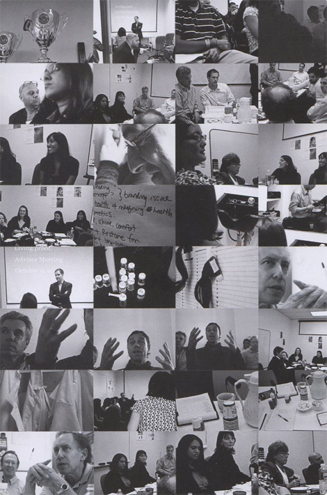
Bob Langer at work.
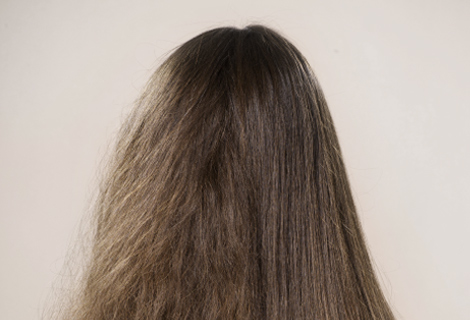
Frizz. No frizz.
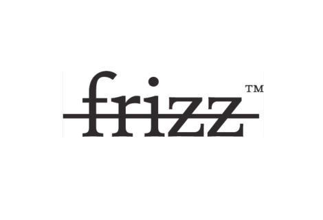
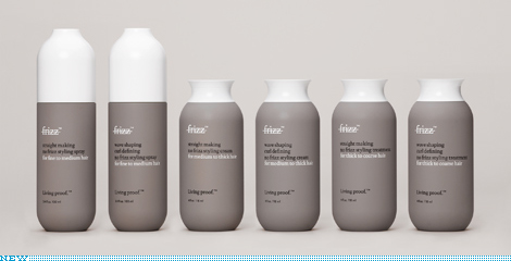
This is another branding job by Wolf Ollins, the powerhouse of recent 2012 Olympics fame and controversy. The identity is made up less of a conventional logo and more of a branding compound consisting of one part packaging shapes, one part color palette and two parts typography (DTL Documenta). It’s a sophisticated approach, using just a few brand elements and some smart copy to play the line between high fashion and pharmaceutical formulas. There is a refreshing clarity to the composition and directness of language that is vaguely reminiscent of the annual report work of Bill Cahan’s outfit (certainly others in this category, Cahan came to mind first). While overall there is some familiarity with the conceptual approach that Prada took several years ago with their skin care products (examples here, here and here) this work is exceptional in its execution — from the formal attributes of the bottles to the understated struck-through “frizz” product name. Love the work or hate it, Wolf Ollins continuously displays their spry flexibility. More brand images can be found here.


Jump to Most Recent Comment
Colin’s comment is:
Great review of the whole brand and not just a logo. I think the name, "Living proof" is so inherently solid that you really just need to get out of its way. Which Wolf-Ollins did remarkably. Good stuff.
On Feb.24.2009 at 06:50 AM
Franklin’s comment is:
Colin,
Thank you for not saying first. I am sick of that crap.
On Feb.24.2009 at 07:46 AM
Sacha’s comment is:
This one got me scrolling down the page trying to find the logo. I'm still looking...
On Feb.24.2009 at 08:33 AM
Mike’s comment is:
@Sacha
Why are you looking for the logo when they is such a good review of the brand.
If you look over the site and advertising, the overall imagery is enough to distinguish the product. I don't think the logo is all that big of a deal in this case.
On Feb.24.2009 at 09:23 AM
Jonathan’s comment is:
"Living proof" is the brand (essentially without a logo) that uses products and branding as its proof of existence? Did I word that right, does that make sense?
If thats the case, talk about a genius move by WO...
On Feb.24.2009 at 09:43 AM
altoption’s comment is:
Just had a look at Bill Cahan's website. Is this a joke? Wow. Most pretentious website ever.
On Feb.24.2009 at 10:08 AM
Rodrigo Müller’s comment is:
wow.
On Feb.24.2009 at 10:40 AM
emily’s comment is:
well, it made me buy it.
i like the color palette, fonts, and informational videos.
for some reason i feel like its all boys who comment on this blog..
On Feb.24.2009 at 10:51 AM
Kevin Zwirble’s comment is:
I do like the back story, it helps to really understand the focus for the brand.
The mark seems in the vain of many British design firms like Kent Lyons...very clean, crisp, sophisticated, and dare I say timeless?
On Feb.24.2009 at 11:49 AM
damon’s comment is:
Nice looking stuff.
I'd like to see more collateral / Advertising from this brand.
On Feb.24.2009 at 12:28 PM
Katelynn M’s comment is:
@emily: lol, and I agree.
Among the design failures in the hair product aisle, this is definitely a stand-out. As a shameless girl who frequently purchases toiletries based solely upon package design, this will be in the basket on my next trip out.
From a designer standpoint, I truly appreciate the marriage of simplicity and typography that make this a brand, as opposed to some jaunty logo on a bottle.
Now perhaps had WO taken this route with the olympic logo...
...nevermind.
On Feb.24.2009 at 12:30 PM
Morgan Smail’s comment is:
Nice work. Great bottle forms.
It's very encouraging and inspiring to see a company with such vision and intent. Something we DEFINITELY need more of in the marketplace.
nice write up Armin
On Feb.24.2009 at 12:42 PM
Morgan Smail’s comment is:
pardon me.... nice write up Christian
On Feb.24.2009 at 12:46 PM
ben’s comment is:
love the card.
On Feb.24.2009 at 12:46 PM
Glenn Sakamoto’s comment is:
Beautiful work.
On Feb.24.2009 at 02:14 PM
lucid’s comment is:
Are we focusing on packaging now?
Great packaging... poor execution on the logo!
On Feb.24.2009 at 04:32 PM
Kirk’s comment is:
striked frizz
On Feb.24.2009 at 04:42 PM
Serviceburo’s comment is:
The products themselves have a very interesting marketing angle, I definitely dig the science-oriented factor. However, I think that they missed the boat on the packaging. Yes, it's nice and I have no specific criticisms of it (hard to believe the same agency produced the abomination that is the London 2012 logo) but it seems like they really missed a chance to do something neat on the design.
The whole science angle gives them a lot of opportunities to really run with the design. "Science" has a lot of visual associations that they could have done a much more effective job of integrating into the identity. While what they have produced is nice, these packages are going to get lost on the shelf when sold in a salon. Just not quite distinctive enough.
On Feb.24.2009 at 06:56 PM
Anonymous’s comment is:
Lucid, this is a 'poor execution' of the logo?
Do please explain how this is 'poorly executed' because, with absolutely no reasons or evidence offered, I suspect that you're actually just trying to be sensationalist, contrary, intellectual and interesting.
Or..?
On Feb.24.2009 at 10:03 PM
David H’s comment is:
I don't get it. I guess I'm still trying to learn what defines a good design. Honestly, if it wasn't for the post defining what everything was, I wouldn't know 1. the name of the product is "no frizz" and 2. the name of the company is "Living proof" (strange capitalization on those, too).
I know a good design isn't based on the effort or time spent designing a product, but this design feels insulting to me. I want a *little* effort put into the design. I think I would have to be given a good sales pitch to accept this design for my brand.
On Feb.24.2009 at 10:37 PM
Von K’s comment is:
I really like this. The packaging is perfect. It feels honest and beautiful. When you're talking about beauty products, the package how most people get to know your brand and this one just works.
The overall brand is very well done. Other high-end brands in this category try to evoke the science end of product making to instill confidence in the consumer, but this does it so much more effectively by introducing you to the people, talking straight and not forcing a "sciency" look.
On Feb.25.2009 at 12:13 AM
Another Sheila’s comment is:
The product is pretty darn amazing. I ordered it from their website. The customer service is Zappos-like--its excellent. They gave me free product when my shipment was delayed a couple of days and sent several friendly and thoughtful emails to apologize.
They also included a deck of "brand" cards with my shipment that were, truth be told, a bit up its own. I mean who wants to read a double sided deck of cards about a hair product? I'm in the business and I couldn't make myself go through it. Even if the product is the second coming I'd kind of like a quick story about it and not a lot of self congratulations. Maybe it was the pitch manifesto, who knows. Best to keep that deck of cards as clever guidelines document for the internal folks I say.
Also, I'm sorry but the look and feel seems pretty darn category like for a company that says its an unconventional beauty products company.
Then there's the name. Its hard to look at the product and figure out the name of the Company/product--is it Living proof or the Frizz strikeout? Or both? Or,huh? The company/product hierarchy is unclear.
If you ask me, the identity is sterile, somewhat precious and bit confusing--which is in direct contrast with the really warm and friendly experience I had with them.
Cute but not terribly practical packaging btw when it comes to getting the product out the bottle once you are about half way through, but I can forgive that.
I like this company alot, kind of in spite of their branding actually. I don't know, I think the design should enhance the experience not mask it.
On Feb.25.2009 at 12:22 AM
John Mindiola III’s comment is:
Has anyone mentioned that this design is exceptional, WITHOUT the use of scantily-clad models? It feels very real, like they actually care about their product and its purpose, not just about plastering big breasts and luscious lips all over the place. It's a product line that will help women feel beautiful without having to gaze through some suit's idea of a beautiful women. Sexy without sex? That's hard to do. Great work. A+.
On Feb.25.2009 at 12:46 AM
jacqueline c.’s comment is:
I'm really drawn to the combination of clay brown and royal blue in the collateral, and I like the little frizzy-head drawings. The bottles are nice, but not as much unconventional as they are just bland, in that stylish way. (I wonder how the tops work, though... the large ones seem weird.)
Now how does the stuff smell?
On Feb.25.2009 at 02:37 AM
Kellie Schroeder’s comment is:
The packaging is GORGEOUS!
:)
On Feb.25.2009 at 03:20 AM
Jo Chua’s comment is:
As a designer, I love it!
As a consumer, I would be confused.
Would this be a classic breach of Form follows function?
On Feb.25.2009 at 05:06 AM
millie rossman kidd’s comment is:
@David H
You said:
"I know a good design isn't based on the effort or time spent designing a product, but this design feels insulting to me. I want a *little* effort put into the design."
Sometimes great design looks effortless. Some would argue it should.
On Feb.25.2009 at 05:50 AM
Fanny Khoo’s comment is:
understated simplicity that builds credibility to a new brand. logos are past it
On Feb.25.2009 at 09:47 AM
Goffredo Puccetti’s comment is:
Spectacular. Top marks. I love the concepts and the implementation. Bravo WO!
On Feb.25.2009 at 10:31 AM
fakar’s comment is:
In regards to Anonymous response to Lucid... Isn't he or she entitled to an opinion without a thesis... seems like a slam to me, are you the designer!
Love the overall look and feel, simple and clean. The mark seems simple in comparison, type with a line through it = frizz?
On Feb.25.2009 at 12:04 PM
BWJ’s comment is:
Beautiful all around. I love the simple, but strong communicative quality of the Frizz logo. And the color palette as well as shape of the packaging is definitely lust worthy.
Once again WO knocks it out.
On Feb.25.2009 at 03:54 PM
Reserves’s comment is:
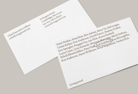
Business card name concept is fresh…
On Feb.25.2009 at 04:32 PM
Camryn’s comment is:
The business card is awesome but (by including the whole staff roster) all cards will be rendered out-of-date for all staff whenever anyone joins or leaves.
On Feb.25.2009 at 09:38 PM
Durkastahn’s comment is:
Pffft. What a massive load of wank. Bill Cahan's site is pure wankery. This logo is pure wankery. There is nothing retail about this brand, nor its application. The reason all the designers here love it is because it's nice design work, but let's be honest - it doesn't look much different than much of the other design work that is out there at present. This could have come from a thousand different design houses around the world, and is pretty much the standard stuff that comes out of boutique agencies at the moment.
Nothing here that does anything for me - nothing different, nothing that jumps out. Just looks like more design-wankery in my opinion.
On Feb.25.2009 at 10:28 PM
Matheus’s comment is:
text? That's the new logo? die.
On Feb.26.2009 at 02:01 AM
t-bone’s comment is:
this is pretty cool. great colours and type.
i like the circling of the name on the business card, but to have a name on one side and contact details on the other is sooooo stupid.
On Feb.26.2009 at 08:07 PM
Brandy’s comment is:
Forget the"logo"…the packaging is gorgeous…
On Feb.26.2009 at 09:00 PM
Jo Chua’s comment is:
@ Brandy
You said it. "Forget the Logo".
On Feb.27.2009 at 12:49 AM
dMullins’s comment is:
Love it.
On Mar.03.2009 at 09:03 AM
Brian Douglas Hayes’s comment is:
Very nice. Aveda did this product concept first, but this identity looks far more consistent and focused.
On Mar.04.2009 at 04:06 PM
film seyret’s comment is:
thanks man
On Apr.14.2009 at 06:01 PM
CKohmescher’s comment is:
I have to admit, the packaging/brand definitely has a "cool" factor to it but in the end, it really doesn't appeal to me for the product that it is. Don't get me wrong, I love the color combinations and clean look but for what it is, it just feels wrong.
At first glance the packaging looked like a huge medicinal pill ... who wants to think about medicine/hospitals while relaxing in the shower. Secondly, I wonder how the product smells. The color combination (as cool as it may be) reminds me more of a clay/mud mask than something I want my hair to smell like.
On Apr.27.2009 at 05:28 PM
Comments in Brand New, V1.0 have been closed.


