

NOTE: This is an archived version of the first incarnation of Brand New. All posts have been closed to comments. Please visit underconsideration.com/brandnew for the latest version. If you would like to see this specific post, simply delete _v1 from the URL.
![]()
In February of 2008, the Major League Soccer awarded the city of Philadelphia an expansion slot to become its 16th team and start play in the 2010 season. Operating since then under the snoozy name of MLS Philadelphia 2010, the team finally unveiled its new name and identity yesterday in front of Philadelphia’s historic City Hall: Philadelphia Union.
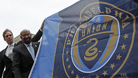
Team owner Jay Sugarman, left, and mayor of Philadelphia, Michael Nutter unveil the new logo at City Hall.
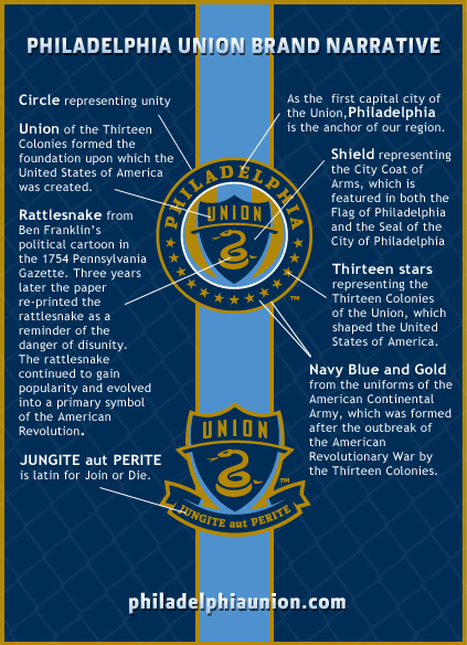
The new logo, designed by New Haven, Connecticut based Silverman Group, is soaked in American history:
Union references the original Thirteen Colonies, which established the foundation of the United States of America. The club’s colors are navy blue and gold, symbolizing the uniforms of the American Continental Army, accented by the lighter shade of blue found in the Philadelphia Flag. The primary symbol of a rattlesnake is derived from Ben Franklin’s political cartoons and was featured in multiple editions of the Pennsylvania Gazette during the 1750s. The rattlesnake was utilized to emphasize the necessity of colonial unity and serve as a reminder of the danger of disunity. Franklin’s rattlesnake gained enormous popularity and evolved into a primary symbol of the American Revolution.
— Press Release (PDF)
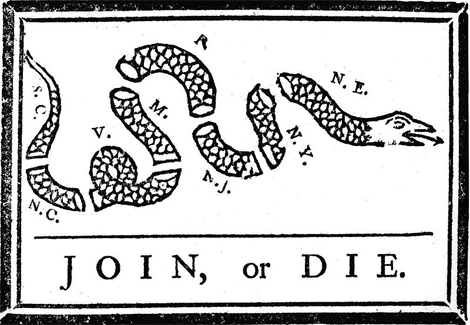
Benjamin Franklin’s Join, or Die political cartoon, published in 1754 in the Pennsylvania Gazette.
It’s almost as if they are daring Americans not to like it and expose how unpatriotic they are. Not really. But I just haven’t seen a logo that goes to the extent of this one to reach into its history. What’s nice is that the logo becomes a symbol of what Philadelphia is known for and avoids using landmarks or other specific cliches. And the execution of the logo is actually quite nice and effective as a soccer crest; the snake might reduce to a worm-like figure on small applications, even on the secondary logo, so maybe we will soon see a snake-focused graphic that helps avoid that. Overall, a nice and strong emblem.
Thanks to River Brandon for first tip.


Jump to Most Recent Comment
Michael’s comment is:
Inspiration?: http://tinyurl.com/q6kv9k
On May.12.2009 at 08:32 AM
Ryan Adair’s comment is:
The reasoning behind all of the individual elements is fantastic, the connection to Phili and therefore to the US. Nothing beats design with a reason behind it. The colors I think are very good.
Also, looks like a more believable Soccer club crest than, oh, the New York Red Bulls. All in all, very nice. Very solid looking sports identity.
I wonder what the uniforms look like?
On May.12.2009 at 08:35 AM
Scott’s comment is:
Overall, a nice crest. Colors = nice.
But here's the rub: the snake looks a little "cheap" to me. It doesn't need to be "Denver Broncos," forward-facing, 90s-style athletic logo looking ... but this iteration is, well, plain. Particularly, when it's small, as Armin mentioned.
Second, what's with the color outlines within the outer circle, and surrounding the shield? That part of the design seems random and too "modern." Perhaps a solid color would've been more appropriate, or perhaps two colors (considering there's a random white outline, as well). Altogether nice, but just a hare unfinished, IMO.
Anonymous’s comment is:
Strong, aggressive, and not laughable in its execution = 3 things I thought I would never say about an MLS identity (with the exception of DC United and Chivas).
Looks believable as an identity of an established club. Cheers.
On May.12.2009 at 09:13 AM
Dennis Moran’s comment is:
Hmm.
All that said, I always a bit suspicious when a new brand identity requires a 7-8 paragraph "brand narrative" as an explanation-with callouts. On top of all that, wouldn't it have helped to simply use English for "Join or Die" rather than "Jungite aut Perite"?
Will all uses come with an explanation? What will the "uninformed" think when they first see the snake? Do the biblical references trump the Revolutionary War references?
Hey, I'm just asking.
On May.12.2009 at 09:42 AM
coda’s comment is:
I don't think there's enough contrast between the colours. I'd rather have the type and snake in white, or something with more punch - the gold is too muted and lacks energy.
On May.12.2009 at 09:45 AM
Rob’s comment is:
I'm a fan, as far as sports branding goes. I would like a little more pop in the colors, the gold seems a bit muted, but could present a waterfall of options printed.
I agree, I think the snakes needs a secondary lock up. Perhaps interlocked reminiscent of the "Join or Die" snake with the latin shield.
Was there any kit design released? I'd be anxious to see how this plays out on uniforms.
On May.12.2009 at 09:46 AM
emily’s comment is:
On top of all that, wouldn't it have helped to simply use English for "Join or Die" rather than "Jungite aut Perite"?
i think its because most people would be very confused if they saw, in english, "join or die" on a soccer club's crest.
i agree though. and the snake cheapens it. variance in line thickness would help as well.
On May.12.2009 at 09:53 AM
Proverbial Thought’s comment is:
As far as sports logos go, I think this one is SPOT ON!!! Not overdone with the hstrokes and bevels. No angry animal threating to mawl me, and no unnecessary dashes of black and/or white! The historical relevance and symbolism all work soooo well... Congrats to the Sliverman Gropu.
Also, because it is asports franchise, and there will inevitably be a need for more ferocious imagery at some point and in some applications. The inclusion of the snake leaves romm for more venemous applications of vipers and pythons around the stadium and on posters.
Most imprtantly, I am glad they didn't envision "UNION" to be two hands holding or something wimpy like that. You know, how the Columbus Crew did there logo. GREAT JOB all around!!!
On May.12.2009 at 09:57 AM
Bart O'Dell’s comment is:
I love the inclusion of so many events and symbols of early American history! This by far is one of the best MLS if not all sports brands out there. Nice work!
On May.12.2009 at 10:03 AM
Philip’s comment is:
I'm with coda and rob on the colors. So muddy...yuck. Sharp design and the brand narrative is intriguing.
On May.12.2009 at 10:24 AM
Impossibly Stupid’s comment is:
Playing devil's advocate, I'm also going to say the gold looks more brown, and the snake thus looks like a big dump. That does seem to better reflect the American attitude towards soccer/futball. And if any part of their branding involves using "Union of the Snake" by Duran Duran, their failure is complete.
On May.12.2009 at 10:43 AM
Josh’s comment is:
Maybe it's the Euro connection with soccer but the MLS has to have the best logos of any professional league in the US.
This is another example.
On May.12.2009 at 10:45 AM
Marcos Kirsch’s comment is:
Bad choice to use stars (13 of them!) as part of the logo. In soccer, it is customary to add starts for each championship the team has.
On May.12.2009 at 10:50 AM
jRod’s comment is:
this is a really well put together logo with great use of Philly's history. even the circle and type remind me a lot of a city or state seal. the color selections were good and had definite meaning.
really the only thing that i would change would be the contrast between the gold and the blue. its true that they become muddled and problematic at a distance. I'd say lighten that up a bit and it will look a lot better. I would also like to see what it looks like on paper with gold metallic ink...
On May.12.2009 at 11:07 AM
Stereo Radiation’s comment is:
Dennis Moran: I think putting "die" on the logo is a little off-putting. I am not aware however of the expression being uttered by Americans in any language other than English. A google search for "Jungite aut perite" reveals exactly zero articles unrelated to the Philadelphia Union. (Same with "iungite" since the letter j is medieval.)
I appreciate that they didn't go straight for the red, white and blue, which would have been cheap. Also, that they steered away from the liberty bell. I am surprised they have not mentioned the snake on Gadsden's "Don't Tread on Me" flag, which is almost certainly related to the Franklin cartoon - although it doesn't line up with the idea of "unity"
On May.12.2009 at 11:12 AM
Proverbial Thought’s comment is:
By the way. THe snake does look like the snake from Q-bert on the Atari 2600. Nonetheless, still love the logl.
On May.12.2009 at 11:18 AM
Carlo’s comment is:
For goodness sake Mayor Nutter, someone couldn't steam out the wrinkles in the flag for the unveiling?
Other than the fact it reminds me a little too much of the Philly police badge (but I guess police badges are also rooted in historic emblems) every other aspect of it is perfectly suited for Philadelphia - history, unity, serious, educational.
The team name "UNION" could be a little larger though.
I love the touch of the arch slicing through the shield under "Union". It almost seems to represent "strength" as in bending a steal beam.
Drew’s comment is:
"Bad choice to use stars (13 of them!) as part of the logo. In soccer, it is customary to add starts for each championship the team has."
------------------------------------------------
Said stars (for championships) are found above the team's crest, not included as part of the crest. Big difference.
Overall, I like this crest, outside of the snake figure.
On May.12.2009 at 11:31 AM
M.’s comment is:
Big MLS/soccer fan here. First of all, there is no "The" in the name, a la "The Philadelpia Eagles". It's "Philadelphia Union", like "Manchester United" (or DC, for that matter). Small change but a big difference; it moves the phrase from a low-rent American "xtreme"-style franchise name to a snobbier, more Euro-y legacy-style name. Neither is perfect but the latter is far preferable (to my palate).
The snake references Franklin, Gadsen, etc., but it's really there because of Nike's much-loved Don't Tread On Me campaign that the first commenter linked to. US Soccer fans have been dying to see that logo used more prominently, MLS knows this, and pushed for something like it when it came time to design Philly's crest, I'm sure. The only surprise is that Adidas (who controls the uniform contract for the league) wants to play with a mark that is so similar to an iconic Nike creation (who uniforms the US national team). But it's good for MLS that the snake is there as it shows a connection between the league and its longtime fans.
Finally, on the design itself, this is nearly perfect; the only cheesiness is the swooping horizontal divider line on the shield that seems to exist for no reason, and carries a futuristic shadow/strike. Remove that (or just tone it down a bit), maybe traditionalize the snake caricature a bit, and it's hard to imagine getting the mark better.
The colors are from the Philly flag, subbing out yellow for muted gold, and are the ones chosen by the Philly soccer supporters group that predates the team itself - another sign that MLS is really trying to align itself with passionate domestic fans.
On May.12.2009 at 11:45 AM
Armin’s comment is:
Thanks for noting the "The" appendage big MLS fan. Does make a big difference. Corrected.
On May.12.2009 at 11:53 AM
Maz2781’s comment is:
I love all the history around this mark, a true reflection of the city.
But as a logo, I feel it is extremely clunky, I think it could have been alot simpler. There is no hierarchy of elements, I feel the snake or the union Type or something should be bigger. As has already been stated, the gold is muddy. The colors in the logo should have more contrast to give it more pop.
I think the simpler mark with the latin phrase is more successful as it isn't a logo within a logo.
As far as the latin phrase goes, how does that have any relation to todays soccer fan?! what exactly are they saying to there fans and rivals?
Joel’s comment is:
I agree with M. I love that the name itself does not include the word "The." It breaks the standard American sports franchise naming model: The [name of city or metropolitan area] + [geographically associated animal or industrial occupation]. However, I would prefer a team name that has no official nickname a la Toronto's MLS franchise or most European clubs. It's not that I'm a purist - I just don't want any team to focus more effort on marketing their team than they do on creating a great product. I also hate the singular nickname trend that has been around for more than a decade: Avalanche, Heat, Storm, Crew, Revolution. Too comic booky. Bleh.
Other than that - it's a good-looking identity. I like the historical references and I like that they are not too obvious. I also don't mind the muddier gold - it tones down the identity, which is something that needs doing in American sports logos.
On May.12.2009 at 12:57 PM
Proverbial Thought’s comment is:
Joel... How's this for a singular name:
ataylor’s comment is:
i also really hate singular sports team names -- this one pushes it a bit, but it could have been much worse (oklahoma city thunder???). but i think they could have named the team philadelphia union fc and used "union fc" in the logo, which would give a little more soccer street cred.
i think the dark blue could be a little more saturated, while i'd like to see both the gold and the light blue a little lighter. i also think white needs to be used a little bit more.
hopefully the crest design with the banner will go on the uniforms, it looks much stronger than the circle. although probably the biggest factor in how good the uniforms look will sadly be determined by the sponsor's logo (since most mls teams have gone the european route with kit sponsors)
On May.12.2009 at 01:24 PM
nathan’s comment is:
I guess my only question is, if they are referencing the revolutionary snake and want it to read that way, why make the snake tamed and coiled? Either it should have been arranged like the original snake drawing so that the visual gestault was more obvious, or at least made to look more menacing. For a sports team, I wouldn't want the "tame" version of my icon to be predominant one. That's like changing the Chicago Bears icon to a hibernating teddy bear.
Give me vicious or give me death!
http://www.sibanate.blogspot.com
Valentino’s comment is:
Nothing wrong with a bit of a tame looking snake. Internazionale (Italy) had a snake that looked like a sock puppet and they've always been one of the strongest clubs in the world.

I do very much like this logo, unlike most other MLS logos, which I'd prefer to follow a European style rather than other US sports.
I'd prefer it without the gold behind the shield. I don't have a problem with the stars like someone mentions. Other teams have stars in and outside of their crest for various reasons - Boca Juniors (Argentina) have stars inside the crest representing championships, Atletico Madrid (Spain) have stars (inside) for historical purposes like Philadelphia, Man City (England) have stars above their crest purely for decorative reasons, so there's no hard and fast rules there. Personally I prefer them for domestic championships but each team that feature them have their own reasons. (Inter/Juventus/Milan - 1 star per 10 domestic championships, Liverpool - 1 star per European cup victory)
On May.12.2009 at 02:47 PM
drewdraws2’s comment is:
I think the reason there is so much justification for this logo (on the website) has to do with the elephant in the room, Philadelphia is notoriously a "Union town", for better or (often) worse. There is a long history of blue-collar fanaticism for Philly sports, and this is a clever nod to that tradition, while clearly justifying the name in other ways for the rest of the world. Philadelphia locals get it, and there's more than a little tongue-in-cheek. I love that about it.
This name and logo has been a long time in the making and took into account a TON of public opinion (there were entire websites dedicated to the name and logo designs). In my mind, they've done a great job with it considering that poll-centric decisions very rarely end well.
On May.12.2009 at 03:01 PM
Michael’s comment is:
I think you can pick just about every logo and identity apart if you really wanted to. They all have negative and positive attributes that you could spend all day wondering why something was done or what it might be lacking.
Overall, it's a pretty good mark. Maybe the gold is too dingy if it's non-metallic, and maybe there are a lot of stars but it does a lot more than most sports identities do and it seems someone actually put some thought into it. It tells a story and puts some real brand equity into the team and area.
The "join or die" part is pretty smooth too considering Franklin used that in the cartoon with the disjoined snake. The logo is actually fascinating as a history lesson for people who have no clue about Philadelphia and the role it played post-revolution.
We could always revisit the Detroit Lions rehash and be thankful for work that actually has a rationale to it.
On May.12.2009 at 03:04 PM
drewdraws2’s comment is:
@nathan: The Gadsden flag uses a coiled rattlesnake in very much this position, so I don't think it looks "tame". A coiled rattlesnake is ready to strike, not getting ready to get in a basket.

Cary’s comment is:
I absolutely love the logo - one of the best recent sports marks in memory.
Lots of good design thought in there.
On May.12.2009 at 04:06 PM
Sam’s comment is:
Seems to be more of a whats-what of American history symbolism rather than representative of Philadelphia itself, only the word 'Philadelphia' and the shield seem to directly relate to the city itself...
Having said that I think the colours, shape and secondary logo work very nicely and, depending on the uniform colours, could work very nicely on and around the soccer pitch.
On May.12.2009 at 04:36 PM
Stuart’s comment is:
I like the explanation for the logo and appreciate the effort that went into making it. The colors, however, don't resonate as well with me. I understand their historical significance but I think they could have strayed a little here and still held the concept of navy blue and gold. I think it's just that the low contrast makes everything a little flat looking. Perhaps the lighter blue could have come to the forefront a little more. Overall, I really like it.
On May.12.2009 at 05:39 PM
Michael’s comment is:
@sam
The country started in Philadelphia, so if you are saying it's about the country them I would say they hit the mark.
Oh, and the Philadelphia flag colors are sky blue and yellow, which they didn't explain. The Swedish were the first to settle in Philly... which also were the first place in the US to get Ikea incidentally. I am actually glad they went with gold instead of yellow, hopefully they use gold in the uniform, which I think would go over better than plain yellow.
On May.12.2009 at 08:35 PM
Sam’s comment is:
@Michael
Ah, thanks, obviously need to brush up on my American history, not something we're that big on down under. Makes more sense now you explain that background.
On May.12.2009 at 10:00 PM
Xav’s comment is:
I like it.
I like what Australian and American new football franchises have been doing with their identity in the last couples of years, they stick to the spirit of the sport and still manage to add a dash of modernism. This is another great example, fair play to them.
I'm not sure about the stars though. First, they might give the impression that all 13 colonies are behind the club (unlikely). Second, stars have a very important signification in football, you got to earn those babies! Can't have stars on your crest if you haven't won them. Should have come up with something else there.
As for the singular team name, I like it too. Again, they stuck with the spirit of the game, where singular names are very common and traditional (Inter, Albion, Athletic, United, Olympique, Bayern, Ajax etc...), nice touch.
Concerning the colour scheme, it means something so it's cool. Also, it's very Oxbridge, very football, all good.
As a football fan, I approve!
On May.12.2009 at 10:35 PM
Tim’s comment is:
I think the reasoning behind the logo (especially the stars and the reference to the 13 colonies) is odd: Sports teams are usually connected to a specific city (except the national selection) - in this case it seems (at least to me) as if Philadelphia Union is to represent all of the former 13 colonies, I wonder what other soccer teams and their fans on the eastern seaboard think about that. It would have been more fitting for a regional soccer league (or am I just being overthinking it? Otherwise it's a nice logo.)
On May.13.2009 at 04:02 AM
Valentino’s comment is:
@ Xav
I'm not sure about the stars though. First, they might give the impression that all 13 colonies are behind the club (unlikely). Second, stars have a very important signification in football, you got to earn those babies! Can't have stars on your crest if you haven't won them. Should have come up with something else there
Yes you can, see Manchester City and Atletico Madrid. It'd be good if there were rules on it though.
On May.13.2009 at 05:16 AM
M.’s comment is:
For all that wonder about the stars not being representative of championships won; might I suggest that Philly should change them (say, to silver or sky blue or something), one at a time, as they win each future championship? That would be cool and a clever design solution. You'd think 13 championships might take, what, 40-50 years for even a great team... certainly until the next rebrand!
On May.13.2009 at 11:28 AM
Eli’s comment is:
Philadelphia is once again home of the Union. How does the new name stack up?
MLS names it's Philly Expansion team
The Zed Word’s comment is:
The Latin on the crest is also a nod to traditional crest designs - see Tottenham's "audere est facere", Blackburn's "arte et labore and City's "superbia en praelia" to name a few.
On May.13.2009 at 02:21 PM
Joel’s comment is:
Proverbial Thought -
Battery is a little better since it at least implies multiple parts (unless you're talking about a D-cell). It's certainly a lot better than this lameness:

This one sounds stupid even in French.
On May.13.2009 at 05:16 PM
Proverbial Thought’s comment is:
Hey Joel!!! Why does that soccer ball have ice cycles hanging from it? Funny, that logo reads Impact Montreal... How so, by displaying that over the top high school soccer logo all about town? Sheesh...
On May.13.2009 at 05:36 PM
Xav’s comment is:
@ Valentino’s
The Germans, Dutch and Swedes have guidelines concerning stars and crest. The other countries don't, although in Italy and France's case there are conventions (one star for 10 titles) but nothing is written on paper, it's just tradition.
So, in essence, yes you can add stars to your crest even if you haven't won anything (except in Germany, Holland and Sweden) but it's not fooling anybody and just makes you look a bit silly.
As I said, you gotta earn those babies!
On May.13.2009 at 07:24 PM
PALE FACE’s comment is:
A solid logo with well thought out meaning to all aspects (which helps stamp out client objections).
Well done!
On May.13.2009 at 10:44 PM
Gooie’s comment is:
Overall it's a great logo. IF I had the logo detail card. Give credit to the creatives behind this design. I hate all Philly teams but I would rock this jersey. Let's go Mets!
On May.14.2009 at 02:33 AM
PALE FACE’s comment is:
I still love this logo, but is anyone just a little bothered that with all this Rattlesnake talk on the brand narrative, this snake does not appear to have a rattle, but just a regular tail.
Call me out if this seems like I am nitpicking.
On May.14.2009 at 11:34 AM
milkrow’s comment is:
I too agree with the logo color comments about low contrast. It seems ALL the elements in the logo are handled with the same degree of importance and it would have been nice for one element to stand out more...which is currently the white circular rule...not the emphasis I think they were going for. I think this logo will see a revision soon for merchandising purposes.
On May.14.2009 at 03:32 PM
Bruce’s comment is:
Is the team made up of cops? The mark sure looks like a police shoulder patch. Yaaawwwnn.
On May.14.2009 at 06:16 PM
dMullins’s comment is:
Personally, I find the color to be a hindrance to the overall screen-readability of the logo. Especially in this version:
![]()
espihir’s comment is:
"Marcos Kirsch’s comment is:
Bad choice to use stars (13 of them!) as part of the logo. In soccer, it is customary to add starts for each championship the team has."
Yes, it is customary to put stars for every championship ABOVE the team's crest/logo. When the stars are incorporated into the logo, it is part of the logo and usually symbolizes something else (Chicago Red Stars for example) Philla Union's stars represent the 13 colonies, which, if you don't know that immediately, I think you might need to go back to school.
I wouldn't change a thing, I think it represents the City and State very well as well as football in the united states. This is definitely one of the better sports logo's I've seen in a while.
On May.19.2009 at 11:33 AM
Scott’s comment is:
Name: good.
Design: Not too bad.
Colors: Dreadful. For a soccer (er, football) sports team? Yuck.
Chris’s comment is:
Don't know if this was mentioned, but blue and yellow are the colors of Philadelphia's flag and were the original colors of the NFL Eagles. The Phillies also had blue and yellow uniforms for a time.
On May.24.2009 at 12:28 AM
Char’s comment is:
I've scratched my eyes several times trying to look for the bevels and all the flashy photoshop filters!
I'm very happy that this is a MLS logo and it's clean and simple as it should be.
rooney’s comment is:
i've heard good design work is stealing without getting caught. well they got caught. the name is great and befitting considering the history. a good write-up about the name can be found here: http://onthebutton.wordpress.com/2009/05/12/philadelphia_union/
On Jun.08.2009 at 08:41 PM
JR Salazar’s comment is:
There are some teams that put stars for their titles on their shield (Boca Juniors) and some who use it above for decoration (Manchester City).
If the Union wins an MLS Cup, I reckon they would use a special type of star above the shield (maybe silver-colored) for their logo. I put it this way regaarding the 13 on the shield-it's better than having 13 dots on them.
On Jun.15.2009 at 07:42 AM
Nate’s comment is:
If they wanted the logo to represent Philly, they should have some angry, drunk fans with cheese steaks in one hand, and throwing snowballs at Santa Claus with the other.
On Jun.26.2009 at 12:03 PM
Comments in Brand New, V1.0 have been closed.


