

NOTE: This is an archived version of the first incarnation of Brand New. All posts have been closed to comments. Please visit underconsideration.com/brandnew for the latest version. If you would like to see this specific post, simply delete _v1 from the URL.
![]()
After a little break from soda discussion — although the eternally climbing comment count here suggests otherwise — here is a fresh one, Sprite. Just in time for the NBA All-Star’s Slam Dunk contest which Sprite sponsors they are putting into use a new, dynamic and active logo that, in context, is actually quite decent. I’m not sure I fall for the “explosive” starburst but there is something interesting about the way the lettering and the lemon/lime interact with it. Also, I realize there is this other Sprite logo, but I can’t figure out or don’t remember if it was just temporary, but the new logo certainly seems like an evolution of that. And reader Jared Ramey pointed out that the logo might be based on this. So for a mass consumer brand trying to appear cutting edge and “with it” this is not bad. Not my style or my thing, but not bad.
Thanks to Christopher Martin and Jared Ramey for the tip.


Jump to Most Recent Comment
Gavan M.’s comment is:
Reader Jared Ramey pointed out that the logo might be based on 'this'? I'd say there is not a shadow of a doubt that it IS based on 'this', but what IS 'this'? A sprite logo from Japan from many moons ago, or…?
On Jan.30.2009 at 06:49 AM
Harry’s comment is:
Hmmm... I thought that the picture of the sprite can that you mentioned was here to stay for a while. Could this be just a promotional logo for their NBA deal? I like how it's a little retro though.
On Jan.30.2009 at 07:07 AM
Jedd’s comment is:
I don't like it. Ugly gradients and the type looks squished. Looks unfinished
On Jan.30.2009 at 07:08 AM
Brandon Cox’s comment is:
I think it looks appropriate for soda, but I also think it's okay to break with the soda tradition. I give it 3 years.
On Jan.30.2009 at 07:12 AM
Flipyap’s comment is:
When I saw this pop up in my RSS reader, my first thought was: "That's disgusting."
Not a great first impression.
Now that I had a chance to take a closer look at it (and ignore the terrible, awful "explosion"), I quite like the lettering and the way it cradles the lemon, though I think it looks more like a sports team logo, than of a soda.
On Jan.30.2009 at 07:22 AM
ArleyM’s comment is:
Looks stretched. The original is preferable.
On Jan.30.2009 at 07:31 AM
Barclay D.’s comment is:
eh. i would totally be fine with the 'starburst' out of the picture. i guess they are trying to keep to their... i guess tradmark you could all it with the gradient of blue to green. sure beats Pepsi's Sierra Mist newest.
On Jan.30.2009 at 07:43 AM
Taimar’s comment is:
Don't like it, too busy and squeezed. Explosion is the new swoosh?
On Jan.30.2009 at 07:50 AM
Michael [linefeed]’s comment is:
Over designed.
On Jan.30.2009 at 08:02 AM
Philip’s comment is:
Three things I feel (IMHO) might help:
Take away the weird explosion.
Take away the awkward angle.
Fix that effed up "r".
On Jan.30.2009 at 08:28 AM
Michael’s comment is:
wow that's horrible
On Jan.30.2009 at 08:32 AM
Josh’s comment is:
I thought they'd go more toward the urban/tech area with all of their sub"lime"inal ads. This is disappointing, but maybe they'll pull a Pepsi and make the application overshadow the logo.
On Jan.30.2009 at 08:34 AM
Anonymous’s comment is:
You're right when you said it's not bad - because it's awful. That "starburst" (if you can call it that) is just flat out ugly.
If they did try to go a bit retro with it they didn't take it retro enough.
On Jan.30.2009 at 08:46 AM
Tom Hackett’s comment is:
It suggests to me that the lemon is "splashing" into the lime...it's kinda playful. At least it doesn't look like it wants to hurt me, like the logo on the soda can.
On Jan.30.2009 at 08:55 AM
Dale Campbell’s comment is:
freakin' hideous.
What the hell is going on with corporate (soda companies) branding as of late.
gaaaaawwwwwd.
On Jan.30.2009 at 08:57 AM
orangetiki’s comment is:
I can do without the Batman sound-word shape, but I think the wording and shape can work if you just spend a half hour longer on it.
On Jan.30.2009 at 09:05 AM
impiri’s comment is:
Ehhh. The current "Lemon/Lime S" logo is simple and clever, and the current application has a cool factor that the new logo can't match. The starburst on this new one kinda looks like my first attempt at using the Pen tool. The intersection of the starburst and the lemon/lime is nice.
On Jan.30.2009 at 09:19 AM
D’s comment is:
Jared's right. This is an update of the logo from the 60's/70's. Look for Sprite packaging on Flickr and you can find more images. And the link you supplied with the interlocking S forms is "current", the big angled logotype with the little "limon"
This is a very interesting time for beverage brand design. Nearly all the major brands are going through a refresh. It's interesting in this specific category (Lemon Lime) where Sierra Mist was just redesigned and now Sprite to see what 7Up will do. I'd bet it's in the works.
Is "retro" right for Sprite? Don't know - but it's at least a competitive zag away from what Sierra Mist has done. Seems like all the new Pepsi designs (Sierra Mist is PepsiCo) are all about hip, new fresh. And all the Coke designs (you got it, Sprite is Coca-Cola Co.) are embracing their past.
Why? Maybe the national mood? Should we settle in with the comfortable/nostalgic or embrace hope/future?
On Jan.30.2009 at 09:36 AM
Jonathan’s comment is:
AHH! Why is the lemon/lime crushing the type!?!
The current lemon/lime clashing "S" thing was actually starting to grow on me... and then you go and change it again! Its only been like a year!
Good call on the reference by Jared, but the explosion thing kills anything positive about this "new" logo.
On Jan.30.2009 at 09:39 AM
Able’s comment is:
I think they forgot to "scale proportions" when making this. It's terrible, and the starburst thing is becoming a joke.
On Jan.30.2009 at 09:41 AM
Nathan McKinney’s comment is:
This seems to be a case of that classic Graphic Design college assignment completely forgotten. Take a word and make it look like what it says. The word itself, "SPRITE" implies something that literally dances or pops off the page. I truely think that's what the designer here was attempting, but they missed the mark. There is an attempt to logo "pop" off the page with the starburst shape.
The effect instead is the word mark being pushed in on by the burst. This isn't helped by the lemon. It's actually reading as an "unburst". The points at the end seem like they are trying to escape a graphic/traffic jam.
I can appreciate the subtleties here: the lemon lime created by breaking the line of the burst, the bottom arc of the burst forming a smooth baseline for the word mark.
In the end, this just misses the mark, but only by a bit. A simple Warp Filter in Illustrator might have saved the day.
Then again, maybe the can itself will reveal some of the thought process.
In the mean time, I like this rehash better:
![]()
jRod’s comment is:
hey, i never said that i liked the logo... truth is, it bugs the heck out me too. but my real problem lies in the combination of the "limon" and the explosion. the original never had the limon in it and looked better because of that.
I agree with Jon... the type would be better if it weren't being crushed.
side note: i first saw this on my Xbox 360 as advertisement on Live. funny where you find things...
On Jan.30.2009 at 10:04 AM
Jacob’s comment is:
It would look fine without that pointy "wrapper" around it. It makes it look like someone cut it out with scissors.
On Jan.30.2009 at 10:10 AM
Serviceburo’s comment is:
The logo is kinda meh for me. It's structurally alright, but I'm a notorious minimalist and zazzy designs aren't really my thing.
On an interesting branding note, Sprite as a brand was one of the first successful forays into branding in a street level "urban" context. It was a marginal brand for Coke when they sold it against 7Up, but when they switched focus to making it a "hip-hop" trend, sales exploded. Gotta love the cynicism of marketing execs.
On Jan.30.2009 at 10:21 AM
Don’s comment is:
I like it other than the lemon/lime being cut in half by the border. That looks really awkward and unnatural. Over-designed.
On Jan.30.2009 at 10:22 AM
Bruce’s comment is:
I think Jared's right about the new mark alluding to that really old one. There are things I like and don't like about this new mark. As others have pointed out, the type looks squished, but I wonder if it is supposed to appear that the "limon" is dropping down on top of the word, thereby squishing it. Anyway, I think the limon is too close to the word. I also am not too big on the way the burst lines dramatically go from a point to pretty thick--it's too dramatic a change in the thickness. Overall, not bad, but I don't see it lasting. I prefer the mark Armin shows in the pop-up window.
On Jan.30.2009 at 10:57 AM
Noah’s comment is:
The only positive I can see here is that maybe the bright green background will be the color of the new cans.
On Jan.30.2009 at 11:00 AM
Camryn’s comment is:
orangetiki - I also went straight to "Batman".
On Jan.30.2009 at 11:01 AM
Ryan’s comment is:
I really dislike the after. I feel like these carbonated beverage logos degress everytime they try to round up a younger crowd. It's making the 'old school' regulars (who care) move on to better... well, beer I guess.
Bring on the beer logos!!
On Jan.30.2009 at 11:19 AM
Dan’s comment is:
It's funny that a few folks are mentioning batman referring to the explosion. I immediately thought of a retro web shape a la spiderman.
I do like the lemon/lime treatment though.
On Jan.30.2009 at 11:42 AM
damon’s comment is:
hate the carrier explosion thing.
that REALLY makes it impossible to focus on the letter forms themselves....not that they're amazing by any stretch, but that carrier is doing nothing to help either.
On Jan.30.2009 at 11:50 AM
damon’s comment is:
and the 3d/drop shadow is maaaaaangled.
On Jan.30.2009 at 11:51 AM
Mark’s comment is:
Wow, ALREADY!
BTW the previous logo is wrong IT WAS that sharp edeged symbol with the wordmark underneith.
I had a sneaking suspicion it was based on the old old packaging.
All around not bad, more tolerable than the previous one. This change WAS NEEDED!
On Jan.30.2009 at 12:02 PM
Glenn Sakamoto’s comment is:
Can this logo get any worse?
On Jan.30.2009 at 12:03 PM
Rob M’s comment is:
Alright, I'll say it: I dig it.
On Jan.30.2009 at 12:20 PM
Frank’s comment is:
Is throwing your brand recognition over board the new trend amongst the big soda brands lately ?!
I don't get it.I don't get it at all with Pepsi and i don't get it with Sprite.Both the pepsi globe and the Sprite wordmark are comparable to the Nike Swoosh and the Coke wordmark in brand recognition so please someone tell me why a company is willing to give up such assets for just the sake of "new" ?!
It's not even a question of execution (though both the Pepsi globe and the Sprite logo are horrible in that regard i think) but rather of why changing it *at all*.If it ain't broken, don't fix it.
It's really like Coke decided to exchange their world famous wordmark for Comic Sans.
On Jan.30.2009 at 12:59 PM
Faye ’s comment is:
I thought they were confining these horrible logo revamps to Pepsi products. I love Sprite! If they touch the Coca Cola logo I'm going to blow my stack.
On Jan.30.2009 at 01:52 PM
Jon’s comment is:
Simply horrible.
On Jan.30.2009 at 02:17 PM
Jonathan’s comment is:
Frank, to compare the Sprite wordmark with the iconography of the Nike swoosh is pretty ridiculous. The pepsi globe WAS close to iconography, but as we all know, no one at pepsi knew that.
On Jan.30.2009 at 02:31 PM
Mark’s comment is:
Did any body else notice that the wordmark is virtually identical to the previous one except for a few tweaks? Go ahead take a look between the new one and the link to the other previous Sprite logo. They're virtually identical except for the Lymon and the starburst!
On Jan.30.2009 at 02:48 PM
Pookie’s comment is:
My first reaction was "meh," but I like the nod to the past. As others have said, it's all in the execution. Diet Rite and Fresca have disappointed in recent years (although the current Fresca logo is better than its predecessor.)
On Jan.30.2009 at 02:49 PM
Wünderwoman’s comment is:
No....freaking way? What has happened? Did Sprite fire all of it's designer's and have a student design competition? Winner gets $50 bucks?
This is a sad, sad day for Sprite...and design.
On Jan.30.2009 at 02:55 PM
Jessi Long’s comment is:
Harry, looks like they may be moving past their NBA deal.
Wieden, Bartle Bogle Battle It Out for Sprite Account via Advertising Age
http://adage.com/agencynews/article?article_id=134206
On Jan.30.2009 at 03:46 PM
Scott’s comment is:
Oh, my goodness!
It looks bush league compared to the original Sprite logo provided by Jared.
From the suspect outlining ... to the bizarre spacing and curvature ... to the unusual plane that it (apparently) does not sit on.
Oh, my. It looks "pleasant" from afar. But it also looks bush-league when analyzed closely. I like the nod to the past ... but they should've just RETURNED to the past. It's far superior work.
On Jan.30.2009 at 04:37 PM
Sean’s comment is:
THUNK!
Gradients, strokes, warps, all working against eachother. This is madness. The end result appears to be some awkward barbed shape, or some sharp webbing? There's definitely no 'blast' or 'ray' effect if that's what they were going for.
"So for a mass consumer brand trying to appear cutting edge and "with it" this is not bad. Not my style or my thing, but not bad"
WHAT?! In the world of Apple, Facebook, and, I dunno, the latest Coke this DOES NOT appear modern. This is very bad.
On Jan.30.2009 at 05:10 PM
Sal’s comment is:
Looks like a case of design by filter.
On Jan.30.2009 at 05:19 PM
Joseph Maguire’s comment is:
out of all of the soda rebrands this one is the least changed. I don't mind it. I still prefer coke :) especially with that latest pysop ad.
On Jan.30.2009 at 05:26 PM
BJN’s comment is:
That poor little Sprite logo is being squeesed to death by a green sphincter! Either that or someone's crapping a lymon.
On Jan.30.2009 at 05:42 PM
the macho man’s comment is:
the sprite logo is better than the sierra mist logo, the folks at coke does a good job at their logos. look at the classy coke logo. pepsi couldn't design a logo like that
On Jan.30.2009 at 05:54 PM
decksnap’s comment is:
This looks like the designers reached the 'souring point' and said 'fuck it. You want stupid Batman Bubble, you got it'.
On Jan.30.2009 at 08:06 PM
Brad McCall’s comment is:
I don't know if my impression would change if I saw the logo wrapped around a can, but as you've posted above, I don't like it. It feels like the lemon/lime shapes are crushing the type, but since the star-burst lowers the contrast area here, you can't really see the lemon-lime quickly and it seems like the type is misshapen.
I prefer the simplicity of the old logo better, if only it had the updated type and the blue bordering of the new one. That'd be my vote.
On Jan.30.2009 at 11:41 PM
Jared’s comment is:
Wow. This is so bad. If anyone from Sprite is reading this, please fire your agency!
On Jan.31.2009 at 12:56 AM
Chris’s comment is:
So Pepsi's new logo (which is in fact quite good) is considered one of the worst of 2008, but this (which is horrific) is "not bad?" Is this a joke?
On Jan.31.2009 at 04:06 AM
Jonathan Carnehl’s comment is:
Good call, Chris.
I do like the new green in the background. Clean and bright.
On Jan.31.2009 at 10:22 AM
Kevin’s comment is:
I don't think this is particularly bad, I guess I've never been that impressed with Sprite's designs. Their "S-Lemon/lime" with the beveling and drop shadows looks atrocious, so ANYTHING would be an improvement. Maybe not this though....
and Chris, the pepsi logo is good?
On Jan.31.2009 at 12:25 PM
JRoby’s comment is:
Not positive, but this new logo may only be for "Sprite Green" which is a new naturally sweetened version of Sprite.
![]()
Chris Dixon’s comment is:
Shite.
On Jan.31.2009 at 09:07 PM
Jason’s comment is:
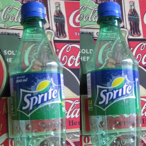
I HATE the new logo design as displayed on the background at the top... However, it actually looks nice on the can and bottle with the green background:
![]()
Myke25’s comment is:
You can see what this logo looks like on a sprite bottle at sprite.com.
Kind of a throwback...don't hate it. Just wish soft drink companies could keep a logo for longer than a year before messing with it.
On Jan.31.2009 at 10:17 PM
Anonymous’s comment is:
WHAT is going on with these awful soda rebrandings?
It's time to start mowing lawns. Graphic design is dying.
On Jan.31.2009 at 10:42 PM
Tyler’s comment is:
God so horrible. I can no longer take this blog seriously at all.
On Feb.01.2009 at 12:49 AM
jrmm’s comment is:
I saw the new Sprite label on www.mycokerewards.com and IMO it looks really awesome... I really hope that logo would be released here in Mexico... The Sprite label hasn't been updated since 2003...
On Feb.01.2009 at 12:50 AM
Manuel’s comment is:
this grey frame is just horrible: there is almost no contrast between the green background and the actual logo.
beside this i think that the blue-tones are way to much and the batman-shape is embarrassing!
> i definitely like the green-white version on the bottle! the green is nice, there is no blue and the contrast is quite well!
On Feb.01.2009 at 05:37 AM
Anthony’s comment is:
I think the new logo just gave me a black eye.
On Feb.01.2009 at 03:23 PM
Matt’s comment is:
Looks too aggressive, I think. The original had a friendlier look to it - this looks like it's going to hurt you. My only guess is that they concluded the product is doing well in tougher urban areas and needs a logo to reflect that toughness.
On Feb.02.2009 at 01:20 AM
Gavan Michael’s comment is:
Perhaps the reason the mark looks significantly better on the Green Sprite bottle is that... it isn't the same mark.
Check out the Lemon -- it's significantly smaller in the Green Sprite version. In the version at the top of the page it extends to the left ever so slightly past the r. On the Green Sprite bottle is doesn't even make it halfway. in the Green Sprite version it isn't distorting the t.
Furhtermore, the letters prit don't hug the bottom of the 'Kapow!!' bubble in the Green Sprite version, and (most importantly for the overall balance of the thing) the S is not floating a few feet above the baseline (all aided greatly by the absence of the blue outline).
I suspect the Green Sprite version was created by a graphic designer. Then perhaps to form the umbrella version it was adapted by… someone less typographically minded.
On Feb.02.2009 at 03:04 AM
dbrenton’s comment is:
I didn't read all the comments so forgive me if this has been said, but...I love how all the softdrinks are going to a more basic simple look. Solid colors are great. We don't need confetti, fake water beads, graffiti and swirls all over our cans and bottles. I love to design down. Simplify. Everything is shouting at you...so why not stand out with just a solid color. I love it. And the new sprite logo is good too.
On Feb.03.2009 at 12:59 PM
Gregory’s comment is:
When did Sprite become a soap/detergent company?
On Feb.03.2009 at 01:31 PM
Brian Who Likes Airplanes’s comment is:
I normally hate when they mess with the big ones, but this keeps the iconic familiarity of the old while still making it new.
Actually, maybe I like when they mess with the big ones, because I like Pepsi's also.
On Feb.03.2009 at 03:09 PM
Matt’s comment is:
Ha @ all the comments, very funny. Batman haha
First impression with logo on top: Not a good redesign at all. Obvious nod to past blah blah blah. Blue is a bit too dominant for me, why not more green and yellow?
On Bottle below: Kinda nice, different logo no blue smaller lime no shadow on type, explosion still sucks, but it sure does look a hell of a lot better than the one up top.
On Feb.03.2009 at 07:49 PM
Matt’s comment is:
oh, and the sprite.com website sucks, I don't see any of these bottles on there...???
On Feb.03.2009 at 07:51 PM
jrmm’s comment is:
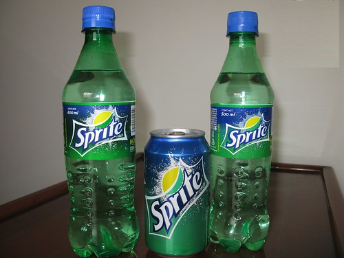
The new Sprite logo is now in Mexico, here's a pic:
Angela’s comment is:
It's not terrible, but the old one was much more recognizable and good.
On Feb.16.2009 at 11:42 AM
ALvo Luksic’s comment is:
![]()
mmm I don´t like the new one either, it looks that it´s been designed by a 15 year old manga fan who likes to draw robots (reminds me my friend´s logos when I was at school). I think Sprite should mantain a fresh and clean look. This is my version of a new Sprite logo. What do you think?
jrmm’s comment is:
Here's another picture I took...
Panasit’s comment is:
I like Fanta redesign. This Sprite redesign, surprisingly enough, is not complicated enough to be interesting.
Not bad though. I never realized how boring the old one was.
On Mar.02.2009 at 11:23 AM
Charlotte’s comment is:
I think it would be much more appealing without the starburst. It makes me think 'refreshing' and 'soda' but it looks too busy-especially on the can.I think it's going in the right direction but is missing some finishing touches.
On Mar.02.2009 at 02:15 PM
Joe’s comment is:
To e completely honest i disagree w/ so many of you, idk y semi retro is bad, thats the only times logos were good. The current logo, not the one thats shown as before in the pic above (that was the original and the best 1), but the shity one thats out now with the huge lemone and lime, in my opinion is terrible and that this future new one looks great. I mean seriously guys u cant be telling me that pepsi's better, b/c theyre the worst soda logos I've ever seen. I do agree tht maybe its missing something, but certainly not too busy. I hope it comes out soon, cant wait.
On Mar.13.2009 at 10:01 PM
Mark’s comment is:
ugh...
saw the new pictures, it would look BETTER without the nonsensical ice freezing design in the back, geez let the thing BREATHE give it some freaking space don't ad some ridiculous graphic effects!!11! to make it look "cool".
THAT DOSN'T WORK!
we KNOW it's cold you don't need to show ice that it's cold geez!
It makes me think that the guys who make the graphic effects!!!11! (NOT the designer of the logo) think we're so stupid that they need to show ice to show that it's cold.
well at least it's an improvement over the old so-sharp-and-pointy--that-touching-will-make-your-fingers-bleed S design.
On Mar.13.2009 at 10:33 PM
Mark’s comment is:
oops forgot a d I fixed it below.
ugh...
saw the new pictures, it would look BETTER without the nonsensical ice freezing design in the back, geez let the thing BREATHE give it some freaking space don't add some ridiculous graphic effects!!11! to make it look "cool".
THAT DOSN'T WORK!
we KNOW it's cold you don't need to show ice that it's cold geez!
It makes me think that the guys who make the graphic effects!!!11! (NOT the designer of the logo) think we're so stupid that they need to show ice to show that it's cold.
well at least it's an improvement over the old so-sharp-and-pointy--that-touching-will-make-your-fingers-bleed S design.
On Mar.13.2009 at 10:37 PM
Mark’s comment is:
oh duh...
silly me that's A SPLASH not ice in the background.
Either way, it's not that distracting, once I've understood it it's actually not that annoying. At least this design says "refreshing drink" and NOT "oh look how cool I am!!!11!".
That's a relief.
On Mar.13.2009 at 10:43 PM
Rafyta’s comment is:
I also thought of Batman LOL
On Mar.17.2009 at 05:48 PM
Adam Haase’s comment is:
Alvo Luksic, ur re-design of the Sprite logo is top shelf.
It just makes the fruit come to life.
My view is that with your re-design of the Sprite logo, the fruits looking more lively, I get the feeling it would want to make people get out more and have the feeling of physical activity.
The bold lettering i reckon shows just how passionate you are with Sprite.
I hope this makes sense.
On Apr.10.2009 at 08:30 PM
Jordan’s comment is:
I still like the one they had before this one (below).
![]()
Robert’s comment is:
^ I liked that one better too. It was simple, but cool. I liked how it's like yin-yang.
On May.14.2009 at 04:02 AM
Mark’s comment is:
I like the new logo.
Have you ever seen the new ads? it features people banging into each other and creating splashes, really unique stuff.
On May.14.2009 at 04:12 PM
brainman214’s comment is:
the new Sprite wordmark DOES look like the one on a 1971 bottle logo i have in my collection of bottles.but I think they overdid it on the exploding star and lymon.I first tasted Sprite in 1961,it's first year in the US.Spite must be fifty years old so they change again.Poor Coke! Can they at least keep the wave on thier Coke Logo?
On Jul.03.2009 at 11:42 AM
Comments in Brand New, V1.0 have been closed.


