

NOTE: This is an archived version of the first incarnation of Brand New. All posts have been closed to comments. Please visit underconsideration.com/brandnew for the latest version. If you would like to see this specific post, simply delete _v1 from the URL.
I had been meaning to write about the packaging and identity that Pentagram partner Paula Scher did recently for the new player in the sweetener category, Truvia. Then, with the swirl of the Holidays and the craziness of trying to finish things before and around them, I just kind of forgot. A couple of days ago, while grocery shopping with my parents and the rest of the Vit clan in a grocery store five or forty-three times bigger than our Brooklyn Key Food, the new Truvia packaging literally stopped me in my tracks as I reached for my own preferred sweetener (Splenda).
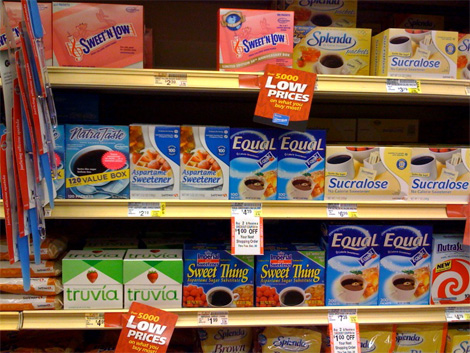
Sweetener aisle in a Houston, TX grocery store.
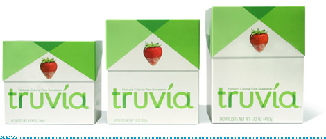
At Pentagram’s New section you can see the full identity, packaging and explanation in handsomely photographed images. “Truvia™ is designed,” reads one of the captions on those images, “to stand out from the competition.” It’s the kind of thing that designers love to write as a selling point in client presentations or as bragging points in press releases. However, in this case, Truvia actually (and literally) stands out from the competition. I’m not sure if the photograph above manages to capture the stark contrast but, in person, Truvia’s presence is remarkable. In a flood of swirls, gradients and glowing typography, the simplicity of Truvia is the sweetest of them all.
My favorite part of the packaging is the typography, it feels very light and fresh, and the overlapping effect is rather nice. I could do without the leafy dot over the “i”. First because it’s just too leafy and second because it makes it look like an accent, and for a Spanish-speaking person like myself I would want to pronounce the name as Tru-veeeee-ah, instead of Tru-vyah. Truth be told, I don’t even know how I’m supposed to pronounce it, but the accent doesn’t help. The choice of the strawberry is visually interesting too, as it creates a great, um, accent in the green and white box. Overall, this is a bold statement on the part of Truvia, to realize that they needed to really stand out within the crowded category in order to be able to make quick impact.
Disclaimer in case anyone needs it: I used to work for Pentagram. The mostly positive review is, in theory, objective and detached from the relationship.


Jump to Most Recent Comment
Aaron Pou’s comment is:
It is a breath of fresh air to see this packaging amongst the crowd. However, the point about the accent leaf over the letter i is a valid one. Hispanic or not, it still reads TRUE-V-UH to me. I like the lowercase typography, it's friendly. Overall, it looks more like packaging I'd come to expect from Europe, maybe Switzerland or Australia, which is a compliment.
Well done overall.
On Dec.29.2008 at 03:29 PM
Paul Riehle’s comment is:
The packaging reminds me too much of a well designed cigarette pack. It does stand out quite well with the competition.
Also I dont exactly understand the strawberry, it does look nice but I for one have never tried or seen anyone dip strawberries into sugar (fake sugar) Why do so many of the packages have strawberries on them?
On Dec.29.2008 at 03:40 PM
the macho man’s comment is:
it stands out in the crowd. the stawberry makes it look BAM!!! I like the design and i give it an A+. it makes splenda and sweet and low look like they were designed by the same graphic designers that the okc thunder and pepsi hired.
On Dec.29.2008 at 03:47 PM
John Mindiola III’s comment is:
Gorgeous. This is what packing graphics are supposed to be. I'm not a fan of every aspect of it, but this is definitely a case where the whole is greater than the sum of its parts.
On Dec.29.2008 at 03:48 PM
Jeff’s comment is:
Disclaim like you mean it! You shouldn't have to say "in theory." Tell us you're objective and we'll take your word!
On Dec.29.2008 at 03:59 PM
Vegas’s comment is:
I like the simplicity of the design, and it does stand out among the crowd. The only negative I could see is, if its not seen in context surrounded by other boxes of sugar substitutes, you may not tell what it is as you are just walking by.
On Dec.29.2008 at 03:59 PM
Jeff’s comment is:
And
Beautiful identity! Looks delicious.
On Dec.29.2008 at 04:00 PM
jinushaun’s comment is:
Truvia really does stand out!
I was shopping yesterday and was actually shopping for sugar to do some baking. I don't believe in artificial sweeteners and never heard of Truvia before, but there it was. My eye immediately caught on to it--the green standing out in a sea of yellows, blues and pinks that splash other sugar packaging.
This is what design is all about: communication.
On Dec.29.2008 at 04:03 PM
Morgan Smail’s comment is:
fantastic. website too
best sweetener design by far... very thoughtful and feels authentic. perfect example of how GOOD design can differentiate a brand from it's competitors
On Dec.29.2008 at 04:05 PM
Jason A. Tselentis’s comment is:
I also saw a cigarette package at first glance; but maybe it's the package itself that looks similar to cigarette boxes. Either way, I wonder why a strawberry was used here? Equal also uses a strawberry, so I group it with that brand. Is this just Equal in disguise? A stevia version of Equal?
On Dec.29.2008 at 04:12 PM
Jw’s comment is:
We've seen the TV commercials and thought the same thing: refreshing packaging. Thanks to Peapod I no longer have to endure the grocery store, so I won't see this in its environment, but it's quite nice.
On Dec.29.2008 at 04:45 PM
Ray’s comment is:
according to this: http://www.youtube.com/watch?v=SiaG72zSHlc
It's pronounced truvía. The accent mark over the 'i' changes the pronunciation to tru-vee-a.
It truly seems like a innovative product and I'm glad that they were brave enough to create an equally as innovative design solution for their packaging. It gives me hope.
On Dec.29.2008 at 05:22 PM
DG3’s comment is:
I'm diggin' it.
Smart move, given that it DOES stand out from look alike competitors.
On Dec.29.2008 at 06:31 PM
DG3’s comment is:
On a related note, Equal is due for a revamped logo.
On Dec.29.2008 at 06:33 PM
John Mark’s comment is:
MMMMMMMmmmmm... Looks like menthol cigarettes!
On Dec.29.2008 at 07:40 PM
Paul Cooley’s comment is:
One of my favorite looking things of the year. Also, this little lad of the caliber of Rembradnt's equally differentiating (A word?) rebranding in the context of toothpaste.
A fine example of a reason i am a design student. Lovely.
(The leaf over the eye reeks of an post-design insistence by somebody on Truvia's side with a "great" idea to push the "organic" idea...we get it!)
On Dec.29.2008 at 08:31 PM
Paul Cooley’s comment is:
Yikes...editing please.
"Also this little lad *is* of the same calibur..."
"The leaf over the "i"..."
Sorry, long day.
On Dec.29.2008 at 08:33 PM
Jef Nickerson’s comment is:
Add me to the seeing a cigarette box group. Strawberry flavored Marlboro menthol lights?
The name hurts too, didn't Philip Morris change their name to something like Truvia.
...I looked it up, Altria. Similar non-sense word.
On Dec.29.2008 at 09:22 PM
Jeff’s comment is:
The name isn't completely without meaning. The sweetener is derived from the "stevia" plant. Add "true" to that to imply the "realness" of the sweetener, and voila. That's also why there's a leaf in the logo.
I'm totally over the use of strawberries on sweetener packaging, though.
On Dec.29.2008 at 10:29 PM
red’s comment is:
It may be that there aren't a great number of fruits out there to represent sweetness. An orange? Cherries? Both can be sour or tart. The strawberry is a sweetener archetype; many people do tend to sprinkle sweetener on the cut berries.
Regarding the leaf: I'm confident that the leaf is intended to function as a diacritical mark. "Tru-veeeee-ah" sounds right to me!
On Dec.29.2008 at 11:06 PM
Ricky Irvine’s comment is:
It's nice and sticks out from the others, but in doing so it looks like a box of science experiments. When it comes to food I eat I don't want to be part of a science experiment. :(
Otherwise, it's a very nice looking box. :)
On Dec.30.2008 at 12:23 AM
Alex C.’s comment is:
There are certain things I forgive for using gradients, bevels, swooshes, textures, and other supposed design faux pas--food packaging being one of them.
Here's a perfect example of something that has obviously gone through several design filters, generating a final result that is refined (don't get me wrong) but completely inappropriate.
Food packaging has its established design lexicon, which is totally fine. I would hate to see everything on the shelves of my super market look like it could have been designed by Josef Müller-Brockmann.
On Dec.30.2008 at 01:50 AM
Kodie’s comment is:
This new packaging is not selling the product to me. Is this really a different product or are they striving to appeal to health-conscious consumers, even socially or environmentally aware consumers (or who like to think they are)? The color green, the simple "de-branded" brand. People who don't want to be assaulted visually by the usual packaging seem to allow for a gentler design and not what's inside.
Since stevia is already available and packaged, and probably located in another aisle, this packaging is trendy. Trendy trendy trendy. Different, cool, healthy - healthy cookies and such come in the green boxes. Yellow is associated with sugar (Domino) which makes sense for Splenda, then you have pink and blue artificial stuff. Green packaging comes "loaded" with healthy stuff, especially if the package is mostly white, come down off that hype and step into something genuine and simple. When you choose this product, it's almost as good as that yoga class you keep meaning to sign up for, and the exotic tea you bought but didn't really like as much as you thought you would.
Maybe I'm not analyzing the effort properly. People who think they're above being pandered to by marketing and packaging can definitely be pandered to, and that's simply the first thing I see on this package.
On Dec.30.2008 at 07:40 AM
Jamie’s comment is:
I like the design but agree with others that my very first thought was CIGARETTES for several reasons:
1) the shape of the box resemebles a cigarette pack
2) the green shapes at the top resemble the red (or gold) shape on the Marlboro boxes
3) I just quit smoking, so maybe cigarettes are just on my mind. =o)

John McCollum’s comment is:
Yeah. I love it.
I also like the leaf. It turns the type into a wordmark. It's beautiful.
On Dec.30.2008 at 09:25 AM
matt klaman’s comment is:
I saw this identity on a commercial a little while back and i stopped dead in my tracks. it is absolutely amazing.
On Dec.30.2008 at 11:53 AM
Glenn Sakamoto’s comment is:
Using green was a good way to differentiate from the competition and connotes freshness. But does anyone read 'minty'?
In the US, we sometimes dip our strawberries into sugar (especially if they are too tart and lack sweetness).
The strawberry is an excellent way to show off the product (which is essentially white) and at the same time it communicates 'natural.'
Brava, Pentagram!
On Dec.30.2008 at 12:45 PM
nate’s comment is:
The strawberry throws me off. At first glance I would guess this to be some European organic dried fruit snack. I'm not a huge fan of the overlapping type elements either. It's not necessarily bad, but it seems to be the trend du joir.
I'll go against the grain here and say this package fails. It doesn't say enough about what's inside, and has little to no relation to sugar substitute. The design is pleasing and stands out in its given environment, but really that's about it.
On Dec.30.2008 at 12:51 PM
Dylan ’s comment is:
I thought cigarettes at first too. There are all those flavored smokes on the market now, it is easy to mistake due to the flip top box design.
After seeing the pic on the shelf, this one really stand out. The other packages all look the same and now wonder if there is a requirement to have a cup of coffee on the packages of artificial sweeteners?
Very well done.
On Dec.30.2008 at 01:51 PM
Dylan ’s comment is:
I forgot to add...
But only if the marketing behind this product is able to establish it to consumers correctly.
On Dec.30.2008 at 01:54 PM
felix sockwell’s comment is:
Looks great.
Well done, P'gramers (Paulagram?).
Just goes to show you: good packaging design doesn;t have to come from Landor or Sterling or the usual suspects. The client took a chance and looks like it paid off. Hats off.
On Dec.30.2008 at 02:12 PM
101101’s comment is:
I love the design, it's simple, friendly and to the point and I totally agree with Aaron Pou -- it looks European. I myself am from Europe and shopping here, in the US, makes me dizzy. All those swirls, flashy bold typographies, gradients and highly saturated screaming colors give me a headache. It's just a bit too overwhelming and intimidating to go to the store.
On Dec.30.2008 at 02:27 PM
Melina’s comment is:
It beautifully stands up, so it is definitely a great work! And I like simplicity a lot. But for me the first association was — something feminine and cosmetic. And menthol paper handkerchiefs.
On Dec.30.2008 at 02:54 PM
Kevin’s comment is:
I have always agreed with the less-is-more approach to packaging design. While in college I worked at a grocery store and was surrounded by horrible design. Learning about what not to do was easy, since I saw it everyday.
Another quick note; While at Target recently, I saw retro Wheeties boxes that had the same affect. They stood out on the shelve wonderfully because of the simple, clean, and well-designed blue and orange boxes. In a sea of drop-shadows, 3d type, and gradients they took the cake!
http://img.photobucket.com/albums/v320/Vexorg/Sledgehammer/IMAGE_00746.jpg
On Dec.30.2008 at 02:57 PM
Package Designer’s comment is:
C'mon. This is terrible. It is sterile and boring. Plus it looks like (bad) cigarette packaging. Admit it, If this wasn't designed by Pentagram, no one would be giving it any kudos.
On Dec.30.2008 at 03:19 PM
Colin’s comment is:
I would probably, if I knew nothing about the truvia brand, see it and wonder why a cigarette box was in the sweetener aisle (nevermind that I wound never be picking up artificial sweetener). Out of context, it looks like a squashed cigarette box. I don't smoke like I don't use sweeteners, but that shape is unmistakably Marlboro to me.
Nevermind again, it would certainly pike my interest, and I would probably pick it up and consider it, once I realized it was a sweetener.
On Dec.30.2008 at 03:25 PM
damon’s comment is:
not too bad, I kinda like it.
I would have liked to see some attempt to create the overlap effect on the U and the I as well, they seem out of place without it.
on the U the descender on the U on the left side, the tail or whatever the correct typographic term is could have solved that, and on the I the dot or leaf or whatever might have been a good opportunity to do the multiply effect on that letter as well.
I'm not sure the overlap on the top that people are likening to marlboro really works super well for me either. It's not too bad, but I think it could have benefited from even more white space, or some really beautiful photography/illustration that made it feel high end rather than just one strawberry on it's own.
maybe 5 images and vary the packaging so they feel more custom
On Dec.30.2008 at 05:08 PM
Gregg’s comment is:
Maybe the green shapes at the top resemble the angles used in the Marlboro packaging but the truvia packaging will almost always be next to the other sweeteners.
No one will really mistake it for cigarettes.
On Dec.30.2008 at 05:13 PM
Josh’s comment is:
@packagedesigner - Are you feeling bad because you didn't get to stretch any type or add a ribbon in?
@alex c - Why forgive food packaging for its bad taste? Of course its always gonna be there, but food packaging was refined and less intense in the past. So now when someone makes a smart, informed decision about how to market a naturally derived sweetener, its poppy cock and inappropriate because it doesn't glow in the dark like a bag of Doritos. Silly...just silly my friend.
The oddest part is all the "hey! its cigarettes" comments. Great...the box opens "like" a cigarette box. Thanks Pentagram for making us want to use Truvia artificial sweetener in our coffee while we smoke our cancer causing tobacco sticks.
Ridiculous. If you're any person who has existed in the last 20 years, you know cigarettes aren't just out in the aisle and right next to artificial sweeteners. And upon my last examination of most cigarette boxes I haven't seen such a light, airy appearance or a giant piece of fruit smack dab in the middle of it.
Great job regardless of all the comments here. The less is more idea seemingly is lost on the majority of the packaging industry and this audience.
On Dec.30.2008 at 05:32 PM
Chris’s comment is:
I like it aesthetically, but it doesnt tell me anything about the product. It looks like someone moved some other product into the sweetener area.
I think a coffee cup or some sort of sugar analogy is required.
You can be clean and simple without losing context.
On Dec.30.2008 at 06:45 PM
Mark’s comment is:
Now THAT'S a beautiful package design.
I loved it look when I first saw it on the commercial. :D
Mark’s comment is:
Now look at that compared to the other packages designs PUTS THOSE OTHERS TO SHAME. :D
On Dec.30.2008 at 08:07 PM
Nicole’s comment is:
I've seen these in the grocery store lately and I really like them! The box looks like a house, a cute little strawberry house. It's quite whimsical and helps distinguish it from the other brands.
On Dec.30.2008 at 09:14 PM
Kodie’s comment is:
There's a difference between mistaking the design for a cigarette box and associating the design on first glance with a major cigarette brand. What else were we talking about? It's odd as an alternative to not only that awful sugar, but saccharine, which causes cancer in laboratory animals, to aim right for the most popular brand choice of known cancer-causing substance for a design to resemble. Or it's a little green strawberry house, I saw that too. I expect some elves live in it and they sing a little song.
On Dec.31.2008 at 06:55 AM
Scott’s comment is:
I concur with those that say it looks like a cigarette box ... that's a bad thing.
I concur that it's unique in an aisle of ubiquity ... that's a good thing.
I think the strawberry is trite. Who dips a strawberry into sugar? What? The fruit isn't sweet enough. That's like putting salt on your chips (loaded with half the daily intake of sodium).
The end of the day analysis is this: unique, pleasant look. Wouldn't compel me to buy it. Nor, would it turn me off. But nothing award-winning that's for sure.
On Dec.31.2008 at 09:39 AM
Jody’s comment is:
Love the packaging, but can't get past the name. I'm surprised no one mentioned how much it sounds like a pharmaceutical company offering! On the one hand, you have a very fresh, clean-looking package with leafy, green shapes, on the other, you have a name that sounds like something that came straight out of a lab. I'll stick with my sugar-in-the-raw, thanks.
On Dec.31.2008 at 11:32 AM
Rachel’s comment is:
I like it, but cautiously - the package definitely stands out from the others on the shelf, mainly for the stark contrast in color and (literal) white space. If I were in the market for artificial sweetener (I'm not) I would definitely pick it up, as my eyes are preternaturally drawn to simple, graceful aesthetics and packaging.
However, it also brings to mind a sort of sterilized "supermarket of the future" in some cautionary-tale futuristic sci-fi movie where everything is always weirdly clean, cold and impersonal - think "Gattaca." While simple design like this is refreshing, I think there's still room for the Equals and Sweet 'n Lows of the world to be garish and tacky - reminds us of our humanity, which can sometimes be clean and neat, but more often than not is messy, crowded, loud and colorful. The idea of a supermarket full of Truvia clones scares me a little. (And I do realize this is far too much philosophizing about a sugar substitute.)
I definitely did not read the leaf/accent over the "i" as a diacritical mark on first glance - I automatically assumed it was a way to make the product seem "green" (also in light of the color use) like so many other logos (usually for companies/products that are hilariously non-green - like artificial sweeteners?) are doing these days.
On Dec.31.2008 at 01:13 PM
Mongoose’s comment is:
So, let's see. Sweet n' Low is pink, Equal is blue, Splenda is yellow, and now Truvia is green. Got it.
..really, that's one of the big differentiators, and if this makes it big, what'll make the difference on coffee table packets. People barely see product name, they see color, when it's on the diner table. Green is a good choice for the 'new style', and it has a good, clean look to it.
Unusual to break form the cup-of-coffee shorthand for 'artificial sweetener'. Strawberry is an interesting choice, and apotentially dangerous one.. but, overall, nice.
On Dec.31.2008 at 06:20 PM
Alex C.’s comment is:
Josh: you have to learn how to pick your battles. I mean, c'mon: do you really think good designers should spend their time worrying how to restructure food packaging? I love Paula Scher's work, but her talents are lost trying to make some crappy alternative sweetener look better than it probably is.
"Less is more" doesn't mean you should literally reduce a design solution to its lowest common denominator. Doing so renders a solution banal and sterile--like Truvía.
On Jan.01.2009 at 01:02 AM
Nicole’s comment is:
Regarding the strawberry image, I think the implication is, "Though Truvia is artificial sweetener, it's so good and above the other artificial sweetener brands that you'll want to use it beyond just dumping it in your coffee or tea. You'll want to use in foods where you can actually SEE the sugar, like with baked goods and fruit."
On Jan.01.2009 at 04:25 PM
debbie millman’s comment is:
Alex C. asked:
"...do you really think good designers should spend their time worrying how to restructure food packaging?"
Yes. Most emphatically. Why wouldn't they?
On Jan.01.2009 at 05:25 PM
Pale Face’s comment is:
I think it looks great! Especially next to all the others one the shelf. Good Job!
On Jan.01.2009 at 07:15 PM
paula scher’s comment is:
Here is some information you may want to know about Truvia and my design of its packaging:
Truvia is a sweetener that comes from the Stevia plant, which has long been available on the gourmet food market. Stevia is amazing because it has no calories and no chemicals. The Stevia sweetener had a bit of a bitter aftertaste. Cargill found a process for refining the Stevia plant to get rid of the aftertaste. The sugar crystals from Truvia have been bulked to be the equivalent of cane sugar. The product is suitable for cooking, and safe for any cake, pie, or confectionary recipe. Cargill and Coca Cola partnered in the launch of this product. Coke will be introducing the ingredient in its soft drinks. Truvia will compete head to head with Splenda, which is also owned by the Coca Cola company, but Splenda contains some chemicals, though less than Equal and Sweet and Low.
Coke and Cargill were both my clients here. i worked for two large scale corporations at once and developed the packaging from the earliest stages of the project.
Truvia is pronounced Tru-vee-uh, with an accent on the "vee". it was not the first choice of a name. We designed a whole package system based on another name that we couldn't get clearance for. I was never crazy about the name, but the logo design came fast. The overlapping letter forms and the rounded softened Futura seemed immediately right. The hardest part was the damn leaf. I wanted a plain old round dot on the eye, but the leaf accent had its advantages, We did a million leaf iterations. There are around 450 trademarked leaf designs collected in a big book of trademarks. Its interesting reading if you can get your hands on it.
The box design by my partner Daniel Weil is of importance because it has a flip top box like a cigarette package. That means that you can close it after you use it and it stays shut. Our thinking was that the packaging would be attractive and could be left out on a table top.
The construction of the box created the dramatic angles that are followed in the packaging by overlapping the two tones of green. The overlap on the front could be likened to a Marlboro package head on, but the shape of the Truvia boxes are more cube-like and they don't look very much like cigarette packaging in person. The effect is more like oragami or wrapping. The box design actually has more of a feeling of candy packaging, especially European candy packaging, which is why the Europeans on this blog felt comfortable with it.
All of our design choices were very deliberate. We chose a strawberry for the front of the box because it the fruit that most people think of putting sugar on. While everyone puts Sweet and
Low in their coffee, they don't sprinkle it on their strawberries. You can sprinkle Truvia on your strawberries. Also the red of the strawberry added warmth to the front of the package.
The back of the package displays a coffee cup shot over head and it wraps around from the back to the side of the package and creates and an interesting effect when the product is stacked. You can see this on the Pentagram web-site, or see it in person in the grocery store.
The box design and graphics are an absolutely huge departure from what contemporarily exists in this area. it took tremendous courage for Coke and Cargill to depart from the stupid gradients, swirling coffee bubbles etc. They tested the hell out of the packaging and it scored way off the charts, which is good news for all of us. America's taste is getting better.
I consider this packaging design to be a big victory. It is much harder to improve the quality of packaging design for commodity products put out by large scale corporations than it is to design graphics for cultural institutions. There is much more at stake for those corporations, they have to make changes that are scary. And ultimately, masses of people will confront the ultimate design on a daily basis.
I think Alex C.'s comment that my " talents are lost trying to make some crappy sweetener better...etc." misses the whole point of the goal of my work, and I hope all of our work. The goal is to raise the expectations of what design can be. If we can make headway improving the design of a a crappy sweetener box, that makes the design of the next crappy commodity product easier achieve, and suddenly everything gets incrementally better, and the classy stuff has to get better still.
Never lose sight of the goal. its the whole reason we work.
On Jan.02.2009 at 12:03 AM
Alex C.’s comment is:
Maybe my youth makes me see the world of design through a naïvely optimist pair of rose-colored glasses. But I don't think my view of design misses the point. (Note: it's a real trip--and treat--to be discussing design with Ms. Scher.) :)
I think our mission is to raise the level of public discourse, independently of raising the level of design. We control information and the way it is disseminate, and subsequently how it's assimilated. This gives us a greater level of responsibility than I think many of us recognize.
Here we have Truvía, a subsidiary of Cargil and Coca-Cola. Both are companies with track records that should make our blood curdle, but instead many see it as our goal to try and make their product a design model for others to follow.
My point: how does making food packaging prettier help us at all? I'll leave it at that, since I'm sure this debate can go on for some time.
On Jan.02.2009 at 02:25 AM
S’s comment is:
I guess Alex C. wants design to change his world and ours.
"Unless I am completely blown off my feet, this design must be bad."
On Jan.02.2009 at 04:33 AM
Michael Bierut’s comment is:
I pull out my favorite design quote once a year, so let's get it out of the way right now. Here goes:
"I happen to believe that the visual environment ... improves each time a designer produces a good design and in no other way. We tend to overstate our case in the most complicated manner, and to confuse the simple purpose of our perfectly honest, useful little craft with the language of the sociologist, the psychiatrist, the scientist, the art critic and sometimes even the mystic. The obvious function of the designer is to design."
This is from Bill Golden, the designer of the CBS eye, and worth (re)reading whenever you get confused about the most obvious way design can change the world. There are others, of course, but if "making things prettier" is so dismissively easy, why do most things look like crap?
Congratulations to my partner Paula, and good luck to everyone in 2009, in whatever battles you choose to fight.
On Jan.02.2009 at 08:29 AM
chris d’s comment is:
But... but... it clashes with the overall color scheme of the sweetener aisle! xD
The simple elegant package, designed to soothe the senses, becomes the jarring one.
On Jan.02.2009 at 10:24 AM
Diane Faye Zerr’s comment is:
I saw the new product at the grocery store and it immediately stood out (even though it was hard for me to see on the top shelf). I was curious.
I love the strawberry, it automatically made me think of sweetness. Although I didn't purchase it that trip (I stuck with Domino's round container, which takes up WAY too much room in my cabinet but it keeps the sugar fresh and it's easy to handle) Truvia still sits in my mind and I think I might try it next time.
And just because cigarettes are known for that type of packaging does not mean that every other company should avoid it. It's a great way to house a product.
On Jan.02.2009 at 11:25 AM
Nate’s comment is:
If nothing else, let's call this a victory for white space and minimalism.
On Jan.02.2009 at 11:34 AM
Kodie’s comment is:
Reflecting on Jody's comment: yeah, it does seem like a brand manufactured in some meetings with a pharmaceutical, now that you mention it. It also brought to mind the role in "Steel Magnolias" made famous by Dolly Parton, Truvy Jones. Hadn't thought about it in a few years.
And a little bit on Rachel's comment: while this design might seem clean and fresh, white and kind of simple and plain, even if I loved this package, I would not like the landscape of the supermarket to resemble it. Marketing by package design is a tricky business and see how well or poorly changes to established designs are received - maybe the new design is brilliant, but the old one contained some comfort of familiarity, something that is not easy to imitate. I don't want my supermarket shelf to look like Europe or the sterile outposts of the future.
It's nice when a brand tries to set itself apart, to outpourings of praise by people in the biz, and maybe I'm just a lowly consumer. I don't even buy artificial sweetener. A piece like this appeals to people who fancy themselves set apart from the gauche and vulgar offerings, smarter than the average person on their 28th fake diet regimen. The probability that some other companies that sell things I do buy will go this way with their packaging, but it's unsettling to think of a world where this becomes the norm. I like to think I'm in a world where I can admire a package design, and still choose the best product regardless, but the "refreshing" blank white plain packaging world frustrates the intent. Whatever theme is bombarding us on the shelf, it will be bombarding, it doesn't matter if it's boring and soothing, and makes you feel chic and non-materialistic when you stock your open pantry shelves. I guess, overall, I prefer a swirly gradient bombardment with twinkles if applicable. As long as you're trying to sell something I don't really need and I'm trying to decide which to put in my cart, I think a shelf of simple and sedate products would be more hypnotic than the garish colors and bold marks. I do just want to recognize items quickly and get out of there.
On Jan.02.2009 at 03:39 PM
Joe Moran’s comment is:
Sweet! My Mom & Grandmother put sugar on strawberries my whole life. Left them in the fridge overnight to get "extra" sweet. True!
Only critique, the letters should be solid or a shade. Not a fan of both at the same time. No added message received.
Bon appétit!
VR/
On Jan.02.2009 at 10:34 PM
Mr Posen’s comment is:
The pack is well designed, it stands out from the shelf competition... though it does look a little like alpine fresh cigaretts.
A success non the less.
On Jan.03.2009 at 12:09 AM
Pale Face’s comment is:
Dont get me wrong, I love a good debate, and I think people are always allowed to speek their mind, but Good lord.
You gotta have balls to debate Ms.Scher's as well as Mr.Bierut’s take on a product and client she/they have first-hand knowledge of while you had zero information of the particular client's and project's demand before the final product was released. And let me tell you, if you do have the balls to do that, then those balls do not have the brains.
Some times you gotta respect your elders. Or they'll take your ass out (Speaking in terms of all things design, of course)!
On Jan.03.2009 at 12:52 AM
Alex C.’s comment is:
Graphic designers sure do have the cult of personality down.
Questioning your "elders" is not a sin, nor is questioning convention. And I don't need to have the company's briefing to know their track record--newspapers and third-party sources do just fine. Do you really think they're going to air their little secrets to you?
On Jan.03.2009 at 04:52 PM
Rich’s comment is:
Pale Face:
having balls does not denote a lack of brains... for which, by the way, it appears you could use a healthy dose of both
Rich’s comment is:
With all due respect to Mr. Bierut and Ms. Scher, I'm afraid it may not have been Alex C who missed their point but rather they who missed his
I don't think he was ever denying that graphic design's most obvious function is to improve our visual environment or that it was infact Paula Scher's personal goal...
it seems Alex C was simply questioning if the lesser goal of doing so for the sake of "design" is worth the expense of enabling dishonorable clients and messages.
On Jan.03.2009 at 06:50 PM
Rich’s comment is:
A few years ago, I attended a lecture by Pentagram partner Kit Hinrichs who unashamedly reported he refuses to do work for Cigarette brands because it conflicts with his own personal ethics. Apparently Mr. Hinrichs recognizes a similar "level of responsibility" Alex refers to in an earlier posting.
Wether your own personal set of ethics agree with Kit, Alex, Paula, Michael or Bill, the fact of the matter is that Alex's point was perfectly valid...
so I have to say, it's slightly disheartening to see high-profile professionals like Mr. Bierut patronize others for their noble ideals.
On Jan.03.2009 at 06:51 PM
jam’s comment is:
Rich, they are not cigaretts, they are sweetners.
On Jan.03.2009 at 11:13 PM
Gavan Michael’s comment is:
I'm a little perplexed as to where this cigarette connotation came from in the first place. Am I to understand that upward facing concave angles automatically connote tobacco products? The dimensions of the packaging, the colour palette and the imagery (and the logotype itself, to a lesser degree) are all a million miles from flavour country.
I think people sometimes get carried away in trying to play devil's advocate.
Personally, my favourite bit about the whole thing is the very mild tiling effect of the boxes when placed side to side in various arrangements that Paula mentioned. At the bottom of this page.
I can't imagine that this particular example is going to have a huge effect on shelf presence, but I'm still a complete sucker for clever tiling packaging.
On Jan.04.2009 at 12:01 AM
Michael Bierut’s comment is:
Rich, I didn't mean to patronize Alex or anyone else, and I apologize if it came off that way.
On Jan.04.2009 at 09:45 AM
Kodie’s comment is:
So I was in the supermarket yesterday and purposely looked at the sweeteners (for the first time since this topic was brought to my attention) and noticed another brand on the shelf:
http://www.purevia.com/
I don't know what's to be made of Truvia making an original step out from the norm, when other stevia-based sweeteners are bringing the very similar distinction from other-based sweeteners to their packaging.
The leaf over the i is going to the left and "upside-down" of the Truvia one. Another prominent leaf to bring in another shade of green, a swirl, a bowl of the stuff instead of the strawberry, but the lettering is reddish brown for an analogous touch of contrast. A little yellower on the green, not look like a cigarette pack, and a little bit cheaper. Truvia and Purevia are packaged differently enough but in the similar "hey it's stevia" recognition category.
On Jan.04.2009 at 09:49 AM
Anonymous’s comment is:
Kodie to your point:
Coke and Cargill registered the Truvia name about a year and half ago. As I said in my post we had another name at first. About a month after Coke registered Truvia, they found that Pepsi registered Purevia, for a product with the same description.
In my brand standards it states that Truvia packaging should use white space, geometric shapes, overlapping green, that photography should be clean and simple. The Purevia packaging was accomplished after Truvia, but before it was released into the market place.
I had never witnessed corporate spying first hand before this and found it really unnerving.
On Jan.04.2009 at 11:23 AM
paula scher’s comment is:
sorry, I forgot to type in my name
On Jan.04.2009 at 11:24 AM
paula scher’s comment is:
sorry, I forgot to type in my name
On Jan.04.2009 at 11:25 AM
paula scher’s comment is:
sorry, I forgot to type in my name on the previous post.
On Jan.04.2009 at 11:28 AM
felix sockwell’s comment is:
corporate spying... really unnerving.
As a former DDB/ Pepsi brand guy, its no surprise Pepsi stank it up/ decided to cheat. Now they have to sit with a design that doesn't respect it's constituents (the public). I took a non-designer poll over the holiday on the new Pepsi logo with faux 70s avant garde type. Same deal.
Another reason to pass on Pepsi.
On Jan.04.2009 at 04:17 PM
Kodie’s comment is:
Ms. Scher, Keep in mind, I'm not in the biz. :) I have had "above" admin work involving graphics, fliers, programs, and logo creation, of which I think I have more than an average flair, somewhat of an idea what's really appealing or adequately professional looking given the lack of the usual graphics programs and tools vs. what a typical, non-marketing dept. admin would think jazzes up a memo, and the disappointment of having my vision distorted and undervalued and wrought ugly in the hands or by the direction of other people, such that I no longer want to take credit. Small potatoes either way, but I like to take pride in things I make.
I just found this site a few weeks ago and find the input very interesting, even as an observant consumer, and see myself possibly studying this in more depth - making things come together just so, visually communicating a concept (well above what's expected at that job title, anyway), is a lot more rewarding than filing and making copies and stuffing folders. I have a ways to go, but this site opens up a lot of concepts for me of which I was unaware. Seeing your idea imitated so closely and having your product's presence undermined sounds like a horror. Sorry for the corporate spies; it didn't occur to me that was at play since this is the first I'd seen either product on the shelf.
On Jan.04.2009 at 08:06 PM
GregT’s comment is:
I like how the Truvia boxes side by side make a little pattern.
BTW, per one of the first commenters, strawberries dipped in powdered sugar are wonderful!
On Jan.04.2009 at 09:40 PM
Amanda B.’s comment is:
I'm not getting the whole cigarette packaging thing. Last I checked, no one had ownership of the flip top lid...Really, I think it's not used enough. I assume the thought here was convenience in grabbing a couple packets of the product. Flip, grab, close. Not the smashed, caved in box you all probably have in your cupboards...
In any case, truly a breath of fresh air, Paula. Love it.
Personally, I hate coming across products in the grocery store that are such a visual cluster f*ck of bad elements, bad type, bad...well, everything.
While I meddle around the grocery store for a great vinegar, a new flavor of yogurt, or (duh) restocking my everyday sweetener, it's moments like these, coming across great design in the middle of an entire sea of recycled, unthoughtful nonsense, that I remember why I love being in this business. Maybe the everyday shopper isn't necessarily having their "a-ha" moment in the aisle about design, but at the very least, introducing design like this to the masses is certainly a great thing and is a step in the right direction.
What Paula said, "the goal is to raise the expectations of what design can be" - I think ultimately this is something we should all strive for as designers. Isn't this what it's all about? And if it isn't, why is that?
On Jan.04.2009 at 10:16 PM
mark l’s comment is:
brilliant, is the designer british?!
On Jan.05.2009 at 05:29 AM
Chad K’s comment is:
First off, I think this is a great design—not only successful for its execution, but for its uniqueness against competitors. And the reason I love it the most, that I do not believe anyone has mentioned yet, is because Paula, in an interview by Monocle in Sept. 2007, when asked what everyday object she would like to redesign the most, she said a "Sweet'N Low" packet.
I am not sure if it was fate, if she was plugging a future design that she was already working on in her interview, or brilliant foreshadowing. Doesn't anyone else remember this interview?
On Jan.05.2009 at 08:36 AM
marnie’s comment is:
I think the packaging is lovely and the fliptop is smart. But, I confess, I also love the Sweet'N Low little packets. I loathe artificial sweetener, but can hardly resist picking up those little pink packages when I see them.
I'm super depressed to see Coke, Cargill and PepsiCo screwing around with stevia, though. Leave it to the multinationals to take something cheap and easy and completely natural and doctor it up with some chemical process and then inflate the hell out of the price.
On Jan.05.2009 at 09:51 AM
Malcolm’s comment is:
Nice work. Sure kicks ass compared to all the other packages on the store shelf in the photo.
Regarding the "corporatization" of stevia, however, I'm with Marnie.
Dave Conrey’s comment is:
I like the fact that the design doesn't have a single swooshy line in it anywhere. Notice how all the other boxes feel that a swoosh is imperative to artificial sweetener branding.
On Jan.05.2009 at 01:02 PM
Bruce’s comment is:
The packaging looks fresh, natural and light. Looks good on the shelf! Hate the name, though. Sounds like a new drug.
On Jan.05.2009 at 01:30 PM
steve’s comment is:
the minimal packaging presentation works well within a competitive set rife with swirls, sparkles and every other horrific packaging cliché. breaking through all that clutter and category language is certainly a feat in and of itself.
it is however a packaging architecture that has certainly been explored before within the transparency-tool-fueled versions of illustrator.
the technique is used to a favorable effect on the logo.
another nit...the beauty shot of the strawberry is lacking some interest and detail. it should be 'the' strawberry and it's just not quite right.
On Jan.05.2009 at 02:54 PM
Noah’s comment is:
What a great thread! I would imagine most designers struggle with the issues addressed here. Wonderful to get the back story from Ms Scher. It is discussions such as these that elevate our profession and propel good design to be the expectation and not simply a pleasant surprise.
I had a painting professor that used to say "it's all been done--it's up to you find the right pieces and use them in the right context." Once again, I think Pentagram did just that--with beautiful results.
On Jan.05.2009 at 05:07 PM
Morgan Smail’s comment is:
i really like the tagline "Nature's Calorie-Free Sweetener"
I'm not so hot on trying to cram consumer-attention-grabbers like "calorie-free" into the middle of taglines but the "Nature's Sweetener" part is so powerful it's almost forgivable
anyone got any info behind the story of the taglines?
On Jan.05.2009 at 08:21 PM
Bertron 500’s comment is:
I likey! I do agree it may seem a tad bit dry, but I wouldn't say its sterile. It seems fun and interesting upon first glance when compared to the rest. It doesn't need to be a mind boggling work of genius to be effective. It's sweetener. If I ever had to use sweetener I would look at and consider it first.
But I prob would change the box. It does look like cigarettes because of the sshape the green gradients make.
On Jan.05.2009 at 10:33 PM
Anonymous’s comment is:
Designers, you can debate all you want about "nobility", but you're wasting your breath. A package designer's ultimate goal is to create a box that will increase sales. It's not that deep.
On Jan.06.2009 at 04:12 AM
Gavan Michael’s comment is:
Yes that is correct, package design is meant to increase sales. Just as you or I wake up every morning to go to work to increase our employers' profits, and to earn our own salary so we can pay the rent to increase the landlord's profits, so he can pay his dues and so on.
But in a world where large portions of the population don't even have the food, shelter or medicine to survive, the practice of making money should not be mutually exclusive to having a conscience and attempting to do what we can.
So you will just have to forgive us designers if we occasionally wax lyrical on the subject in whichever form it pops up, because it does actually matter, believe it or not.
On Jan.06.2009 at 08:38 AM
Bruce’s comment is:
Now, having read Paula's concise description of the process, I want to try Truvia, despite the lackluster name.
Years ago, I had lunch with a friend who worked in marketing for Coke. He asked me to try Stevia in my iced tea, and I thought it was a bit bitter. Nice to know they've gotten that worked out. I've been a Splenda man, but will try the new stuff.
As for corporate espionage, it's been going on forever. Getting caught is the only real crime in corporate eyes. And the tricks work both ways. My friend at Coke said that whenever they were really unsure about something, they'd "leak" it to Pepsi, and let Pepsi react, then observe the results. Case in point: Coke had been seriously considering 3-litre bottles, but research just wasn't decisive enough, so they leaked the idea to Pepsi. Pepsi jumped on it, got the 3-litre bottle out, and it didn't sell well. Saved Coke a bundle of cash.
On Jan.06.2009 at 09:03 AM
Jean Claude vanMammal’s comment is:
you guys let me know when they find out that this sh¡t grows spare toes on the backs of mice. thx.
BTW, the packaging looks nice on the shelf!
On Jan.06.2009 at 10:31 AM
peripheral’s comment is:
actually, i think the accent mark was intentional. we work with a client who is linked to this product and they all pronounce it tru-vee-ah. not sure that i like the treatment of the accent, but i think purposeful.
On Jan.06.2009 at 01:05 PM
Anonymous’s comment is:
You're really deluding yourself if you think the package design for a zero-calorie sweetener has some affect on people without food, shelter, or clothing. (Well, maybe if it sells enough it'll affect the sugar price and that could help starving people!) The best thing you can do is make as much money as you can, donate as much as you can, and convince people with more money than you to donate as much as they can.
On Jan.06.2009 at 05:01 PM
Anonymous’s comment is:
affect -> effect, grammar nazis.
On Jan.06.2009 at 05:02 PM
Daren Guillory’s comment is:
Tru-ly stands out on the shelf!
That is a victory in and of itself. I think it is very well done.
On Jan.06.2009 at 05:06 PM
Michael’s comment is:
I didn't read all the comments, but it IS true-vee-ah, they say it in the commercials on TV, so the accent is correct.
Also, the tall package looks like cigarettes.
On Jan.06.2009 at 05:22 PM
jack’s comment is:
well, to throw in a dissenting "looks like" opinion, from the photos the flip-top lid reminds me of a recipe box. which fits perfectly. i like the reasoning for it, too... most sugar containers are ugly (burst-covered boxes) or unwieldy (large bags) that encourage you to put the sugar in a separate container entirely. this would look nice on the counter.
then again, i don't smoke, and neither did anyone in my family growing up, so i have little to no experience with cigarette packaging.... just lots of experience with flip-top recipe boxes. :)
On Jan.07.2009 at 05:01 PM
Amanda’s comment is:
Yay, something from Pentagram I actually enjoy!
On Jan.09.2009 at 11:26 PM
Gavan’s comment is:
Hey Amanda -- when I saw this it actually made me realise how much I have been enjoying Pentagram's work recently.
By my reckoning, they've been in a good streak recently! The few burger joints and Saks Avenue project that Michael Bierut has done are great, and this most recent work continues the trend of very SIMPLE outcomes that, above all else, just seem to WORK. I can't find anything really to hate??
On Jan.10.2009 at 06:02 AM
Anonymous’s comment is:
*Sorry my mistake, Popeyes fastfood wasn't Michael Bierut at all, but DJ Stout and Julie Savasky in the Houston office.
On Jan.10.2009 at 06:11 AM
ania’s comment is:
It's definitely better than their recent redesign of the WNET.org brand. Didnt like what they did for the Public Televisions logos.
On Jan.10.2009 at 12:21 PM
Goffredo Puccetti’s comment is:
Very nice design. A brief superbly executed imho.
But the real treat here is to have the chance to appreciate a debate on design and ethics with top graphic designers.
Thanks again to Under Consideration for that.
Best Wishes for 2009.
Corey’s comment is:
Huge kudos on the new design. Pushing such a simple, successful design through a cargill/coke collaboration and consumer testing is impressive.
I do agree with the comment about the leaf though. It could have been nice to see the triangle from the overlapping shapes on the top of the box be the accent. Either way, that's a minor detail... The packaging looks amazing in contrast to the competition.
On Jan.14.2009 at 01:43 PM
Stephanie’s comment is:
I worked as an in-house graphic designer for a Pittsburgh grocery chain and found the same "simplicity" principle apply there as it has with truvia.
With so much visual chaos in a grocery store due to the broad variety of products (not to mention their often over-designed packaging), the best way to stand out is to go super simple. Not only is it timeless and elegant, it jumps out more than the packages with the cheesy starbust "screaming" NEW!
On Jan.15.2009 at 05:54 PM
Harry’s comment is:
I don't know if this has already been said, (I'm too lazy to read ALL of those comments) but I recently saw a commercial and they did pronounce it as tru-veeeeeaaah rather than truuu-via. Maybe that's an added bonus of the leaf/accent.
On Jan.18.2009 at 05:35 PM
Alice Baldwin’s comment is:
I know I'm late on this as the many comments so… but I love it.
It is very refreshing against all the other sweeteners out there on the shelf. I love the way the boxes look together and even stacked in different ways, which should always be a standard for what good packaging is.
It makes me want to buy it, even though I use regular sugar :)
On Jan.23.2009 at 01:12 AM
anne marie’s comment is:
So, the leaf is "leafy" because the product is made from the sugar found in an actual leaf. Love it all!
On Jan.23.2009 at 01:04 PM
Shauna ’s comment is:
Out of context it looks a lot like a cigarette package but with the other sweeteners that impression is gone.
I like the single strawberry it goes well with the very plain design,
However it would have worked a little better if they made it more obvious that the strawberry is dipped in sugar, it looks more like the tip of the strawberry is a little discolored.
troy’s comment is:
I think it's great that good sweeteners like truvia and purevia are coming out, but they stinn aren't perfect solutions for baking applications and maybe some other bulk use cooking applications. For this try doctor grandmas delight. You can get it at whole foods. Really perfect zero calorie all natural sweetener.
On Jun.17.2009 at 05:18 PM
Comments in Brand New, V1.0 have been closed.


