

NOTE: This is an archived version of the first incarnation of Brand New. All posts have been closed to comments. Please visit underconsideration.com/brandnew for the latest version. If you would like to see this specific post, simply delete _v1 from the URL.
Walmart has taken some of their 250 billion dollars in sales and invested it in improving their own line of products. This initiative has involved extensive product and consumer testing, the introduction of new formulas and products, a staffed number for consumers’ product inquiries, the ability to rate and review their products on on their site, and of course new packaging.

Walmart redesigned Great Value packaging graphics to create a consistent, recognizable look throughout the store, making it easier for customers to find their favorite products. The new Great Value packaging offers easy-to-read nutrition labels and more appetizing food photography. Walmart also reduced packaging when possible as part of the company’s sustainability goals.
— Press Release
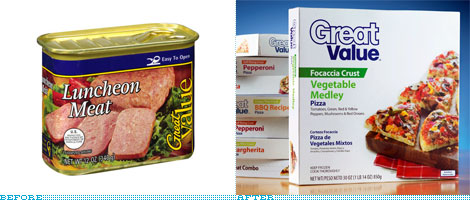
I’m overwhelmed trying to assess the old packaging to set the stage. It’s horrendous. Inconsistent colors and illustration styles, terribly handled typographic compositions, varied photography styles — some of which remind you that you can make terrible looking food look even worse (just look at that luncheon meat shot!). The one loose thread holding it together, aside from consistent disparity, is the clunky use of Rotis Serif.
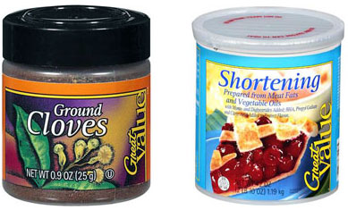
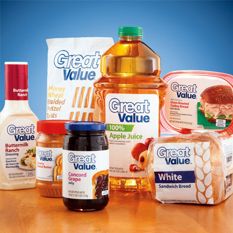
There is hardly any comparison between the old packaging and the new packaging — there is a universe of improvement between them — though there are still some not-so-good things going on here. Let’s start with the good. The packaging makes great use of white space, often allowing an airy environment for the product photography and enabling the typography to be visually scanned and parsed with ease. The photography has a tasty aesthetic and often moderately interesting product compositions. The color palette, while utilizing a wide range of hues, employs relatively consistent values and saturation levels, seems to choose colors with care (orange for orange juice, a vibrant purple for the Concord grape jelly, etc.) and combined with the large quantity of white and navy blue in the packaging, creates a readily identifiable palette. And let’s hope we see more fun illustrations like the one on the Fruity Puffs cereal.
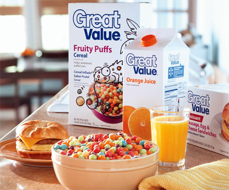
Then we get to the not-so-good. The product typography, while clear and neatly arranged in all its Myriad glory, is as plain and uninspirational as the white bread it serves. While uninflected, sans serif type can work well in letting other graphic elements sing in some grocery contexts, it doesn’t here. Don’t get me wrong, I appreciate the restraint and lack of starbursts (though I’m sure some will come soon enough), agree that the nutrition information is easy-to-read, and understand that this setup is easy to implement and control — it just feels antiseptic. The other not-so-good part is the “Great Value” logo, whose typographic implementation has nothing going for it. Outlined letters + bad kerning always = disaster. For all the good work that’s gone into this system I can’t imagine what they were thinking with this wordmark.
I won’t get into the actual packaging forms and materials, they’re cost effective and I wouldn’t expect to see them change much for that very reason. They’ve mentioned that they made an effort to reduce materials where possible, maybe they could have made more of an effort, but we can certainly be thankful for what reduction we get and ask for more. Spending a lot of time in the service and experience design fields myself, I always appreciate companies wiling to invest in testing and understanding their products in an effort to improve them for the consumers.
When I first heard that Walmart had redesigned this line of products, I’ll admit to having an expectation that while low, I wouldn’t have expected many corporate giants of this size (or near this size) to surpass. While their are some shortcomings — overall I stand impressed.
Thanks to Tom Lucero for the tip.


Jump to Most Recent Comment
Alex’s comment is:
Looks like any other generic store made brand.
On Apr.14.2009 at 07:37 AM
Romeo Calonghi’s comment is:
Very clean.
On Apr.14.2009 at 07:46 AM
ZedZedEye’s comment is:
It looks cheap! (hey wait, maybe thats the point?)
On Apr.14.2009 at 07:54 AM
AL’s comment is:
But shouldn't a value product look generic, plain, uninspirational etc? I think this packaging line has been well thought through with it's white background and 'generic' typeface choice. It's not about fancy fonts and illustrations - as long as it differentiates itself from all other brands and says "I'm your cheap Walmart bread", it works.
On Apr.14.2009 at 07:56 AM
Bill Dawson (XK9)’s comment is:
What is that cartoon reptile doing to those Fruity Puffs?? I think I'll just have the plastic bagel sandwich and OJ, thanks.
On Apr.14.2009 at 07:56 AM
Bill Dawson (XK9)’s comment is:
This look worked so well for Tropicana, I'm sure it will be staggeringly successful here.Sarcasm intended.
On Apr.14.2009 at 07:59 AM
mojo’s comment is:
reminds me of "ja!", a brand of "rewe" (german foodstorechain) http://www.rewe.de/index.php?id=1591
the packaging looks too sterile
On Apr.14.2009 at 08:01 AM
PopD’s comment is:
I've seen the use of white to grab attention on many of the lays products. Usually at the top touting some healthiness(?). In a sea of packaging trying to grab consumer's attention it seems that all white packaging will allow the 'Great Value' products to be set apart from all the other brands out there. Not to mention the use of white on more 'health conscious' food items.
Given the amount of products, it's cool to see a brand carried across so many items this effectively, despite any shortfalls.
On Apr.14.2009 at 08:08 AM
Noel’s comment is:
Anticeptic -good word. With these products lined up on shelves, i might think i've lost my way into pharmaceuticals.
On Apr.14.2009 at 08:20 AM
Daniel Campos’s comment is:
It looks like medice packaging. But, I liked!
On Apr.14.2009 at 08:32 AM
Ian’s comment is:
It looks good, but as for "easy-to-read nutrition labels," I think I'm going to have to disagree.
Looking at the hi-res "breakfast" photo, I noticed that the Nutrition Facts portion was bilingual in both English and Spanish. I understand Walmart's reasoning for printing both languages, but from what I can tell, this panel of a product will be super-cramped and otherwise difficult to read.
Bravo on unifying the "Great Value" brand, though. I had always wondered why Great Value was so... weirdly unconnected.
On Apr.14.2009 at 08:55 AM
Scott’s comment is:
Kind of reminds me of the 'generic' store brand from the 70s and early 80s.
All white packaging (and I do mean ALL white)
Block blue letters
Absolutely nothing else. Therefore, one bought:
BEER
NACHO CHIPS
JELLY
:)
On Apr.14.2009 at 09:01 AM
Ricky Salsberry’s comment is:
For a brand to work across such a plethora of products, it has to have some genericness to it. Maybe not as much as here, but that's what's up for debate.
If this came across my desk, sure I'd tweak some type things, but you can't argue that this is a vast improvement.
This reminds me of Michael Bierut's line from Helvetica... this is the cool crisp glass of ice water to wash away the past packaging.
On Apr.14.2009 at 09:09 AM
Don’s comment is:
I'm not a fan of the new packaging, but it is definitely an improvement. The "great value" brand is one I (unfortunately) grew up with, yet I had no idea it was Walmart's official value brand. As sterile as the new brand is, it is at least more memorable (due to the new colors mostly).
Overall, positive step forward, but it still needs to be redesigned. Sadly, this probably won't happen, and I can see the good work that was done here being undone over the years before it is improved.
On Apr.14.2009 at 09:14 AM
Jonathan’s comment is:
Saw this is Walmart over the weekend and told my girlfriend the same thing, outlined text + bad kerning = nightmare logo! Besides that, I really like the clean white packaging. It definitely stuck out in the store, and I didn't even put two and two together that this was a redesign of that old terrible great value. Let's just say I'm glad that's gone, hopefully forever, because it was horrendous.
On Apr.14.2009 at 09:15 AM
Stephen Doran’s comment is:
I think the packaging looks a lot more European than the usual grocery packaging in the US. I remember walking through D'Agostino for the first time and being baffled as to how really loud and busy all the packaging was. Very different to here.
On Apr.14.2009 at 09:17 AM
Adam’s comment is:
I agree with AL. You have to look at this for what it is--a generic store brand--and what it's not--a food brand like Kraft. Store brands make EVERYTHING; they don't specialize in certain types of food like chips, cookies, soups or dressings. There's only one point of differentiation for generic store brands--Price.
And think about where Walmarts are located (Anytown, USA). Think about the majority of people who buy this brand (blue collar, lower income). In that context, the new logo assures that everyone will know what you're getting with this brand--a great value.
I think the packaging also raises the level of perceived credibility and quality of the food, which might attract new buyers who may have thought the old brand looked too cheap and sketchy.
Finally, I think the level of consistency throughout the packaging is also a vast improvement and will help the store brand stand out when going aisle to aisle.
On Apr.14.2009 at 09:19 AM
Paul’s comment is:
I hope they keep simplifying the packaging design and making the product names more abstract until we get Darma-like labels:
GREAT VALUE
Fruit-Flavored Cereal Product
GREAT VALUE
Meat-Like Substance
GREAT VALUE
Processed Peanut Paste
Paul’s comment is:
err I meant Dharma (Initiative), not Darma.
On Apr.14.2009 at 09:22 AM
Mike’s comment is:
Look at that family of Great Value products all together and just staring at you. They look like they're from the creepy, brain-washing gated neighborhood. I can hear them calling, "Join us!"
On Apr.14.2009 at 09:25 AM
Tim’s comment is:
A huge improvement, but at the first glance I was disappointed that it looks so - super generic. I think it would look less "cheap" if the white space wasn't so dominant on the packaging and there was a clearer seperation between the product photography and the white shapes.
On Apr.14.2009 at 09:29 AM
Andrew Meyer’s comment is:
I really like the new direction. It reminds me of the old (I couldn't find a picture) generic food boxes that were just white with large black letters on the front saying something like, "Corn Flakes".
I almost feel like the whole idea of a generic brand is that it is suppose to be a simple alternative to the more expensive brands. A lack of inspiration in the design is almost fitting. The goals of the design after all would likely be simply to communicate the contents of the package and other necessary information (nutrition facts, quantity, etc).
While I agree with some of the critique here, I am really, overall, pretty impressed and would consider this to be a successful redesign of the Great Value brand.
On Apr.14.2009 at 09:34 AM
Ricky Irvine’s comment is:
An improvement in organization is not necessarily an improvement in perception. These designs appeal to me not. I see medicine and flour packaging used for all products.
Truly and honestly the old packaging were more attractive.
On Apr.14.2009 at 09:38 AM
emily’s comment is:
my sympathy goes out to the walmart in-house designers.
On Apr.14.2009 at 09:40 AM
Adam’s comment is:
This is an interesting juxtaposition because it seems like they went from a extremely overdone packaging scheme to one that looks sterile. It seems as if all these products could be generic drugs. I applaud them for at least introducing consistency across the brand, but the lack luster logo with it's awkward proportion and outlined text is unappealing to me.
On Apr.14.2009 at 09:57 AM
John Colucci’s comment is:
I like it too, It's simple, clean, and to the point. The super clean design sort of made me think of this old inspiration:

Bikky’s comment is:
Well on their own I think the packaging all looks fine, clear and functional. But then maybe I'm comparing the hideous typography of the old packaging.
I would worry though how many products will be next to each other in store, leaving the entire shop floor a sea of white.
On Apr.14.2009 at 10:06 AM
koyo’s comment is:
Is not a brilliant design work, specially the new logo. But instead of the old graphic system, this is a much more nice work. The older one, didn't have any graphic design or personality.
Good Job.
On Apr.14.2009 at 10:11 AM
deelirium’s comment is:
The point was to make it look like the generic, cheap brand, and they succeeded. It may not be pretty, but it accomplishes the goal.
Mission accomplished.
On Apr.14.2009 at 10:25 AM
b’s comment is:
I understand the criticism that if there was an entire aisle stocked with these newly packaged Great Value generic products, it would look very sterile and maybe even "antiseptic". But that probably will never be the case. They will live next to (or below) the richly colored and marketed name-brand products... and will definitely stand out. Overall I think it's an awesome improvement.
On Apr.14.2009 at 10:28 AM
Andreas Tabor’s comment is:
This packaging is clear:
their selling point is price
not taste
not lifestyle
It screams "Cheap! Buy me!"
instead of "tastes delicious"
Artisan54’s comment is:
its gutsy ill give it that, but when you look at other "store brands" it feels unfinished.

especially for the millions that walmart racks in they could spend some money and make their products actually appeal to consumers.
jaz’s comment is:
Private label does not have to automatically mean generic. Walmart should have taken a page out of Target's book.
On Apr.14.2009 at 10:47 AM
Jordi’s comment is:
Cheap things don't have to look cheap. And they don't have to be half-cooked designs. Of course is a huge improvement over the old mashup of cliparts but I think that is a missed opportunity of execute a nice and balanced design, like it seemed to be the objective.
Another point: If the cheapness of the product is the key, why is printed in (at least from the pics) 4 inks, and not 1? I know that in large print quantities there's little price increase, but I'm buying a least-possible-cost product.
On Apr.14.2009 at 10:59 AM
Denny’s comment is:
It may not be the most sophisticated design, but in terms of contrast... WOW!
On Apr.14.2009 at 11:02 AM
tish’s comment is:
Cheap implies that the product isn't any good. Maybe the word everyone is searching for is economical, and that IS exactly the point. It doesn't look cheap, it def. distinguishes itself from the name brand products that will lie next to the Great Value brand.
The updated look has its flaws, but it def. looks better than what wast he before look.
Wal-Mart could never compete with Target, even when it comes to design. Seems to be in two different leagues to me.
Congrats to walmart.
On Apr.14.2009 at 11:03 AM
impiri’s comment is:
You guys just beat me to it... Target's Market Pantry brand is still the gold standard. It's instantly recognizable and visually consistent across a wide range of products. The best part about it is that the logo gets out of the way and lets the name of the product take center stage. I'd much rather pick up "generic brand MAPLE SYRUP" than "GENERIC BRAND maple syrup", y'know?
That said, this is definitely a huge improvement over the previous Great Value treatment. A better, slightly smaller logo would work wonders.
On Apr.14.2009 at 11:12 AM
Rikki Tissier’s comment is:
I think a value store brand *should* look 'anti-septic' personally. Store-brand regular stock is supposed to look better than this, and full-brand stock is supposed to look even better. In a way, making the value stock look *too* good could cannibalize the high-profit brand items.
I think for comparison you could check out Tesco Value items in the UK. It says what it is, has a picture, and that's it. It is what it is!

Personally I think this new Walmart packaging is attractive and basic - exactly what value items should be.
On Apr.14.2009 at 11:19 AM
Uncle Flim’s comment is:
I've designed store brand before. Store brands walk a fine line especially if the store itself markets multiple brands. In the case of some house brands, they are actual both a value store brand, and a "good-as-the-national-brands" store brand. I always tried to think in terms of what the customer feels when selecting that brand. How would they feel bumping into their neighbor at the store with a cart full of this stuff? Personally, if I had a cart full of Great Value I'd be afraid someone would think I lost my job.
On Apr.14.2009 at 11:43 AM
MADPHILL’s comment is:
Definitely an improvement, but it is disheartening to see yet another (also Winn Dixie) company rip off Publix's unique spin on illustrative creatures interacting or personifying the food on the product photography. Annoyed at that kind of homogeneous IP ripping, but what else is new?
All in all, I have concerns about a retailer like Wal-Mart going with the white. I hope they put some matte varnish on that stuff, cause Wal-Mart already has a filthy store and seems like every thing I pick up, leaves my hands sticky and certainly unsanitary. So, there's that.
Lastly, the "Great Value" type treatment, while appropriate in aesthetic for a great value, because of it's uninspired treatment and font selection...remind me heavily of the Fed Ex mark. Not necessarily a bad thing I suppose, but worth mentioning.
On Apr.14.2009 at 11:46 AM
jRod’s comment is:
SUH-WEEEET!
I have been waiting for them to redo the Great Value stuff for years! I hated the terrible italicized serif font they used and the glamour-like food shots they used on all the packaging (see luncheon meat). This was long awaited and i think its pretty classy looking for a generic brand. at least it keeps up with Target now...
On Apr.14.2009 at 11:56 AM
Michael Wendell’s comment is:
Actually, I think it's a fail because for exactly the reasons you like it. The old design was incredibly innocuous, and very generic, without identifying itself as "Walmart's Generic Brand" You could safely buy something, bring it home, and put it in your cupboard without being reminded of Walmart when you used it. Honestly the old design almost achieved a mystical lack-of-branding that allowed it to blend in. You could almost forget where you bought it if you wanted to. And that, in my opinion, was what worked for it.
On Apr.14.2009 at 12:00 PM
lucid’s comment is:
The End is Here!
The age of the the Anti-Design is upon us.
On Apr.14.2009 at 12:01 PM
Doug Bartow’s comment is:
There's a slippery slope between 'white space' and 'blank space'.
However, the lead image is a bit slanted: would you rather eat WalMart private label SPAM, or focaccia crust vegetable medley pizza?
On Apr.14.2009 at 12:22 PM
john’s comment is:
I refuse to form an opinion until Andrew Sabatier tells me what to think.
On Apr.14.2009 at 12:58 PM
Nick’s comment is:
I think this design upgrade does exactly what its supposed to do. If you're shopping in Walmart you're there for value. Clean, simple, organized communication. Good job.
On Apr.14.2009 at 01:01 PM
Moeed’s comment is:
Good stuff, clean and consistent.
On Apr.14.2009 at 01:09 PM
exigent’s comment is:
Although quite sterile, it shows as clean and has a freshness to it. Whereas the older design stunk of bad type, bad color combinations and an overwhelming sense of generic cheapness. The new design may miss the mark of typographical genius and may seem a bit bland, but when put side by side with it's competition, this will undoubtedly be a refreshingly simplistic design among brands that feel more is better. ie starbursts, flares, shading, gradients, 72 fonts skewing in 35 directions and every cartoon character imaginable. I say wait for the product to hit the shelves and see it in it's element. Not a grand slam, but a definite improvement.
On Apr.14.2009 at 01:13 PM
Steve’s comment is:
Definitely an improvement.. but it's still WAL*MART. ugh.
On Apr.14.2009 at 01:30 PM
anklepool’s comment is:
While it's not the prettiest design, I think it fits for they type of product they are selling. Plus I think it'll really help to stand out on the shelves. I'm always looking to save a buck or two where I can on the grocery list and have spent time looking for the Great Value brand at Walmart before. The inconsistency of the old packaging made it impossible to spot on the shelves. I usually just shop by price sticker rather than packaging in order to find the Great Value product I'm looking for. Overall, I think I'm going to like it :)
On Apr.14.2009 at 01:36 PM
jacqueline c’s comment is:
I've actually eaten that Great Value Luncheon Meat.
It's not bad... but it does look just like the photo.
judy sunu lee’s comment is:
i agree with jaz. cheap doesn't have to look unappealing. when you see the product on the shelf, you have to want to buy it and this packaging, although better, just doesn't make me want to pick it up and put it in my basket.
On Apr.14.2009 at 01:43 PM
Paul Lloyd Johnson’s comment is:
In the UK, Asda uses the same Great Value packaging for some items, but they mainly use the 'Smart Price' brand. Hopefully they'll update the Great Value range and maybe even replace Smart Price with it entirely, as it's pretty nice looking for a budget own brand.
On Apr.14.2009 at 01:43 PM
Mark’s comment is:
Big improvement!
Now it will stand out more to potential buyers.
Doesn't look like a store brand!
On Apr.14.2009 at 01:47 PM
Calvin’s comment is:
I appreciate the effort to make the Walmart food products consistent. I give them points for that.
They fell short on appetite appeal.
Not a friendly looking wordmark.
"Great Idea", "Bad execution on the wordmark"!
Nathan McKinney’s comment is:
I'm really curious how this works out on the store shelf. Packaging has a totally different feel in context of a store environment. Will the white simply wash out among the shelves, or will it stand out from the overly saturated name brands?
Furthermore, as a definition, the generic versions of of a product should be an obvious "you could buy this instead of that but cheaper". The old packaging clearly went the route of trying to mimic the packaging of name brand equivalents. Sometimes that worked well: the generic was always sitting nicely beside it's counterpart. A dynamic duo. This new approach has other possibilities. the products don't necessarily have to neighbor the expensive brand. The Great Value stuff might literally get it's own section of shelving in some areas. You can shop the "cheap section" in the cereal aisle for example. The grouping of like brand items into their own section of the aisle might increase the overall perceived value. And believe me, while they want to communicate that you as a consumer save money with the generic, the store actually makes more money on the cheap stuff. The margin on the generic stuff doesn't have to work around all the expensive branding that national brands demand.
Of course, there is a lot riding here on the quality of the product. Before, if the generic was a weak counterpart, the rest of the great value brand was visually disconnected enough that any bad brand-equity-juju wouldn't carry over to other product lines. This redesign makes a branding statement through out the store. It will be harder to shrug off a bad product experience from one aisle to the next.
As someone who spent 10 years working for this corporate willdabeast, part of me really appreciates the taming of the circus that was Wal-Mart several years ago. Another part of me really sees how much flavor has been squeezed out of the design with the rebranding. It comes across stale and bland much of the time, and that seems to hold true here to a degree. It's missing a life of it's own.
I gotta say though, the photography sure does look better and overall there are massive improvements.
On Apr.14.2009 at 02:24 PM
Rico’s comment is:
I wonder if the products taste as bland and the packaging looks.
On Apr.14.2009 at 02:31 PM
Josh’s comment is:
It looks like Fedex Brand food. I can't believe nobody said that yet. Kinkos isn't profitable for them, so they needed a new focus.
I like the update compared to the previous inception. I don't think I ever bought anything Walmart store brand because of that.
And I loathe Rotis...I just makes my skin crawl everytime I see it.
On Apr.14.2009 at 02:53 PM
Skylar’s comment is:
It looks better, no doubt, but it still looks like any other generic brand.
The best example I can think of for a store brand is Target's "Archer Farms", amazing!

candrews’s comment is:
Archer Farms makes up less than 3% of their total Private Brand sales. Their Private Brand sales are about 10% of their total grocery sales. So although Archer Farms may look prettier it doesn't mean that it's look is increasing sales. Pretty doesn't mean it does the job.
On Apr.14.2009 at 04:13 PM
Gustavo Cadar’s comment is:
It looks diet
On Apr.14.2009 at 05:02 PM
Proverbial Thought’s comment is:
Well, nothing's cheaper than white ink.
On Apr.14.2009 at 05:04 PM
Saylor’s comment is:
wowwy wow wow.
so many opinions on a generic, basically strip-down-design brand.
so here's my belly button, i mean opinion:
"It's generic. You buy it cause its cheap. Stripping down the design to basic white / basic type / basic picture leaves the consumer with no question as to whether its going to be the cheaper choice... excuse me, the better value."
__yes, I quoted myself.
On Apr.14.2009 at 05:24 PM
magnusotis’s comment is:
Blah! I agree that Target's "Archer Farms" is a MUCH nicer design compared to the "Great Value" brand. If they keep this design, they should re-name it "Pretty Good Deal."
On Apr.14.2009 at 05:34 PM
Matt’s comment is:
I think the old "Great Value" products looked so inconsistent is that they weren't supposed to be consistent with each other. The packaging was supposed to be consistent with the major national brands for that particular food item.
The shortening can is light blue; Crisco is dark blue. Crisco canola oil has a green label; Great Value canola oil has a green label. Barilla pasta comes in blue boxes; Great Value pasta comes in blue-themed boxes.
They weren't trying to make you realize that all the "Great Value" products were from the same place (because they're not—like all house brands, they're made by national manufacturers at a lower price negotiated by the store); they were trying to present them as the "generic" versions of the products people already knew.
Now that Wal-Mart is going all in on the "the economy is tight and we save you money" theme, they probably believe it makes sense to try to highlight the "Great Value" brand as something they can advertise: here are products just as good as the national brands at a fraction of the price, and they look like this, and you'll only find them at Wal-Mart.
But to do that, they have to look like each other, not like the national brands that each individual product is shelved next to. And they have to be distinctive enough that when people glance around, they'll see them. The sea of white—which other brands wouldn't dare try—gives them visibility on a crowded aisle.
It doesn't have to be state-of-the-art. It has to avoid being butt-ugly, be consistent with other GV labels, and easy to pick off the shelf. The design meets all of those goals. The question is whether they're the right goals.
On Apr.14.2009 at 06:06 PM
7OA’s comment is:
I gave a tip for this too.......*frowns*
But now to the overview. I like the simplicity, but the simple rebrands are happening across the board, and it's getting annoying. I like how the luncheon meat pic is gone (eew, even though I like SPAM).
Overall, the wordmark isn't the best, but most average shoppers aren't typography experts. Most don't even know what "kerning" means in typography. So I think this is (in a big picture) a pretty good rebrand, but there's a few kinks that could be fixed.
I'm starting to see this rolled out in the freezer section, and I think it stands out and makes a pretty good impression on someone who is just looking for a no-frills but okay pizza or whatever. I've also noticed it's white so it pops compared to the dark reds and golds of most pizza boxes...and it's really the only wordmark you can even vaguely see past the condensation on the doors.
Overall score: 4/5.
On Apr.14.2009 at 06:21 PM
Patrick’s comment is:
You have to look at this from the perspective of a customer who consistently buys the Great Value items in each section. These customers typically aren't reading the labels or ingredients, they're only looking at the price tag. For those value customers, the ability to spot the house brand among all the brand names as fast and easy as possible is most important.
In that respect, I think this rebranding succeeds. The typical Great Value-focused shopper will be able to spot the large blue type on white labels with a minimum of effort. They can walk down every aisle and grab the white label package without doing much hunting. The customer that occasionally buys Great Value items will probably be drawn to the crisp white label more often than before. So while the rebranding may not be exciting, I think it's going to deliver tremendous ROI for Wal-Mart.
On Apr.14.2009 at 06:31 PM
RoyL’s comment is:
Is this a knock off of the "old-new" Tropicana strategy?
On Apr.14.2009 at 06:39 PM
b.r.o.o.d.y.’s comment is:
I'm curious as to why they went for the blue wordmark. Blue isn't usually a color that relates to food (go ahead and tell me how much edible blue stuff you have in your fridge), and is in fact quite de-appetizing.
Sure, it's a neutral color but Black would have worked much better here IMO. But probably orange or red would have been the way to go.
Other than this mini-rant about the color, I actually like this modest, simple rebranding. Great Value products are not glamorous and definitely should not look like they are; the design is simply being honest about it. I could actually grow to love it, but I think the color blunder is too big to forget... It sucks some life out of the designs.
On Apr.14.2009 at 08:23 PM
Chuck Spidell’s comment is:

christy’s comment is:
I agree that the consistency is is an improvement, but like someone else noted it is veering a little towards medicinal.
People do buy these because the items are cheap, but also because they think "this is exactly the same as the name brand but cheap!" They could be hurting themselves by distancing the products from their comprable brand names so much.
On Apr.14.2009 at 09:13 PM
John Mindiola III’s comment is:
Major improvement. As a regular Walmart shopper, this is a step in the right direction. Unfortunately, though, I think a leap was required. I, too, wish the GV logo was MUCH more subtle. I'd rather see POTATO CHIPS in huge letters, and GV somewhere up in the corner. It seems many "need" brands are going toward this "we look cheap cos we are cheap" look. McDonald's $5 posters look similar to this, just reversed.
On Apr.14.2009 at 09:39 PM
Julius’s comment is:
Can you imagine the 'Design by committee" that went on in the development of this branding. I bet it was a nightmare.
On Apr.14.2009 at 10:34 PM
Shane’s comment is:
WOW, I think it is 100 times better than what it was. I'm excited for the change, and it is far overdue. I'm surprised it took them as long as it did to make these changes.
On Apr.14.2009 at 11:11 PM
Tyler’s comment is:
While I think the design is okay, I am no fan of the plain white background. It reminds me too much of Repo Man or They Live, or even Dharma Initiative stuff from LOST. I get what they were trying to do, but it seems a little too 80's to make me hungry.
On Apr.14.2009 at 11:21 PM
mog’s comment is:
Someone should tell Walmart that slapping Myriad on a minimalist white package doesn't make you cool, just because (*cough*) other brands do it.
On Apr.15.2009 at 12:35 AM
Covarr’s comment is:
I, for one, liked the typography on the words "Great Value" on the old ones. That's about the only thing I liked. If they'd kept that, but used the newer minimalistic packaging, I think it would have been better than what they actually did.
On Apr.15.2009 at 12:47 AM
dg3’s comment is:
Much needed. I never liked the previous version.
On Apr.15.2009 at 01:29 AM
Lost’s comment is:

non-brand, generic, cheap and actually looks good (no shame in buying a non-brand here)
On Apr.15.2009 at 06:00 AM
Proverbial Thought’s comment is:
I just noticed that the bread actually says WHITE on it!!! Too funny.
On Apr.15.2009 at 09:43 AM
Kwesi Amuti’s comment is:
These look like a more updated "No Frills" packaging program from Pathmark in the late 70's / early 80's. I wonder what made them switch over so quickly...
On Apr.15.2009 at 09:43 AM
Carly’s comment is:
I agree that the Target private brand food packages are much, much nicer, but I feel that Target is a more upscale store with generally wealthier customers and higher prices. The grocery prices at Target are usually higher than at the average price grocery stores in my area.
When I first started working in Direct Mail it was really hard for me to wrap my brain around the fact that if a mail package looked too nice,it wouldn't get a good response. People would assume that a lot of money went into the design and therefore would not donate money. I think a lot of the same rationale needs to be applied to the WalMart generics - it can't look too nice or people will assume it's a rip-off.
House of Thuan’s comment is:
A step in the right direction but has one major flaw.
PROS
— Consistent visual graphics
— Clean
— Easily identifiable
CONS
— Too heavy an emphasis on the "Great Value" wordmark
— "Great Value" wordmark design sucks ass
SUGGESTION
— Take a cue from other sucessful store brands like Archer Farms, and Publix. They did it right and did it well.
kirk’s comment is:
... hmm how can we make our cheap looking generic product look even more generic.
everything looks like its liquid fabric softener now.
On Apr.15.2009 at 12:50 PM
Simon’s comment is:
I do not like it at all, I guess they want to give the impression they are cheap as far as price but I also feel the logo gives all the items another aspect and that is that all there items are cheap as far as quality. If you take a look at targets own brands they are able to offer a product that is cheap in price but their logo shows quality. It doesn't mean that the quality is better but as far as what they are trying to project it looks much better than Wal-Mart brand.
The Wal-Mart brand truly does look cheap as far as quality and if you look at the psychology of a lot of people that kind of logo they will not allow on their kitchen table. I know that sounds weird but when I think back of the old Kmart brand years ago many kids would not wear or even be seen going into a Kmart because their brand appeared to be very cheap. The old saying used to be years ago with Kmart was that you were very poor if you went there to shop. I think Wal-Mart's new logo is going to be giving that same impression. Don't misunderstand me I think it's important for people to be frugal and to shop right, but people are people and this new Wal-Mart logo really looks chintzy and quality cheap.
Chris’s comment is:
Better... logo ruins it for me though.
Publix Grocery stores recently re-branded their generic products and did it with MUCH more finesse.
http://www.publixpackaging.com
On Apr.15.2009 at 01:40 PM
jrmm’s comment is:
Here in Mexico the new Great Value packaging started to appear in Walmart stores since March... I wonder if Equate and Aurrera (Walmart's mexican generic brand) will change its packaging too...
On Apr.15.2009 at 06:48 PM
the macho man’s comment is:
the overall change is good.
if they changed the GREAT VALUE logo and added more color (like in the Archer Farms picture in the comments) it would look really good.
the new picture of foods on the package looks better than the old pictures.
the new font on the packaging is waay better too.
i give wal-mart between a B+ and a A- on this redesign
On Apr.15.2009 at 07:38 PM
Kevin’s comment is:
I think it is an improvement over the existing look.
Is it as strong as Target's Market Pantry brand? No. Will it help Great Value be more recognizable on the shelf? Yes.
Is that a win? Yep.
On Apr.16.2009 at 01:38 PM
andyRespire’s comment is:
Regarding Target's generic brands:
'Market Pantry' is their generic store brand of everyday foods.
'Archer Farms' is their premium store brand - usually costs more than 'Market Pantry' and are more boutique/specialty items.
On Apr.16.2009 at 01:51 PM
Craig Hughes’s comment is:
Regarding some of the other comments: There's no need to pull up Archer Farms as the poster child of store brands and use it as a measuring stick for everything else. Yes, we all know Archer Farms rocks the awesomeness, but it has great customer loyalty because the quality and uniqueness on the outside matches the quality and uniqueness of the stuff they put inside: Black Pepper and Sea Salt Potato Chips, Madagascar Vanilla Ice Cream, etc.
Inside & outside are working for eachother.
Now transition to Great Value. If GV decided to go the Archer Farms route and make their design a little more premium on the outside, it would be a lie. Unless they change the way they make their food (Have you tasted their Fruity Pebbles knock-off? Enough said), they would be duping their customers if the design was any more polished. The new design actually is right in line with honesty. If you went and bought a premium branded GV granola bar only to find that it tasted like foot, you'd feel deceived by the company and would never buy anything again. But if instead you buy a stripped down store-brand that looks fairly decent but could use a little improvement, you know exactly what you're getting: a stripped-down, fairly decent granola bar that could use a little improvement. Then you can just accept it for what it is. You got exactly what you bought, nothing more, nothing less.
On Apr.17.2009 at 10:40 AM
Tim W’s comment is:
The old packaging system reminded me too much of going to my grandma's house 15 years ago, which has a certain nostalgia, for sure, but definitely dated. The new packaging works well in some applications, and not as well in others, but is absolutely an improvement. The salad dressing, for example, looks similar to Kraft's new packaging, which is a good association to have.
B-
On Apr.17.2009 at 04:44 PM
Von K’s comment is:
It's miles better than the old cluttered mess, but that wordmark is HUGE problem.
The pizza packaging given as an example looks like something pharmaceutical. The green bar with the diagonally sliced end looks like it should be holding a word like "soothing" or "maximum strength."
It'd be nice if this look was just for the pharmacy packaging and something a little less clinical for the foodstuffs. Maybe something a little stylish for the clothing, etc. Just variations on a theme, you know?
On Apr.17.2009 at 05:10 PM
RoleModel’s comment is:
Stop & Shop's Nature's Promise and Simply Enjoy brands are another bunch of store brands that stand out - particularly Nature's Promise.


dMullins’s comment is:
I have a feeling that this stuff is really going to stick out on the shelf, sitting next to all those other super saturated products.
This was much needed.
On Apr.19.2009 at 04:30 AM
KK’s comment is:
As previously mentioned, it resembles the budget Value brand at Tesco supermarkets in the UK. Tesco was strategic in marketing the 'Value' brand with bland, sterile packaging to increase the sale of it's other own-brand products. Currently both the 'Tesco' brand and the 'Finest' brand are designed with a more colorful, premium packaging. By offering a lowest-of-the-low, consumers often gravitate to a slightly more expensive but comparable store brand.
I think this rebrand is effective for what it is - a non-premium design for a non-premium brand.
On Apr.19.2009 at 12:44 PM
ED’s comment is:
I agree with Gustavo -- it does look diet!
Also, I grew up on store brands, and I recall feeling pretty sensitive to different tiers of generics. Pathmark "No Frills" was definitely the cheapest, and a scary choice for canned veggies or something.
The one thing Great Value had going for it in its previous form was an alignment with the quasi-premium generics, like "America's Choice" which is found at Acme / Shaw's / Albertsons groceries. In the 90's I remember the grocery had a choice between hi-lo generics.
Great Value scares me now...
On Apr.19.2009 at 10:00 PM
Paul Riehle’s comment is:
Its no way great, but its so much better than the last look. I have been known to not buy Great Value solely on the fact that its so poorly designed.
On Apr.20.2009 at 12:40 PM
The Panda’s comment is:
Won't the whole store be all white? What happened to the use of color? As if the florescent lighting isn't enough, they will have an entire store with white packaging.
On Apr.20.2009 at 04:15 PM
Anonymous’s comment is:
too generic looking, the other one atleast looked like a name brand.
On Apr.21.2009 at 05:54 PM
Noah ’s comment is:
I agree with MADPHILL’s and House of Thuan’s comments with Publix. The aluminum foil animals and the striped cookies with the tiger. Come on, pretty amazing.


Silas Amos’s comment is:
It is interesting how white is moving from signifying premium to value in the eyes of consumers - here are our thoughts...
http://www.jkr.co.uk/design-gazette/2009/04/white-out/
On Apr.30.2009 at 08:57 AM
Anonymous’s comment is:
thank god, clean and safe.
On May.08.2009 at 02:30 AM
Esteban’s comment is:

brista’s comment is:
What is the other brand you link to in the post? The one that sings in its grocery context.
On Jul.11.2009 at 10:32 PM
Comments in Brand New, V1.0 have been closed.


