

NOTE: This is an archived version of the first incarnation of Brand New. All posts have been closed to comments. Please visit underconsideration.com/brandnew for the latest version. If you would like to see this specific post, simply delete _v1 from the URL.
![]()
CREDIT UPDATE: The new Seal was designed by Louise Fili.
I must be making all the wrong consumer choices because I had never seen or heard about the Good Housekeeping Seal that adorns the packaging (and in some cases the advertising) of everything from washers and dryers, to cell phones, and even to movers. The Seal, issued by the Good Housekeeping Research Institute — a 17,000-square-foot (since 2006 when it moved to the Hearst building) lab and kitchen testing facility with scientists and engineers as its staff — is given to products that pass their rigorous tests, granting them not just use of the seal, but entry into the its namesake magazine, Good Housekeeping, which only takes advertisers whose claims and promises can be corroborated by the Institute. The seal gives consumers a two-year warranty on any approved product and will happily issue refunds if necessary. The Seal was introduced in 1909 and, to celebrate its 100th anniversary, a new version has been released.
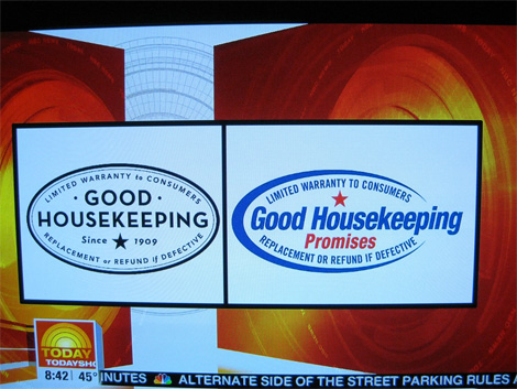
Screen capture from the November 25th Today show by Chino.
“If you’re not a Baby Boomer or older, you don’t really know what the seal is because they haven’t done anything to re-energize its importance,” said Marshal Cohen, chief analyst of the NPD Group, which specializes in consumer behavior.
— Polishing the Good Housekeeping Seal, from a November 20, 2006 article in The New York Times
So at least this confirms I’m not crazy or that I am completely oblivious to the things I buy. For clarification: I’m neither a baby boomer nor older. Also, my purchasing decisions rarely come from Good Housekeeping, rather from Wired, MacWorld, and the Amazon.com and epinion.com customer reviews, so not only am I not a baby boomer or older, but a young geek. I digress. The new Seal is far, far better than the old one which was very Swooshy American and had more of a coupon-ish aesthetic that didn’t flatter it. The new Seal is very nicely executed, and in its use of House Industries’ Neutraface, it gently pushes the nostalgia buttons of the Good Old American Days when apple pies were put in windowsills to cool. With the wider character shapes and generous letterspacing I do wonder if the legibility of the text is compromised, although the Good Housekeeping name, for those that do know about it, is more than enough. But no doubt, this is a great upgrade and it’s nice to see some properly executed typography go out to the mass market.
If you are interested in learning more about the Seal, this is a good article and here is a quick video overview. And here is the official promise of the Seal.
Thanks to Chino and Dennis Derammelaere.
UPDATE: It seems there is confusion about this. And now even I am confused. So, as far as I can tell, the swooshy thing is the old logo: if you look at the screen grabs below, the swooshy thing appears in products and ads and there is no way a new logo can get on those so fast; the other telling part is that the swooshy logo is the only one that appears on Google Image Search which, again, if this were the brand new logo it wouldn’t yet appear in Google; and, finally, the last screen grab shows the new logo with a “100 years” text below it. So, yeah, I think we got it right. Happy to correct this if I’m wrong.


Jump to Most Recent Comment
johndbritton’s comment is:
Is it just me, or do the before and after seem to be switched?
On Nov.26.2008 at 08:07 AM
Rocco Piscatello’s comment is:
Excellent, terrific and most important for me, appropriate. It is also amazing to note the increased effectiveness of the star - made by a simple position change.
Bravo.
Woke’s comment is:
Excellent execution I think. And thankfully they stayed away from a brown gradient/bevel to make it 'more authentic'.
On Nov.26.2008 at 08:23 AM
Nick Irwin’s comment is:
I actually enjoy the simplicity of this one....looks more like a seal instead of a swooshy thing....lets get rid of that awful 90's design element one swoosh at a time!!!
On Nov.26.2008 at 08:28 AM
Darran’s comment is:
Argh I'm confused, which one is the new seal? The old fashioned one looks better at any rate.
On Nov.26.2008 at 08:31 AM
Nick Irwin’s comment is:
similar to...
![]()
Oak’s comment is:
The new mark is so classic that when i saw this in my screen reader I figured that it was the original, to be replaced by the "patriotism-meets-heart-burn-medication-complete-with-unoriginal-curved-swoop" logo.
So glad to realize that the retro mark is the update. I am struck by how courageous a move it is to step back to a very basic, one color classic mark. It's perfect for this usage because it will work very well on multiple products.
I really like this a lot.
On Nov.26.2008 at 08:32 AM
Jw’s comment is:
The Today Show totally botched the unveiling. They meant to show the old one first (as they had the new one covered up by a red velvet curtain in-studio), but they displayed the new one on the screen, making the reveal a little lackluster.
So yeah, the NBC screenshot is reversed, probably because some producer though that the new one looked old.
This is a very good change, as their previous seal was way too dated with its swooshy 90s look. The new one actually looks like seal and is definitely more in line with the idea of a long-standing institution.
On Nov.26.2008 at 08:52 AM
Amanda’s comment is:
I love when things like this happen in design. It makes me so happy. And no, that is not sarcasm.
On Nov.26.2008 at 09:03 AM
Robbie ’s comment is:
I'm a fan. It's a step in the right direction. It may also be a sign that coorporations are understanding that italics don't make a more interesting mark. Wonderful typography. Hoefler & Frere-Jones would be well pleased.
On Nov.26.2008 at 09:14 AM
Paul Lloyd Johnson’s comment is:
All this "I'm confused", "Which is which" stuff, just shows out of touch some people are. Just look around at the logos used on this particular site. Retro is in. Big time. The other logo looks like it was made in Microsoft Publisher in 1995.
Honestly the new logo is excellent and it is very much contemporary. Well at least here in Europe anyway.
On Nov.26.2008 at 09:15 AM
Frank C’s comment is:
Armin - I think the before/after images at the beginning of the post are switched!
On Nov.26.2008 at 09:19 AM
chris d’s comment is:
Looks great inverted too!

g-sppud’s comment is:
Wow. What a breath of fresh air this thing is. Bravo to the designer, and to Good Housekeeping.
On Nov.26.2008 at 09:41 AM
Jonathan’s comment is:
Classic & hip! I love it! Take note people, take freaking notes!
On Nov.26.2008 at 09:49 AM
ryko72’s comment is:
very nice back to basics approach – i really don't believe it needed the dropped-crossbar typeface however. Gotham (or something similar) would have served the purpose just as well and kept it more current and relevant. instead, this type makes it feel a bit antiquated and 'used-to-be' relevant...which, in my estimation, is kinda the truth for their endorsements.
On Nov.26.2008 at 09:56 AM
Rob’s comment is:
![]()
Not bad though! I'm also thankful they didn't decide to keep the swoosh and put a gradient on it.
On Nov.26.2008 at 10:01 AM
Mrs. M’s comment is:
Adore it.
Incidentally, I'm not quite thirty, but I knew about Good Housekeeping. I knew about the seal and the magazine, mostly through association and tales from my older (female) relatives.
I love how neat and confident the typography is. Even the star feels bold and reassuring. It's vested with enough antiquity to call to mind an age before the advent of cheap plastic and disposable everything. Comforting.
On Nov.26.2008 at 10:02 AM
Darel’s comment is:
I was going to say what Rob did...that it has a very 'Super Target' feel, but that's not a bad thing, and, of course, both are based on classical logo/seals.
This is definitely a nice upgrade. It's very much a seal now.
That said, perhaps it need some color (or maybe it will have) as has been stated, it has flown under the radar for a lot folks.
On Nov.26.2008 at 10:15 AM
Mark’s comment is:
It's a much needed improvement,over the old ugly swooshy one.
It's nice clean,simple and to the point.I like it.
On Nov.26.2008 at 10:20 AM
Matheus’s comment is:
Now THATS a real logotype evolution.
On Nov.26.2008 at 10:21 AM
Lonnie’s comment is:
I like it, but it's far too close to Target's Archer Farms brand.

blue’s comment is:
A sound rejection of trendy insubstantial slickness for solid classic gravitas.
On Nov.26.2008 at 10:55 AM
Jacob’s comment is:
Are we finally throwing all the swoosh logos in the fire? Please?
On Nov.26.2008 at 10:56 AM
rickyaustin’s comment is:
Show this to every PR, Ad Executive or cheesy creative working with companies to promote themselves.
Which logo has more promise built into it??
The swoosh that has the word "promise", or the one that has history & promise built into its core.
They nailed this.
It will even help clean up the products that it appears on. No more WalMart-esque ugly thing to put on your packaging that definitely doesn't enhance the package. Now a clean, confident, subtle mark that won't ruin a brand.
Good Stuff.
On Nov.26.2008 at 11:08 AM
rickyaustin’s comment is:
Oh - and Archer Farms doesn't own this aesthetic, and neither does Converse All Star.
It all comes from the same very small pile of reference. Neither inhibits the other brand.
I'm not going to buy a vacuum and see this little half inch seal on the bottom and think "Hmm, I wonder if the vacuum comes filled with delicious chocolate chip cookies?!"
(all packages should have bonus chocolate chip cookies, btw.)
I'd argue that this is a more appropriate solution for Good Housekeeping than it is for Archer Farms (even though Archer is hella-nice itself).
On Nov.26.2008 at 11:12 AM
Josh’s comment is:
Love the change. Very appropriate, and FAR more convincing as an authoritative seal of approval. Great tie-in to guild mark tradition, and all-around solid, stand-alone mark. This is a welcome update to a long list of very unusual, unnecessary, and butchered marks lately.
On Nov.26.2008 at 11:26 AM
George - LogoDesign.org’s comment is:
I like it, a very "classic" look for a longstanding company.
On Nov.26.2008 at 11:26 AM
Lauren ’s comment is:
I like the redesign but can't help wondering who it is going to reach. As an update I quite like it, but I don't think it is going to make an impact on the "young geek" demographic.
I immediately saw Archer Farms as well, but that's probably a good thing. It touches on the traditional values aesthetic and history of the GH brand.
On Nov.26.2008 at 11:30 AM
oscar’s comment is:
I think it's a sad comment on logo design that so many people are sure the swooshy hell logo is the update. This is a huge improvement.
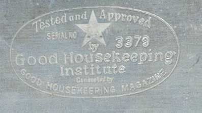
In any case, here's an image of a historical version:
Nigel Sielegar’s comment is:
The redesign is much, much better than the original one. Typographically better, The design is very appropriate. More importantly, it looks more trustworthy.
On Nov.26.2008 at 11:42 AM
Diane Faye Zerr’s comment is:
Rob: That is what I thought of when I first saw it too.
Oscar: Great find! This one is good too 
Finally someone has done their research and made an overall improvement on a logo. Way to go!
On Nov.26.2008 at 11:48 AM
Jenn’s comment is:
Ah! I concur, Lonnie. I was just thinking it looked similar to the Archer Farms logo in Target. Although the design is nicely done, I don't know that it has quite the right tone of what that sort of seal should have.
On Nov.26.2008 at 12:08 PM
Yeison Agudelo’s comment is:
its kind o a throwback but i like it better than the previews one
On Nov.26.2008 at 12:12 PM
Pamela L.’s comment is:
I don't mind the vintage look. I actually prefer it, rather than the modern 'swoosh' look.
I think it brings back feelings of nostalgia and if it has a 'seal' on it that appears to have been around for ages, then YEAH I'll believe it has credibility and reliability in the industry.
If your grandmother swears by it, then she's probably right.
On Nov.26.2008 at 12:26 PM
James Moes’s comment is:
Retro. Clean. I like this a lot. Good Housekeeping indeed.
On Nov.26.2008 at 12:47 PM
Kelly Hobkirk’s comment is:
Nicely done. Definite improvement.
On Nov.26.2008 at 01:29 PM
Adam’s comment is:
I like the new retro design. It emphasizes that the company has been around a long time, and there for trust worthy. Its clean and classic design is reassuring. It looks like something that could be embossed on a gold seal, unlike the other one.
On Nov.26.2008 at 01:38 PM
jack’s comment is:
hooray! now it actually reads as a "seal." i thought the old version usually blended in on the packaging as just another swooshified piece of information.
On Nov.26.2008 at 01:52 PM
Dylan ’s comment is:
Simple, elegant, timeless and well done. Makes the old logo look old! The Red star is a nice touch.
On Nov.26.2008 at 02:20 PM
jRod’s comment is:
i really like the idea that we are returning to our design roots. nice job. GH.
On Nov.26.2008 at 02:57 PM
David’s comment is:
Okay, glad to see that I wasn't the only one who immediately thought of Archer Farms.
Very nice improvement, even though it wouldn't sway my buying decision one way or the other.
On Nov.26.2008 at 03:22 PM
Design’s comment is:
Why does everything she does just look so damn old and moldy?
At least the old italian stuff she rips off is decent at times, but this is *yawn*.
On Nov.26.2008 at 05:19 PM
Paul’s comment is:
Back to the Future!
Liking.
On Nov.26.2008 at 05:59 PM
Ryan’s comment is:
Is it just me, or is anyone else getting tired of Neutraface (the "new" typeface)? My firm has used it for years, and it seems like it is becoming cliché..."use this font and look retro!"
On Nov.26.2008 at 08:58 PM
XK9’s comment is:
I am a Baby Boomer and I love this. It's not nostalgic; it's an intelligent refinement. The Good Housekeeping seal is meant to work with other packaging and advertising. A product would claim "Brand X has earned the Good Housekeeping seal of approval." So the seal needs to play well with others. Nice job and beautiful, sophisticated typography. I would love to see the seal embossed or letterpressed.
Will Macy's claim trademark infringement because of the red star? How about Communist China?
On Nov.27.2008 at 02:33 AM
XK9’s comment is:
Reminds me a bit of the work of the design office of Charles Stuart Anderson in the 90's. Refined simplicity and expert typography can create breakthrough design solutions.
On Nov.27.2008 at 02:43 AM
Armin’s comment is:
> Charles Stuart Anderson in the 90's
Charles Spencer Anderson : )
On Nov.27.2008 at 05:45 AM
dale harris’s comment is:
brilliant. appropriate design always wins.
On Nov.27.2008 at 08:52 AM
damon’s comment is:
I like the KO version better than the positive, but it's clean and old timey which says quality and tradition.
looks as though it could be on a jar of jam from the county fair a bit, but whatever, it's seal, not a logo really
it works.
Moeed’s comment is:
Well done.
The new logo is very nice.
On Nov.27.2008 at 02:25 PM
Adam’s comment is:
It's nice to see someone get it right...kudos to the designer
On Nov.27.2008 at 03:47 PM
Wünderwoman’s comment is:
Wow. GREAT research and work.
Should expect nothing less from a pro like Fili. Finally...design that is thoughtful, legible, well executed and functional (pulling in the 100 year history).
Death to the swoosh.
On Nov.27.2008 at 04:26 PM
Randy Hill’s comment is:
Thank goodness they got rid of the swoosh. The swoosh was the worst thing ever to happen to graphic design. Nice retro feel. I thought it was the original when I first saw it. Good job!
On Nov.28.2008 at 02:04 PM
Soren Lorensen’s comment is:
This is such a beautiful, historically meaningful, and elegantly restrained execution. I really hope this gets recognized by marketing execs as the new voice of design, because I am so tired of being directed to add drop shadows and hyper-gloss to everything.
FWIW, the logo was given some screentime during the Macy's Thanksgiving Parade. It was on a steamboat-style float with characters representing Build-A-Bear, and a young Filipino vocalist named Charice Pempengco. So that one on the right is indeed the correct logo.
On Nov.29.2008 at 06:28 AM
orangetiki’s comment is:
Hooray for updating logos. Good to see people are "getting it".
On Nov.30.2008 at 11:56 AM
Jessica ’s comment is:
We live in a world of technology which is constantly updating before we can afford the next one, or failing us. We've come to associate a certain look in graphic design with failed products. The old logo (as seen above on the right) reflects that 1980's cheap futuristic approach, that has left many of us unsatisfied and hungry for a sense of nostalgic dependability. For that reason, and for the well-thought type - I think this logo really works.
I also can see how people may feel critical of the mark because it is similar to archer farms, and isn't really doing anything remarkably new or innovative.
All in all though, it feels like a breath of fresh air, and it is nice to see that a large company is hiring Louise Fili not to design a five-star cafe logo but rather a logo that is ultimately for middle to lower income women.
Well done.
On Nov.30.2008 at 10:36 PM
Jessi Long’s comment is:
They had a float in the Macy's thanksgiving day parade, where they displayed the new logo.
On Dec.01.2008 at 09:11 AM
Jessi Long’s comment is:
You can see a video of the thanksgiving day parade float here:
http://www.abs-cbnnews.com/entertainment/11/28/08/charice-shines-macys-thanksgiving-parade-new-york
On Dec.01.2008 at 09:14 AM
felix sockwell’s comment is:
great stuff from fili as always
On Dec.01.2008 at 10:00 AM
Ron’s comment is:
Quaint, nostalgic drivel.
Why Americans love this stuff, is beyond me.
exigent’s comment is:
Wow. Yay. Regression is crap, and that is exactly what this is. Sadly, this looks horribly generic and yet you all eat it up like its the reinvention of the wheel!? Sometimes I wonder about the frequenters here. Well I cannot jump on the "this looks great and I am full of it bandwagon.
This is something a sowly signmaker from podunk Iowa would come up with in their garage. As a kid, this is something I would have pumped out. It is boring and ignorable. In fact, I would have to scroll back up to remember this lame remake.
Granted, the swosh is part of a long-overdone fad, but the new seal has nothing to hold any attention and is easier to miss on a package than the old seal. I just cannot understand why having an "old-timey" look will make people think that a NEW product will be better than another. In fact, in my opinion, I wouldn't pick it up.
Case in point: If Tide detergent switched back to their "old-timey" logo and design I am more sure than ever that people would switch brands due to a product that looks dated... or as you all call "classic, old-timey or nostalgic.
So to sum up... I'm with Ron. BLAH.
On Dec.01.2008 at 12:58 PM
KAST’s comment is:
OUTSTANDING!
On Dec.01.2008 at 05:04 PM
Rob’s comment is:
Exigent & Ron
I see what you're saying.
You've got to understand what Good Housekeeping is before you call this redesign "quaint nostalgic drivel".
Say that Good Housekeeping sucks, not the logo. The logo speaks to their target audience better than the last one did. The traditional American household is all about nostalgia. American household ideals are about nostalgia. If the seal is on a new product, the people whom that matters to will know that they can identify with the product, which is the goal of this redesign.
I don't think this design was about progress. By those standards, it's drivel. Either way, it may be derivative and nostalgic, but truth is, that's America.
On Dec.01.2008 at 06:32 PM
Stewbs’s comment is:
It's about time. I work in retail and am forced to use this logo often. I'm glad to see the swishy hack logo go away.
On Dec.01.2008 at 10:15 PM
Char’s comment is:
FLAW-LESS
On Dec.04.2008 at 12:47 AM
Darrel’s comment is:
"I just cannot understand why having an "old-timey" look will make people think that a NEW product will be better than another."
Methinks you didn't read the design brief nor business goal of the rework.
(Not that I read it either, but I'm guessing it had nothing to do with selling 'new product')
On Dec.04.2008 at 03:44 PM
Missy’s comment is:
Unfortunately, this mark seems to be taking the GH brand back into the middle of the last century. Progressive or forward thinking it is not. Dare I say it already looks way dated?
Would love to see the designer's evolution on this mark. What came before?
On Dec.08.2008 at 03:50 PM
Sheraton Kalouria’s comment is:
Simplified. Pared down. Improved.
But also a bit Chuck Taylor.
Check out the link for the Converse logo.
The Star is very very very overused and also extraordinarily STRONG.
But is Macy's backing the guarantee or is GH?
Pre-radiant star, could've been mistaken for Wal-Mart...
It's better--it's just not strong enough to pop-off the packaging and signage it will adorn...they're all hideously over-designed and busy busy busy...
Larry C’s comment is:
Ugh... the new design looks to be straight from FDR's sock drawer. I have no love for the swooshies of the old design, but even they are preferrable to this.
On Dec.10.2008 at 02:27 PM
pedro rocha’s comment is:
cool!
On Dec.12.2008 at 07:25 AM
Mongoose’s comment is:
The 'Retro' feel of the seal is, of course, something that's making the designers swell with pride. But it's not the core of why this is a better logo than the swoosh, I think.
It's because the incomplete swoosh simply does not convey authority. It conveys Burger King. The present seal looks like a seal, a stamp, something pressed to an inkpad and then thwacked onto boxes as approval. The 'since 1909' only further confirms that.
Yes, I'm squeeeing with everyone else over the retro font and the star and the dots and that FONT and the tiny 'if' and 'or' and 'to' and that FONT! ... but the closing of the seal with that delightful thin-inside-thick double edge is the key, here.
I give it an A. Better aesthetically, better for their goals, and death to swoosh.
On Dec.15.2008 at 12:50 AM
Bethani’s comment is:
An amazingly bold choice for Good Housekeeping. My mother was a subscriber, so for someone just under thirty I am very aware of the seal. From a brand standpoint, this seal works exactly the way its supposed to. It immediately creates an impression of "old fashioned" quality. Old fashioned in this sense meaning when products were made to last more than a few years, and if it didn't you called the company and they made it right. I don't know if that's what the designer or GH was thinking when they brought retro back, but unconsciously or not; way to go.
On Dec.15.2008 at 09:16 AM
Greg’s comment is:
Hmm...I had no idea that because something had the "Good Housekeeping" seal it gave me a two year warranty. Interesting.
On Dec.15.2008 at 01:15 PM
Stephanie’s comment is:
Just so you don't feel bad, I was actually watching the Today Show segment when they were doing the. unveiling, complete with the new logo on a board covered with a curtain for the big reveal.
host: "But first let's take a look at the old logo"
(cut to a graphic of the Good Housekeeping logo)
Good Housekeeping rep, awkwardly: "um, actually, that's the NEW logo.... "
While the host is laughing nervously at the screw-up, they pull down the curtain and, sure enough, whoever was responsible for the show's on-screen graphics had mistaken the two logos.
The new one does hearken back to the original design, but with update it's so much cleaner than the one that's been in use lately...
On Dec.17.2008 at 05:46 PM
Allison’s comment is:
It's a little to fonty for me. Not customized enough.
It's cooler than the 80's one though, which make me think of grandma. I feel like i might believe in the old one more though, and think that the new one was just a trendy symbol trying to designate high-quality in order to allow the cost of the item to go up.
Steven Sessions’s comment is:
Wow. Are we getting rid of a swoosh? And was it really designed in 1909? We thought the swoosh belonged to the 90s. Anyway, we like the update, even if it's not distinctive. It's very pleasant.
Link
t’s comment is:
so they they basically just reused the old logo and probably spent millions to do it.
On Jan.05.2009 at 11:30 PM
Joseph Maguire’s comment is:
This is not an original mark. It's a standard traditional brand belt face mark. So be it, the content didn't really require our attention anyway.
On Jan.06.2009 at 12:28 PM
Nazar’s comment is:
IMHO old logo is better. New one looks ugly.
On Jan.12.2009 at 03:28 AM
Emily’s comment is:
Nice, but my immediate thought is "Archer Farms."
On May.23.2009 at 04:29 AM
Comments in Brand New, V1.0 have been closed.


