

NOTE: This is an archived version of the first incarnation of Brand New. All posts have been closed to comments. Please visit underconsideration.com/brandnew for the latest version. If you would like to see this specific post, simply delete _v1 from the URL.
![]()
Earlier this year, the city of Seattle and the Seattle SuperSonics owner Clay Bennett came to a $75 million-agreement where Bennett would be able to get out prematurely from his lease at Key Arena and take the team to Oklahoma City, while Seattle retains the SuperSonics name, rights and history so that one day it can have its team back. Introduced officially yesterday — although apparently leaking out slowly over the past few months — is the name and identity for the NBA’s “newest” team: The Oklahoma City Thunder. If the name doesn’t make you shake in your seat out of electrifying excitement neither will the logo, not even with lukewarm blurb about it: “With a nickname denoting energy and power, a classic-look logo, and the colors of an Oklahoma sunset […]”. Perhaps the most misguided, dispassionate and lackluster professional sports logo produced in recent time. There is nothing unique, memorable or thunderous about it and the cornucopia of elements thrown in there never make a cohesive whole. Quite dispiriting to see a blank-slate opportunity missed so harshly.


Jump to Most Recent Comment
Matthew Moore’s comment is:
Horrid. The team gear looks terrible with this mark.
What exactly does a "classic-look logo" mean? A 5th-grader designed it?
On Sep.04.2008 at 06:50 AM
dg3’s comment is:
Oh. My. Gawd. Simply awful.
They're not still going to be playing in the NBA are they? This has junior college sports written all over it.
On Sep.04.2008 at 07:35 AM
Stereo Radiation’s comment is:
This would fit in well in the D-League.
What's with the stripes?
On Sep.04.2008 at 07:57 AM
david karwan’s comment is:
This logo breaks my heart. Growing up a colossal NBA fan, I was more than disappointed when Clay Bennett relocated the team to Oklahoma, but the acceptance of this identity is just sad.
I completely agree that this logo has nothing unique, memorable or thunderous about it. The OKC logo is generic at best. One would think, a sporting franchises would understand and value a vivid imaginative logo that would excite its fans and the entire sporting community.
On Sep.04.2008 at 08:07 AM
david karwan’s comment is:
This logo breaks my heart. Growing up a colossal NBA fan, I was more than disappointed when Clay Bennett relocated the team to Oklahoma, but the acceptance of this identity is just sad.
I completely agree that this logo has nothing unique, memorable or thunderous about it. The OKC logo is generic at best. One would think, a sporting franchise would understand and value a vivid imaginative logo that would excite its fans and the entire sporting community.
On Sep.04.2008 at 08:08 AM
Plamen’s comment is:
As the guys at sportslogos.net say, Buffalo Sabres management can now relax. The Slug is no more the worst logo in US pro sports.
On Sep.04.2008 at 08:38 AM
KZ’s comment is:
Welcome the the WNBA, Okahoma.
On Sep.04.2008 at 08:58 AM
John Mindiola III’s comment is:
pathetic. i now hope one of two things: 1. a new identity is created mid-season; 2. the franchise bombs horribly, and they move back to seattle. this is the worst typography in all of sports now. just when i thought that belonged to the charlotte bobcats.
On Sep.04.2008 at 09:07 AM
Scott’s comment is:
I fully agree this is simply awful. I'd love to see many NBA logos redesigned (too many rely heavily on an image of a basketball), but this is by far the worst.
On Sep.04.2008 at 09:08 AM
felix sockwell’s comment is:
this is the worst sports logo I've seen in a decade
On Sep.04.2008 at 09:14 AM
Tom Hackett’s comment is:
What Felix said. The "retro" type...any old-school paste up artists in here? It looks like it was done the way we used to "arch" type set on photo paper, cutting between the letters and fanning out the type on the curve. The name Thunder is about to slide off the Vicks-cough-drop-shaped shield. No element here fits with any other. It's sick-making.
On Sep.04.2008 at 09:24 AM
Andrew J Klein’s comment is:
maybe the thunder comes from the amount of visual tension?
On Sep.04.2008 at 09:32 AM
Peter O'Connell’s comment is:
What's the deal here? Did somebody hold a logo contest for high school art students?
Jeez. If they sell only one jersey in the gift shop this year they should feel darn lucky.
The name is fine and should have inspired something more impressive than this!
On Sep.04.2008 at 09:35 AM
Jeremy’s comment is:
I just threw up a little in my mouth. What an abomination. They should already be looking into re-branding themselves.
On Sep.04.2008 at 09:43 AM
Tomasz Ronda’s comment is:
As a basketball fan myself, I wish new team best, bust must join all of you in saying that logo is just crap. 'thunder' looks like done in Wordart. I am not American, so OKC doesn't straight forward bring me a recollection with city (more likely with KFC). to sum this up: terrible job.
On Sep.04.2008 at 09:47 AM
Tim Rebich’s comment is:
Wowzas. D-League status.
Maybe the NBA should create a development league for identity design.
On Sep.04.2008 at 09:54 AM
Prescott Perez-Fox’s comment is:
I hate non-plural collective noun-based team names (Thunder, Magic, Heat, everything in the WNBA).
The logo and colouring reminds me of the Tennessee Titans, who were also a new-by-relocation team. Similarly, I've never been impressed by their graphic prowess.
The website linked in the write-up didn't seem to work for me — are there any viable photos of the Thunder uniforms or other graphics?
On Sep.04.2008 at 09:56 AM
Daren Guillory’s comment is:
What is even more surprising is that they made no attempt at an obvious metaphor to thunder or thunderstorms, in general, through the visuals.
I mean, the Grizzlies have a grizzly, the Timberwolves have a timberwolf, etc.(the rockets used to have a rocket, now they have a vampire R, go figure).
And, is it just me, or is that 4 logos in one?
What design firm is in charge of branding NBA franchises, and are reputable design firms at large missing a huge opportunity to do great work in this arena?
On Sep.04.2008 at 09:58 AM
Craig’s comment is:
Tremendously disappointing, in every way...though expected from the kind of leadership displayed by owner Clay Bennett. The Uniwatch design contest produced numerous better solutions than this, and and all for free.
On Sep.04.2008 at 10:14 AM
john’s comment is:
Any idea who did this? Surely this is beneath big-timers like SME. Was it the NBA's in-house team?
On Sep.04.2008 at 10:18 AM
sarah’s comment is:
i'm from oklahoma. not a basketball fan. (but i guess that's beside the point.) i think they nailed the "sunset" colors. only problem is, the colors of an oklahoma sunset are not meant to be worn by a sports team. i mean, light blue, purple, pink??? no professional sports organization should make their players wear those. come on.
i agree with pretty much everyone on here, HUGE missed opportunity. but we're kind of good at that here. :)
On Sep.04.2008 at 10:22 AM
Joel Gendron’s comment is:
Here's a link to the "Thundershop" for those of you in dire need of Thunder apparel. Wait a sec, they should come up with a line of undergarments and call it "thunderwear."
www.nbathundershop.com
On Sep.04.2008 at 10:27 AM
Joel Gendron’s comment is:
Colors of an Oklahoma sunset = THUNDER? Oh yeah, that's exactly what comes to mind when I think of thunder.
On Sep.04.2008 at 10:34 AM
Ty’s comment is:
There seems to be too much going on in the icon. With the type, basketball, shield and then motion marks, it gets really busy.
On Sep.04.2008 at 10:46 AM
jRod’s comment is:
i have several friends in OKC and they are excited about the new team, but i am utterly disappointed in what the team decided to adopt as the logo. I really have no idea what they were thinking. The only thing salvageable would be the "OKC" but even that is a bit of a stretch (pun intended). The word "THUNDER" has never needed a thin condensed font to represent it. Heck, i would almost take Impact over this.
On Sep.04.2008 at 11:02 AM
damon’s comment is:
I LOVE IT.....
no wait, that's beer, I love beer.
this I hate.....that type is ridiculous, and there isn't even a STAB at making it feel thunderous.
fail.
On Sep.04.2008 at 11:03 AM
Jason ’s comment is:
A friend of mine actually had another design that made it to the final 3 before they chose this crap. It absolutely blows this away. If I could, I would send it your way, but I'm not going to do that without his permission. I will see if I can encourage him to send it to you.
On Sep.04.2008 at 11:09 AM
Glenn Sakamoto’s comment is:
Do you feel the thunder? I don't.
On Sep.04.2008 at 11:25 AM
Peter Whitley’s comment is:
I'm sure it won't last long.
The second casualty is the sublime Seattle Sonics logo. It's gone through several changes over the years (as most venerable team logos do) and will be hard to replace.
This was the logo I grew up with. In spite of the fact that I'm hardly a sports fan but this mark has special meaning to most people who grew up in Seattle during the '70s. Even with its vice-like letter spacing...well, shit. It's just awesome.

And there were periods of badness too. Our exciting sports team logo...now in Denny's-vision! Check the slim lines on the basketball. I'm sure embroiderers everywhere were like, WTF?

Willis’s comment is:
Pathetic.
It's so bad, I wonder if they couldn't get the real one done in time, and just put up a placeholder logo for this season that no one would mind dumping later. It's awful.
On Sep.04.2008 at 11:46 AM
JJ’s comment is:
It's the pre-season version. The real starting lineup logo will replace it come opening day. Right?
On Sep.04.2008 at 11:54 AM
wooj’s comment is:
Wow. Seeing this makes me miss the Sonics more. This definitely doesn't pass the 'would I wear this on a t-shirt' test.
On Sep.04.2008 at 11:57 AM
Joel’s comment is:
As a citizen of Seattle, I applaud this new identity. I didn't even care that much about the Sonics, but I want this OKC team to fail miserably. With any luck, they'll soon be relegated to the WNBA where their name and logo will fit in quite nicely.
On Sep.04.2008 at 12:05 PM
Paul Riehle’s comment is:
The THUNDER seems like an after thought on its placement and OKC just looks bad together... I really dont think this is working well at all.
On Sep.04.2008 at 12:31 PM
MADPHILL’s comment is:
After spending 75mill. they had no money for design. That's just fluff anyway. ;)
On Sep.04.2008 at 12:35 PM
RoleModel’s comment is:
Well, when you get Seattle Piloted out of town, I don't think an image is the first thing they think of.
Be glad they'll have uniforms.
On Sep.04.2008 at 12:46 PM
Michael Laborde’s comment is:
I was really hoping of seeing this on here after seeing this logo on ESPN yesterday. I was imagining what the headline for it would have been.
My headline for this would have been:
"Thunder Logo Goes Thud"
On Sep.04.2008 at 12:56 PM
ChrisM70’s comment is:
How about this headline:
"Thunder Rumbles, Bumbles"
On Sep.04.2008 at 01:06 PM
Kevin’s comment is:
We may have an answer to where this logo came from...yikes
http://sports.espn.go.com/espn/page2/story?page=lukas/080709
On Sep.04.2008 at 01:08 PM
Joel’s comment is:
Nice catch Kevin. Their generic temporary logo was better than the one above.
On Sep.04.2008 at 02:05 PM
Norman Orstad’s comment is:
I think I see the Washington Wizards logo was squashed in the background!
On Sep.04.2008 at 02:11 PM
Corey Buckner’s comment is:
Although the new logo looks as though they borrowed it from the props department of central casting, I can still say THANK GOD they got rid of the green and yellow logo and color scheme.
They thought people weren't watching them on TV because they were on the Pac Coast; but in reality their jerseys were murder to look at on TV and coused us to feverishly adjust our tint in otder to save our retnas!
The new logo is rather bland; looks like something from the old XFL...
On Sep.04.2008 at 02:43 PM
Corey Buckner’s comment is:
One more thing; what's up with the web 1.5 website?
On Sep.04.2008 at 02:45 PM
Corey Buckner’s comment is:
@ Sarah: I think they thought they were starting a WNBA team and didn't have time to redesign the gear before the press conference. I agree... PINK?
On Sep.04.2008 at 02:48 PM
Mark’s comment is:
NNNNNNNNNNNNNNNNNNNNNNNNNNNNNNNNNNNNNNNNOOOOOOOOOOOOOOOOOOOOOOOOOOO!!!!!!!!!!!
:=(
why? why? why? there is no reason for this shitty crappy logo
DESPICABLY BAD!!!!!!! >P
On Sep.04.2008 at 03:05 PM
Lee’s comment is:
the new logo is gross. very very gross.
On Sep.04.2008 at 03:29 PM
Dylan Mullins’s comment is:
This is SOOOOO bad. Like, a level of bad that is worthy of MANY, MANY swear words.
Fuck. I really hate the state of corporate/industry logo design these days.
On Sep.04.2008 at 03:52 PM
Darrin Crescenzi’s comment is:
This thing is a violent car accident.
On Sep.04.2008 at 04:04 PM
Jeff’s comment is:
Artistic design is not my strongpoint...to say the least. but... I could have designed something better than this. That's how bad this logo sucks.
On Sep.04.2008 at 04:05 PM
Dirt Monkey’s comment is:
Rumor has it that Ackerman McQueen (AM), an Oklahoma City-bad advertising agency, which also has offices in Dallas and SF, created the logo. They're pretty well respected, albeit a bit of sweat shop, so I'm surprised it's this bad.
Oddly, I think their Web site from eight years ago was better than what they have today. I interned there, but turned down a job and head to an Omnicom agency in Dallas.
On Sep.04.2008 at 04:26 PM
Armin’s comment is:
> an Oklahoma City-bad advertising agency, which also has offices in Dallas and SF, created the logo
[Emphasis mine]
When those two highlighted items are in the same sentence is when we get results like this. Designers don't do good advertising; advertisers don't do good logos. It's the law, written somewhere.
On Sep.04.2008 at 04:31 PM
cole’s comment is:
uh…
die-hard sonics fan for the past 20 years. I loved that team so much. i hated that they moved.
i knew they'd pick some stupid WNBA/D-League name—they did.
I knew their new logo would suck—it does.
and the spiteful side of me is really happy about all this. but the part of me that still loves the players just feels really bad for them.
i mean look at damien wilkens in this picture: http://www.nba.com/thunder/
He's MISERABLE!
horrible mark on the nba (the relocation).
horrible mark on their jersey (the design).
horrible. horrible. horrible.
i appreciate everyone validating this so I know it's not just my bitter feelings.
Dirt Monkey’s comment is:
I wrote "Oklahoma-bad," but I swear that was suppose to be "Oklahoma-based." And I'm from Oklahoma. Ha.
On Sep.04.2008 at 04:33 PM
Dirt Monkey’s comment is:
"horrible mark on the nba (the relocation)."
Unless you've been to OKC in the last two years, or have seen their Core to Shore project, or understand the money Devon is investing with the Devon HQ/Tower they're building, I don't think this is accurate.
Get the dust bowl stereotypes out of your head. OK, back to hating on the logo/Thunder brand.
On Sep.04.2008 at 04:36 PM
cole’s comment is:
bummer. they switched images.
too bad because that was really funny.
cole’s comment is:
oh, not having a team in OKC—that's fine and great. They did a great job with the Hornets when they had them. But the way the whole move from Seattle went down—the fighting, the lawsuits, the dirty blog posts, big money winning out in the end over tradition and people, etc. it was just poor form…
I'll still begrudgingly root for them, I know…
Dirt Monkey’s comment is:
I hear ya. It was a mess.
On Sep.04.2008 at 04:40 PM
Annette’s comment is:
I'm from Oklahoma, and I'm pretty disappointed in this logo not just because it sucks, but because it makes us Oklahomans look like a bunch of fifth-graders trying desperately to compete with adults. Great way to dispel the stereotype that Oklahomans are backwards hicks. :(
On Sep.04.2008 at 04:44 PM
Brandon’s comment is:
As an avid sports fan/designer, I'm embarrassed once again. Why sports teams, why?
On Sep.04.2008 at 04:47 PM
Mike’s comment is:
Is there a specific distance from the center of OKC that one can safely live without being blinded by this? For the love of God... think of the children!
On Sep.04.2008 at 04:56 PM
jonathan’s comment is:
ehh it's par for the course. okc is a visual trainwreck (with VERY few exceptions) and i'm not surprised the logo looks as chincy it does.
it should also be mentioned that a couple years ago okc was (and i'm not sure...judging by my neighborhood, still is) the meth capitol of the midwest.
On Sep.04.2008 at 05:09 PM
therealnickjones’s comment is:
I live in OKC. I think the worst thing about all of this is that OKC has a pretty thriving design community and a lot of great work coming out of it. Unfortunately this logo will be the face of OKC to the world. Now we will forever look like the idiots with a clip art pro team. Nice work Ackerman. You really made us proud on this one...
On Sep.04.2008 at 05:19 PM
Joey’s comment is:
I like how the "R" in THUNDER doesn't line up. Notice how the shield shape on the inside doesn't line up with the darker blue shield outline on the outside. Classic. I'll also direct you to where the OKC and the "orange and blue stripes of power" trail off in two different directions.
Given the application and given the resources, this logo is the worst logo ever. Period.*
*at least the London Olympics mark was a new idea.
Mongoose’s comment is:
Holy shamoley. It makes the Orlando Thunder logo look good, by comparison, and that's hard.

It doesn't even seem like a bad basketball logo. A lot closer to a bad soccer team logo, with the shield and the 'nameplate' letters up top.
D-, and it only avoids an F because the background swooshes are non-horrible. For swooshes.
On Sep.04.2008 at 05:51 PM
David’s comment is:
Craptacular enough to make the Graphic Design USA annual.
On Sep.04.2008 at 05:53 PM
madeo’s comment is:
From an espn article about the Thunder:
http://sports.espn.go.com/nba/news/story?id=3568051
"Bennett said the light blue color coincides with the state flag to represent the inclusion of all Oklahomans, the yellow refers to the sun and the reddish-orange color to the sunset. With the University of Oklahoma featuring crimson as its primary color, and Oklahoma State using orange, Bennett said it was "not too red and not too orange."
Thunder is a fitting moniker for the Oklahoma City franchise, not only as a reference to powerful storms in the area known as Tornado Alley. The Oklahoma City-based 45th Infantry Division carries Thunderbirds as its nickname, and that's a reference to the state's American Indian heritage. Even one of Oklahoma native Garth Brooks' biggest hits was "The Thunder Rolls."
"There's just all kinds of good thunder images and thoughts, and the in-game experience of Thunder," Bennett said. "Just here was a good sense of how that evokes emotion. It's very powerful."
"It's very unique," said Mason, a former Oklahoma State forward who the Thunder acquired in an offseason trade with Milwaukee. "It's going to take some time getting used to, just like Utah Jazz or Orlando Magic, but I think it's a great thing for the state and a great thing for the city."
As bad as this one is..I think the Washington Wizards have the worst name and logo in the NBA...that's a hell an accomplishment if you think about it.
On Sep.04.2008 at 06:07 PM
Samuel’s comment is:
Might as well slap Gatorade Logo on it to make it look more "Thunderous".
On Sep.04.2008 at 06:20 PM
ryko72’s comment is:
thing is, okc is probably so ecstatic to have a pro franchise, they'd buy anything with a logo on it.
this way they'll be able to redesign it in a year or two and sell that merch all over again to all the oklahomies that what the fresh gear.
more and more these logos are designed with a shelf life, unfortunately this one is doa.
Stereo Radiation’s comment is:
Corey Buckner: Oh no you did not hate on the XFL! I was a season ticket holder for the Chicago Enforcers... I thought the Unis and logos were, overall, pretty flashy and cool.
The problem with OKC is, how does one visually depict thunder? Thor's Mjöllnir or Zeus' chariot might convey thunder, but paganism in the bible belt? Not gonna happen. Lightning is usually thought of as a separate phenomenon.
I guess the answer is to say "to heck with it" and throw a basketball up on a shield. Go Thuns!
On Sep.04.2008 at 07:57 PM
Wünderwoman’s comment is:
Oh my.
I'm speechless.
Von Glitschka’s comment is:

This was so bad it was hard to do something to make fun of it without improving upon the design.
On Sep.04.2008 at 11:45 PM
Mark’s comment is:
spot on Von...
hahahahahahahaha!!!!
brilliant. :D
On Sep.05.2008 at 12:00 AM
GBone’s comment is:
Totally inept in all ways.
I've never seen a logo fail in such a glorious way.
I think they went to a web stock logo site and threw on the Thunder type in 30 seconds. Make that 12 seconds. Make that 3 seconds.
Nic Taylor’s comment is:
It looks like the typeface didn't activate when someone went to open it so a crappy default one slid in it's place...
When do they relocate next?
On Sep.05.2008 at 01:14 AM
dg3’s comment is:

Brian Mays’s comment is:
I've heard a few reasons locally why the logo went this way, but it's not my place to share them here. Suffice to say, I think the fault for this may not lay entirely at the feet of Ackerman.
I will admit my first thought was, "Oh, they went to Logoworks!"
My biggest criticism of it is the genericness of it. Take out Thunder...put in Pistons. It could work for ANY basketball team, pro, amateur or college. There is nothing specific to Oklahoma other than the letters OKC.
On Sep.05.2008 at 10:15 AM
Boomer Mike’s comment is:
The word is that the Ackerman designer actually had 3-4 good designs, and corporate committees being what they are, they naturally bickered around, pulled the worst from all the logos.
Awful, awful logo. As an Oklahoman, I apologize to all sports fans and designers.
On Sep.05.2008 at 10:20 AM
KJtheGreat’s comment is:
Usually, you can't go wrong with a "classic" design but they totally missed the boat on this one. So, now the people of Seattle have to watch THEIR team play in a football state with this horrible logo plastered everywhere. Double whammy!
On Sep.05.2008 at 11:25 AM
darrel’s comment is:
awkward
On Sep.05.2008 at 11:31 AM
D’s comment is:
http://newsok.com/article/3292623/
Ackerman-McQueen did design the logo.
Some ad agencies have in-house design departments but the majority don't.
On Sep.05.2008 at 11:45 AM
Connie’s comment is:
I fail to see how the OKC Thunder logo is any worse (or, for that matter, better) than the Seattle Sonics logo it replaced. Almost all professional sports logos look amateur.
On Sep.05.2008 at 12:07 PM
Holden’s comment is:
I'm an Oklahoma-based designer, and actually interned and worked for Ackerman for a short time. It's a horrible, horrible organization that has ruined and abused a lot of very talented people.
I know who designed this logo, and I'm fairly certain he hates it more than any of you do. Because it's an agency, the final product is ultimately determined by group of inept and myopic upper management with crippling delusions of grandeur. I know for a fact that they don't care about or listen to anyone but themselves, but shame on 'em anyway.
On Sep.05.2008 at 12:11 PM
Dylan Mullins’s comment is:
@Dirt Monkey: I think "sweat shop" should have tipped us all off to the quality of work they'd put out.
Also, someone give Von a gold medal or Most Valuable Poster award. This guy is always makin me crack up.
On Sep.05.2008 at 01:52 PM
TJ’s comment is:
Holden is correct. This abomination has "designed by committee" all over it.
On Sep.05.2008 at 01:55 PM
jy’s comment is:
oh yeah, my friend works for ackerman. when i showed him this thread yesterday he was like "yeah everyone at the agency fucking hates that logo"
On Sep.05.2008 at 02:21 PM
rich’s comment is:
I love it
It's got all the makings of great sports logo- a shield (super original), arched typography (classic) and an ambiguous acronym (clear and memoriable). Who wouldn't like it?
On Sep.05.2008 at 07:10 PM
dtsa’s comment is:
worst....................................... logo............... ever!
On Sep.05.2008 at 09:25 PM
Anonymous’s comment is:
ps
i hope rich is kidding because shield (super original)(not really see nj nets, arched typography (classic)(classic-overused) and an ambiguous acronym (clear and memoriable)(wow).
On Sep.05.2008 at 09:27 PM
Peaches’s comment is:
I'm pretty sure this was in in house job at Adidas.. they do about 90% of the sports rebrands; NFL, NBA, and NHL--yes even the lovely Sabers logo :)
I want to be the first to say lets not bash the designers on this one, We all have been involved with a project that was being driven by the client (in this case OKC) and 9 times out of 10 the client has no design/concept background and simply likes the design fluff.
I would love to see other directions that was shot down.. plus i think Barrons was a better presence.
On Sep.06.2008 at 03:26 PM
jimmymac’s comment is:
Seriously, the logo sucks enough - why the use of Singular in the name, adding insult to injury. C'mon folks, singular names are crap: Magic, Heat, Wild, Thunder.
What, in all honesty, is so wrong with the plural form?
On Sep.07.2008 at 04:42 AM
dg3’s comment is:
"What, in all honesty, is so wrong with the plural form?"
I dunno. Thunders sounds kind of silly.
On Sep.07.2008 at 08:38 AM
dg3’s comment is:
Besides, there is no plural of thunder.
No one says, "We saw a lot of lightnings and heard plenty of thunders last night".
On Sep.07.2008 at 08:41 AM
PP’s comment is:
I won't comment. Both logos are an American thing. Who cares.
On Sep.07.2008 at 09:52 PM
thedown5’s comment is:
This logo is so horrible, it makes the Detroit Pistons' flaming-teal-horsehead-tailpipe logo of the 90's look like genius.
On Sep.08.2008 at 01:30 AM
Dylan Mullins’s comment is:
@PP: But...you did comment....
On Sep.08.2008 at 01:40 PM
anonymous’s comment is:
Way to be a dick, von glitschka.
On Sep.08.2008 at 04:26 PM
Ephraim’s comment is:
Ok, I am an Oklahoman and a graphic designer. and I agree with all that the logo sucks. The name is fine but the logo looks like it was done by a 1st grader. It looks like someone searched "basketball logo" in a clipart catalog and then put OKC on it. Then they were like, "Oh, wait the name is Thunder" then they slap it on the top and call it good. Seriously, someone needs to get fired.
I made my own by the way which looks way more professional and actually represents the name "Thunder" and the state of Oklahoma. Check it.

officialthunderfanbase’s comment is:
the official fanbase website:
On Sep.08.2008 at 08:54 PM
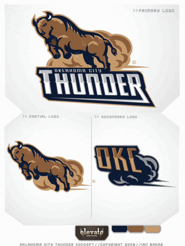
Ian Bakar’s comment is:
I can't even fathom. Just devastating. I'm a graphic designer in virginia, and here was what I had for them:

Like a thundering herd of bison.
Or,

Ian Bakar’s comment is:
Images didn't show up, check them here:
Reproducing or reposting of this image is prohibited.
On Sep.08.2008 at 09:07 PM
Ian Bakar’s comment is:
Sorry...link typo.
On Sep.08.2008 at 09:09 PM
Ian Bakar’s comment is:

anonymous’s comment is:
ephraim sorry to say but your logo does not look more professional, part of it does, I like the type treatment, but the icon is not good. I think everyone is just beating a dead horse.
On Sep.08.2008 at 10:00 PM
anon’s comment is:
Ian, I like your second concept, especially the full logo, not so much the T by itself though.
On Sep.08.2008 at 10:06 PM
Captain’s comment is:
Ephraim, your logo blows. Sorry, but it's true. You may want to rethink telling people you're a Graphic Designer. It's still okay to say you're an Okie though.
Nice job Ian. Both of your logos are an improvement on what they ended up with. I don't think either one is right for the NBA (colors are a bit too muted), but you've got chops.
On Sep.09.2008 at 03:01 AM
mj’s comment is:
Very nice Ian.
I wish you were contracted for this.
On Sep.09.2008 at 11:50 AM
K’s comment is:
I don't know what more can be said. I'm completely underwhelmed, but as an Ackerman McQueen survivor myself, I'm not surprised at the result.
On Sep.09.2008 at 12:41 PM
Ephraim’s comment is:
What I was trying to do was take the concept that they already have and tweak it. I kept the exact same color scheme as they have now. They wanted a shield so I made a better one. They picked light blue because it is the color of the OK flag. So I made a concept that better represents the flag. Look at an Oklahoma flag and you'll see why I did what I did. I wasn't making my own thing, I was just trying to fix what was already there. If I was really trying I'd have changed the crappy color scheme.
Truthfully, I love Ian's logos. they're totally bad ass and look a million times better the current logo and they look better than mine. God knows that I wish either of those were the logo on opening night at the Tunderdome/Ford Center
On Sep.09.2008 at 12:47 PM
Ephraim’s comment is:
I forgot to mention that I only spent about an hour on my logo cause I have about 20 other projects going right now.
On Sep.09.2008 at 01:00 PM
Jason Tselentis’s comment is:
As a former Seattlite, and former Sonics fan, I am thoroughly disgusted. This emblem is not worthy of appearing in a Hanna-Barbara cartoon. Please... this team will have a bleak 1st season based on the logo. Look at the other weak emblems out there, the yellow/orange NFL Buccaneers comes to mind; only when they redesigned their identity did they perform well.
On Sep.09.2008 at 03:20 PM
Tim Belonax’s comment is:
I'm confused. I thought this was their new logo?
On Sep.09.2008 at 05:12 PM
mj’s comment is:
In my opinion, the colors have little to do with the poor quality of the logo. I actually like the scheme, albeit predictable.
The quality issue comes into play in the lack of any symbol or creativity put into layout. I don't see the classic look and feel they were going for either, much too modern.
On Sep.10.2008 at 04:17 PM
rickyaustin’s comment is:
Apparently it's pretty difficult to make a proper mark, when you have to deal with a name like 'Thunder'
http://images.google.com/images?ndsp=18&um=1&hl=en&client=safari&rls=en&q=thunder+logo&start=0&sa=N
On Sep.10.2008 at 05:48 PM
rickyaustin’s comment is:
Maybe they should jump on the "Use the same Greek God clipart" bandwagon that these two pro teams already have...
Sussex Thunder (British American Football)

Stockton Thunder (American Minor League Hockey team)

chris’s comment is:
A comment and a suggestion in a single photo. A more dramatic thunder.

mike allan’s comment is:
Ian, your logo captures the essence of the team as we would like it to be (too bad they'll suck) and shows some thought. Not like the piece of crap they have chosen. Can you whip up an image of us broken hearted Seattle fans whuppin' Bennets sorry ass? thanks
On Sep.11.2008 at 04:56 AM
Joachim’s comment is:
Ephraim: I understand your intentions with your logo, but I wanted to share what I actually see instead: what I see is a basketball with icicles and a carrot floating on top of it. It's really hard to create something that clearly communicates something visually, but that's something to take into consideration that other people might not see the same thing.
On Sep.11.2008 at 12:55 PM
yumanti’s comment is:
The alternate logo work is already infringing on The Golden State Warriors' logo and their mascot, Thunder.
On Sep.11.2008 at 11:22 PM
S.J.B. Barrientes’s comment is:
I felt bad for Supersonics fans having lost their team. Clearly, the "Thunder OKC" logo should cause many of the Supersonic fans to breath a sigh of redemption. If God had known that a human would be responsible for this new logo for "Thunder OKC" he would not have bothered to create the world.
On Sep.11.2008 at 11:30 PM
Dusty Ahrens’s comment is:
Ephriam... No....
Logo's horrible, Looks like it took em 20 minutes to make that.
On Sep.12.2008 at 04:40 PM
ScottyM’s comment is:
Quite possibly the worst logo in the history of the league. At the very least, the sorriest example of 'effort' in the league's history.
Not to mention the name ... with finalists like Barons, Marshalls, and Bison ... the team absolutely BLEW the opportunity to brand itself in a unique way, with a unique name.
Not only did they rip Seattle and its history, but they ripped the mascot and parts of the logo from the Golden State Warriors.
http://www.nba.com/warriors/mascot/meet_thunder.html
On Sep.12.2008 at 07:41 PM
LA’s comment is:
as John Malkovich's character in a recent movie would say:
WHAT THE FUUUCK?
On Sep.23.2008 at 02:25 PM
Jerben22’s comment is:
The logo is horrible. Worst I have seen since the Denver Nugget skyline. Note to Clay; fire everyone in your marketing department.
On Sep.24.2008 at 03:47 PM
David’s comment is:
Practically every Single A Minor League Baseball logo looks better than this one.
Absolutely Awful.
On Sep.27.2008 at 11:27 PM
True Thunder Fan’s comment is:
Screw all of you! some fan you guys are. how bout you quit gripin over the logo and care about the team. and have you looked at some logos in the league. look at the lakers, its a basketball that says lakers. look at the knicks, its a basketball that says knicks over it. for God sakes look at the bobcats! its a freakin high school team logo! look at the pistons, and freakin a! look at the pistons! holy crap. think before you start bashing something. unlike all of you faggots im going to support my thunder and thank the lord they are here!
On Oct.09.2008 at 08:33 PM
matt’s comment is:
in reference to true thunder fan's comment, your team's logo sucks PERIOD. If you have to compare one logo to another just to make it look good, then it probably sucks to begin with. Get a grip, the logo sucks, and the team will also. your team is bound to lose, starting with the brand itself
Ephriam, maybe you should spend more time on your logos, cuz that one doesn't cut it.
Ian's almost does, except that there is ABSOLUTELY no connection to basketball, other than that, they both are very graphic and bold.
On Oct.10.2008 at 11:03 AM
SONICS fan’s comment is:
This logo just proves what a low-class organization Clay Bennett runs. You should have seen the "ads" his marketing team put together while the team was still in Seattle. Pure garbage. No imagination, no thought, just an image with type slapped over it.
This logo serves as a perfect example of the low standards to be expected from trash like Bennett.
On Oct.13.2008 at 04:53 PM
Mark’s comment is:
I don't like to hurt anybodys feelings. If Clay Bennett actually thought this logo was good, that's his opinion. I'm from Toronto, so I like the Raptors. I like the fact that the Raptor's logo has a Raptor on it. That's usually what your aiming for. Golden State has the Warrior on it. Washington has a Wizard. New Orleans has a Hornet, etc... ( I mean, shit, what's with the name - Thunder? ) There's only a handful of teams that have a logo that doesn't indentify the team name. The Lakers, the Clippers, the Pistons, and the Trail Blazers, I might be missing one or two. But they seem to work any way. This logo - is shit. The colours have been done already. It just does not look good at all. The team knows how bad it is, but their gunna have to wait at least two years to change it. I thought Ian Bakar's Bison logo was pretty damn good. Nice job!
On Nov.09.2008 at 07:29 PM
Mark’s comment is:
I keep thinking "racing team* when I see this logo.
On Nov.09.2008 at 11:26 PM
Ben A’s comment is:
As a designer - HAHAHA, this is an abominable logo.
As someone from Seattle - HAHAHA, you stole our team and all you got was this lame t-shirt!
On Nov.11.2008 at 03:10 AM
Joshua’s comment is:
There is a reason why this logo is garbage...OKC reminds me of the villain in Italian Job. The one who shoots the old man and steals the loot from everyone who was working with him. Then when they go to get revenge they find out that instead of getting material things that are original, he gets the stuff that all those he had betrayed wanted to get with their share of the jackpot.
So why are we suprised?! OKC is a cheap ripoff version of San Antonio in some ways, and Clay Bennett is mererly trying to make that team(organizationally anyway) look like the Spurs.
They couldn't get their own franchise so they lied their way into a situation where they could off a city and steal it's prize possession.
I love KD and JG...those guys went through a lot of garbage with the whole relo mess, and they will always be SONICS. But I find great pleasure in knowing that Clay Bennett is going to have, when all is said and done after this year, one of the worst teams in the HISTORY of the NBA.
It's a good thing you can't literally steal wins, or this team might actually be successful. Kinda funny, we are starting to see why Clay has been so successful. He has piggybacked on other people his whole life...now, when he has no coattails to ride he finds himself in the quicksand of failure.
Congrats OKC!
Your city is TRASH
Your team's logo is TRASH
Your team is TRASH
and soon your game attendance will be TRASH
BIG LEAGUE CITY?! Riiiiiiighhhhht!(You gotta be kiddin' me)
Oh well, at least you guys have "noodling"...hahahaha...
On Nov.15.2008 at 04:52 PM
Smookie’s comment is:
They should have been named the OKC bombers
On Nov.20.2008 at 11:07 AM
SCS3000’s comment is:
Joshua,
This is about a logo, not a city. Sorry OKC is not as "big league" as you like, but life is very good here. Lots of room to roam, little congestion, cheap houses, and peaceful compared to most large cities.
On Apr.06.2009 at 12:24 AM
Anonymous’s comment is:
But I find great pleasure in knowing that Clay Bennett is going to have, when all is said and done after this year, one of the worst teams in the HISTORY of the NBA.
Funny how they've already won more games than the 07-08 Sonics.
Here's to hoping that a redesign is only a year or two away.
On Apr.06.2009 at 10:45 AM
Comments in Brand New, V1.0 have been closed.


