

NOTE: This is an archived version of the first incarnation of Brand New. All posts have been closed to comments. Please visit underconsideration.com/brandnew for the latest version. If you would like to see this specific post, simply delete _v1 from the URL.
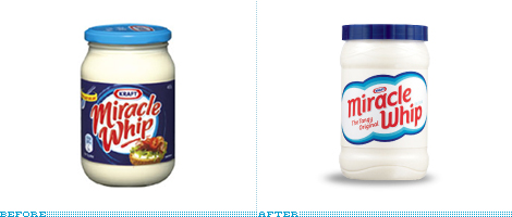
Miracle Whip, the zingy alternative to mayo, has apparently seen better days in terms of mayo-alternative ubiquity and has re-entered the market positioning itself to the 18-to-34-year-old demographic. Which typically means some sort of social application, in their case Zingr, but that’s the least interesting part of this. The new label and logo are remarkably Old School, reversing the order of Before/Afters in consumer packaging by ditching the swirls and overly friendly and loopy typography for an almost disarming simplicity. Apparently all the thrift shopping of vintage stuff by the 18- and 34-year-olds has finally paid off and that oldish look can feel new again. Fingers crossed, this will be the first of many consumer brands to revert back from the crazy scripts and wild backgrounds.
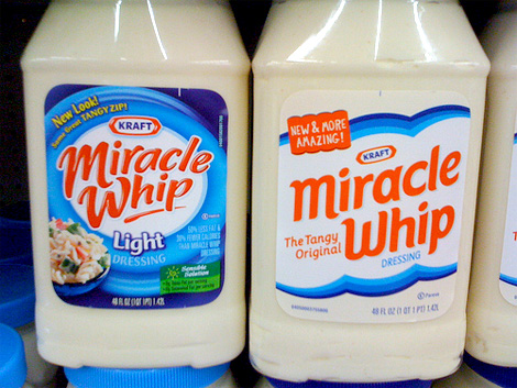
Old and new bottles, side by side. Photo by Bee Forks.
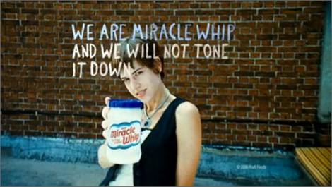
Frame from new TV commercial by mcgarrybowen. Image source.
Thanks to Brittany Forks for the tip.


Jump to Most Recent Comment
Keli’s comment is:
Their commercial text seems kind of contradictory to the rebrand? Anyways, I'm not much of a fan of the bland packaging - looks more like a store brand now. As far as standing out on the shelves I don't think this will do as well of a job as the previous packaging.
On Jun.02.2009 at 08:06 AM
josh’s comment is:
i dig it. the type on the new package feels maybe a bit too spaced out but I like the cleaness of the design. what is miracle whip anyway?
On Jun.02.2009 at 08:10 AM
Danielle’s comment is:
Miracle Whip is fake mayonaisse basically. It's not supposed to be mayonaisse, but it's supposed to be sort of like it. It's kind of tangy. I use it with my tuna for tuna sandwiches. Mmm.
I agree, the words Miracle Whip look a bit strange on the updated version. I think it's the spacing, but perhaps it's because I'm used to the words being squished together. At least they're no longer reflective, right?
And I don't know why, but I want to see that little line under the 'whip' still. It just made it seem a bit more fun. Like, "Miracle Whip!" and the line underneath was like the consumer flinging the Miracle Whip off their knife and onto their bread. Now it's like, "Miracle Whip. Dressing." Not as exciting.
On Jun.02.2009 at 08:24 AM
Conor’s comment is:
The kraft logo's angle is weirding me out.
On Jun.02.2009 at 08:42 AM
stefano picco’s comment is:
Hmmm ... first impression - looks like milky way spread :P
On Jun.02.2009 at 08:43 AM
Spiff’s comment is:
I think they should go for messier not cleaner. The commercials should have people slinging this stuff around, slapping it on walls... high energy. I mean this is a brand of *paint* right?
On Jun.02.2009 at 09:04 AM
Leroy’s comment is:
I like the old design beter!
On Jun.02.2009 at 09:10 AM
Matt Hunsberger’s comment is:
Is that really the ad? I'm insulted.
On Jun.02.2009 at 09:21 AM
James Re’s comment is:
I like it.
Clear Brand no more swooshies like in the original. I personally would be way more inclined to pick this up than the previous brand.
Retro is modern and high energy. People in the 18-34 bracket are way brand savy and the exciting high energy commercial seems to me to be tongue in cheek(whether that is intentional is unknown) but its the same product and people know its not glamorous.
An honest brand with snarky advertising.
I like it.
On Jun.02.2009 at 09:35 AM
Aaron’s comment is:
Very well done. General Mills has been using some limited edition "throwback" packaging on Trix, Cocoa Puffs, and other cereals, but this is the first rebrand I've seen to go for an intentionally retro update.
The look is clean, the lack of product shots is refreshing. I agree with Conor that the angled Kraft logo is the only miss on this rebrand. If we're very lucky, the "New & more amazing" text will only last a month or two.
On Jun.02.2009 at 09:37 AM
Taylor’s comment is:
Anyone else see Marshmallow Fluff?
On Jun.02.2009 at 09:40 AM
Dave’s comment is:
I saw a massive ad painted on a building in Toronto for this rebranding and the "we will not tone it down" line gave me a chuckle since its so absurd. But I did remember it... so I guess that's an advertising success!
On Jun.02.2009 at 09:42 AM
John Mindiola III’s comment is:
If Miracle Whip and its fans will not tone it down, then I think they should have some aggressive packaging on their product. Now THAT would stand out on the shelves.
On Jun.02.2009 at 09:46 AM
Dale Campbell’s comment is:
I'm really liking some of the cleaner design decisions being made lately.
While I don't necessarily have anything negative to say about the old design, the new design is well done also.
As a designer, if presented the two, I would pick the one on the right (newer design).
I agree that the text appears a little too loose or "spread out".
Keep well,
Dale
StagingLt’s comment is:
I far prefer the 'before' packaging. To echo some previous commenters, the new packaging looks bland. This will stand out on the shelf as 'wonderful in its simplicity'(?) until other companies join in on the trend (ala WalMart store brand, the ill-fated Tropicana rebrand), and then everything will be homogenous again.
On Jun.02.2009 at 09:58 AM
Allan Peters’s comment is:
I must say that the new jar design looks great. However it looks like the squirt bottle went through an ugly filter. All of the spacing got messed up, the placement of the word dressing is bad, and the "new and more amazing" call out needs to go. But the designer's original intent on the top jar is hot. Good job. Way to step out of the swirl machine.
I'd say it's less of a retro design and more of what coke just did. They took all of their strongest branded elements and eliminated everything else. Ritz and Oreo just did the same thing. Check them out here: http://allanpeters.blogspot.com/2009/05/new-packaging-for-oreo-and-ritz.html
marnie’s comment is:
I tend to agree that the re-brand (which I like) and the ad copy (meh) don't mesh at all.
It does look old school, which I enjoy, but I'm OLD, and half a decade outside their target market. I also agree it looks like marshmallow fluff, which, frankly, I find appropriate. I love Miracle Whip, but I don't find the product any zingier than the packaging. I've never understood their marketing around the "tangy zip" since I think of it as a quintessentially bland food. Maybe it really blew people's socks off in the 1930s but surely in today's food market of 7 thousand kinds of hot sauce it's not particularly extreme.
On Jun.02.2009 at 10:05 AM
Jonathan’s comment is:
Nice pun there Dale...
The newer design is much better, much cleaner and man do I hope everything does start to go this way. Lets please get rid of the crazy backgrounds!
I don't think the text is too loose. I like how the i sits nestled in next to the M. I like how the M and W flow. I also like the "New and more amazing" tag, that's good stuff. And I agree with Conor, that Kraft logo looks like its sliding off the bottle!
All in all, much improved!
On Jun.02.2009 at 10:06 AM
Craig’s comment is:
Only in America does mayo need an alternative...
The new packaging stands out much more on the shelf. The angular Kraft logo is a bit odd. I have never seen the Kraft logo in any other position than top dead centre.
On Jun.02.2009 at 10:09 AM
cBraunDesign’s comment is:
I can instantly think of at least three different "retro" design directions they could have gone to make this so much better. It looks supremely ordinary to me. Not to mention, that angled Kraft logo looks horrible. Oh well, as long as it still tastes better than Mayo.
On Jun.02.2009 at 10:18 AM
emily’s comment is:
i am in the target demographic, and i like the package. i still won't ever buy it, though. im a helmans girl when I actually eat mayonnaise.
The ad campaign, however.. that is absolutely absurd. "we will not tone it down" ???? what is this, free speech? leave it to mega-corporations to try to be "edgy" and "trendy."
On Jun.02.2009 at 10:34 AM
Chris’s comment is:
Wow! New and more amazing!! I'm hooked. It's like they tapped my mind while I was sleeping and pulled out the exact words that I needed to see to convince me to buy Miracle Whip. In all honesty, folks, I haven't eaten this stuff since I was five yrs. old at my neighbor's house and I'm not starting now. But good try.
On Jun.02.2009 at 10:37 AM
Nick’s comment is:
I agree with the general consensus so far. The feel of the packaging is nice but the execution is lacking in some places. But I think this is more than just a nostaglic throwback solution. To me, the new package is what the packaging should have been with the last redesign. I have a feeling that people wouldn't even be talking about nostalgia. They would probably be talking in evolution terms.
Remember this jar from 2003ish...before all the swirls and 3D type was introduced...

When I look at this, I find it very telling that the previous "swirly" design might not have been all that successful and required a bit of a reset button action. So with that said, I think the new new packaging is a good move all in all.
Now, this ad... First off, the message of the ad doesn't even come close to the message of the packaging, there is a total disconnect. Also, I'm in the 18-34 age range AND I have eaten ALOT of sandwiches in my time and I can tell you honestly that I have never, ever made a sandwich with rebellion in mind... ever. Like, Yeah! I'm making a sandwich and there nothing you or anybody else can do about it! Take that, establishment!
I can see this angle working with some products, like mountain dew (or mtn dew, whatever they are calling it now) or various candy bars but, in my opinion, going this angle with a sandwich spread is just weird and out of left field, particularly when matched against the packaging.
So... The packaging, a good step forward. The advertising, not so much.
On Jun.02.2009 at 10:43 AM
Mike’s comment is:
I prefer the old one, at least as far as the words actually go. I feel that it connects more with the word "whip" than the new one, which is just...there. There's not much "action" going on I guess. Perhaps they were trying to connect more with "miracle" with the cloud.
On Jun.02.2009 at 10:49 AM
oscar’s comment is:
I definitely like the de-cluttering of the new label, but I feel like the type needs more heft to it. I do think it's funny that it manages to be both "new and more amazing" and also "the tangy original" at the same time.
On Jun.02.2009 at 11:01 AM
Jacob’s comment is:
"We are Miracle Whip, and we will not tone it down."
Whooooa. DUDE! Bad ASSSS! *cue slashing guitar riff*
Well, that bit of pathetic cheese aside, I am really digging the back-to-the-future approach.
On Jun.02.2009 at 11:05 AM
Adam Haase’s comment is:
I've never seen that in Australia.
On Jun.02.2009 at 11:05 AM
Chris’s comment is:
Dude, this isn't your father's mayonaise. It's Miracle Whip!
On Jun.02.2009 at 11:20 AM
John does Amsterdam’s comment is:
clever, clever title ;)
and yes - it's time for an update for the good ol whip.
and nice to finally see the producer tapping into the youth of the nation; esp keeping up with current trends in consumer culture.
On Jun.02.2009 at 11:22 AM
jRod’s comment is:
you know, for years i had waited for label printers to catch up with the rest of the world, and now they are reverting back to the 2 or 3 color look. it makes no sense to me.
On Jun.02.2009 at 11:27 AM
Beth’s comment is:
I actually like the simplified look. I think it's a nice trend to see brands moving away from overly-flashy, ugly color combos that aren't going to be "cool" in a year or two anyway. I'd like to see more brands going with looks that can really last.
On Jun.02.2009 at 12:04 PM
Chris R.’s comment is:
I love mayonnaise. I dip my french fries in it, but every time I look at it think about what mayonnaise actually is, it's disgusting. Therefore, I cannot figure out why every mayo brand seems to put their product in a see-thru container. Come to think about it, I typically only use mayonnaise in packet-form. I know Miracle Whip is different than mayonnaise (but equally repulsive to think about even with half the fat), but I wish they could have cleared up that container issue for me.
On Jun.02.2009 at 12:06 PM
Dennis’s comment is:
Miracle Whip bought out the entire Elevated "L" train stop (billboards, electronic signs and even underfoot static cling mats) at Wrigley Field in Chicago. I'll post photos when I can.
On Jun.02.2009 at 12:51 PM
Lauren ’s comment is:
I like retro, but this is too store-brand for me. And I am indeed the target demographic.
I think it's because of the white-on-white. The simplicity is a nice change but for me there is little to no impact. Plastic jug is "eh".
It's nice on the old one to see the pasta salad, because you don't eat it plain. Nobody thinks, "I'm going to eat a bowl of Miracle Whip for lunch." Having the end-result shown, be it sandwich or pasta salad, is more enticing than pasty-white jar with orange type.
New and Amazing! Hehe
On Jun.02.2009 at 01:02 PM
Kevin Zwirble’s comment is:
I think that in their marketing they're targeting kids who grew up with parents that bought this for them. Why make it retro? To rekindle a connection with the consumer based on the assumption that they grew up with the product.
I think that's a smart move, but I'm also biased because I'm a big fan of less-more in packaging. In high school and college I worked in a grocery store, and being a designer I shuddered at all the bad design that surrounded me. I think the simple, almost all white packaging will stand out on the shelves against all the packaging that looks like the previous version. Kudos!
On Jun.02.2009 at 01:12 PM
Kale’s comment is:
First, this comment is biased because I think Miracle Whip is one of the easiest ways to wreck a good sandwich. With that said, the design is okay. Seems like you might notice it on the shelf compared to the old design, but after noticing it I would think it was a store brand. So is that really a positive gain?
In the end I think they would be better off coming up with a new name or recipe. With organic being the trend, why would someone want to try something that was a miracle of high-fructose corn syrup and sugar?
We will not tone it down? That is too funny. No one is going to start making sandwiches differently because of a commercial.
On Jun.02.2009 at 02:00 PM
Jeff’s comment is:
I think the tag lien should read:
"We are Miracle Whip: OUR CAPS LOCK KEY IS LOUD!"
On Jun.02.2009 at 02:01 PM
LB’s comment is:
This didn't read "retro" or "generic" to me. It just looked like a cleaned up version of Miracle Whip.
Whenever I see Miracle Whip advertising their tangy zip, it reminds me of what my brother, a mayo purist, says, "I think that tangy flavor is something they just couldn't get rid of."
On Jun.02.2009 at 03:11 PM
Sand’s comment is:
Reminds me of another white spread

I like the newer cleaner design (hope the orangey-red is just the photo) but I think non-designers and everyday consumers who are less critical would lean towards the old design.
lucid’s comment is:
Yawn!
This is not retro... the past was never this boring. In the past the typeface would have been more exciting. Google it for yourselves.
Boring and generic!
On Jun.02.2009 at 03:54 PM
hofn’s comment is:
I need to see more packaging photos of this rebrand. Right now, looking at those two bottles next to each other, the only words that come to mind are "why bother?"
I've also noticed a decline in this blog of posts on rebranding of american companies/products.. a sign of the times, i guess
On Jun.02.2009 at 04:12 PM
Glenn Sakamoto’s comment is:
"No school like the old school"
– From Pixar's The Incredibles.
Marianne Elwell’s comment is:
I like the packaging, but since I don't like mayo or Miracle Whip, I wouldn't buy it for myself. It does remind me of Marshmallow fluff which I love, of course!
On Jun.02.2009 at 04:44 PM
Robin’s comment is:
I like how the packaging industry seems to be swinging towards the simple rather than the flashy. I hope this reflects our generation.
But really, "we will not tone it down"? Do your amps go up to 11, Miracle Whip?
On Jun.02.2009 at 05:25 PM
John Mindiola III’s comment is:
After looking through the new Miracle Whip site, it's making more sense now. The whole ZINGR effort actually seems pretty smart, hip. I mean, talk about brand-influence and emotional-connect with a product!
On Jun.02.2009 at 06:06 PM
Jason’s comment is:
Not sure why but this new direction clicks with me.
On Jun.02.2009 at 06:28 PM
Paul’s comment is:
well it gets rid of all those light swishes and swirls...that all shelf based foods are using now.
refreshing.
it also looks kinda old school which I like.
as for what the product actually is ... I think I just threw up a bit in my mouth. fake mayonnaise! WTF!
On Jun.02.2009 at 07:08 PM
Molly Bennett’s comment is:
I agree, it looks like a store brand. It also kinda looks like the "before" of the Wonder Bread rebrand...
On Jun.02.2009 at 08:41 PM
izzy’s comment is:
Good improvement, except for the Kraft logo -- I can't get past it... it's puny size and its weird angle make it very awkward and (I'm sure) a lot more noticeable than intended...
I think in general the label feels a bit too forced, like it's wanting to make sure everyone gets that it's retro and edgy. It lacks charm and authenticity, and could use at least some appetite appeal... a little something that'll make me keep thinking "WIMP" every time I read "WHIP."
On Jun.02.2009 at 08:46 PM
2fs’s comment is:
"We are Miracle Whip and we will not tone it down"? With a vaguely snarly hipster girl standing at an angle shoving the enormous jar into the lens? I mean, if yr gonna go for the "rebellious youth" thing why not take advantage of the name and have a full-on dominatrix present the product? That would be marginally less stupid and condescending than trying to make faux-mayo "extreme" and "rebellious." Are we entirely certain that ad still isn't from an "Onion" parody?
On Jun.02.2009 at 09:24 PM
GreenCouch’s comment is:
I fell in love with the new jar the second I saw it. I actually bought Miracle Whip for the first time in over a decade and promptly went home to spread it on a turkey sandwhich. I forgot just how good it was.
On Jun.02.2009 at 11:00 PM
Donald G Wooten II’s comment is:
Not a Miracle Whip fan, but I do see the logic in the branding shift.
As far as mayo goes, you want to see white. All white as a matter of fact. Any color inside the jar is vomit worthy. I think they wanted to emphasize the, and I mean this aesthetically, "pure and clean" nature of the product. The text is clean but flat (not fluffy). It definitely won't help confuse the shelf.
They put a bullet through their boot with the "new and more amazing" line because its the same old stuff in a brand new bikini. Also, after all these years, no clear definition on what this is? A customer still determines what Miracle Whip is by its competitors on either side of the shelf. Scary yet corporate.
robbert’s comment is:
The execution needs work, but I do like the approach.
Too many packs look like they've never met a photoshop effect that they didn't like – all glows and highlights, drop-shadows and vignettes. Add to that call-outs and flashes and icons and the average pack starts looking more like a brochure than a logo.
And after all, that is what a good pack should be: a logo made solid.
On Jun.03.2009 at 11:49 PM
Jake’s comment is:
I don't like the new design at all! It looks like some supermarket's own branded cheap label. Yuk!
On Jun.04.2009 at 05:08 AM
Adam’s comment is:
I'm surprised no one's yet commented on how the old packaging still has its "NEW LOOK! Same great tangy zip!" callout on it. So for those of you wanting a quick exit for the "New and more amazing!" callout on the new packaging, prepare to be disappointed.
One thing I noticed from the 2003 evolution is that they finally changed it from "salad dressing" to just "dressing". Because really, who *ever* put this stuff on a salad??
Total disconnect between marketing and design here. Kraft logo looks foolish on that angle. Personally, I liked the darker label on the previous design. White label on white product has no visual flair; it goes past "clean" and right to "sterile".
On Jun.04.2009 at 11:19 AM
Tom’s comment is:
I prefer the old brand and its "overly friendly and loopy typography". The old type is well-crafted. It has personality and rhythm, and the background swirls a nice allusion to "whip."
The new packaging, with its clumsy type, pointless angle, and vector "clouds" looks poorly designed by comparison. It's different, but certainly not better. My two cents.
On Jun.04.2009 at 12:24 PM
Estel’s comment is:
I think it is too clean.
White on white, plus the sanitary blue, and the red.. makes me think of Harpic or some other cleaning product.
Well executed though; aesthetic.
On Jun.04.2009 at 05:36 PM
Panasit’s comment is:
I don't "feel" anything significantly different between the two. And I think the change is just an update rather than a redesign.
On Jun.04.2009 at 10:10 PM
Melissa’s comment is:
I much prefer the new version. How could anyone prefer that mess of a "before"? Please let us move away from that type of packaging!
I love the idea that we might be going back to a more classic and refined look with grocery store packaging. I hate being at the store and having a million different brands screaming for my attention with their swirls, gradients, crazy type, and bright colors!
The ad... I know what they're trying to do. I think thats the problem! We're all like "Ohhh...okay, Miracle Whip, we get it. Sure, sure You're very "hip". Yes, we promise..." Meanwhile we're rolling our eyes and mouthing "No you're not"...
Please don't try to sell us Miracle Whip by pretending it's edgy. It's Miracle Whip. That's all. It's a condiment for sandwiches. Which is all that new packaging says to me and that's why I like it! It doesn't seem like it's trying so hard.
On Jun.05.2009 at 01:32 PM
aratoh’s comment is:
Never realized it was "dressing". Not thrilled about the clouds, the cleaner look is an improvement.
On Jun.08.2009 at 02:52 PM
daho’s comment is:
I agree with another poster - it looks light and airy like a marshmellow brand.
Sidenote, in design school in the late 80s, one rule we were taught was never to use BLUE in food product labels. I never liked those professors and their stupid "rules" anyhow...
On Jun.08.2009 at 04:28 PM
Mo’s comment is:
Just wanted you all to know that it is not just the packaging that has changed. Most of the ingredients have also changed and not for the better. It tastes nothing like the tangy Miracle Whip we all love. I even wrote to the Kraft Company about it. This is their response.
Thank you for visiting www.kraftfoods.com and I'm sorry to hear you were disappointed with our product.
The formulation of MIRACLE WHIP Salad Dressing has indeed changed and I'm sorry you were disappointed with your most recent purchase.
We conduct quite a few tests before our products are introduced into the market place. We only launch our products when we know that the majority of the consumer testers enjoyed them. We work hard to appeal to the taste preferences of all of our consumers.
So in essence, they are saying too bad for you, it is different now.
On Jun.08.2009 at 05:22 PM
Aggie’s comment is:
I totally do not agree with the notion that simplistic packaging looks like a generic store brand. We, as consumers, are so used to seeing hideous packaging graphics: awful, distorted type, drop shadows, whooshies, swirlies, that we don't even see a good layout when it's right in front of us. I love the new Miracle Whip packages. I'd like to see more stuff like this!
On Jun.09.2009 at 11:49 AM
Bill’s comment is:
I would have to disagree with Mo. The ingredients have changed for the better, I think anyway. They now have Sugar (as opposed to HFCS). I tasted it and its just as good, if not better. I went to the facebook site and they also indicate this under the info tab. Not sure which product Mo was tasting.
On Jun.10.2009 at 04:42 PM
kirk’s comment is:
dont be fooled. this isnt marshmellow fluff.
On Jun.11.2009 at 03:15 PM
Jason’s comment is:
Why does this look like marshmallow fluff instead of mayo?
On Jun.16.2009 at 10:52 AM
greho’s comment is:
The trend is organic... well, not totally so... though I did find some all-natural salami the other day. Awesomely good stuff. As good as any I've had visiting Italy or Germany.
Miracle Whip is indeed now made with sugar once more, and not high-fructose goo. It's ingredient list is now much shorter. So, yeah, it's goo, but it's less-bad-for-you goo.
As for the taste, it reminds me of how it used to taste, before they sexed it up with a chemistry set.
And why do I know these things when I stopped buying the HFCS-based Miracle Whip two years ago in favor of olive-oil-based mayo?
Because of the new packaging. I saw it. I went "ooooh..." And I picked it up, read it, and bought it. So, it worked.
On Jun.19.2009 at 07:10 PM
Brian’s comment is:
I like it. It seems more light, more white, less "cereal boxy graphics." The "New & More Amazing" tagline is cute. Mayonaise is actually a pretty gross product, but they've made it seemed like a light and tasty friend—I would say that's a job well done.
On Jun.20.2009 at 03:34 PM
Woody’s comment is:
I have no problem with the redesign of the label. I do have an issue with the redesign of the product inside the jar. Why are they tinkering with the formula again? Is this a reversion to the "old" formula? Not likely... (Of course, if it is, I'll be first in line, but they don't say one way or the other.)
On Jun.27.2009 at 10:21 AM
Mark’s comment is:
BIG improvement.
I like the restraint, well done.
The previous one had way too much stuffed onto one label, good to slart over with a clean simple slate.
On Jun.28.2009 at 05:09 PM
Anonymous’s comment is:
I too quit buying miracle whip, a childhood favorite, when I began boycotting HFCS. We switched to regular mayo as a result, but I've never been able to shake the full-fat guilt. I saw the ad for the "new" whip the other day and barely noticed the goofy ad campaign because my heart lept with the hope that the switch had done away with the HFCS. Now that I know it's true, I'll definitely buy it again! No HFCS, THAT should be their marketing ploy.
On Jun.30.2009 at 06:58 PM
Brad’s comment is:
Read: "We are Miracle Whip, and we will not go silently to our grave."
Although that would certainly seem preferable to this desperate, feeble attempt at rebranding a fundamentally un-cool, un-healthy, edible food-like substance.
On Jul.05.2009 at 07:52 PM
Comments in Brand New, V1.0 have been closed.


