

NOTE: This is an archived version of the first incarnation of Brand New. All posts have been closed to comments. Please visit underconsideration.com/brandnew for the latest version. If you would like to see this specific post, simply delete _v1 from the URL.
![]()
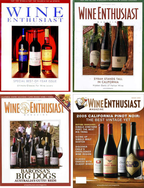
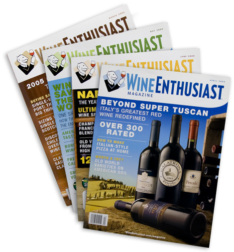
Time for a palate cleanser after all that soda talk: Founded in 1979, Wine Enthusiast Companies has been providing all things wine — from products like glassware, refrigerators and wine racks, to tasting events, and to a magazine for, um, wine enthusiasts — to the ever growing market of wine consumers, from experts to novices and everything in between. For better or for worse, wine has become less the domain of experts who can sniff and swirl their way through a tasting flight to a broader market that buys their wine from Costco. (A good friend of mine and wine snob, actually praises their selection so that last sentence isn’t meant as an insult). Wine Enthusiast Co. realizes the need to expand into a broader market and that its identity should reflect the eclectic wine audience. Working with New York-based CBX, they created a whole new identity for their broad range of offerings.

The biggest change comes in the form of the age-defying Winston, the face of Wine Ethusiast. Originally born as Lord Winston in 1979, wearing an ascot and with his pinky finger properly raised he smells his glass of wine. Well, no more Mister Lord. Now, just Winston, he wears a sweater and a button-down shirt and smiles as he raises his glass in a toast. More friendly and approachable for sure and looks like the kind of cool, old guy that you would want to hang out with. No offense to cool old guys. I like the new personality of Winston, but I like the old execution much better with the more consistent line thickness, as opposed to the new one that has a lot of thicks and thins. Ironically, the new Winston style goes better with the old typography and the old Winston style goes better with the new condensed sans serif.
The rest of the materials carry on with the same update of taking it from stuffy and serious to friendly and accessible. The result is a nice update that should take away the intimidation factor for newcomers but it’s still elegant and confident enough that the more experienced oenophile will not think less of the brand.
And here’s a nice treat, courtesy of CBXer David Weinberger who worked on this project. A 7-foot poster that served as a visual audit at the beginning of the project to explore what wine is and what it could be. You can click on the image for a bigger view.


Jump to Most Recent Comment
Dale Cruse ’s comment is:
Winston's nose looks much less pointy now as well!
On Oct.27.2008 at 08:12 AM
Jeff’s comment is:
Do not pass "Go," do not collect $200 ...
On Oct.27.2008 at 08:22 AM
Tomasz Ronda’s comment is:
hahaha, Jeff's comment is spot on!
On Oct.27.2008 at 08:30 AM
reyarts.com’s comment is:


john’s comment is:
I'm not a wine snob, and I like this redesign very much. Well done.
On Oct.27.2008 at 08:44 AM
Rodrigo Müller’s comment is:
nice redesign, nice reading, love the colors!
On Oct.27.2008 at 09:01 AM
mingshi’s comment is:
Thanks for the brain-storming chart. Always interesting to see what thoughts had gone through to the end.
Yet Winston is not really needed on magazine headers, is it?
On Oct.27.2008 at 09:09 AM
sra’s comment is:
Winston looks a lot friendlier now (and maybe a little sloshed), I like it.
On Oct.27.2008 at 09:32 AM
matt’s comment is:
Overall, i think the redesign will work well. Winston is much friendlier and hipper, no stuffy tie and shirt buttoned all the way up.
In contrast to Armin's comments on the line weights, I believe the thick and thins give it more personality than just 1 single weight. Winston now has character, something everyone can relate to, especially the wine itself.
The typeface i'm not so sure of, sans serif, just like every other logo nowadays. I think the serif was more appropriate, it gave it that level of elegance/sophistication which it lacks now...
On Oct.27.2008 at 09:42 AM
Walt’s comment is:
FYI... the link to the poster is going to the wrong image.
On Oct.27.2008 at 09:43 AM
matt’s comment is:
and he's not trapped in a circle now either, let winston be free... kinda
On Oct.27.2008 at 09:43 AM
Andrew Klein’s comment is:
I guess he has a preference for red wines?
On Oct.27.2008 at 09:57 AM
Armin’s comment is:
> FYI... the link to the poster is going to the wrong image.
Oops. Corrected.
On Oct.27.2008 at 10:07 AM
John McCollum’s comment is:
I think that the illustration update works well. Still iconic, but less idiosyncratic. Good.
I'm not terribly impressed with the type treatment. It's overly generic and ties poorly to with the illustration, lending the whole thing a clipart/comp look.
On Oct.27.2008 at 10:19 AM
Pedro Rocha’s comment is:
yey! how enthusiast! Give him another galss of wine, please...;)
On Oct.27.2008 at 10:34 AM
jRod’s comment is:
its a good logo, but i am not a fan of the 2 tone blue wordmark. in this case, i wouldn't have crammed the words together, using the capital letter as a separator.
On Oct.27.2008 at 10:35 AM
Lank Thompson’s comment is:
Winston could be giving a toast, but he could also be swirling the glass to check the "legs" so it works for both audiences—spitters and swallowers.(sorry)
Nicely done.
Pedro Brito’s comment is:
This made my day :)
On Oct.27.2008 at 10:43 AM
felix sockwell’s comment is:
that one weak ass drawing.. the form is diluted (unstable) and looks like clip art.
pls notice the color.. Hey, its Kool-Aid!
On Oct.27.2008 at 10:52 AM
Miles’s comment is:
Yeah, I think I'd have gone with a seriffed typeface, but maybe not the same one they originally had. Though I do think the face they chose looks a lot better actually in context on the magazine covers than by itself.
On Oct.27.2008 at 11:21 AM
Malcolm’s comment is:
I agree with Felix - the color of the wine in the glass is just wrong. But look closely at the wine in the glass – I think I know where Pepsi's wave went.
I'm not liking the magazine flag. The white background for the flag, combined with the clip art feel of Winston, make this look more like a newsletter.
Robert’s comment is:
I think they missed an opportunity here. Why doesn't the rounded rectangle match the angle of the W in Wine?
On Oct.27.2008 at 11:28 AM
Ragdoll’s comment is:
I disagree that a flat line weight looks better than one with more contrast. The contrasted weight, with thicks and thins, gives more definition and depth to the icon.
I do, however, agree that it should be paired up with the serifed font. It has a nice classic look, and, anyway, the tends are swinging back toward serifed fonts.
Finally, one detail that should be discussed is the change of Winston's preferred hand. He's now a righty who is turning his back toward us. His arm is blocking us from approaching him. The older logo allows Winston to open up his stance, turn toward us, and welcome us in.
On Oct.27.2008 at 12:00 PM
Big Daddy Cool’s comment is:
ClipArtEnthusiast
On Oct.27.2008 at 12:47 PM
colormist’s comment is:
Before: Winston Sober
After: Winston Sloshed
Having never seen either before, I have a preference for the old brand, but I can see where they'd want to dump the stuffy image. I'm not a big fan of wine, so I probably wouldn't read or purchase from either venue.
On Oct.27.2008 at 02:04 PM
koyo’s comment is:
Nice Work.
On Oct.27.2008 at 03:19 PM
koyo’s comment is:
Nice Work.
On Oct.27.2008 at 03:23 PM
EMD’s comment is:
Why does the cover need to say "magazine"?
So I don't get it confused with Wine Enthusiast Newsletter?
I really think the masthead works well, and the rounded end is a nice touch.
On Oct.27.2008 at 03:51 PM
ScottS’s comment is:
I don't consider myself a wine snob, but I do consider myself a design snob. Either way, I'm not liking a cartoon on an otherwise "serious" magazine. For oenophiles I just don't see the appeal to this rather cheesey clip art. Ascot or not, sipping or toasting, I just don't get the relevance of Sir Winston (and one could argue that his age may make it seem like this mag is aimed at an older/more senior audience). I think the nameplate--and cover as a whole--would be improved w/o good ole Winston (sorry old boy)!
On Oct.27.2008 at 04:22 PM
George - LogoDesign.org’s comment is:
LOL @ all the Monopoly references - that was the first thing I thought too..
On Oct.27.2008 at 04:41 PM
steve’s comment is:
the original had a more authentic quality about it - akin to the New Yorker illustrative style.
while the brief probably contained familiar objectives such as - 'make it modern and accesible', this is too playful to me. it doesn't speak to
the wine experience.
Wünderwoman’s comment is:
Sweet and saucy.
Nice work.
Muireadhaigh’s comment is:
I'm surprised anyone here thinks this redesign works. It should have marked Winston's eulogy. The illustration is amateurish, the logotype is terrible (and obviously "narrowed") and the magazine cover design is a ham-fisted mess. Helvetica black and condensed in all caps for wine?
On Oct.27.2008 at 07:45 PM
Mark’s comment is:
*tries to avoid any reference to the Monopoly guy*
not bad.
On Oct.27.2008 at 08:42 PM
Stuart McCoy’s comment is:
I am a wine snob and a design snob. My wife and I did a wine themed kitchen design when we bought our house a few years ago with a 54 bottle wine refrigerator as a nice centerpiece. The wine snob side of me likes the new design. I have no problem with a character like this.
The design snob side of me, however, has a few problems with the logo. First the top of the glass looks awkward. I get that they were trying to show the rounded shape but the angle seems off and it would have just been better to have it slightly curved up or flat (my preference being flat). I like that CBX used a condensed sans serif and used an actual small caps face but I don't really care for the two-toned look of it nor do I think it was probably the best choice for type faces. It;s not horrible and for a magazine masthead it works but I don't think it says "Wine Enthusiast". Perhaps a serif type face might have been a better choice. There are still lots of good ones out there begging to be used.
On Oct.28.2008 at 12:31 AM
Glenn Sakamoto’s comment is:
It looks more modern and clean, but it lacks the charm of the original.
On Oct.28.2008 at 12:12 PM
altoption’s comment is:
Makes me want to spit.
On Oct.28.2008 at 12:26 PM
eric’s comment is:
Overall I like the re-design. The only thing that bothers me is how his mouth almost looks like the back side of his collar. The negative space seems a really weird.
On Oct.28.2008 at 12:47 PM
marnie’s comment is:
I like the new personality of Winston, but I like the old execution much better with the more consistent line thickness, as opposed to the new one that has a lot of thicks and thins. Ironically, the new Winston style goes better with the old typography and the old Winston style goes better with the new condensed sans serif.
I agree with this completely. I think they could have found a better way to goose up ol' Winston.
On Oct.28.2008 at 03:03 PM
Goffredo Puccetti’s comment is:
Nice works.
On Oct.29.2008 at 02:10 AM
Mongoose’s comment is:
Now this is pleasant to see. We've got a repositioning that's headed right where they're aiming for: 'Enthusiast' over 'Snob'. The font I'm not crazy over, it looks a bit too condensed.. but it's legible enough, combined with the large teaser type and the fact that wine bottles are all over the cover, no one will confuse this for CatFancy.
The old logo reminds me rather of the logo of The New Yorker, which is gloriously stodgy and iconic. But Winston doesn't need to be Eustace Tilley; better that he be approachable, avuncular, and I think that's well-carried in the logo. He's raising the wine, either to toast or to admire, and that smile is a nice touch. He's enthusiastic.
What I'm not quite sold on is the blue box he rises out of; it seems to be a little too... beer-drinker instead of wine-drinker. Wine should after all be allowed a little snooty formality. It's a nice color, and with the red of the wine makes for a nice bit of logo pop, but the tilted square just doesn't work for me.
I give it an A; it's an almost textbook perfect update of a logo.
On Oct.29.2008 at 12:26 PM
oeseyin’s comment is:
Seeing the new Winston, the first thing I thought of was the subtle redrawing of KFC's colonel Sanders from a couple of months back when they got rid of his bow-tie and slapped and apron on him.
On Oct.29.2008 at 11:46 PM
Josh’s comment is:
I like it. Very Clean, Very neat. And a big improvement on Winston.
On Nov.01.2008 at 05:31 AM
Paul’s comment is:
works for me ... cheers!
On Nov.02.2008 at 10:30 PM
Randy Hill’s comment is:
I don't like it. It looks like something made out of clip art. At least the old "look" looked more serious.
On Nov.05.2008 at 01:12 PM
Comments in Brand New, V1.0 have been closed.


