

NOTE: This is an archived version of the first incarnation of Brand New. All posts have been closed to comments. Please visit underconsideration.com/brandnew for the latest version. If you would like to see this specific post, simply delete _v1 from the URL.
![]()
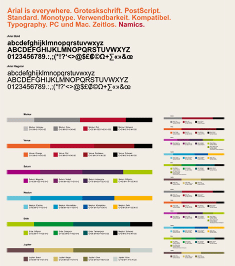
The background on this will be brief as I lack in German fluency. Namics is a web design and development, and information technology company based in Frankfurt, Germany and from what our generous tipster informs us it is one of the biggest in Europe. They recently launched a new identity, designed by Zurich based firm Heads, that replaces their ambiguous icon for an ever-changing wordmark.
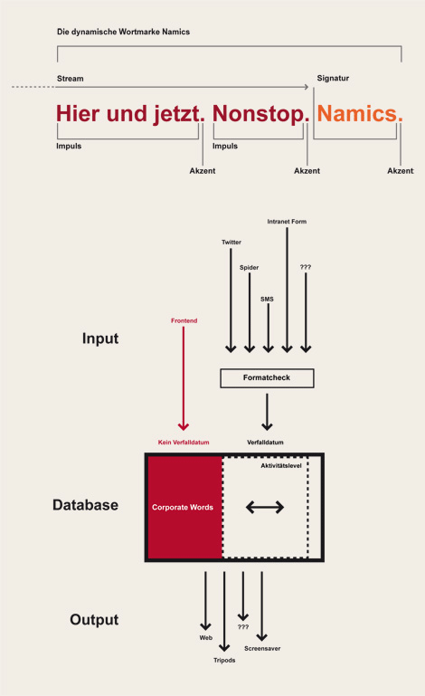
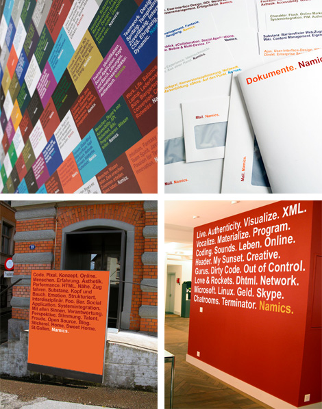
Labeled by Head as “the world’s first ‘Real Time Corporate Identity’,” the Namics logo is a constantly fluctuating identity based on words preceding the Namics name, that are input by its employees through any number of methods, be it Twitter or SMS. The effect is, of course, best appreciated on the web site, where the logo restarts itself over and over with a new group of words. But if you look at the project page on Head’s web site, you can see that the result feels as dynamic in print as it does online.
The best part is that the identity is set in… Arial.
Thanks to Adrian Nussbaum for the tip.


Jump to Most Recent Comment
Jake’s comment is:
Love it! Modern, clever and unique. I was initially concerned about the practicality of implementing this identity in print, but I think it works just as well as online.
On Jun.25.2009 at 08:52 AM
Chad’s comment is:
I do wonder if this choice of Arial is part of the joke of how few fonts are available for designing on the web. I certainly wouldn't pick Arial for any OTHER reason.
On Jun.25.2009 at 08:56 AM
obse.’s comment is:
wow.
On Jun.25.2009 at 09:23 AM
awesomerobot’s comment is:
Sounds like form is following function as far as the arial bit goes.
On Jun.25.2009 at 09:35 AM
Danne’s comment is:
I think it's really smart. It isn't even bothering me that it's in arial, and if they used it to reinforce the concept, then I like it even more.
Sehr gut!
On Jun.25.2009 at 09:46 AM
john’s comment is:
I predict Andrew Sabatier will mess his pants over this.
On Jun.25.2009 at 09:49 AM
David H’s comment is:
It looks interesting in print to me, but when viewing it on the Web, I think it looks like default header text. Even though I knew the words up top were part of the "logo" of the site, I still thought the site felt empty without a graphic of the company's name or logo.
On Jun.25.2009 at 09:51 AM
Manuela’s comment is:
Amazing, it is a new concept within corporate identity, no static logos anymore! It's something like the guys that won that FWA award with a site in youtube. They just go beyond the limits!
On Jun.25.2009 at 09:55 AM
Jenni McKay’s comment is:
I initially scoffed when I saw the before and after, but did a 180 once I read the rationale. What a brilliant idea! Here's my blog response to this post.
On Jun.25.2009 at 09:58 AM
Carlo’s comment is:
Bravo.
Wait, hmmm. Yeah - bravo.
No wait. Yeh - definitely bravo!
Sand’s comment is:
I didn't immediately like it. But as the rationale settled in... I found it quite refreshing. Even the use of Arial helped distinguish it from other type-centric designs (because it's not Helvetica)
I'm still learning about "brand" and as a graphic designer... How does a company develop equity if it has a "constantly changing nature"?
My lack of knowledge aside, I still think it's clever and cool.
On Jun.25.2009 at 09:59 AM
Plamen’s comment is:
This is what they call "debranding", isn't it?
On Jun.25.2009 at 10:08 AM
Chad Kaufman’s comment is:
I love identities that take on this form of transformation. Creating a system as an identity rather than simply a mark for companies with rather ambiguous operations is a plus. But not for school like this odd mark:
![]()
When I first saw the before / after, I thought we were in store for another hard to handle identity, but the execution of this is great (and would be even better if I knew what it said). Love the color palettes.
On Jun.25.2009 at 10:08 AM
Ethan Allen Smith’s comment is:
This branding is absolutely diabolical. And I mean that as a high compliment.
On Jun.25.2009 at 10:19 AM
Ryan Adair’s comment is:
Very slick...
On Jun.25.2009 at 10:31 AM
ScottyM’s comment is:
It looks terrific in old-school print representations.
Mail. Namics.
Document. Namics.
Memo. Namics.
That's really cool.
I'm ambivalent about the web application. In some ways it's great (real-time updates that precede the corporate mark), some not so much (Arial as a web font looks pixilated ... and therefore "unfinished" as a mark, IMO).
I think there will be lots of imitators real soon, though. Overall, nice work.
On Jun.25.2009 at 10:37 AM
Ryan Gonzalez’s comment is:
Strange — not so conventional as usual. Arial? I've never seen something set in Arial, opposed to Helvetica, when there's a professional redesign.
I do like periods, though.
And the dynamic logo through SMS/twitter is pretty original.
On Jun.25.2009 at 10:56 AM
StagingLt’s comment is:
I've never typed this before, but...
Meh.
On Jun.25.2009 at 10:56 AM
Impossibly Stupid’s comment is:
It's well-executed for what it is, but I can't help being left with the feeling that they're trying a bit too hard to be hip. It reminds me too much of those motivational posters where you're supposed to read some deep meaning into a word and a picture, only they ditched the picture here and went for the thousand words it is worth.
In the same way, it is overly ripe for parody, just like despair.com has parodied motivational posters. For example (it'd look even better if I could set the font/color):
Bland. Generic. Uninspired. Overpriced. Smelly. Keyword Spam. Namics.
or
Developers. Developers. Developers. Monkey Boy. Microsoft.
And what could Namics even do about it? Maybe German laws are different, but I don't see how that's a brand they can control. It's just a list of words, a common font, and some basic color schemes. I can't wait for the first silly legal battle over it.
On Jun.25.2009 at 11:08 AM
Andrew Sabatier’s comment is:
I admire this approach to brand identity.
Adaptive identities reflect more closely the experience of a brand. The more dynamic an identity, the more dynamic the experience. The trick is to find a unique system that is rich and immersive enough to be memorable.
The Namics system has been properly owned, is well handled and makes sense relative to the name but I think the system highlights the limitations of the overall approach. This identity is very cerebral and has a highly constrained emotional range.
Information by default implies linguistic information. Dynamic names I get. Great for a lingistics-based brand. Namics suggests that all information is linguistic or subject to linguistics. Namics may believe this but the rest of us shouldn't be expected to.
There might be clever systems behind the brand that help generate the identity but this identity is more clever than it is intelligent. Web development no matter how semantically-oriented towards Web 3.0 manifests itself, to a significant degree, in the visual, gestural and emotional range of experience. Names and tags may enable handling of material online to deliver rich and immersive experiences but the names and tags in themselves are not rich and immersive.
If by this new branding, Namics is suggesting that information technology spans only the linguistic range of communication then they've built a redundancy into their brand. Their approach is credible up to a point but not compelling enough to mark out an outstanding brand identity or brand experience.
A.
Alex B.’s comment is:
fyi, the words mean:
"Thinkers. Agile.
Piping Hot. Effective.
Humans."
I love it!
On Jun.25.2009 at 11:27 AM
JoshV’s comment is:
@ScottyM How Arial is rendered in a browser depends on the browser, OS, or both. Looks great in Firefox and Safari on my Mac!
On Jun.25.2009 at 11:47 AM
Yotam’s comment is:
Love it. Including the Arial.
The most original aspect about this, imo, (besides the whole real-time-logo thing) is the fact that not only the words change, but also the length of the logo. it could be 2 small words, or a whole page.
Robert’s comment is:
Excellent idea - really like it, although I doubt if you would really want the brand namics to be associated with "dirty code" and "out of control"?
Be careful which words are placed before the brand ;)
It is nice to see something so fresh and yet simple.
On Jun.25.2009 at 12:11 PM
Mo’s comment is:
It's clever, but I wonder how manageable it will be over time. When a new employee needs business cards, will Namics be billed an hour's creative for thinking up a new set of words?
On Jun.25.2009 at 12:13 PM
Ismael’s comment is:
I do like the concept. It's refreshing.
That being said… Arial? Really? You couldn't have used anything else?
On Jun.25.2009 at 12:22 PM
Rodrigo Müller’s comment is:
oh my God, I've never thought that such a perfect branding could be done with Arial. lots of props for that, the result is amazing!
On Jun.25.2009 at 12:24 PM
damon’s comment is:
I love this.
when I firs saw it I thought blah, but once I realized it was dynamic it's incredible for a web dev company.
arial is a widely used web safe font (why there aren't more I don't know) and despite the fact that it isn't exactly cutting edge, you can't exactly say it's hideous or doesn't work.
I think this is cool as hell, but I like concepts, many people here just like execution.
On Jun.25.2009 at 12:49 PM
Dan’s comment is:
It's really nice to see the idea of corporate identity being something dynamic, embracing the idea that a corporation is made up of the people that work there and letting the brand reflect that. My only critique is that visually it lacks any emotive quality and perhaps feels more sterile where it should feel more personable.
On Jun.25.2009 at 12:58 PM
ben K’s comment is:
I'm quite surprised with the overwhelming applause for this design. My reaction: it's not a logo, it's a marketing campaign. There is no logo anymore. You are just critiquing a campaign (which, in itself, I like too).
Campaign idea: thumbs up.
Utter lack of logo: thumbs down.
damon’s comment is:
^^^^I agree, even doing something simple in a badge for their company name wouldn't have hurt the concept and would have made it more lively.
On Jun.25.2009 at 01:31 PM
Joerg’s comment is:
How refreshing!
On Jun.25.2009 at 02:09 PM
ScottyM’s comment is:
^^Maybe this is another step toward completely confusing the public about brand positioning, brand development and branding (chuckle).
With so many people mistaking a logo as "the" brand ... it only serves to further confuse folks. Conversely, I think it does a nice job of pulling it all together:
The logo = Namics.
The campaign = All the funky words people choose to use before the logo. And its implementation across various media.
The brand = Employees dynamically choosing those words and thusliving the corporate lifestyle. Plus, the public's interaction with this campaign in unique ways.
Joey V’s comment is:
It's perfect for a web-based company. It's unique. Very clever. I like it. Namics.
On Jun.25.2009 at 03:01 PM
Tim Gengler’s comment is:
I am tempted to say this is a 'not great' logo with a pretty great execution, but really it's a 'not great' logo with a typical execution.
I have seen this exact thing done in Helvetica on posters dozens of times. So what's interesting about it? That it's done in Arial? I 'get' it, and that's clever to a certain degree, but I wouldn't base a logo around it.
I want to love this, but it's just not all that special.
On Jun.25.2009 at 03:08 PM
Glenn Sakamoto’s comment is:
Great idea!
On Jun.25.2009 at 03:33 PM
Brian Pelsoh’s comment is:
Arial, really?
Typography teachers everywhere just died a little bit.
On Jun.25.2009 at 03:52 PM
Ethan Allen Smith’s comment is:
@Joey V
Comment of the day. You get a cookie.
On Jun.25.2009 at 03:54 PM
Mog’s comment is:
ben K wrote:
"I'm quite surprised with the overwhelming applause for this design. My reaction: it's not a logo, it's a marketing campaign. There is no logo anymore. You are just critiquing a campaign (which, in itself, I like too).
Campaign idea: thumbs up.
Utter lack of logo: thumbs down."
I pretty much agree. This isn't rebranding so much as debranding; the use of a myriad of colors and an extremely common font sort of bear this out. It all feels sort of gimmicky, like a marketing campaign. "Nobody else's logos change in real time based on tweets from the employees!" Yes, and there's a reason for that.
On Jun.25.2009 at 05:26 PM
Steven Hoober’s comment is:
Glad a few besides me are saying it's not a logotype. I say it's a treatment. Sure, ubiquitously applied, but the mark is ONLY the name at the end. Just saying the whole thing is the logo is just... marketing. The fact we're talking about it means it worked, at least a little.
And in print it can look good, but online I do agree the /manner/ they made it dynamic makes it look unfinished. Should have used IFR or some other real rendering technique.
Oddly, I don't mind the Arial per se. Mostly kerned okay, which is the issue with it in Word documents, etc. And I chose Akidenz for much of our company text (not the logo type) so those terminators look more natural to me now than they used to be, in an all-Helvetica world.
On Jun.25.2009 at 05:29 PM
Amanda’s comment is:
This is just typographic minimalism taken too far.
On Jun.25.2009 at 07:04 PM
Jd’s comment is:
I'm in agreement that this is not a logo, but a campaign. We all know that Arial is Helvetica's bastard cousin born in the caverns of microsofts underbelly. The fact that its every, doesn't mean it needs to be proliferated. However, they did a decent job with the print collateral, but as dynamic as the campaign is, the web site is uterly boring.
On Jun.25.2009 at 07:11 PM
whatisee’s comment is:
The. Emperor. Is. Nekkid.
On Jun.26.2009 at 12:33 AM
Bill Dawson (XK9)’s comment is:
Let A = Arial
A = Abomination
A + effective design = effective yet tainted design solution
The fact that it's from a Swiss design firm, makes this choice unforgiveable.
...
@ben K. As Andrew might say, this may not conform to a popular idea of a logo, but the resulting form is a brandmark. This is an identity built on a rigid typographic system where keywords in concert with the company moniker continually reshape the company and its focus, and in turn, re(de)fine its identity. Change is key to longevity and success. This concept embraces constant change.
Rather than painting a picture, it paints an idea.
I believe that is very effective corporate identity and we'd be wise to learn from it.
On Jun.26.2009 at 03:31 AM
Emily’s comment is:
Meh. I like a few of the applications in print (Documents. Namics. / Mail. Namics.), but other than that I'm not impressed. The idea itself is nothing new, only the fact that it's in Arial (really?).
Plus it hits one of my biggest pet peeves - a list that goes like this:
Noun. Noun. Noun. Verb. Noun. Adjective. Adjective. Noun. Vaguer Noun. Fuzzier Adjective. Noun. Verb. Noun. Adjective. What? Noun.
Is it too much to ask for grammatical as well as visual consistency? My teeth were grating from the first line: "Live. Authenticity. Visualize. XML." Seriously, what?
You can't just throw random words around and pretend it's really awesome copywriting.
On Jun.26.2009 at 03:56 AM
marco’s comment is:
Although I'm personally attracted to the way this looks, and I like the use of arial here, I must confess I think this is not a good corporate branding, and more a, be it very good, corporate campaign.
In my opinion a logo should be (amongst all other things):
- recognizable
- unique
- clear
On all these things the logo scores really, really bad.
Also I'm really interested how the logo is going to be used solely, i.e. for dualbranding, sponsoring etc.
On Jun.26.2009 at 04:25 AM
marco’s comment is:
(sorry for the double post)
As for this logo being a brandmark...
My personal opinion is that an identity always changes, adapts to the moment and is constantly moving. That in itself is nothing unique, but more a condition of branding.
However I don't think a companies visual identity should always be dynamic. I don't think dynamicness is unique enough distinctor to use as a concept for an Identity (there are always exceptions). But it can be a helpfull aid in portraing some of the aspects in the company. A strong visual identity support an ever moving and changing brand, but at the same time functions as an visual anchor based on the hearet of the brand.
Anyway, I do think this is a nice identity, but I think a small addition to the wordmark could have made it more unique and recognizable...
On Jun.26.2009 at 04:34 AM
type.nasos’s comment is:
haha, reminds me when helvetica took overthe market in US
the main concepts was DO THIS. PERIOD.DRINK. PERIOD
in 2009 we doing that by using the bad clone of helvetica..
kinda ironic. but meh, nothing new
Henning von Vogelsang’s comment is:
As the first employee of Namics commenting here, I should put some things straight.
Arial was chosen due to practical reasons. It's true, the limitations imposed by the intersection of fonts that are currently available on Windows and Mac OS did have an influence on the typeface choice. I beileve that in an ideal world, Helvetica would have been our first choice, but Arial was simply the next best thing.
Namics considers the entire Namics-experience as the brand experience. There is more to it than a sequence of words followed by a company name. The new branding reflects our way of being as much as our other activities. People working at Namics are expressing their ideas and feelings through Twitter, Facebook, Flickr, YouTube and the like. We've been doing this for a few years now, so the brand design (using semantic representations set in Arial and put on various color backgrounds) represents an accurate expression of the status quo, the living brand Namics. A brand design is not the brand, it is one channel for the brand experience.
On Jun.26.2009 at 08:13 AM
David Nydegger’s comment is:
I am also a namics employee.
@Mo: Every employee is allowed to put his or her own words on the business card. This is done via a simple web2print tool. On my business card, as an example, it says: Online strategy. Apple. Design thinking. On rails. Gadgets. Web. Experts. Coffee. Consulting. Namics. This is a mixture of topics I am interested at work and some personal tastes. :-)
On Jun.26.2009 at 09:59 AM
Eric’s comment is:
What's wrong with Arial? It's a perfectly good typeface. Because there are a limited number of typefaces that work well with logos, they're _all_ overused.
On Jun.26.2009 at 10:40 AM
Vavoom’s comment is:
If I did not know that the company's name was 'Namics', I would have never got it from the website...
On Jun.26.2009 at 10:41 AM
Josh’s comment is:
Well I'm most often inclined to think that most things Swiss heads do are outright genius and in some ways this is no exception.
Cerebral thought is very lacking in American design. I lack it, you lack it, most of us lack it. Though the solution is easily tied to the companies output, I've always admired how the Dutch, Swiss and the Germans can channel the pure essence of what needs to happen vs. how us American designers want it to look.
So what if its has no definable mark. The previous one didn't mean anything. So basically it sat in an ambiguous void where it neither said nothing or everything(if you so choose). The new mark constantly redefines itself. Its says no more and no less than what is being discussed, learned and practiced in the world. It doesn't fall into a pit of Paul Rand, nor does it parade itself with extraneous elements that add meaningless hours to a firms bill.
It's unpretentious, informative, dynamic and a tiny bit cheeky given the use (or practical use) of Arial. Exactly like all my other favorite Swiss design.
Gott Sie Dank fur die Schweizer!
On Jun.26.2009 at 12:39 PM
Tim R’s comment is:
But will it embroider well for golf shirts for the annual tournament?
I dig on the concept. Nice to see the function of an idea take the drivers seat and make the solution sit shotgun.
Dan’s comment is:
A great idea, well executed. The apparent simplicity is deceptive. Not worth over-analysing the use of Arial. Just appreciate it and look at the bigger picture.
Nice to see something like this out there; it makes life a little easier for the rest of us trying to convince clients when they need to push it a bit further!
On Jun.26.2009 at 03:42 PM
Anonymous’s comment is:
Ahhh, like a nice tall cool glass of Lemonade in a desert of insufferably bad design/brandmaking. Danka shein!
On Jun.26.2009 at 08:23 PM
hofd’s comment is:
Trying. Too. Hard. To. Be. Cool. Hip. Clever. Twitter. Abuse. Epic. Fail. Namics.
On Jun.26.2009 at 11:09 PM
John Mindiola III’s comment is:
@Emily, you made a great point about the copywriting semantics. And though all nouns seems to be the obvious choice, I personally think all adjectives would much more reinforce and relay the idea of constant activity. The only thing hurting this approach is when there isn't a long list of words on something (whether print, online, etc). The Namics at the end seems only clever when the list is long, and, the brand is better reinforced (or introduced) when the list is long. "Long lists" become the logo, so to speak.
On Jun.26.2009 at 11:36 PM
Joe Moran’s comment is:
Just a thought… would this fly, too?

su franke’s comment is:
yes it would. There is much more behind this idea than arial. My work as the corporate communicatior at Namics is much easier since the new brand. we always express our ideas within the new CD. so I've got some inofficial colleagues those who are consultants, software engineers and creatives to push the communication. thank you guys. It works like Twitter and Google together ;)
I'm lovi'n it.
Brendan’s comment is:
I think I like where it's heading, but I'm not sure it's found the destination quite yet. I would prefer to see a more structured approach to the type. With this current model, there seems to be too much wiggle room for a meaningless string of words to wind up representing the company. It could very easily look like a random word generator popping up text every so often.
Instead, I think something along the lines of an ever changing haiku (or some structured text format) might offer more interesting opportunities.
On Jun.27.2009 at 10:06 AM
ghazaleh’s comment is:
i'm not a huge fan.
it's really "safe"...I don't see it as a breakthrough and i actually find the rotating texts on the website annoying
it "works", but this rotating business with branding has got to have more creativity to it. it's kind of blah to me, even though choosing of the texts is contemporary.
On Jun.28.2009 at 11:48 AM
Trevor Woods’s comment is:
Very interesting. I didn't give it too much thought the first time I saw it, then I didn't like it, but I think it's a pretty interesting concept. It's fairly vague to begin with, but the identity is slowly reinforced through repetition and color palette.
On Jun.28.2009 at 09:29 PM
D’s comment is:
@Anonymous' comment:
"Danka shein"?
Are you f**king serious? I take that as small-minded racism. There's this search engine called Google, right, and if you're not sure about, say, how to spell something, give it a try, and it'll help you out.
Now THAT'S lazy.
Oh, and @Spring: you obviously don't work on large identity projects very often, or you wouldn't call this lazy. The fact that it isn't just a logo makes it the opposite of lazy.
On Jun.29.2009 at 01:09 PM
Johannes Gorset’s comment is:
Great concept. Terrible execution.
On Jul.03.2009 at 05:45 AM
Ismael’s comment is:
@Eric
It's true that Arial is an OK-looking typeface (except for the capital R, which still makes me shudder), but that's only because it's a cheap clone of a slightly-better-than-OK-looking typeface.
What's wrong with Arial isn't really Arial, but rather the story behind it.
On Jul.12.2009 at 03:32 PM
Comments in Brand New, V1.0 have been closed.


