ADV @ UNDERCONSIDERATION Peek here for details
BROWSE
Client
Canberra Repertory Society
Quantity Produced
50
Production Cost
$617.14
Production Time
12 days
Dimensions (Width × Height × Depth)
32 in. × 24 in.
Page Count
–
Paper Stock
Poptone, Red Hot, 80 lb. cover by French Paper
Number of Colors
5 spot
Varnishes
–
Binding
–
Typography
Hand-drawn type
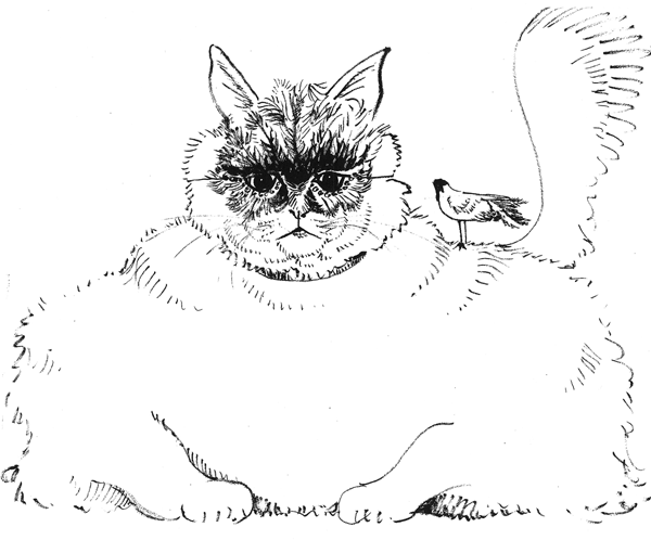
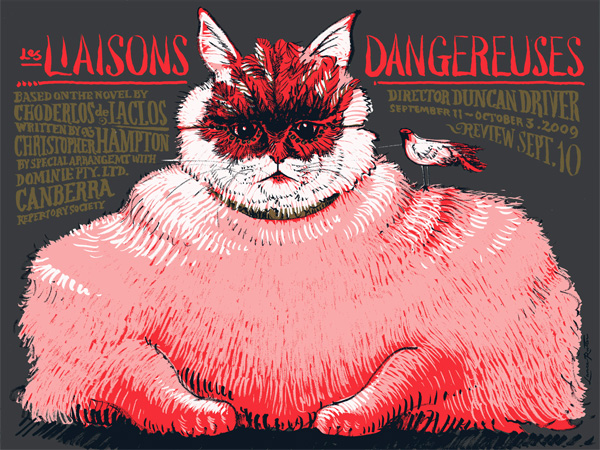
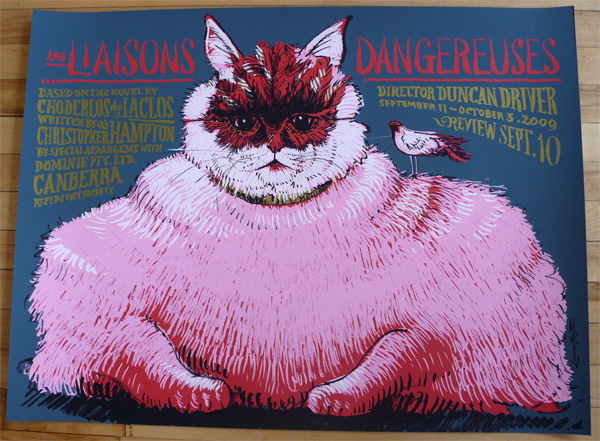
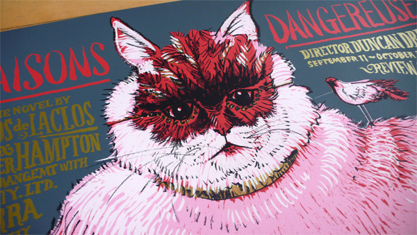
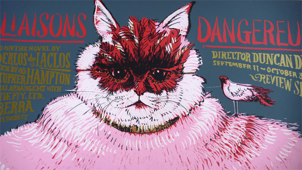
For this production of the 18th century, love and pain novel, Les Liaisons Dangereuses (Dangerous Liaisons), at the Canberra Repertory Society in Australia, Chicago based designer Lance Rutter created a sumptuous poster that looks as if it had been crafted in the same forgotten era as the novel was conceived. While the illustration and lettering are delightful and impeccably done, the production of the poster is what really caught my attention, and it wasn’t until Lance pointed out that this was printed on red paper that I finally grasped what made it feel so rich. But best to hear it from the source, as Lance explains:
Every part of the art was rendered with a Pentel Brush pen — which has a great line quality and the black is very black — on different tracing paper overlays (per color), then scanned on a small HP, blown up, and assembled into a multichannel Photoshop file for the printer.
I like to start with a middle-ground color, so I decided to print this on a bright red paper stock (Red Hot French Poptone). Then I used black and grey for the background and detail and white and pink for highlights and midtones. I added metallic gold for type and some subtle details on the cat, to make her a little more Baroque.
I had originally planned on using various opacities of white on the red paper to create the pink and white highlights, but Steve at D & L Screenprinting convinced me that using a match pink ink would give us better control to match exactly what I was looking for.
This poster (and others!) is available for purchase at the Legendre+Rutter store.
 From sketch (above) to digital file (below) to the real thing.

Les Liaisons Dangereuses Poster
Production Method
Design
Lance Rutter
Printing
D & L Screenprinting, Seattle, WA
This post was published in the original layout of FPO so all images are smaller. Project descriptions as well as production lessons are quoted in the main content area.
Post Author
Armin

Armin Vit
Editor of FPO and co-founder of UnderConsideration LLC.
More: Online / On Twitter
Date Published
September 9, 2009
Filed Under
Posters
Tagged with
metallic ink
poster
red
silkscreen


About
FPO (For Print Only), is a division of UnderConsideration, celebrating the reality that print is not dead by showcasing the most compelling printed projects.
FPO uses Fonts.com to render Siseriff and Avenir Next.
FPO is run with Six Apart’s MovableType
All comments, ideas and thoughts on FPO are property of their authors; reproduction without the author’s or FPO’s permission is strictly prohibited
Twitter @ucllc
Sign-up for Mailing List
Mailing list managed by MailChimp
Thanks to our advertisers
About UnderConsideration
UnderConsideration is a graphic design firm generating its own projects, initiatives, and content while taking on limited client work. Run by Bryony Gomez-Palacio and Armin Vit in Bloomington, IN. More…
blogs we publish
Brand New / Displaying opinions and focusing solely on corporate and brand identity work.
Art of the Menu / Cataloguing the underrated creativity of menus from around the world.
Quipsologies / Chronicling the most curious, creative, and notable projects, stories, and events of the graphic design industry on a daily basis.
products we sell
Flaunt: Designing effective, compelling and memorable portfolios of creative work.
Brand New Conference videos / Individual, downloadable videos of every presentation since 2010.
Prints / A variety of posters, the majority from our AIforGA series.
Other / Various one-off products.
events we organize
Brand New Conference / A two-day event on corporate and brand identity with some of today's most active and influential practitioners from around the world.
Brand Nieuwe Conference / Ditto but in Amsterdam.
Austin Initiative for Graphic Awesomeness / A speaker series in Austin, TX, featuring some of the graphic design industry's most awesome people.
also
Favorite Things we've Made / In our capacity as graphic designers.
Projects we've Concluded / Long- and short-lived efforts.
UCllc News / Updates on what's going at the corporate level of UnderConsideration.

Related entries
36 Days of Type Poster
Ministry of Environment in Colombia Poster
National Parks Map
eBoy Poster
“Love Your Mother” Print