ADV @ UNDERCONSIDERATION Peek here for details
BROWSE
Dimensions (Width × Height × Depth)
6.5 in × 10.75 × 0.5 in
Page Count
168 + Gatefold cover
Paper Stock
Cover: 120 lb McCoy gloss with Cambric patterned nylon gloss lamination
Body: 100 lb McCoy gloss text.
Number of Colors
CMYK
Varnishes
Cover: Gloss Laminate
Body: Gloss UV
Binding
Perfect bound
Typography
Omnes, Joshua Darden
Bau, Christian Schwartz
Univers, Adrian Frutiger
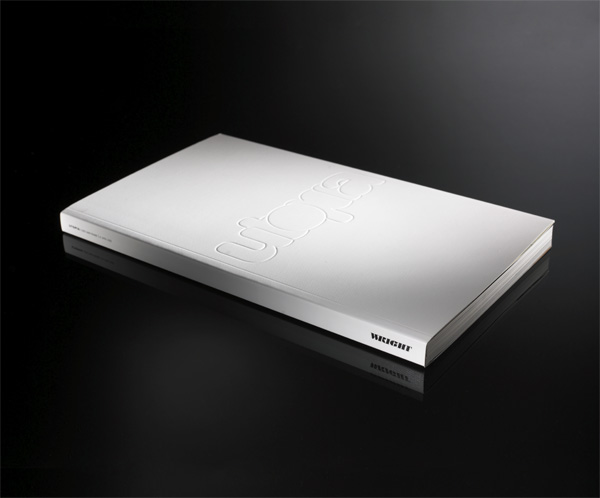
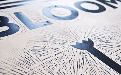
In case you are wondering where or why all this Chicago work came from the simple reason is that I was one of the judges of the The Society of Typographic Arts’ Archive09 competition, so I had the good fortune of seeing plenty of great design first-hand and decided to request some of the entries that caught my attention. But none of it stood out more — especially in terms of tactility — than this catalog for the contemporary art and design auction house Wright. One of the other judges, Rick Valicenti, designed Wright’s identity as well as many of its recent catalogs and publications.
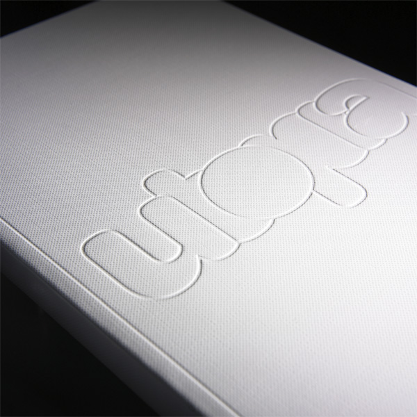
While Rick was verboten to comment (or, of course, vote) on his own pieces I couldn’t resist yelling across the room, as I held the catalog in my hands, “nice paper choice.” He replied, “I made that paper.” Proclamations like this are not rare with Rick so I had to do a double take. Indeed, the paper, a trusty 120-pound McCoy had been tricked out with a “Cambric patterned nylon gloss lamination” that gave the cover an amazing texture. Like linen, on deliciously glossy steroids. Jennifer Mahanay, a designer at Wright, shared plenty of information about this project, including a detail on the cover:
For the cover we sought a material as tactile and glossy as the objects themselves — our collaborative printer, Curtiss Haug of Graphic Arts Studio — located a patterned debossing roll which turned a smooth gloss laminate into a surface similar to that of a rubber raft upon which Utopia’s outlined logotype was debossed.
While the cover provides the initial tactile reaction, the inside of the catalog is a remarkably glossy depiction of the items up for auction in “Utopia: Lost and Found,” a collection of “radical-pop furniture and objects.” Jennifer explains how the inside came together, i.e., harder than it looks:
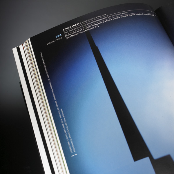
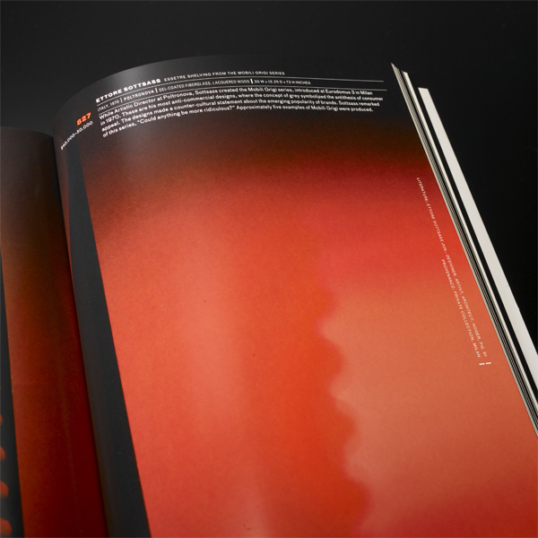
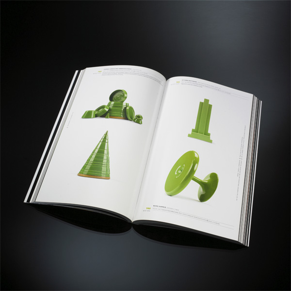
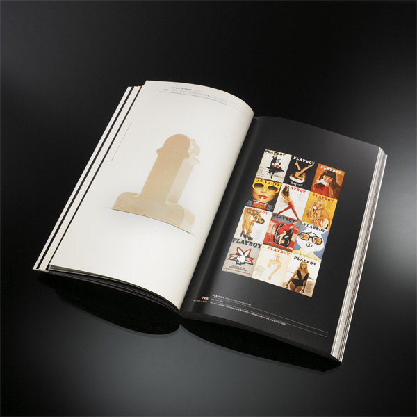
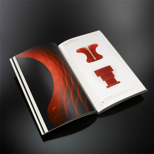
Taking cues from the items themselves, we knew the pages should be richly saturated with color, luscious and glossy. To determine the design direction, we literally began to cut-and-paste. Taking digital snapshots of each item, we created flash cards. The flash cards were spread out on the table, and soon the items began to arrange themselves chromatically in a lovely ROYGBIV sequence. The caption lot numbers followed the chromatic cue of the objects themselves. We photographed the collection at eye-level — straight on or in strict profile — on white backgrounds, providing a consistent look over 168 pages. Metallic and white objects were photographed on black. Once photographed the items were juxtaposed with a designer’s care and not without a sense of humor (see Playboys + Ettore Sottsass vase)!
From cover to cover, this is a truly outstanding piece. For $40 you don’t have to take my word for it and purchase the catalog from Wright.


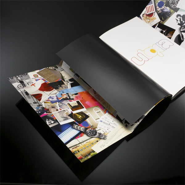
The double gate-fold cover features original collages by the collector, printed full bleed on the inside front and back. These collages reflect the love and diligence that went into building this collection and all the ephemera that is gathered along the way.

“Lost and Found” Auction Catalog
Production Method
Design
Design Director: Rick Valicenti/Thirst
Design: Rick Valicenti and Jennifer Mahanay/Wright
Photography: Thea Dickman
Programming: Robb Irrgang
Research: Emilie Sims
Printing
Graphic Arts Studio
This post was published in the original layout of FPO so all images are smaller. Project descriptions as well as production lessons are quoted in the main content area.
Post Author
Armin

Armin Vit
Editor of FPO and co-founder of UnderConsideration LLC.
More: Online / On Twitter
Date Published
September 16, 2009
Filed Under
Catalogues
Tagged with
catalog
customize
deboss
perfect bound
UV


About
FPO (For Print Only), is a division of UnderConsideration, celebrating the reality that print is not dead by showcasing the most compelling printed projects.
FPO uses Fonts.com to render Siseriff and Avenir Next.
FPO is run with Six Apart’s MovableType
All comments, ideas and thoughts on FPO are property of their authors; reproduction without the author’s or FPO’s permission is strictly prohibited
Twitter @ucllc
Sign-up for Mailing List
Mailing list managed by MailChimp
Thanks to our advertisers
About UnderConsideration
UnderConsideration is a graphic design firm generating its own projects, initiatives, and content while taking on limited client work. Run by Bryony Gomez-Palacio and Armin Vit in Bloomington, IN. More…
blogs we publish
Brand New / Displaying opinions and focusing solely on corporate and brand identity work.
Art of the Menu / Cataloguing the underrated creativity of menus from around the world.
Quipsologies / Chronicling the most curious, creative, and notable projects, stories, and events of the graphic design industry on a daily basis.
products we sell
Flaunt: Designing effective, compelling and memorable portfolios of creative work.
Brand New Conference videos / Individual, downloadable videos of every presentation since 2010.
Prints / A variety of posters, the majority from our AIforGA series.
Other / Various one-off products.
events we organize
Brand New Conference / A two-day event on corporate and brand identity with some of today's most active and influential practitioners from around the world.
Brand Nieuwe Conference / Ditto but in Amsterdam.
Austin Initiative for Graphic Awesomeness / A speaker series in Austin, TX, featuring some of the graphic design industry's most awesome people.
also
Favorite Things we've Made / In our capacity as graphic designers.
Projects we've Concluded / Long- and short-lived efforts.
UCllc News / Updates on what's going at the corporate level of UnderConsideration.

Related entries
Australian Book Design Association Award Catalogue 2016
L.A. Louver Catalog: Charles Garabedian
Andrew Curtis Catalogue
Minus-8 Catalog
“Bright Lights Dark City” Catalog