ADV @ UNDERCONSIDERATION Peek here for details
BROWSE
L.A. Louver Catalog: Charles Garabedian
Production Method
Offset
Design
Stefan G. Bucher / 344 Design
Production coordination: Christina Carlos for L.A. Louver
Printing
Typecraft
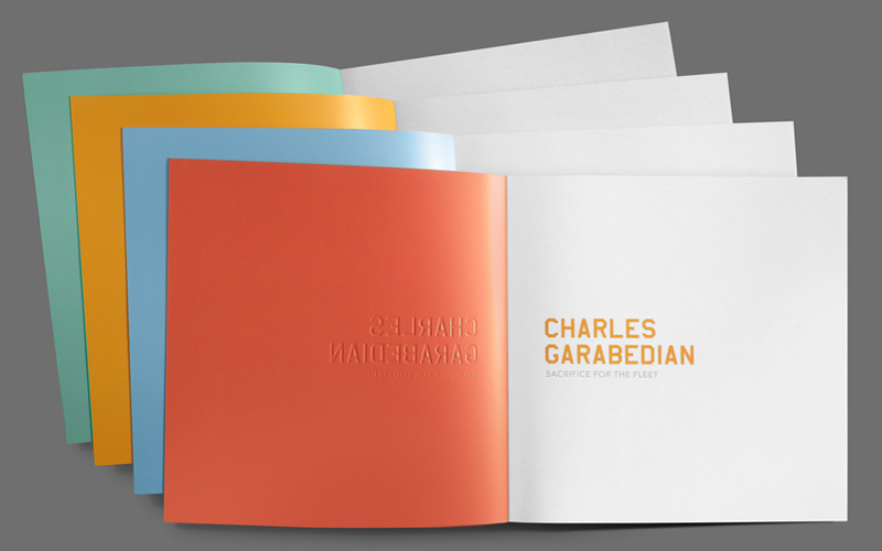
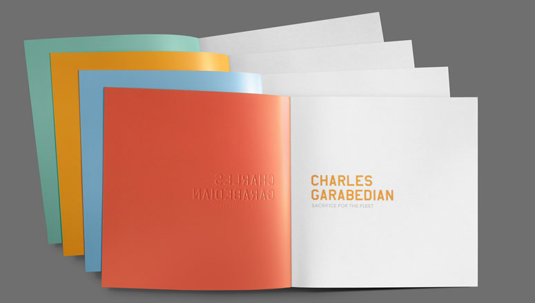
You might not be able to touch the oversized art printed within the pages, but you can surely spend some quality time with the cover. With two different embossed levels, a subtle finish, and color flood, they are a great example of careful planning, a very present designer, and a great printer.
Dimensions (Width × Height × Depth)
10.25 × 10.25 × .35 in.
Page Count
84
Paper Stock
Sterling / Premium Dull / 130# Cover /
McCoy / Silk / 100# Text /
Number of Colors
6
Varnishes
1
Binding
Perfect Bind
Typography
AmarilloUSAF
Avenir
Sabon
Project Description
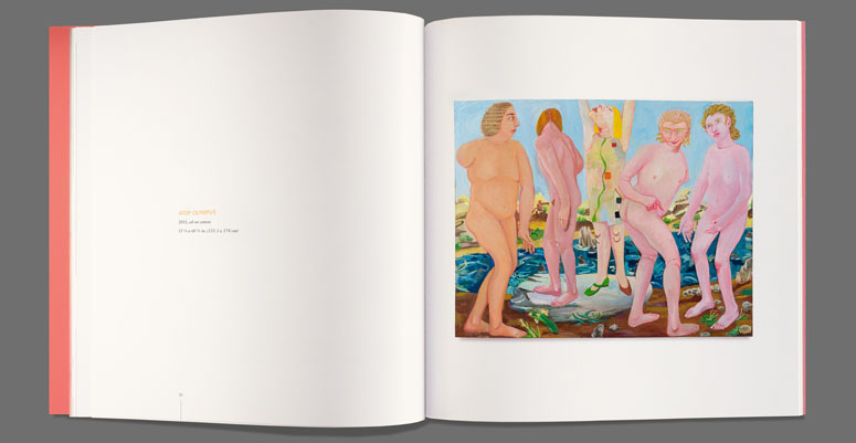
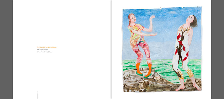
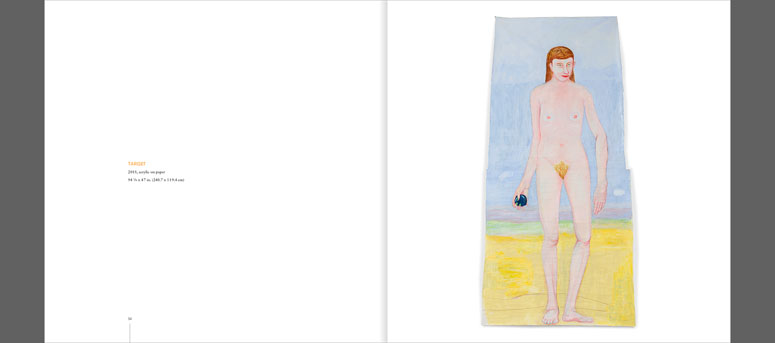
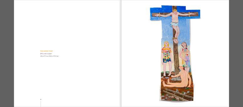
Charles Garabedian’s paintings reintepret scenes from Greek mythology in vibrant colors and in large scale. (Some of the pieces shown here are over eight feet tall.) His dreamlike scenes are rendered in oil on rough paper that grows with many attachments as each painting takes shape.These aren’t neatly framed rectangular canvases. The paper warps toward you and expands in whatever direction the image demands. It was important for the catalog to reproduce this physicality by showing the shadows cast by each piece. And of course, the color had to be vivid.One of the first decisions on these catalogs is always the format. I’d entertained the idea of a tall, skinnny book to give the most area to the largest pieces—The Good Thief and Target, both shown below—but it would’ve done a disservice to the many horizontal works. We went with a square format to split the difference.
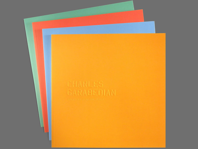
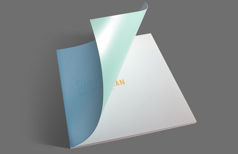
As color is so important to Garabedian’s work, we decided instead to pull a few representative tones from the paintings and print a series of four separate covers, each embossed with the title of the show, “Sacrifice for the Fleet.” The inside cover of each edition was printed in one of the other colors. Orange was paired with red, teal with cyan. To underline the tactile appeal of the work we added a Curious Touch coating to the cover stock to give it a skin-like feel.
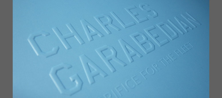
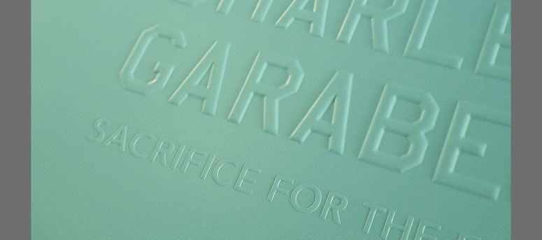
The embossing was done with two separate dies. Charles’ name rendered in large beveled letterforms used by the U.S. Air Force, as a nod both to the title of the show and to his service in the Air Force during World War II. The title of the show was struck into the paper with a regular magnesium die. It was necessary to do two separate die strikes, because the pressure necessary to get a good impression on CHARLES GARABEDIAN would’ve obliterated the more delicate show title.
Production Lesson(s)
Specifying brass dies on a deadline is always a bit nervewracking, as the digital previews of the bevels are only ever so accurate. Much also depends on how the paper will react, particularly when it’s covered in a lot of ink and has been specially coated. You can only apply so much pressure to the paper before it cracks. The debossed side also tends to have a much sharper impression, as it’s in direct contact with the male die. The raised side gets a little softer. In this case that didn’t bother me, as the title page mirrored the type on the cover, so all the elements played well off each other.
Post Author

Bryony Gomez-Palacio
Editor of FPO and co-founder of UnderConsideration LLC.
More: Online / On Twitter
Date Published
June 9, 2016
Filed Under
Catalogues
Offset
Tagged with
AmarilloUSAF
Avenir
catalogue
mccoy
offset
pms
Sabon
sterling


About
FPO (For Print Only), is a division of UnderConsideration, celebrating the reality that print is not dead by showcasing the most compelling printed projects.
FPO uses Fonts.com to render Siseriff and Avenir Next.
FPO is run with Six Apart’s MovableType
All comments, ideas and thoughts on FPO are property of their authors; reproduction without the author’s or FPO’s permission is strictly prohibited
Twitter @ucllc
Sign-up for Mailing List
Mailing list managed by MailChimp
Thanks to our advertisers
About UnderConsideration
UnderConsideration is a graphic design firm generating its own projects, initiatives, and content while taking on limited client work. Run by Bryony Gomez-Palacio and Armin Vit in Bloomington, IN. More…
blogs we publish
Brand New / Displaying opinions and focusing solely on corporate and brand identity work.
Art of the Menu / Cataloguing the underrated creativity of menus from around the world.
Quipsologies / Chronicling the most curious, creative, and notable projects, stories, and events of the graphic design industry on a daily basis.
products we sell
Flaunt: Designing effective, compelling and memorable portfolios of creative work.
Brand New Conference videos / Individual, downloadable videos of every presentation since 2010.
Prints / A variety of posters, the majority from our AIforGA series.
Other / Various one-off products.
events we organize
Brand New Conference / A two-day event on corporate and brand identity with some of today's most active and influential practitioners from around the world.
Brand Nieuwe Conference / Ditto but in Amsterdam.
Austin Initiative for Graphic Awesomeness / A speaker series in Austin, TX, featuring some of the graphic design industry's most awesome people.
also
Favorite Things we've Made / In our capacity as graphic designers.
Projects we've Concluded / Long- and short-lived efforts.
UCllc News / Updates on what's going at the corporate level of UnderConsideration.

Related entries
2017 Brand New Conference Program
Severe(d): A Creepy Poetry Collection by Holly Riordan
Um Caminho para Santiago CD Package and Diary
BOYCO Classpack® Book
Antes de Perder la Esperanza Book