ADV @ UNDERCONSIDERATION Peek here for details
BROWSE
Client
Self-promotion
Quantity Produced
150
Production Cost
$500
Production Time
3 days
Dimensions (Width × Height × Depth)
24 in × 18 in
Page Count
–
Paper Stock
Astrobrights Eclipse Black 80 lb Cover
Number of Colors
1 spot (PMS 877)
Varnishes
–
Binding
–
Typography
Too many to list
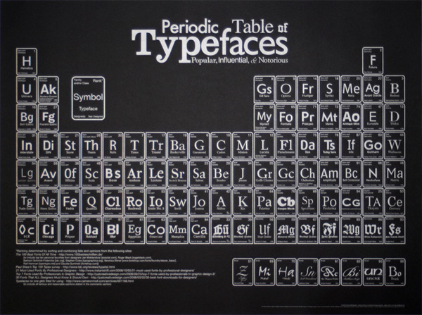
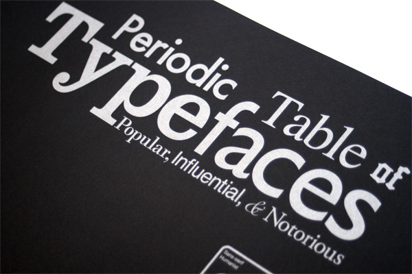
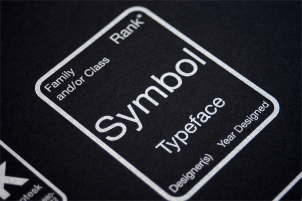
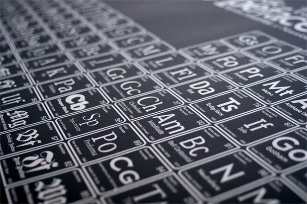
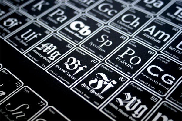
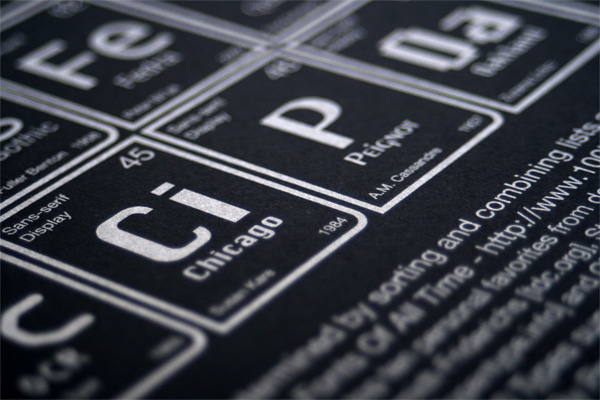
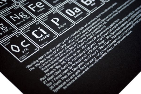
Scribble on Everything, a purveyor of graphic wall decals, prints, apparel and other miscellanea is the proud distributor of designer Camdon Wilde’s ambitious print: The Periodic Table of Typefaces. If you spend much time on design blogs you probably saw this floating around quite heavily. While it looked like a stand-alone graphic born for viral consumption, its destiny from the beginning was to be a print, first produced and sold by Camdon himself and then passed on to Scribble. It comes in two color combinations, black on off white paper and, shown here, silver on black paper. Due to its success and popularity, Scribble turned it into a wall decal as well, and a series of t-shirts. They are all available from Camdon’s artist page on Scribble.
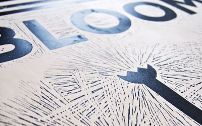
The poster is one of the most photogenic subjects we have had the pleasure of working with here at UCllc headquarters. Every photograph came out great. The silver on the black paper looks pretty fantastic and the overall density and texture created by all the typefaces looks lovely against black.
For the full scoop on the Periodic Table of Typefaces, you can check this comprehensive page, as well as an interview featuring thorough process images with Camden.


Periodic Table of Typefaces Poster
Production Method
Design
Designer: Camdon Wilde
Production: Scribble on Everything
Printing
Emco Press
This post was published in the original layout of FPO so all images are smaller. Project descriptions as well as production lessons are quoted in the main content area.
Post Author
Armin

Armin Vit
Editor of FPO and co-founder of UnderConsideration LLC.
More: Online / On Twitter
Date Published
September 21, 2009
Filed Under
Posters
Tagged with


About
FPO (For Print Only), is a division of UnderConsideration, celebrating the reality that print is not dead by showcasing the most compelling printed projects.
FPO uses Fonts.com to render Siseriff and Avenir Next.
FPO is run with Six Apart’s MovableType
All comments, ideas and thoughts on FPO are property of their authors; reproduction without the author’s or FPO’s permission is strictly prohibited
Twitter @ucllc
Sign-up for Mailing List
Mailing list managed by MailChimp
Thanks to our advertisers
About UnderConsideration
UnderConsideration is a graphic design firm generating its own projects, initiatives, and content while taking on limited client work. Run by Bryony Gomez-Palacio and Armin Vit in Bloomington, IN. More…
blogs we publish
Brand New / Displaying opinions and focusing solely on corporate and brand identity work.
Art of the Menu / Cataloguing the underrated creativity of menus from around the world.
Quipsologies / Chronicling the most curious, creative, and notable projects, stories, and events of the graphic design industry on a daily basis.
products we sell
Flaunt: Designing effective, compelling and memorable portfolios of creative work.
Brand New Conference videos / Individual, downloadable videos of every presentation since 2010.
Prints / A variety of posters, the majority from our AIforGA series.
Other / Various one-off products.
events we organize
Brand New Conference / A two-day event on corporate and brand identity with some of today's most active and influential practitioners from around the world.
Brand Nieuwe Conference / Ditto but in Amsterdam.
Austin Initiative for Graphic Awesomeness / A speaker series in Austin, TX, featuring some of the graphic design industry's most awesome people.
also
Favorite Things we've Made / In our capacity as graphic designers.
Projects we've Concluded / Long- and short-lived efforts.
UCllc News / Updates on what's going at the corporate level of UnderConsideration.

Related entries
36 Days of Type Poster
Ministry of Environment in Colombia Poster
National Parks Map
eBoy Poster
“Love Your Mother” Print