ADV @ UNDERCONSIDERATION Peek here for details
BROWSE
Client
1% Productions
Quantity Produced
65
Production Cost
Less than $100 (not including beer)
Production Time
2 nights
Dimensions (Width × Height × Depth)
16.5 in × 22.5 in
Page Count
–
Paper Stock
Roland Opaque 30, White, 100 lb
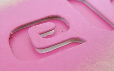
Number of Colors
4 spot
Varnishes
–
Binding
–
Typography
Custom type and Trade Gothic Condensed 20
There is a certain numbness I have developed toward gig posters. It’s not that I don’t like them or appreciate them. I do and I do. But with such an overwhelming amount of them, and a majority simply going over my head with references I am clearly not meant to get, I just don’t have the patience for them and I have developed the same reaction for most of them: cool. Nothing more, nothing less.
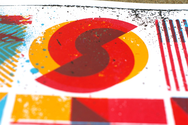
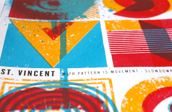
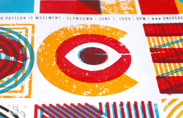
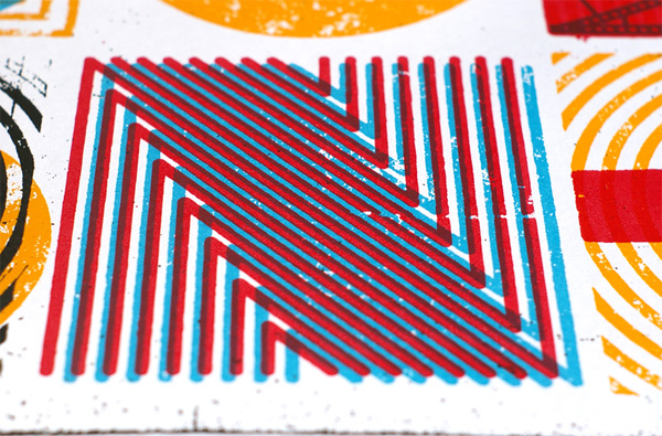
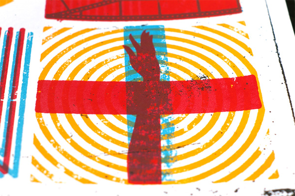
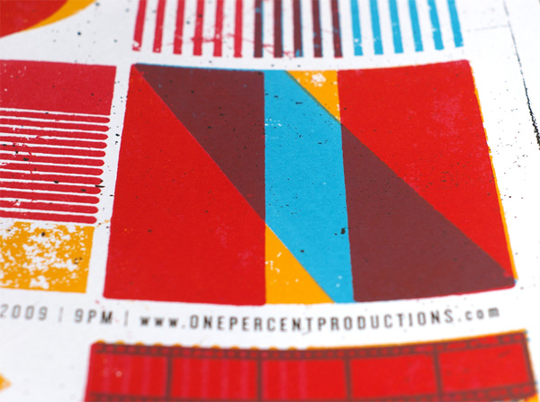
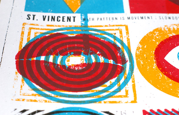
A couple of weeks ago, I had the pleasure of judging the AIGA Nebraska Show and, along with a bunch of other cool things, I was completely attracted by this poster by Eric Nyffeler of Doe Eyed Design. First, there were the colors: primary and screaming. Then there was the original and astute lettering spelling out St. Vincent. Like other gig posters, there is probably an underlying concept I am not getting, but in this case I let my gut guide me and my gut said this is f*cking cool. There is something Saul Bassean about the whole thing. Or, heck, maybe it’s just the beer. Let’s see what Erik has to say:
Never skimp with the transparent base when screen printing. Also, never run out of beer.
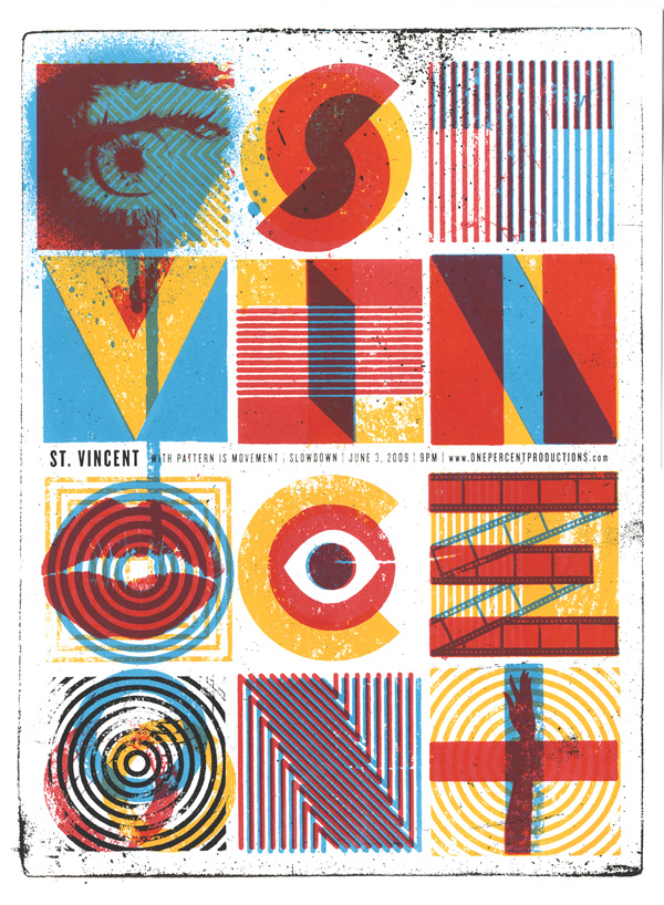


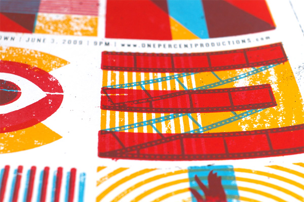
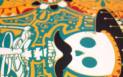
St. Vincent Poster
Production Method
Design
Design and Illustration: Eric Nyffeler, Doe Eyed Design
Printing
Michael Nielsen and Eric Nyffeler
This post was published in the original layout of FPO so all images are smaller. Project descriptions as well as production lessons are quoted in the main content area.
Post Author
Armin

Armin Vit
Editor of FPO and co-founder of UnderConsideration LLC.
More: Online / On Twitter
Date Published
October 20, 2009
Filed Under
Posters
Tagged with
overlay
poster
silkscreen


About
FPO (For Print Only), is a division of UnderConsideration, celebrating the reality that print is not dead by showcasing the most compelling printed projects.
FPO uses Fonts.com to render Siseriff and Avenir Next.
FPO is run with Six Apart’s MovableType
All comments, ideas and thoughts on FPO are property of their authors; reproduction without the author’s or FPO’s permission is strictly prohibited
Twitter @ucllc
Sign-up for Mailing List
Mailing list managed by MailChimp
Thanks to our advertisers
About UnderConsideration
UnderConsideration is a graphic design firm generating its own projects, initiatives, and content while taking on limited client work. Run by Bryony Gomez-Palacio and Armin Vit in Bloomington, IN. More…
blogs we publish
Brand New / Displaying opinions and focusing solely on corporate and brand identity work.
Art of the Menu / Cataloguing the underrated creativity of menus from around the world.
Quipsologies / Chronicling the most curious, creative, and notable projects, stories, and events of the graphic design industry on a daily basis.
products we sell
Flaunt: Designing effective, compelling and memorable portfolios of creative work.
Brand New Conference videos / Individual, downloadable videos of every presentation since 2010.
Prints / A variety of posters, the majority from our AIforGA series.
Other / Various one-off products.
events we organize
Brand New Conference / A two-day event on corporate and brand identity with some of today's most active and influential practitioners from around the world.
Brand Nieuwe Conference / Ditto but in Amsterdam.
Austin Initiative for Graphic Awesomeness / A speaker series in Austin, TX, featuring some of the graphic design industry's most awesome people.
also
Favorite Things we've Made / In our capacity as graphic designers.
Projects we've Concluded / Long- and short-lived efforts.
UCllc News / Updates on what's going at the corporate level of UnderConsideration.

Related entries
36 Days of Type Poster
Ministry of Environment in Colombia Poster
National Parks Map
eBoy Poster
“Love Your Mother” Print