ADV @ UNDERCONSIDERATION Peek here for details
BROWSE
Client
Self-promotion
Quantity Produced
4,000
Production Cost
–
Production Time
7 Weeks
Dimensions (Width × Height × Depth)
Poster: 19 in × 19 in
Tokens: 2.5 in Diameter
Page Count
–
Paper Stock
Cranes Lettra Pearl White, 110 lb
Midwest Products 1/8" Craft Plywood
Number of Colors
Poster: 1 Spot, 1 Foil stamp
Token: 2/1 Spot, 1 digital
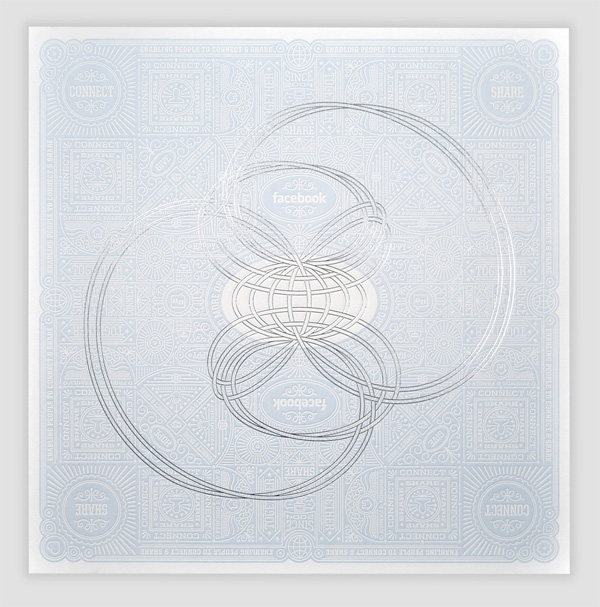
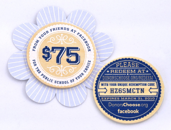
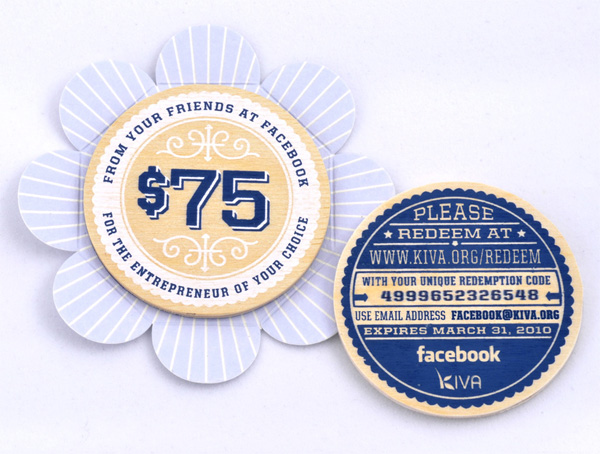
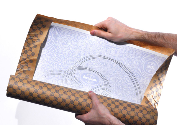
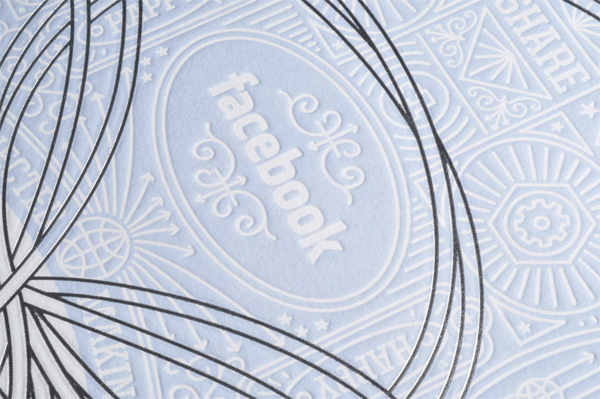
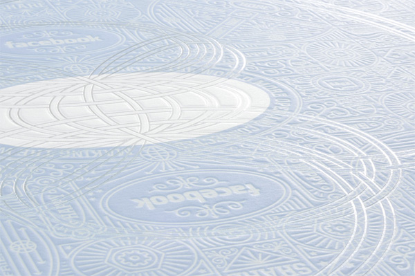
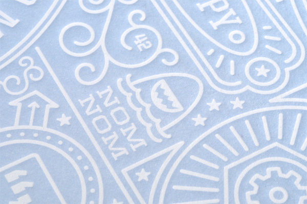
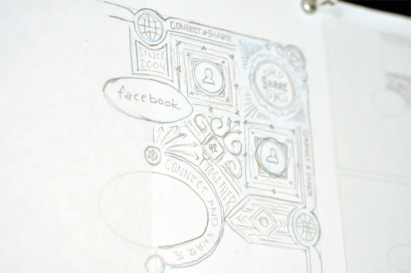
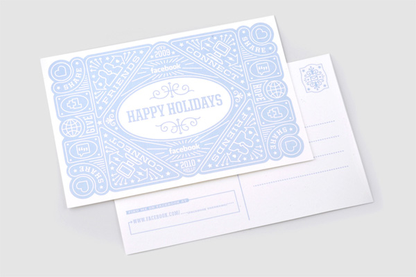
As a gift to its top advertising clients, Facebook typically gives money to donate to a charity of their choice, along with a special item like last year’s reusable shopping bag. This year they decided to do an art poster and the in-house Communication Design Team got to work. Seriously got to work. The result is a 19 × 19-inch-square poster that is printed, embossed and foiled with a delicate, intricate and obsessive design that has the signature typographic and illustrative style of Ben Barry, a designer at Facebook — and if you’ve been following his cryptic photo status updates on Facebook you finally have closure on what he was working on all this time.
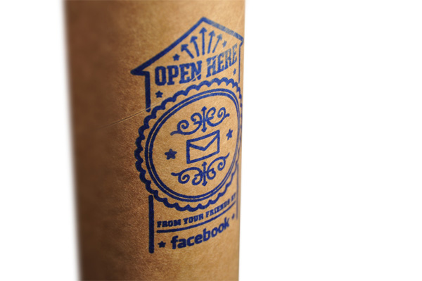
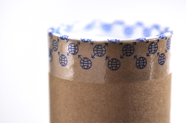
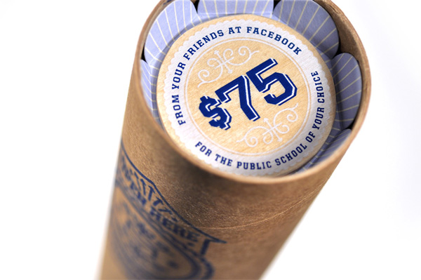
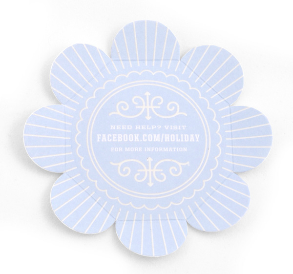
To encourage the donation aspect of the gift, the poster comes with a silkscreened, wooden token that is then customized on the back with a unique code for redeeming the donation. But the token doesn’t just lay there, no, it comes nested in a pretty little flower-like pod that holds it in place. And even opening the poster requires paying attention to the custom printed packing tape and the lovely rubber stamp that has been stamped by hand.
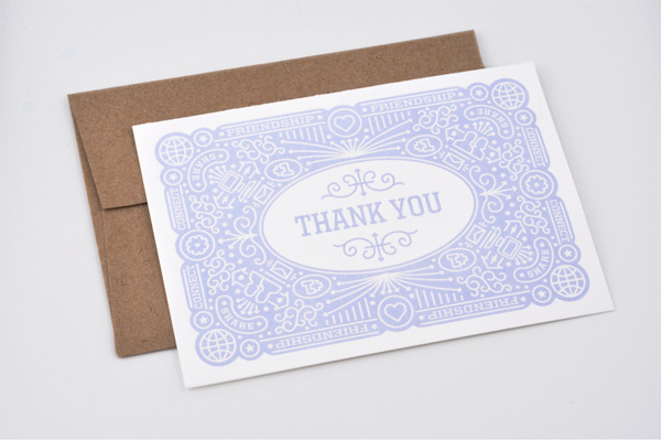
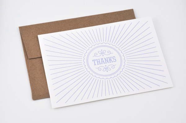
There are also two different Thank You cards printed in 1-color offset and clear foil stamp.
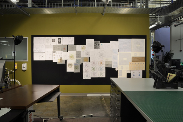
And… yeah, that’s it. Here are 26 images that show more convincingly what I just tried to explain above.

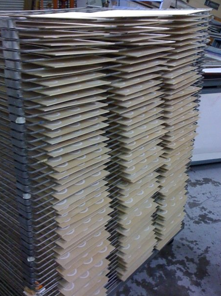
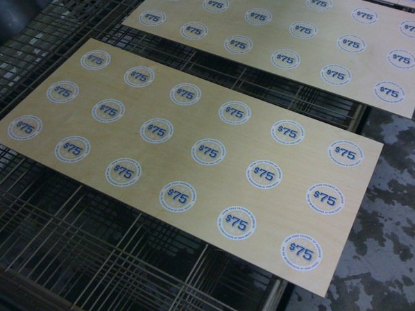
Above and below: Sheets of wooden tokens.
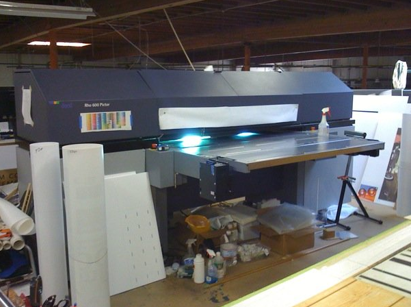
The digital printer that printed directly onto the wood for the unique redemption codes.
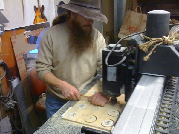
Tokens being routed.
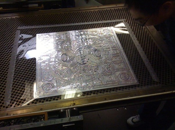
The embossing die for the poster.
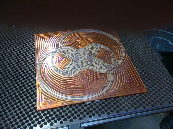
The foil stamping die for the poster.
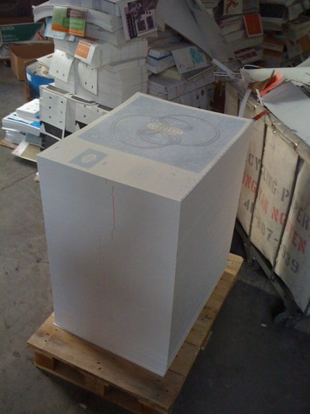
A stack of posters.
Facebook Holiday Gift
Production Method
Design
Facebook Communication Design Team
Printing
Poster/tube/cards/etc: Oscar Printing, Apex Die
Tokens: DPI, Art Real
This post was published in the original layout of FPO so all images are smaller. Project descriptions as well as production lessons are quoted in the main content area.
Post Author
Armin

Armin Vit
Editor of FPO and co-founder of UnderConsideration LLC.
More: Online / On Twitter
Date Published
December 20, 2009
Filed Under
Posters
Tagged with
digital
emboss
foil stamp
offset
poster
rubber stamp
silkscreen
thermography
wood


About
FPO (For Print Only), is a division of UnderConsideration, celebrating the reality that print is not dead by showcasing the most compelling printed projects.
FPO uses Fonts.com to render Siseriff and Avenir Next.
FPO is run with Six Apart’s MovableType
All comments, ideas and thoughts on FPO are property of their authors; reproduction without the author’s or FPO’s permission is strictly prohibited
Twitter @ucllc
Sign-up for Mailing List
Mailing list managed by MailChimp
Thanks to our advertisers
About UnderConsideration
UnderConsideration is a graphic design firm generating its own projects, initiatives, and content while taking on limited client work. Run by Bryony Gomez-Palacio and Armin Vit in Bloomington, IN. More…
blogs we publish
Brand New / Displaying opinions and focusing solely on corporate and brand identity work.
Art of the Menu / Cataloguing the underrated creativity of menus from around the world.
Quipsologies / Chronicling the most curious, creative, and notable projects, stories, and events of the graphic design industry on a daily basis.
products we sell
Flaunt: Designing effective, compelling and memorable portfolios of creative work.
Brand New Conference videos / Individual, downloadable videos of every presentation since 2010.
Prints / A variety of posters, the majority from our AIforGA series.
Other / Various one-off products.
events we organize
Brand New Conference / A two-day event on corporate and brand identity with some of today's most active and influential practitioners from around the world.
Brand Nieuwe Conference / Ditto but in Amsterdam.
Austin Initiative for Graphic Awesomeness / A speaker series in Austin, TX, featuring some of the graphic design industry's most awesome people.
also
Favorite Things we've Made / In our capacity as graphic designers.
Projects we've Concluded / Long- and short-lived efforts.
UCllc News / Updates on what's going at the corporate level of UnderConsideration.

Related entries
36 Days of Type Poster
Ministry of Environment in Colombia Poster
National Parks Map
eBoy Poster
“Love Your Mother” Print