ADV @ UNDERCONSIDERATION Peek here for details
BROWSE
Client
–
Quantity Produced
1,000 (500 on each paper color)
Production Cost
$2,800
Production Time
1 week
Dimensions (Width × Height × Depth)
18 in × 24 in
Page Count
–
Paper Stock
100 lb. French Pop-Tone, Whip Cream and Black Licorice
Number of Colors
1 spot ink (per paper color)
Varnishes
–
Binding
–
Typography
–
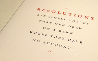
Observing pop culture is a big part of our job description as graphic designers. What we decide to do with that information is up to each one of us individually—how we process that information and how we chose to share our opinion in the en varies greatly. Jason Dean designed a poster that encompasses his latest interest and observations on the subject:
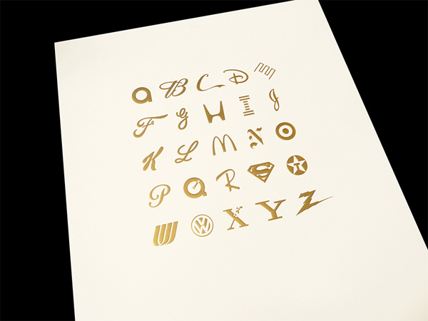
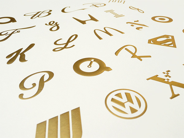
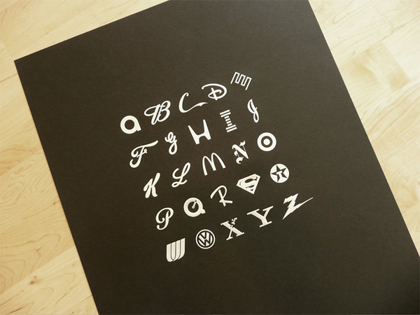
I’m very interested in pop culture, especially in the way that corporate culture has crept into our daily lives. Practically everything, including brands that we might think are mom-and-pop operations, is either owned or at least sponsored in one way or another by the top 1% “Mega-Corps” of America. Being a designer who is often employed by these companies, I am at once repelled by some of their social responsibility as well as in awe of their incredible branding initiatives, marketing and overall public image know-how. For example, I’m sure Paul Rand would be aghast at what happened at Enron, but his work for them has surely stood the test of time, and while his logo may now be a symbol of corporate greed, it’s no less beautiful or functional as a design object. This is the fine line between art, daily life and corporate culture that I’m exploring. Branding and corporate culture have become so pervasive that I sometimes wonder: will these be the symbols that our children’s children equate with these letters, rather than apple, ball, cat and dog?
Using two colored papers from French Paper, Jason set out to produce this poster without using ink—with embossing and foil stamping in mind he set to work. He has now partnered with Mechline in order to sell his posters which are available in gold/cream or silver/licorice.

This post was published in the original layout of FPO so all images are smaller. Project descriptions as well as production lessons are quoted in the main content area.
Post Author
Bryony

Bryony Gomez-Palacio
Editor of FPO and co-founder of UnderConsideration LLC.
More: Online / On Twitter
Date Published
January 14, 2010
Filed Under
Posters
Tagged with
different color stock
emboss
foil stamp
french paper
poster
promotion


About
FPO (For Print Only), is a division of UnderConsideration, celebrating the reality that print is not dead by showcasing the most compelling printed projects.
FPO uses Fonts.com to render Siseriff and Avenir Next.
FPO is run with Six Apart’s MovableType
All comments, ideas and thoughts on FPO are property of their authors; reproduction without the author’s or FPO’s permission is strictly prohibited
Twitter @ucllc
Sign-up for Mailing List
Mailing list managed by MailChimp
Thanks to our advertisers
About UnderConsideration
UnderConsideration is a graphic design firm generating its own projects, initiatives, and content while taking on limited client work. Run by Bryony Gomez-Palacio and Armin Vit in Bloomington, IN. More…
blogs we publish
Brand New / Displaying opinions and focusing solely on corporate and brand identity work.
Art of the Menu / Cataloguing the underrated creativity of menus from around the world.
Quipsologies / Chronicling the most curious, creative, and notable projects, stories, and events of the graphic design industry on a daily basis.
products we sell
Flaunt: Designing effective, compelling and memorable portfolios of creative work.
Brand New Conference videos / Individual, downloadable videos of every presentation since 2010.
Prints / A variety of posters, the majority from our AIforGA series.
Other / Various one-off products.
events we organize
Brand New Conference / A two-day event on corporate and brand identity with some of today's most active and influential practitioners from around the world.
Brand Nieuwe Conference / Ditto but in Amsterdam.
Austin Initiative for Graphic Awesomeness / A speaker series in Austin, TX, featuring some of the graphic design industry's most awesome people.
also
Favorite Things we've Made / In our capacity as graphic designers.
Projects we've Concluded / Long- and short-lived efforts.
UCllc News / Updates on what's going at the corporate level of UnderConsideration.

Related entries
36 Days of Type Poster
Ministry of Environment in Colombia Poster
National Parks Map
eBoy Poster
“Love Your Mother” Print