ADV @ UNDERCONSIDERATION Peek here for details
BROWSE
Client
Self-promotion
Quantity Produced
Tote: 650
T-shirt: 660
Sketchbook: 750
Program: 750
Production Cost
Tote: $1,056
T-shirt: $2,680 (sponsor price)
Sketchbook: $236 (sponsor price)
Program: $1,931.02 (cost of paper, printing fully donated)
Production Time
3 Weeks Average on all Items
Dimensions (Width × Height × Depth)
Tote: 16 in × 12 in × 6 in
T-shirt: S – XL (8-in-wide imprint area)
Sketchbook: 3.5 in × 5 in
Program: 5 in × 7 in
Page Count
Sketchbook: 32 Pages + Cover
Program: 36 Pages + Cover
Paper Stock
T-shirt: Gildan SoftStyle, Orange
Sketchbook
Cover: Chipboard
Interior: Basic uncoated text
Program
Cover: Neenah Esse, Arancio, Texture, 80 lb Cover
Interior: Neenah Environment, Quest Ivory, Vellum, 80 lb Text
Number of Colors
Tote: 1 Spot
T-shirt: 1 Spot
Sketchbook: 2 Spot (Cover only)
Program
Cover: 1 Spot
Interior: CMYK
(Free shipping to U.S., Canada, and Mexico; $5 to rest of the world)
Look for Buy button below
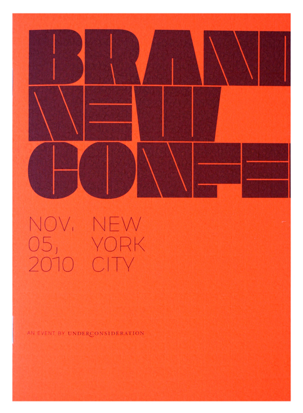
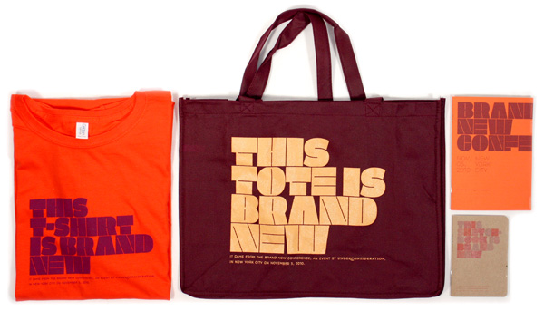
Since we take on client work less every year we have to use our own projects to fulfill the need of creating stuff. Our Brand New Conference, that took place on November 5 in New York, was the perfect opportunity to generate a number of stuffs. We are not ones to let the tail wag the dog but, in this case, the website for the conference dictated most of the look of the printed projects and we basically translated RGB colors to CMYK and PMS colors to get things done. Here is some insight into producing some of the items.
But before that: We have leftovers from the conference and figured someone out there might be interested in acquiring this ephemera so we are making available a package that consists of the items featured here (tote, t-shirt, sketchbook, and program) for $25. The price includes shipping within the U.S. (Priority), to Canada, and Mexico; a $5 shipping charge applies to the rest of the world.
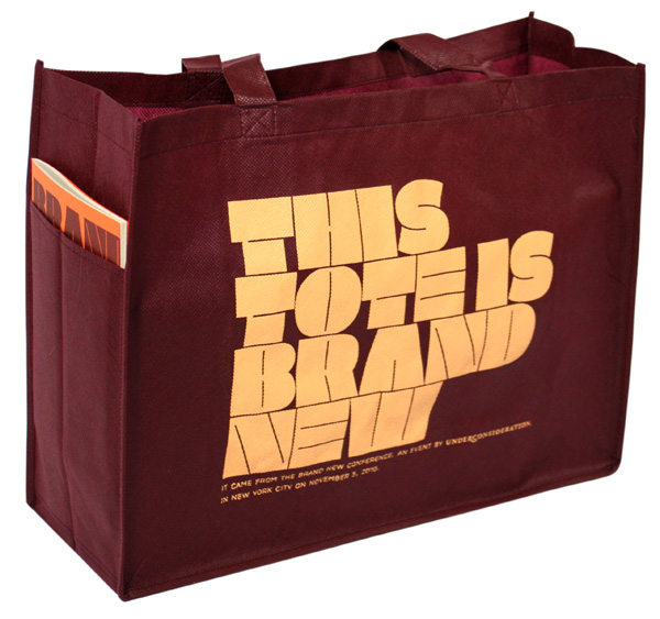
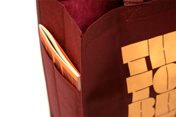
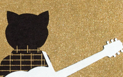
Tote
Once we selected a vendor as there are too many, we went through three rounds of having them ship sample bags to find the right size and color. We never thought it would be so hard to choose a tote, but it is. Ironically, once we chose the perfect size and color, they told us they were out of stock after we had sent files for production. We ended up with the color we wanted but with a much bigger bag. We had originally intended to do all of our materials in two spot colors and have those colors overprint at different tint percentages so that when they overlap they create a third color. But in order to print on the heavily textured tote, the silkscreening has to be done with very opaque ink, so it’s impossible to do halftones. We
went with just a single color.
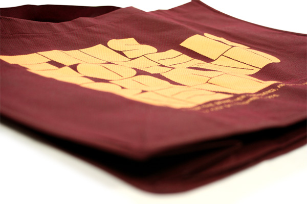
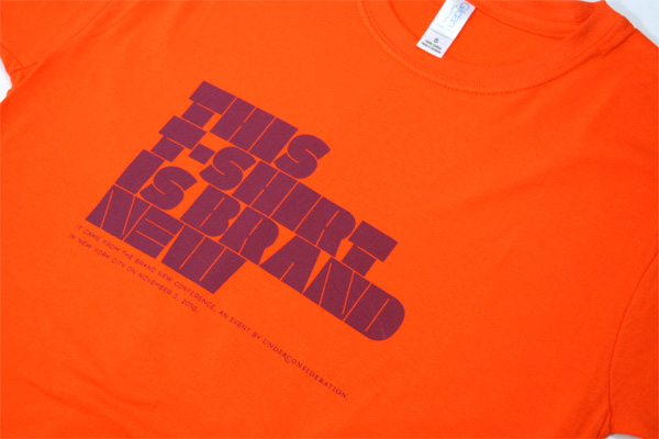
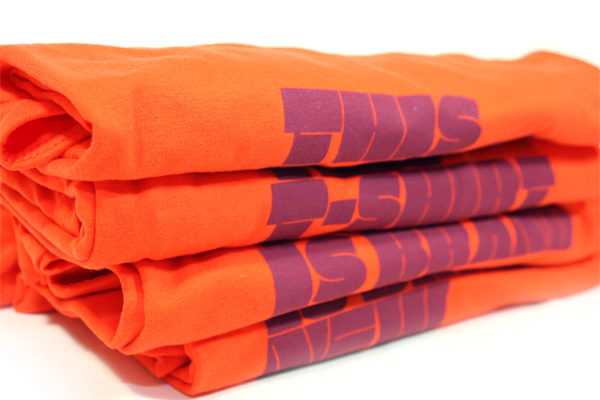
T-shirt
The overprinting wasn’t possible on the t-shirt either, especially not on a colored stock. So we switched to a single color execution too. Instead of the typical American Apparel product we chose Gildan SoftStyle, which is half the price and is actually really really nice.
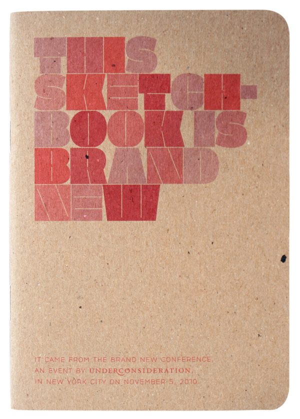
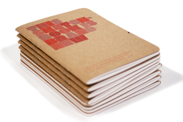
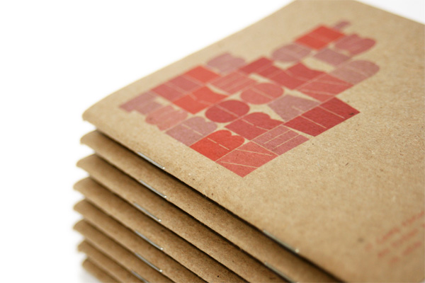
Sketchbook
Here we were able to finally pull off the overprinting as it’s the more typical offset printing. Should have probably given it a hit of white underneath to make it pop more but, in the end, we really like the earthy feel. The sketchbooks are the basic offering from Scout Books and you can see some additional pictures of it on their blog.
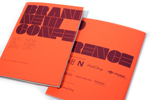
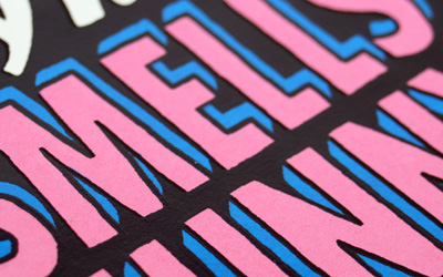
Program
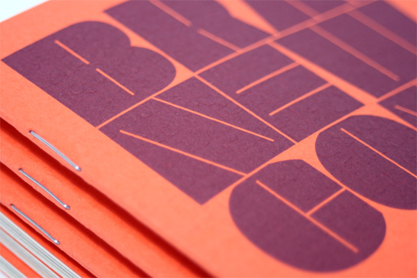
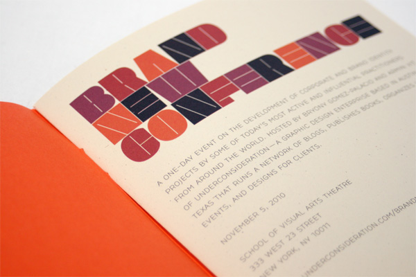
Since Neenah was one of our sponsors we had access to a great library of paper selections and we wanted to print on something we hadn’t before. For the cover we chose Neenah Esse, which comes in a delicious “Arancio” (orange) color and a rough textured finish. We hit that paper with a purple metallic. Everyone knows that metallics work best on white coated paper, so we knew it was a stretch to think we would get any kind of shimmer and, in essence, there isn’t any, but if the sun hits the program just so it has a tiny bit of that metallic shine. We are white-paper-kind-of-folks when it comes to printing design work, but we opted for an Ivory-hued stock that eats up some of the color of the images but, in return, it gives the images a lovely homegrown, vintage look. The body stock is made with 100% post-consumer waste, so that made us feel good. We would have liked to make the program perfect-bound but we ran out of time to be able to have the printed sheets go out to bindery and back. Unlike most conference programs that go in-depth about speaker bios and sessions we wanted it to be more of a catalog and feature the speakers’ current work.
All the items are purposely designed without big, bold “BRAND NEW CONFERENCE” branding and instead have the more vague inclusion of the words Brand New so that the tote and t-shirt can be used a little more loosely and so that we don’t use people as walking billboards.

Brand New Conference Materials
Production Method
Design
UnderConsideration LLC
Printing
Tote: Custom Earth Promos
T-shirt: Standard Deluxe
Sketchbook: Scout Books
Program: Enterprise Press
This post was published in the original layout of FPO so all images are smaller. Project descriptions as well as production lessons are quoted in the main content area.
Post Author
Armin

Armin Vit
Editor of FPO and co-founder of UnderConsideration LLC.
More: Online / On Twitter
Date Published
November 18, 2010
Filed Under
Identity Materials
Tagged with
color paper
identity materials
metallic
neenah
neenah environment
program
sketchbook
t-shirt
tote


About
FPO (For Print Only), is a division of UnderConsideration, celebrating the reality that print is not dead by showcasing the most compelling printed projects.
FPO uses Fonts.com to render Siseriff and Avenir Next.
FPO is run with Six Apart’s MovableType
All comments, ideas and thoughts on FPO are property of their authors; reproduction without the author’s or FPO’s permission is strictly prohibited
Twitter @ucllc
Sign-up for Mailing List
Mailing list managed by MailChimp
Thanks to our advertisers
About UnderConsideration
UnderConsideration is a graphic design firm generating its own projects, initiatives, and content while taking on limited client work. Run by Bryony Gomez-Palacio and Armin Vit in Bloomington, IN. More…
blogs we publish
Brand New / Displaying opinions and focusing solely on corporate and brand identity work.
Art of the Menu / Cataloguing the underrated creativity of menus from around the world.
Quipsologies / Chronicling the most curious, creative, and notable projects, stories, and events of the graphic design industry on a daily basis.
products we sell
Flaunt: Designing effective, compelling and memorable portfolios of creative work.
Brand New Conference videos / Individual, downloadable videos of every presentation since 2010.
Prints / A variety of posters, the majority from our AIforGA series.
Other / Various one-off products.
events we organize
Brand New Conference / A two-day event on corporate and brand identity with some of today's most active and influential practitioners from around the world.
Brand Nieuwe Conference / Ditto but in Amsterdam.
Austin Initiative for Graphic Awesomeness / A speaker series in Austin, TX, featuring some of the graphic design industry's most awesome people.
also
Favorite Things we've Made / In our capacity as graphic designers.
Projects we've Concluded / Long- and short-lived efforts.
UCllc News / Updates on what's going at the corporate level of UnderConsideration.

Related entries
Andy Stewart Design Identity Materials
Carolina Manresa Identity Materials
Bocanegra Studio Identity Materials
2016 Brand New Conference Badges
Molly Taylor & Co. Identity Materials