ADV @ UNDERCONSIDERATION Peek here for details
BROWSE
Client
Self-promotion
Quantity Produced
35
Production Cost
$50
Production Time
2 weeks
Dimensions (Width × Height × Depth)
12 in × 12 in flat
Page Count
–
Paper Stock
Speckletone French Paper
Recycled Maps
Number of Colors
1
Varnishes
–
Binding
–
Typography
–
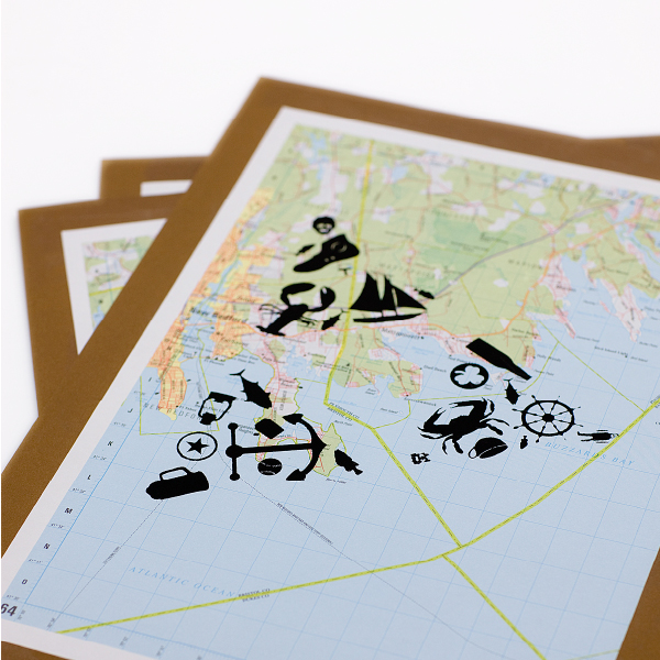
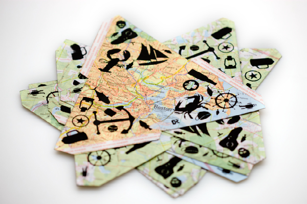
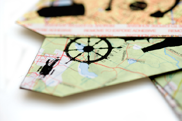
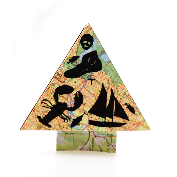
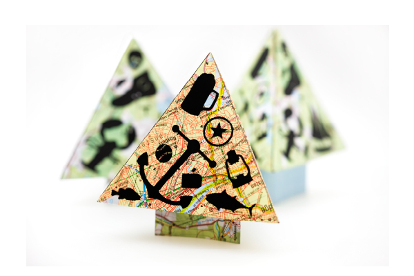
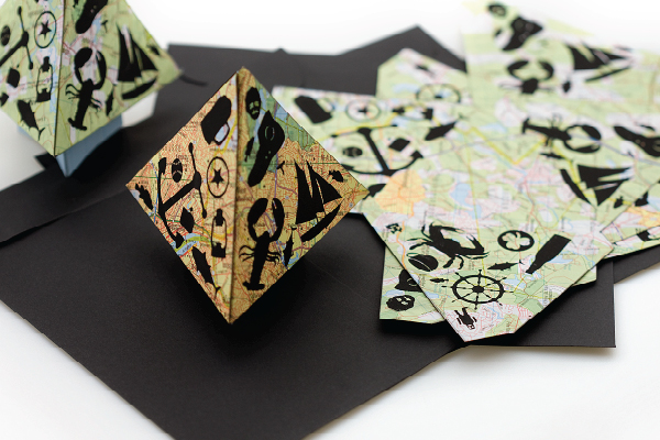
As inseparable as cookies and milk, is the relationship between maps and icons. They are born of a similar language; speak with similar inflection. They’re kin; graphically cohesive. And this is the type of relationship where, no matter what, if intentions are good and execution is strong, nothing should go wrong. Check out the rest of Justin’s site. Really amazing stuff.
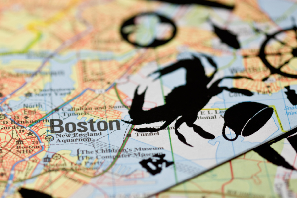
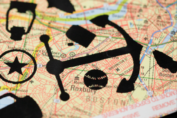
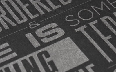
After graduating from Penn State, I took a design job in Boston. My family is always asking for updates about the city, and what I’ve been doing. Instead of writing out lengthy Christmas cards, I’ve illustrated some of the main attractions from the area. Some icons are obvious, some not so much. The cards are screen printed onto recycled maps of the greater Boston area. They are shipped flat, and include directions for construction by the recipient. The variation from printing on different sections of the map made every tree different. It was a small run, all screened in my apartment, of 35 cards. In total the project cost $50, the bulk of the cost was for Speckletone French Paper which I adhered to the maps for rigidity. It was a good opportunity to have a different format for a Christmas card, and something that is engaging for the recipient.
This was my first run at screen printing, and I learned so much from the experience. My apartment is small, and my setup was pretty amateur. My first few screens were underexposed, and I had to re-burn twice. I didn’t have a room I could completely seal off from light, so could only work at night. I burned my screen with a shop light in my closet, and printed everything on my kitchen table. Though a little imprecise, often gritty, and completely hand done, I wouldn’t have wanted these to turn out any other way.


This post was published in the original layout of FPO so all images are smaller. Project descriptions as well as production lessons are quoted in the main content area.
Post Author
Lauren Dickens

Lauren Dickens
Former intern at UnderConsideration LLC.
More: Online / On Twitter
Date Published
March 23, 2011
Filed Under
Stationery
Tagged with
DIY
french paper
icons
maps
silkscreen


About
FPO (For Print Only), is a division of UnderConsideration, celebrating the reality that print is not dead by showcasing the most compelling printed projects.
FPO uses Fonts.com to render Siseriff and Avenir Next.
FPO is run with Six Apart’s MovableType
All comments, ideas and thoughts on FPO are property of their authors; reproduction without the author’s or FPO’s permission is strictly prohibited
Twitter @ucllc
Sign-up for Mailing List
Mailing list managed by MailChimp
Thanks to our advertisers
About UnderConsideration
UnderConsideration is a graphic design firm generating its own projects, initiatives, and content while taking on limited client work. Run by Bryony Gomez-Palacio and Armin Vit in Bloomington, IN. More…
blogs we publish
Brand New / Displaying opinions and focusing solely on corporate and brand identity work.
Art of the Menu / Cataloguing the underrated creativity of menus from around the world.
Quipsologies / Chronicling the most curious, creative, and notable projects, stories, and events of the graphic design industry on a daily basis.
products we sell
Flaunt: Designing effective, compelling and memorable portfolios of creative work.
Brand New Conference videos / Individual, downloadable videos of every presentation since 2010.
Prints / A variety of posters, the majority from our AIforGA series.
Other / Various one-off products.
events we organize
Brand New Conference / A two-day event on corporate and brand identity with some of today's most active and influential practitioners from around the world.
Brand Nieuwe Conference / Ditto but in Amsterdam.
Austin Initiative for Graphic Awesomeness / A speaker series in Austin, TX, featuring some of the graphic design industry's most awesome people.
also
Favorite Things we've Made / In our capacity as graphic designers.
Projects we've Concluded / Long- and short-lived efforts.
UCllc News / Updates on what's going at the corporate level of UnderConsideration.

Related entries
Reticence Stationery
Rebecca Polewsky Stationery
Prieto Estudio Identity Materials
Hechizoo Stationery
The Hideout Stationery