ADV @ UNDERCONSIDERATION Peek here for details
BROWSE
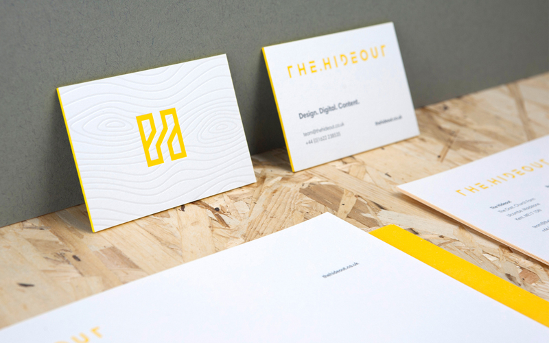
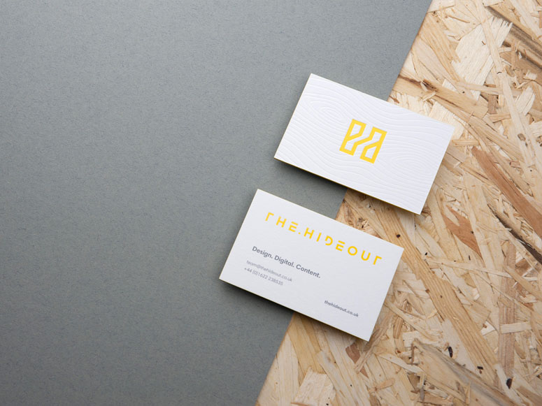
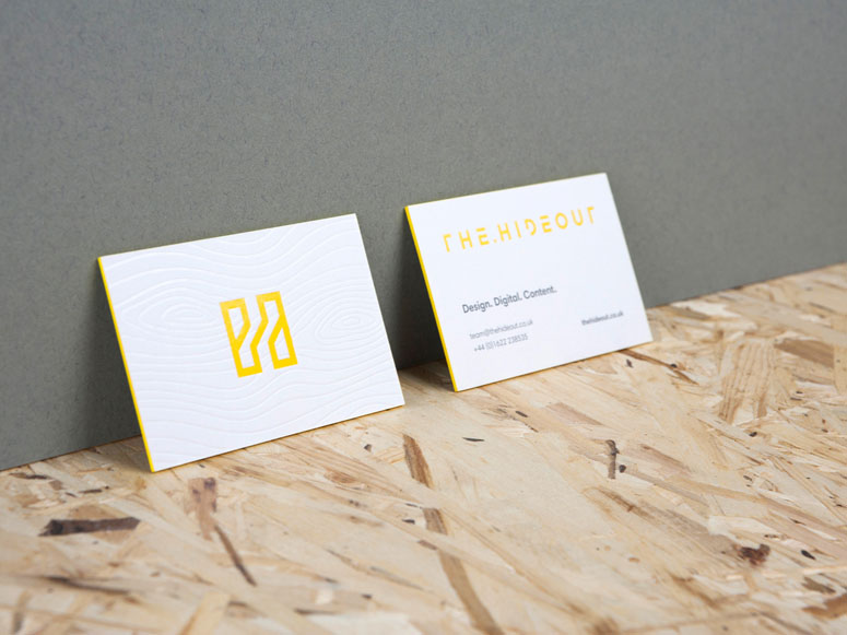
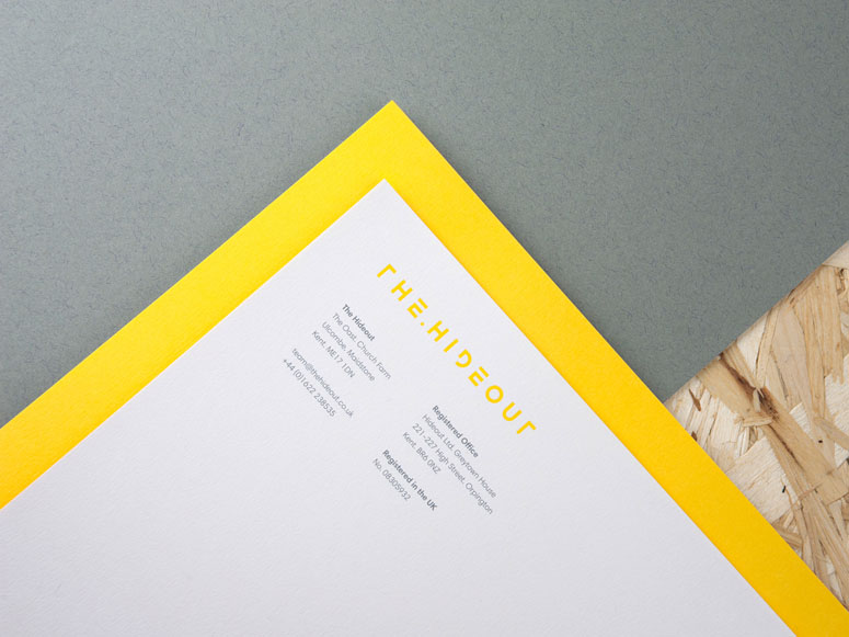
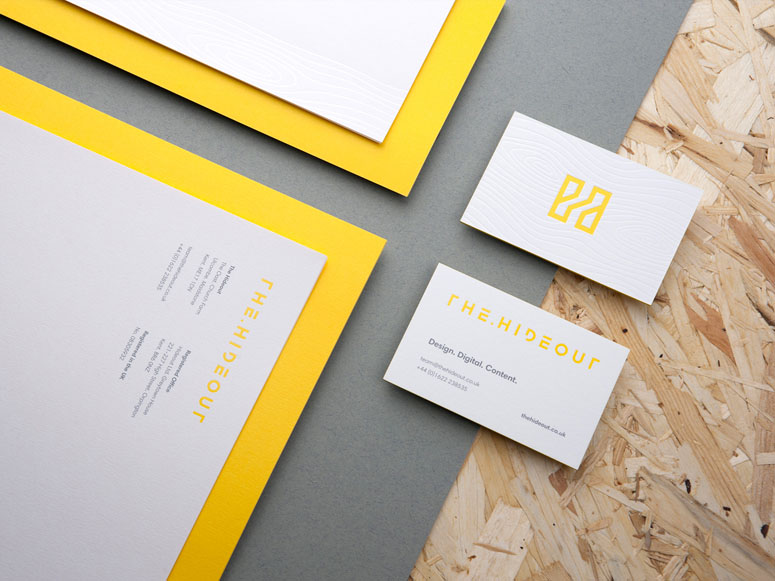
The Hideout Stationery
Production Method
Lithography
Design
The Hideout
John Vingoe - Designer
Sarah Bull - Account Manager
Printing
Identity Print
White foil on white paper gives this stationery a unique visual—something that was not easy to attain without proper communication with the printer. But once the feedback was received the production was smooth and the outcome just like the team at The Hideout wanted it.
Dimensions (Width × Height × Depth)
Business cards: 85mm × 55mm
A4
Page Count
–
Paper Stock
G.F Smith / ColorPlan / Pristine White / 1050gsm
G.F Smith / ColorPlan / Pristine White / 135gsm
Number of Colors
2
Varnishes
–
Binding
Duplex
Typography
Harmonia Sans

Project Description
The Hideout is a studio of designers, developers and content makers based in the garden of England. We offer a full range of services and can help you from the very creation of an idea through to delivery and on-going support. So whether it’s a brand and a campaign roll out, or a website design and build, we can work with you to create it.It was important for us to show that print still plays an important part, even in this digital world. Real consideration was taken in choosing what finishes to use and we worked closely with our printer, identity, to get a final product we were all happy with. The stationery continues the styling and approach of the new Hideout rebrand. A clean and minimalistic look allows the print finishes and tactile nature of the stationery to come to the forefront while staying completely functional. The addition of the simple wooden texture is a nod to the studios surroundings and our “Crafted with purpose” messaging.
Production Lesson(s)
We wanted a subtle look for the foiled wooden pattern on the stationery. We opted to test a white and a clear foil. Surprisingly the clear foil gave a slight yellow tint once applied to the stock, something we didn't want, where as the white foil went on without a problem and looked clean and crisp. It pays to talk to your printer and use their knowledge to get the best outcome for your print. What you think it will look like is not always how it will come out, so their experience is invaluable.
Post Author

Bryony Gomez-Palacio
Editor of FPO and co-founder of UnderConsideration LLC.
More: Online / On Twitter
Date Published
November 7, 2016
Filed Under
Lithography
Stationery
Tagged with
colorplan
deboss
duplex
foil stamp
gfsmith
Harmonia Sans
lithography
pms
stationery


About
FPO (For Print Only), is a division of UnderConsideration, celebrating the reality that print is not dead by showcasing the most compelling printed projects.
FPO uses Fonts.com to render Siseriff and Avenir Next.
FPO is run with Six Apart’s MovableType
All comments, ideas and thoughts on FPO are property of their authors; reproduction without the author’s or FPO’s permission is strictly prohibited
Twitter @ucllc
Sign-up for Mailing List
Mailing list managed by MailChimp
Thanks to our advertisers
About UnderConsideration
UnderConsideration is a graphic design firm generating its own projects, initiatives, and content while taking on limited client work. Run by Bryony Gomez-Palacio and Armin Vit in Bloomington, IN. More…
blogs we publish
Brand New / Displaying opinions and focusing solely on corporate and brand identity work.
Art of the Menu / Cataloguing the underrated creativity of menus from around the world.
Quipsologies / Chronicling the most curious, creative, and notable projects, stories, and events of the graphic design industry on a daily basis.
products we sell
Flaunt: Designing effective, compelling and memorable portfolios of creative work.
Brand New Conference videos / Individual, downloadable videos of every presentation since 2010.
Prints / A variety of posters, the majority from our AIforGA series.
Other / Various one-off products.
events we organize
Brand New Conference / A two-day event on corporate and brand identity with some of today's most active and influential practitioners from around the world.
Brand Nieuwe Conference / Ditto but in Amsterdam.
Austin Initiative for Graphic Awesomeness / A speaker series in Austin, TX, featuring some of the graphic design industry's most awesome people.
also
Favorite Things we've Made / In our capacity as graphic designers.
Projects we've Concluded / Long- and short-lived efforts.
UCllc News / Updates on what's going at the corporate level of UnderConsideration.

Related entries
Elbow Grease Magazine
Novum Magazine
Hechizoo Stationery
Michelle Maguire Book