ADV @ UNDERCONSIDERATION Peek here for details
BROWSE
Client
Self-initiated
Quantity Produced
250
Production Cost
–
Production Time
10 days
Dimensions (Width × Height × Depth)
24 in × 32 in
Page Count
–
Paper Stock
10 pt, Dull AQ Coating, 10% recycled
Number of Colors
CMYK
Varnishes
–
Binding
–
Typography
Akzidenz-Grotesk Condensed
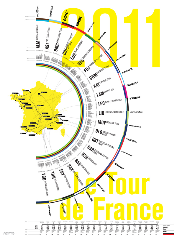
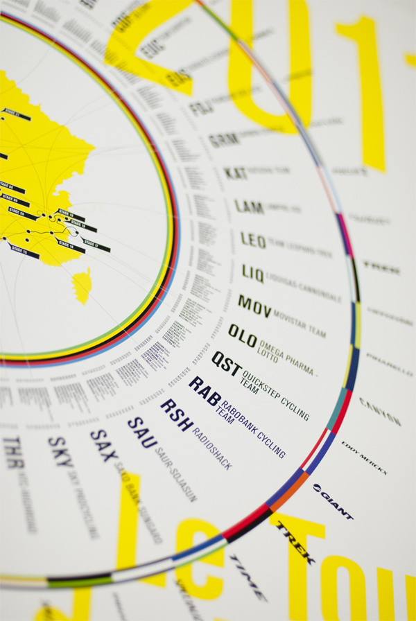
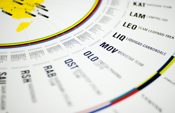
Information graphics about cycling that look like a bike wheel AND a zodiac? I’m smitten. One glance at this poster leaves me eager to devour the tiny details and learn more about this legendary event. Upon a more lingering gaze, the piece communicates the rhythm of tires through French countryside and the excitement of great gobs of people gathering to be part of something incredible. Like any decent infographic, this poster would look fabulous as a fabric pattern too!
The idea behind the Tour de France infographic/print started in 2010 as the World Cup was at full speed and the TdF getting started. Designers around the world were creating very compelling graphics looking at various aspects of the world cup. Realizing I hadn’t seen anything similar for the Tour de France, loving cycling and similarly taken by the sporting events complexity and huge amount of data points; I set out to capture some of the basics of the bike ride. I like the idea of seeing posters for each year showing the variation in each route, commemorating the riders, the shifts in teams, prevalence of bikes, graphically showing the rider stage wins and of course the stage and overall winners.

This post was published in the original layout of FPO so all images are smaller. Project descriptions as well as production lessons are quoted in the main content area.
Post Author
Jessica Mullen

Jessica Mullen
Writer for UnderConsideration LLC.
More: Online / On Twitter
Date Published
November 9, 2011
Filed Under
Posters
Tagged with
CMYK
infographic
information design
poster


About
FPO (For Print Only), is a division of UnderConsideration, celebrating the reality that print is not dead by showcasing the most compelling printed projects.
FPO uses Fonts.com to render Siseriff and Avenir Next.
FPO is run with Six Apart’s MovableType
All comments, ideas and thoughts on FPO are property of their authors; reproduction without the author’s or FPO’s permission is strictly prohibited
Twitter @ucllc
Sign-up for Mailing List
Mailing list managed by MailChimp
Thanks to our advertisers
About UnderConsideration
UnderConsideration is a graphic design firm generating its own projects, initiatives, and content while taking on limited client work. Run by Bryony Gomez-Palacio and Armin Vit in Bloomington, IN. More…
blogs we publish
Brand New / Displaying opinions and focusing solely on corporate and brand identity work.
Art of the Menu / Cataloguing the underrated creativity of menus from around the world.
Quipsologies / Chronicling the most curious, creative, and notable projects, stories, and events of the graphic design industry on a daily basis.
products we sell
Flaunt: Designing effective, compelling and memorable portfolios of creative work.
Brand New Conference videos / Individual, downloadable videos of every presentation since 2010.
Prints / A variety of posters, the majority from our AIforGA series.
Other / Various one-off products.
events we organize
Brand New Conference / A two-day event on corporate and brand identity with some of today's most active and influential practitioners from around the world.
Brand Nieuwe Conference / Ditto but in Amsterdam.
Austin Initiative for Graphic Awesomeness / A speaker series in Austin, TX, featuring some of the graphic design industry's most awesome people.
also
Favorite Things we've Made / In our capacity as graphic designers.
Projects we've Concluded / Long- and short-lived efforts.
UCllc News / Updates on what's going at the corporate level of UnderConsideration.

Related entries
36 Days of Type Poster
Ministry of Environment in Colombia Poster
National Parks Map
eBoy Poster
“Love Your Mother” Print