ADV @ UNDERCONSIDERATION Peek here for details
BROWSE
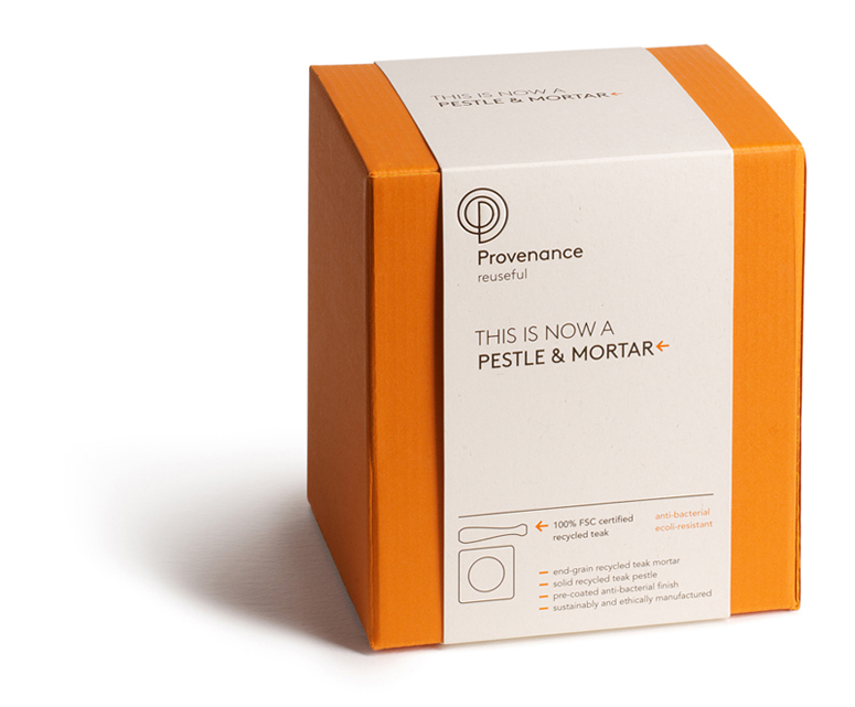
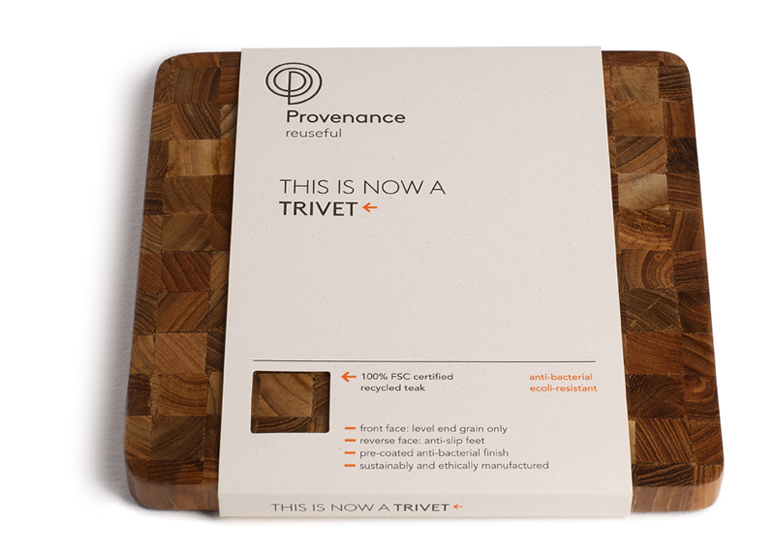
Provenance Packaging
Production Method
Deboss
Offset
Design
Jog Ltd
Creative Director: Robert Smith (Jog Ltd)
Designer: Andrew Hatcher (Jog Ltd)
Photographer: Alan Thornton
Printing
Lithgo Press
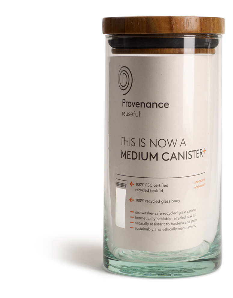
It’s great to see products in production that practice the cradle-to-cradle preach. Every step of the product life-cycle has been considered, from the origin of the materials to the unbranded boxes. But what really hooked me was the curled paper with clever cutout in the “medium canister,” which now looks fit for any modern kitchen apothecary.
Dimensions (Width × Height × Depth)
–
Page Count
–
Paper Stock
Sleeves only: Fedrigoni / Woodstock Betulla / 280gsm / (Woodstock is 80% PCW recycled paper and 20% eco-pulp FSC-certified)
Number of Colors
2
Varnishes
–
Binding
–
Typography
Brown
Avenir
Project Description
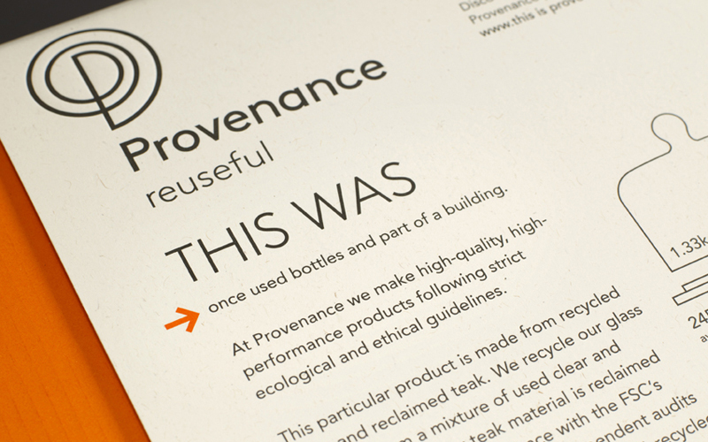
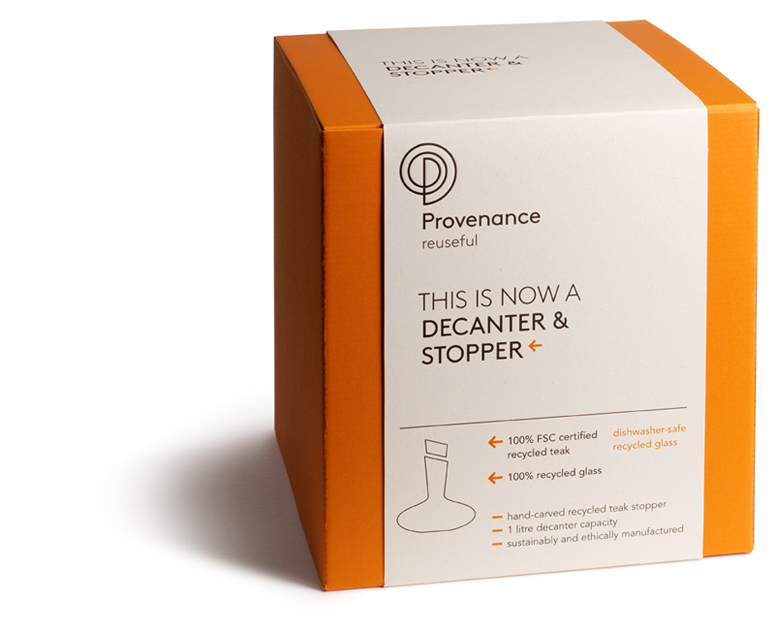
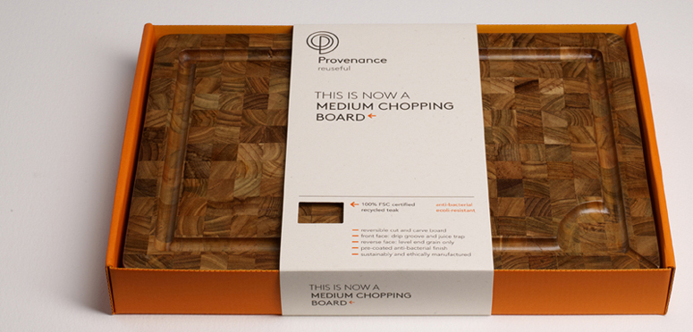
Provenance makes high-quality homeware products from recycled, reclaimed and renewable materials. As the packaging has to sell the story of the materials as much as the product, the brand language ‘this is now’ and ‘this was’ is used on the face and reverse of each product’s packaging, to introduce the story of its provenance.In keeping with the products, the packaging is designed to achieve high shelf and low environmental impact. Strong orange is used for the boxes to draw attention to the display, the corrugated board for these boxes is 100% recycled (100% post-consumer waste), and is left unbranded to encourage reuse (but can be easily recycled). It is self-coloured to make any in-store damage less visible, reducing the need for re-boxing.
Branding is restricted to the paper sleeves, which are made from 80% recycled paper (80% post consumer waste with 20% eco-pulp from FSC-certified sources), with minimal ink coverage and no foil blocking to ensure they can be readily recycled. Sleeves minimize waste when adapting packaging to different languages. Where products are boxed, the sleeve carries a simple line drawing to identify the contents instead of photography for a cleaner aesthetic, as the retailer will always display the physical products. Where possible, cut-outs frame the material of each product, drawing attention to it as much as to the completed product, which should only be one form the material takes in a wider journey of recycling. Like the products themselves, all Provenance packaging is made from materials that are 100% recyclable.
Production Lesson(s)
The environmental profile of the packaging was hugely important. We originally wanted to use foil blocking but on examination it became clear that this reduces the recyclability of the paper so we opted just to deboss instead.
Post Author

Jessica Mullen
Writer for UnderConsideration LLC.
More: Online / On Twitter
Date Published
June 19, 2012
Filed Under
Deboss
Offset
Packaging
Tagged with
deboss
package
product
recycled paper


About
FPO (For Print Only), is a division of UnderConsideration, celebrating the reality that print is not dead by showcasing the most compelling printed projects.
FPO uses Fonts.com to render Siseriff and Avenir Next.
FPO is run with Six Apart’s MovableType
All comments, ideas and thoughts on FPO are property of their authors; reproduction without the author’s or FPO’s permission is strictly prohibited
Twitter @ucllc
Sign-up for Mailing List
Mailing list managed by MailChimp
Thanks to our advertisers
About UnderConsideration
UnderConsideration is a graphic design firm generating its own projects, initiatives, and content while taking on limited client work. Run by Bryony Gomez-Palacio and Armin Vit in Bloomington, IN. More…
blogs we publish
Brand New / Displaying opinions and focusing solely on corporate and brand identity work.
Art of the Menu / Cataloguing the underrated creativity of menus from around the world.
Quipsologies / Chronicling the most curious, creative, and notable projects, stories, and events of the graphic design industry on a daily basis.
products we sell
Flaunt: Designing effective, compelling and memorable portfolios of creative work.
Brand New Conference videos / Individual, downloadable videos of every presentation since 2010.
Prints / A variety of posters, the majority from our AIforGA series.
Other / Various one-off products.
events we organize
Brand New Conference / A two-day event on corporate and brand identity with some of today's most active and influential practitioners from around the world.
Brand Nieuwe Conference / Ditto but in Amsterdam.
Austin Initiative for Graphic Awesomeness / A speaker series in Austin, TX, featuring some of the graphic design industry's most awesome people.
also
Favorite Things we've Made / In our capacity as graphic designers.
Projects we've Concluded / Long- and short-lived efforts.
UCllc News / Updates on what's going at the corporate level of UnderConsideration.

Related entries
Alivu EVOO Packaging
Dutch Harvest Hemp Tea Packaging
GoSimple Packaging
The Farmer’s Daughter Hot Pepper Jelly
Calyx Wellness Centre Package Design