ADV @ UNDERCONSIDERATION Peek here for details
BROWSE
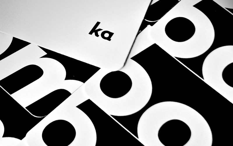
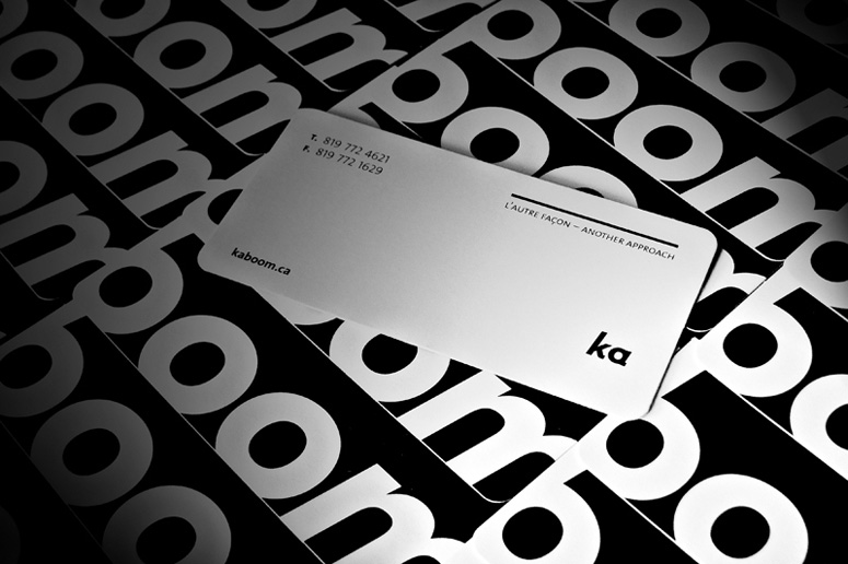
Kaboom Communication Design Business Card
Production Method
Die-cut
Offset
Design
Kaboom Communication Design
Printing
The Lowe-Martin Group
Kaboom’s minimal business card expresses the group’s explosive nature without resorting to bomb clichés. This message will self-destruct.
Dimensions (Width × Height × Depth)
3.5 in × 1.75 in
Page Count
–
Paper Stock
–
Number of Colors
Double hit of black
Varnishes
Varnish on white side
Binding
–
Typography
The Sans

Project Description
This was the business card developed for Kaboom Communication Design. This was an exercise in simplicity and modernism. We avoided colors in our rebranding of the company because we wanted to highlight our work and needed a branding that would take second place to the work we produce. This business card was the first printed piece of our rebranding efforts. We endeavored to avoid clichés that would typically befall a company named "kaboom" and decided to use a simple typographic treatment to best express our "explosive" nature while showing enough class and restraint to communicate that we are a high end design bureau, and understand that space and form are the simple ingredients to making the loudest noise.Production Lesson(s)
The greatest challenge we faced during this project was the practice of removing all unnecessary design elements. Cutting the fat. This challenge then became our mantra as we decided to pursue the limits of what we could leave out.
Post Author

Kelly Cree
Writer for UnderConsideration LLC.
More: Online / On Twitter
Date Published
September 20, 2012
Filed Under
Business Cards
Die-cut
Offset
Tagged with
black
double hit


About
FPO (For Print Only), is a division of UnderConsideration, celebrating the reality that print is not dead by showcasing the most compelling printed projects.
FPO uses Fonts.com to render Siseriff and Avenir Next.
FPO is run with Six Apart’s MovableType
All comments, ideas and thoughts on FPO are property of their authors; reproduction without the author’s or FPO’s permission is strictly prohibited
Twitter @ucllc
Sign-up for Mailing List
Mailing list managed by MailChimp
Thanks to our advertisers
About UnderConsideration
UnderConsideration is a graphic design firm generating its own projects, initiatives, and content while taking on limited client work. Run by Bryony Gomez-Palacio and Armin Vit in Bloomington, IN. More…
blogs we publish
Brand New / Displaying opinions and focusing solely on corporate and brand identity work.
Art of the Menu / Cataloguing the underrated creativity of menus from around the world.
Quipsologies / Chronicling the most curious, creative, and notable projects, stories, and events of the graphic design industry on a daily basis.
products we sell
Flaunt: Designing effective, compelling and memorable portfolios of creative work.
Brand New Conference videos / Individual, downloadable videos of every presentation since 2010.
Prints / A variety of posters, the majority from our AIforGA series.
Other / Various one-off products.
events we organize
Brand New Conference / A two-day event on corporate and brand identity with some of today's most active and influential practitioners from around the world.
Brand Nieuwe Conference / Ditto but in Amsterdam.
Austin Initiative for Graphic Awesomeness / A speaker series in Austin, TX, featuring some of the graphic design industry's most awesome people.
also
Favorite Things we've Made / In our capacity as graphic designers.
Projects we've Concluded / Long- and short-lived efforts.
UCllc News / Updates on what's going at the corporate level of UnderConsideration.

Related entries
KitchenAid Limited Edition Cards
Black Sheep Studio Business Cards and Promotional Items
Seegno Business Cards
Fracas Productions Business Cards
Elegante Press Business card