ADV @ UNDERCONSIDERATION Peek here for details
BROWSE
Client
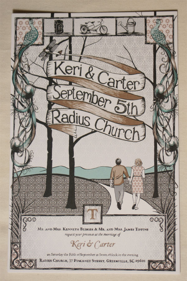
Keri Burger and Carter Tippins
Quantity Produced
200
Production Cost
$360
Production Time
10 days
Dimensions (Width × Height × Depth)
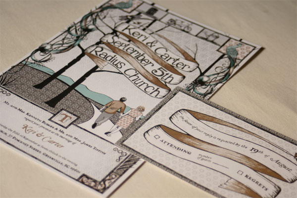
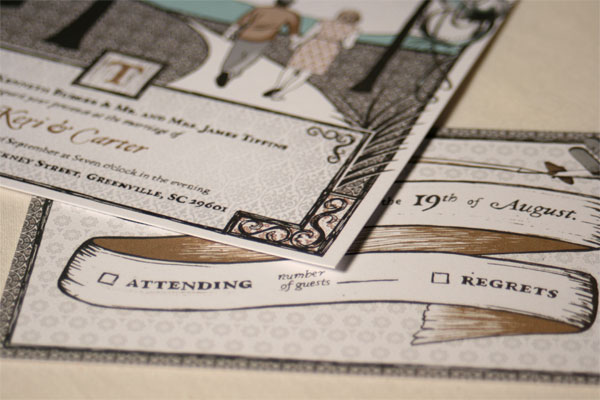
Wedding invitation: 5.5 in × 8.5 in
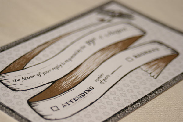
Reply card: 5.25 in × 3.25 in
Page Count
–
Paper Stock
Uncoated, 100 lb. cover
Number of Colors
CMYK
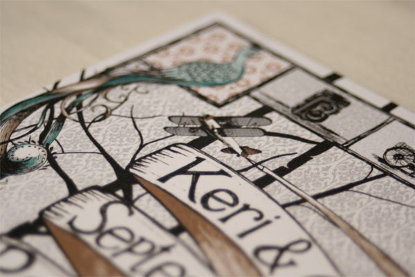
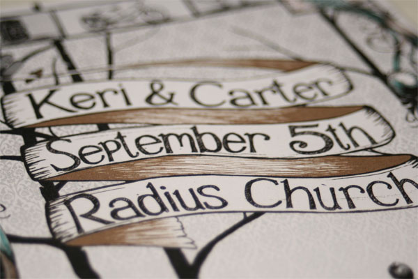
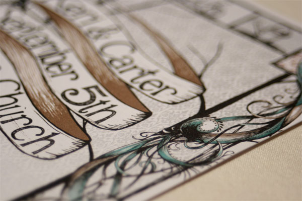
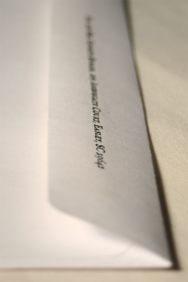
With each passing year I notice that wedding invitations are stepping further and further away from what one would expect to find contained within the envelope. With the couple’s personalities becoming more and more apparent in every wedding detail it is no surprise that Emory Cash spent countless hours on the drawing board crafting infinite details on his illustration and fussing over each hand lettered character as he strove for the perfect invite.
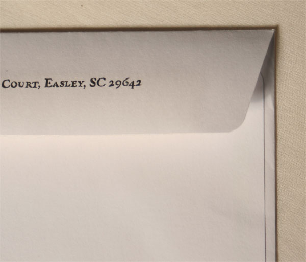
But it is in the envelopes that we see his final punch of dedication as he made Xerox transfers of the return address on each piece. It has been a while since I have seen this technique, so I asked him to give us a quick tutorial for those of you who might be interested in doing something with it:
The process seems to work better with grayscale images, but it is possible to use this process with a color copy. Finalize your design the way you want it and then flip it horizontally before printing it, otherwise your final image will come out backwards. Once you have a printed piece, make a copy of the original printout on your copy machine. Proceed to place this copy face down on the desired substrate and tape in place. I like to tape my paper just along the top so I can flip it up and check on my progress. If you’re transfering your image to another sheet of paper, like I did with the envelope and return card, then a lightbox makes it easy to line the two pieces up exactly where you want them. Now you’re ready to transfer. Take the oil and apply a few drops to the end of a cotton swab and begin to apply the oil to the back of your image. You don’t want puddles of oil, just enough to make it damp.I would suggest working through your image in a series of small sections, otherwise the oil will dry out before you get to it. Next take the paper scorer, or whatever else you might be using, and begin to rub the back of the image where you just applied the oil. This should have successfully transfered the image. Continue to work through your image until the entire image is transferred. You can also go back over areas where it looks like it didn’t transfer as well as you would have liked.
Materials needed:
• 100% pure essential Wintergreen Oil—I found mine at the local Whole Foods
•Cotton swabs
• Bone folder or other hard and dull tool
• Photo copier

This post was published in the original layout of FPO so all images are smaller. Project descriptions as well as production lessons are quoted in the main content area.
Post Author
Bryony

Bryony Gomez-Palacio
Editor of FPO and co-founder of UnderConsideration LLC.
More: Online / On Twitter
Date Published
September 30, 2009
Filed Under
Invitations
Tagged with
CMYK
illustration
offset
reply card
uncoated
wedding invitation
xerox transfer


About
FPO (For Print Only), is a division of UnderConsideration, celebrating the reality that print is not dead by showcasing the most compelling printed projects.
FPO uses Fonts.com to render Siseriff and Avenir Next.
FPO is run with Six Apart’s MovableType
All comments, ideas and thoughts on FPO are property of their authors; reproduction without the author’s or FPO’s permission is strictly prohibited
Twitter @ucllc
Sign-up for Mailing List
Mailing list managed by MailChimp
Thanks to our advertisers
About UnderConsideration
UnderConsideration is a graphic design firm generating its own projects, initiatives, and content while taking on limited client work. Run by Bryony Gomez-Palacio and Armin Vit in Bloomington, IN. More…
blogs we publish
Brand New / Displaying opinions and focusing solely on corporate and brand identity work.
Art of the Menu / Cataloguing the underrated creativity of menus from around the world.
Quipsologies / Chronicling the most curious, creative, and notable projects, stories, and events of the graphic design industry on a daily basis.
products we sell
Flaunt: Designing effective, compelling and memorable portfolios of creative work.
Brand New Conference videos / Individual, downloadable videos of every presentation since 2010.
Prints / A variety of posters, the majority from our AIforGA series.
Other / Various one-off products.
events we organize
Brand New Conference / A two-day event on corporate and brand identity with some of today's most active and influential practitioners from around the world.
Brand Nieuwe Conference / Ditto but in Amsterdam.
Austin Initiative for Graphic Awesomeness / A speaker series in Austin, TX, featuring some of the graphic design industry's most awesome people.
also
Favorite Things we've Made / In our capacity as graphic designers.
Projects we've Concluded / Long- and short-lived efforts.
UCllc News / Updates on what's going at the corporate level of UnderConsideration.

Related entries
“An Evening onboard the HMS Victory” Invitation
Rainforest Alliance 2017 Annual Gala Invitation
The Nelson-Atkins Museum of Art Invitation
Victoria and Sasha Wedding Invitation
“Fast & Four” Skateboard Deck Invitation