ADV @ UNDERCONSIDERATION Peek here for details
BROWSE
Client
TED Conferences, LLC
Quantity Produced
1,700
Production Cost
Not Disclosed
Production Time
3 months
Dimensions (Width × Height × Depth)
6.75 in × 9.5 in
Page Count
168 + Cover
Paper Stock
Mohawk Via Vellum 65 lb cover and 60 lb text
Utopia Two Gloss 60 lb text
Number of Colors
4 spot: Black, Cool Gray 8, Cool Gray 3, PMS 185
Varnishes
Spot satin varnish
Binding
Perfect bound
Typography
Franklin Gothic and Adobe Garamond Premiere Pro
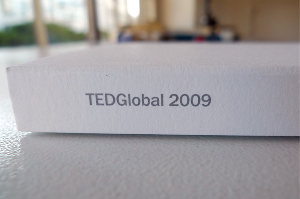
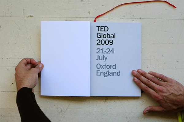
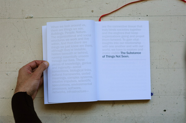
This past July, creative and business geniuses gathered in Oxford for TEDGlobal 2009, an intellectual bacchanal that takes place every two years. Most of the gestures at this conference are grand and sophisticated and this year’s program guide was no exception. Commissioned by frog design from Cahan & Associates, the program guide is a subtle and elegantly designed print piece. The program’s designer, Sean McGuire explains in depth:
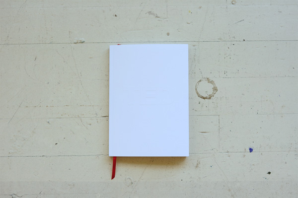
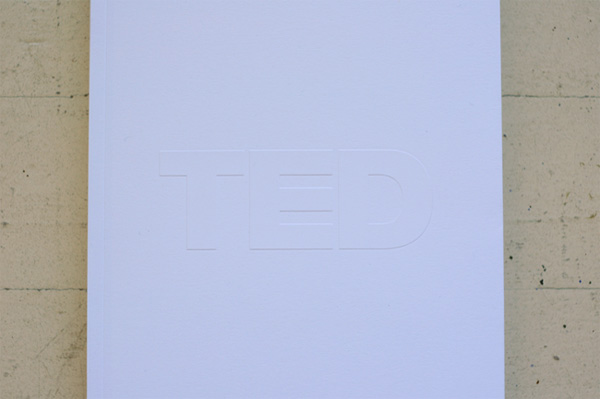
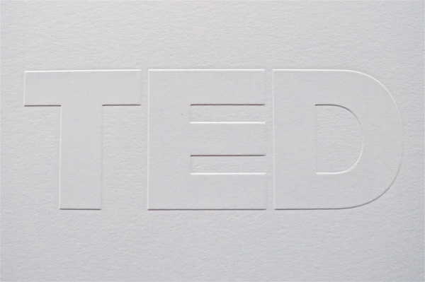
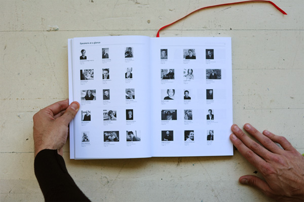
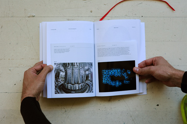
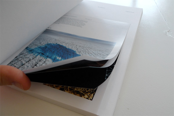
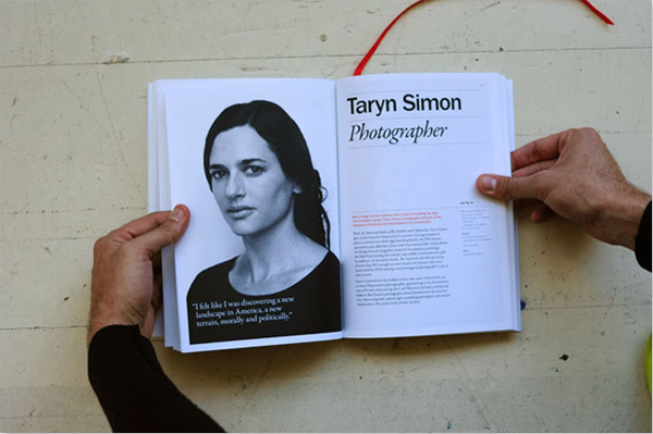
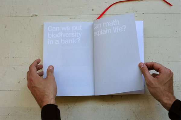
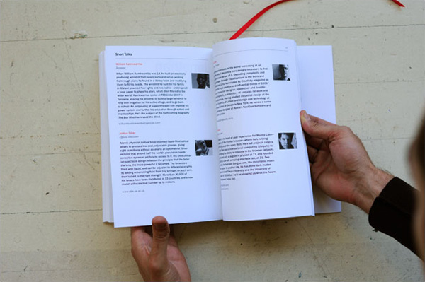
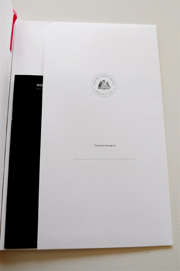
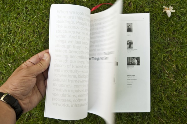
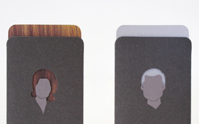
The theme of the conference, “The Substance of Things Not Seen,” was a great place to begin our concepting, but the client kept making our job easier. They wanted this year’s guide to serve as a memento and a keepsake for the attendees and they wanted it to have a scrapbook quality where people would be encouraged to add notes and tokens of their time in Oxford. To achieve the client’s goals and to convey the theme through the guide, we chose to be as subtle as possible, beginning with the cover. The front cover features a gatefold and blind embossed logo, while the gatefold on the back has been glued to create a pocket in which attendees can collect scraps. Inside the guide we kept the color palette to three colors and included a ribbon as a bookmark. Our solution for the “scrapbook” feel the client wanted was to put representative images of the speakers on short sheets and disperse them throughout the guide. In order to keep the guide feeling like a collectible we moved the advertisements into their own booklet which was placed in the back pocket.
I really like the understated design and the simple production that resists being laden with printing tricks, instead relying on a nice red ribbon that gives it a comforting literary feel along with simple paper, strong photography and sweet typography. Somewhat appropriate to the larger-than-life nature of TED, the program guide had interesting company while on press:
The day the guide went to press turned out to be a sad, June day as both Michael Jackson and Farrah Fawcett passed away. At Lithographix in Los Angeles our project was on press next to Michael Jackson’s concert tickets. It was somewhat surreal to hear the news about Michael and then to hear our work had some indirect, loose connection was increasingly odd.

Additional images, photographed against greener pastures, can be found at frog’s blog.
TEDGlobal Program Guide
Production Method
Design
Design: Sean McGuire
Art Direction: Todd Richards
Production: Liisa Turan-Walters
Printing
Editors: Emily McManus and Bruno Giussani
Design Consultant: Sharrie Brooks
Photo Editor: Mike Femia
Managing Editor: Sam Martin
Producer: Tim Leberecht
Printer: Lithographix
This post was published in the original layout of FPO so all images are smaller. Project descriptions as well as production lessons are quoted in the main content area.
Post Author
Armin

Armin Vit
Editor of FPO and co-founder of UnderConsideration LLC.
More: Online / On Twitter
Date Published
October 27, 2009
Filed Under
Program
Tagged with
emboss
perfect bound
program
ribbon


About
FPO (For Print Only), is a division of UnderConsideration, celebrating the reality that print is not dead by showcasing the most compelling printed projects.
FPO uses Fonts.com to render Siseriff and Avenir Next.
FPO is run with Six Apart’s MovableType
All comments, ideas and thoughts on FPO are property of their authors; reproduction without the author’s or FPO’s permission is strictly prohibited
Twitter @ucllc
Sign-up for Mailing List
Mailing list managed by MailChimp
Thanks to our advertisers
About UnderConsideration
UnderConsideration is a graphic design firm generating its own projects, initiatives, and content while taking on limited client work. Run by Bryony Gomez-Palacio and Armin Vit in Bloomington, IN. More…
blogs we publish
Brand New / Displaying opinions and focusing solely on corporate and brand identity work.
Art of the Menu / Cataloguing the underrated creativity of menus from around the world.
Quipsologies / Chronicling the most curious, creative, and notable projects, stories, and events of the graphic design industry on a daily basis.
products we sell
Flaunt: Designing effective, compelling and memorable portfolios of creative work.
Brand New Conference videos / Individual, downloadable videos of every presentation since 2010.
Prints / A variety of posters, the majority from our AIforGA series.
Other / Various one-off products.
events we organize
Brand New Conference / A two-day event on corporate and brand identity with some of today's most active and influential practitioners from around the world.
Brand Nieuwe Conference / Ditto but in Amsterdam.
Austin Initiative for Graphic Awesomeness / A speaker series in Austin, TX, featuring some of the graphic design industry's most awesome people.
also
Favorite Things we've Made / In our capacity as graphic designers.
Projects we've Concluded / Long- and short-lived efforts.
UCllc News / Updates on what's going at the corporate level of UnderConsideration.

Related entries
2017 Brand New Conference Program
Impulsion/Impulse Program
2016 Brand New Conference Program
2016 Brand Nieuwe Conference Program
Taronga Zoo Invitation and Program