ADV @ UNDERCONSIDERATION Peek here for details
BROWSE
Client
Self-directed
Quantity Produced
7
Production Cost
$25.00
Ink was free, and only paid for the paper and the wood to cut
Production Time
Design: 2 days
Carving: 3 days
Printing: 2 days
Dimensions (Width × Height × Depth)
39.5 in × 15.375 in
Page Count
–
Paper Stock
White Hahnemuhle German Etching
Number of Colors
3 Custom Mixed Colors
1 blind emboss
Varnishes
–
Binding
–
Typography
ITC Franklin Gothic
Bookman Old Style
For some people, “fun” is carving a piece of wood for hours on end, and “funny” is, well, things like birds. Some people are probably just Seth Akkerman who created this poster for his own amusement. I could recount what he told me, but best to hear it from him:
My rules when working on personal projects is that they need to make me laugh, I need to be proud of the craft, and if possible I like to work in inside jokes (usually this part results in the humor). For whatever reason, birds have been a common theme in my work lately so I took that concept and tried to think of ways I could push it differently.
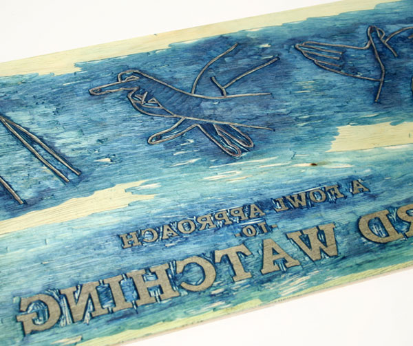
The wood plate method came about because for whatever reason, I really enjoy the tediousness of carving for hours and hours on something that could be printed by a machine relatively fast. I feel a much greater connection to the piece afterwards knowing that I was able to successfully carve every element from a piece of wood including the extremely small type. Also, I think the texture that appears in the end print as a result of the actual wood adds a level of interest for the end viewer to offer them something past the initial glance.
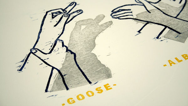
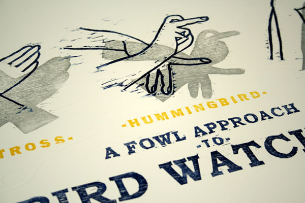
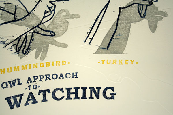
I also chose to use the hand symbols as part of the motif because, as I said before, birds have been finding a way into my work already and I enjoyed the humorous connection between bird watching in a “line-up” field guide structure of actual specimens but conveyed in a non-realistic manner. You can still see the actual birds (thus the shadows for people who couldn’t stretch to get there).
The blind emboss in this piece is the inside joke that I mentioned earlier. This portion is the real exclamation point on the whole piece but only if you see it. I like the idea that someone may not even see them for the first few days or weeks it is in their possession. Then, one day, they happen to look at it the right way and they get it. In my eyes, this is even more value added for the end audience. It gives them something extra to show their friends when looking at it. Also, the blind embossed shotguns are the reason for the play on words “Fowl approach” meaning both birds and that bird watching with guns would be fowl as well.
The only ones who could probably cry foul, or fowl, at this poster are fowls, or fools.
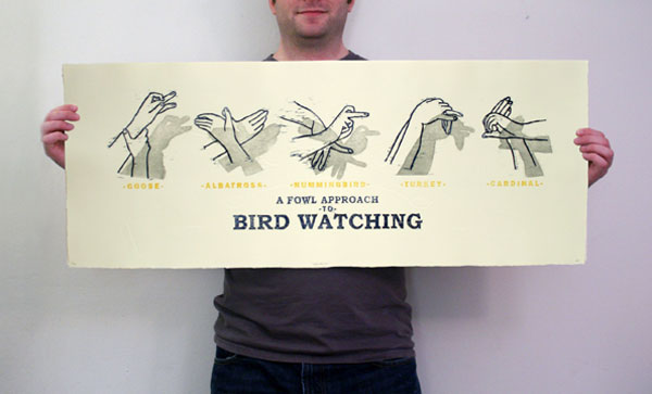

Bird Watching Poster
Production Method
Design
Design, wood cutting, printing: Seth Akkerman
Printing
Seth Akkerman
This post was published in the original layout of FPO so all images are smaller. Project descriptions as well as production lessons are quoted in the main content area.
Post Author
Armin

Armin Vit
Editor of FPO and co-founder of UnderConsideration LLC.
More: Online / On Twitter
Date Published
April 12, 2010
Filed Under
Posters
Tagged with
carving
DIY
poster
relief print
wood cutting


About
FPO (For Print Only), is a division of UnderConsideration, celebrating the reality that print is not dead by showcasing the most compelling printed projects.
FPO uses Fonts.com to render Siseriff and Avenir Next.
FPO is run with Six Apart’s MovableType
All comments, ideas and thoughts on FPO are property of their authors; reproduction without the author’s or FPO’s permission is strictly prohibited
Twitter @ucllc
Sign-up for Mailing List
Mailing list managed by MailChimp
Thanks to our advertisers
About UnderConsideration
UnderConsideration is a graphic design firm generating its own projects, initiatives, and content while taking on limited client work. Run by Bryony Gomez-Palacio and Armin Vit in Bloomington, IN. More…
blogs we publish
Brand New / Displaying opinions and focusing solely on corporate and brand identity work.
Art of the Menu / Cataloguing the underrated creativity of menus from around the world.
Quipsologies / Chronicling the most curious, creative, and notable projects, stories, and events of the graphic design industry on a daily basis.
products we sell
Flaunt: Designing effective, compelling and memorable portfolios of creative work.
Brand New Conference videos / Individual, downloadable videos of every presentation since 2010.
Prints / A variety of posters, the majority from our AIforGA series.
Other / Various one-off products.
events we organize
Brand New Conference / A two-day event on corporate and brand identity with some of today's most active and influential practitioners from around the world.
Brand Nieuwe Conference / Ditto but in Amsterdam.
Austin Initiative for Graphic Awesomeness / A speaker series in Austin, TX, featuring some of the graphic design industry's most awesome people.
also
Favorite Things we've Made / In our capacity as graphic designers.
Projects we've Concluded / Long- and short-lived efforts.
UCllc News / Updates on what's going at the corporate level of UnderConsideration.

Related entries
36 Days of Type Poster
Ministry of Environment in Colombia Poster
National Parks Map
eBoy Poster
“Love Your Mother” Print