

NOTE: This is an archived version of the first incarnation of Brand New. All posts have been closed to comments. Please visit underconsideration.com/brandnew for the latest version. If you would like to see this specific post, simply delete _v1 from the URL.
![]()
Quicktime, Apple’s prevalent media technology, is seeing its latest incarnation within a den of Snow Leopards, announced this last Monday at Apple’s Worldwide Developers Conference 2009. As with almost every updated release of the Quicktime, a new icon emerges — in this case it is also accompanied by the addition of an X at the end of the name, probably acknowledging that it will be some time before the blue Q is completely superseded by the new one. In a way, this iteration of the Q-clock is the one that was always meant to be. Finally the count will reach 20 seconds and the arm will tick its way into formal harmony with the Q descender. I’m sure many of us have always wondered why this hadn’t happened at the outset. One can imagine that this current design may have been a predecessor to the first Q release, a version that perhaps wasn’t approved for abstracting “Time” too much, an approval committee saying “What if the second hand was separated from the tail of the Q?” and a designer saying “D’oh!” But let us not dwell on our past experiences, this logomark is finally living up to its potential. While the plastic, gradient-happy rendering complicates an elegant solution, for all of us inclined to do so, we can sit back and imagine the two-dimensional, one-color version and breathe a sigh of relief.
![]()
The evolution of the Quicktime logo.
Thanks to Junghoon Park for the tip.


Jump to Most Recent Comment
Lucian E.’s comment is:
Too bad the arrow points down...
On Jun.12.2009 at 07:22 AM
binoygopal’s comment is:
good execution
On Jun.12.2009 at 07:31 AM
Andrew’s comment is:
to me, it looks too much like a rotated version of the power/standby icon.
On Jun.12.2009 at 08:04 AM
Robert’s comment is:
The evolution of the Quicktime logo looks a lot like the evolution of design styles.
Especially the last two, with more recently design had a lot of glossy glows, and now with the latest sporting the very dramatic lighting.
On Jun.12.2009 at 08:09 AM
Dale Campbell’s comment is:
I think that it will fit perfectly within the new graphics and interface of the new OS.
Well done, in my opinion.
On Jun.12.2009 at 08:11 AM
MB’s comment is:
*sigh*
On Jun.12.2009 at 08:25 AM
Andrew Sabatier’s comment is:
Quicktime time.
To some degree, at least in the creative world dominated by Apple, a proper and appropriate claim to the Q has been made. It's been a long time coming. The fact that the arrow points down in no way diminishes the strength of the concept. That's how Qs are built. And that's how Quicktime has developed.
As Armin points out, this is where Quicktime was meant to be. Snow Leopard is 'the world's most advanced operating system finely tuned'. This is the Quicktime icon finely tuned and fully realised in the context of Apple's overall development. This is a solid and compelling ground zero for a great piece of software.
Where to next? Not only for Quicktime but for Apple and all its inspired brilliance so far. I revel in Apple's success.
A.
Remy Overkempe’s comment is:
Somewhat of a great execution, I'm sorry. It's a bit weird at first, especially because it's so "Ah, too many this, that and that!", but then, at the second glance, it looks somewhat sophisticated. I don't know why. The purple core is enchanting me and hypnotising me. ... This is a pretty random comment. What was I talking about?
On Jun.12.2009 at 08:36 AM
Roby Fitzhenry’s comment is:
The aesthetic updates seem to match the direction Apple is headed with their visuals. I do wish they would have shown a little more "time" and not so much "Q" in the design. Pretty sure it will grow on everyone though.
On Jun.12.2009 at 09:07 AM
David H’s comment is:
I can't tell if people posting here (or Armin) are being sarcastic or not. That logo is pretty bad: it has too many effects applied to it, it doesn't really state "Time" any longer, and it's just plainly ugly.
On Jun.12.2009 at 09:08 AM
Scott’s comment is:
I disagree. It's a fine update and the gradients just seem to fit in with all of the Apple icons that they produce in the present day.
On Jun.12.2009 at 09:12 AM
Jude Landry’s comment is:
I'm disappointed to see the blue gone. Why lose the color equity for a random change? While it is effects-laden, it lives on screen and so I guess I can live with that. I wonder what my dock would look like with all flat-color icons?
On Jun.12.2009 at 09:19 AM
makkam’s comment is:
...DivX 7"?
On Jun.12.2009 at 09:23 AM
Franky Boy’s comment is:
This is ugly. Just because it came from Apple doesn't make it less so. Deactivate your reality distortion fields for a moment...
On Jun.12.2009 at 09:25 AM
annmarie’s comment is:
Strange, but I don't recall seeing a real-life Quicktime clock or even an on-screen widget when the logo begs to be copied - perhaps the Apple lawyers pulled them down. The latest logo, obviously sitting on a table, what with the 2.0 reflection, if the hand is really a second (minute? hour?) hand, then it's stuck at the 20-second and cannot move further. Hmmmmm...
On Jun.12.2009 at 09:36 AM
Matthew R’s comment is:
Worth noting what they had during the betas (and it appears right until last minute):
I much prefer this one.
On Jun.12.2009 at 09:48 AM
Adam duquette’s comment is:
At first I wasn't into it, but after a second or two of looking at it, I realized that it really fits with the evolution of Apple's overall look.
It's a bit alien-esque, and very "futuristic".
That's my take anyway.
On Jun.12.2009 at 09:50 AM
Sand’s comment is:
Gorgeous. The updated logo finally looks like it "belongs" with the rest of OSX. It'd even look good as a flat 2 color logo (bonus!)
On Jun.12.2009 at 09:51 AM
Craig’s comment is:
Don't like it at all. The gradient is horrible.
On Jun.12.2009 at 09:57 AM
Marcos’s comment is:
I always loved the Quicktime logo, from day one. I must say that the latest version is not my favorite one by a long shot.
On Jun.12.2009 at 09:59 AM
Armin’s comment is:
> I can't tell if people posting here (or Armin)
Not me, Christian Palino. Read, people, read! I know I post most of the time, but there are others in this.
On Jun.12.2009 at 10:05 AM
Altaf’s comment is:
I always thought the old "Q" was a retro record player since it played music. Never knew it was a clock, a clock has two hands not one.
Aside from the color change, this logo is official.
On Jun.12.2009 at 10:05 AM
Cen’s comment is:

Mark.’s comment is:
Pretty good... but I miss the little cap on the end of the clock arm. Gradients, in this context, are not bad; as was pointed out, this was meant to live on a dock with other vibrant, 3D icons.
On Jun.12.2009 at 10:24 AM
obse.’s comment is:
Why?!
On Jun.12.2009 at 10:50 AM
Chad Kaufman’s comment is:
Great catch Matthew R...
I am so glad they got rid of the other hand of the clock pointing up. I always thought it looked like a match stick being lit on the side of the circle.
The execution, as everyone has mentioned, is very fitting to the new Mac, reflectivy aesthetic. The new version appears very solid, which is a nice change of the jelly-looking blue one that came across more like a window cling than an icon.

jay’s comment is:
Eh....Looks like a rotated power button now. The clock hand was once separated because if it connects to the tail, it's suddenly not a clock.
On Jun.12.2009 at 10:56 AM
Davidoff’s comment is:
The "watch-time" concept was a great idea. Now it is only just a nice Q.
On Jun.12.2009 at 11:13 AM
ondrej’s comment is:
i think it looks cheap. there's nothing smart about it. good to use with "how to make glossy buttons" tutorials though...
but we'll get used to it. as always.
Estel’s comment is:
I thought Apple was about thinking different and the -less is more- philosophy, you know setting trends not following them.
I can do with the shape, and though it is true it suits the leopard environment, for me it's a 2.0 trendy thought.
BJN’s comment is:
"Quicktime" was always an opaque and strange name to me that communicates nothing about the app as a media player. But the name's established. I'm happy to see the obtuse clock reference all but vanish. Frankly, the clock logo has a strong association with waiting for Quicktime to load - so to me it's more of an ironically "slow time" substitute for an hourglass.
On Jun.12.2009 at 11:36 AM
Adam’s comment is:
Its nice, but I'm sick of brushed metal here. The Glowing purple center is just silly looking, frankly.
The actual interface of quicktime is the ONLY 10.6 app (as far as we know now) to shed the grey brushed metal, why did the logo just acquire it???
A black metal would better correspond with the new UI and provide a better overall identity.
On Jun.12.2009 at 11:40 AM
Tre’s comment is:
It'll look perfect on my Dock next to my iTunes album art icon.
On Jun.12.2009 at 11:47 AM
jRod’s comment is:
i have to say that i was disappointed to see them move away from the current version. I like the one on Matthew R's post... metal is better than alien.
On Jun.12.2009 at 12:04 PM
Drew Pickard’s comment is:
You gotta remember that this is less a logo and more an application icon. The 'rules' are different.
Like it or not, Apple started the gradient war, and this is the next volley of pseudo-3D weaponry.
It fits right in with their current 'lost in spaces' theme in OS X.
(and will look quite at home in the rumored mostly-black GUI redesign come OS X 10.7)
On Jun.12.2009 at 12:14 PM
Drew Pickard’s comment is:
However, because of the color change, it'll take some getting use to - blue Q is burned into my brain!
On Jun.12.2009 at 12:15 PM
Colin’s comment is:
I tend to think Apple designers can do no wrong. It's wonderful to see them sticking to the concept throughout so many iterations. Pretty easy to do when it was solid to begin with.
On Jun.12.2009 at 12:18 PM
Colin’s comment is:
Also, seems a lot of people are failing to visualize this in the context of the desktop interface. Read Apples human interface guidelines. This fits in perfectly. It has nothing to do with trends.
On Jun.12.2009 at 12:22 PM
Bobby Hays’s comment is:
While a huge fan of the old blue Q, i think this icon looks great and also fits in with their other "Core" icons. The Core Image, Animation, Video, and Audio are all colored spheres with an outer layer of clear sphere. Quicktime certainly belongs to these groups of technologies, so it really works as an extension of the existing icons while incorporating the traditional Quicktime icon. See here http://images.apple.com/macosx/technology/images/quicktime_circles20090608.jpg
On Jun.12.2009 at 12:29 PM
Bill Dawson (XK9)’s comment is:
The previous incarnation of the Quickime logo is quite the venerable mark. It's become synonymous with high quality desktop video. It's an icon that represents Apple's leadership in the evolution of entertainment technology. The software is intangible, so this mark served as a "concrete" example (along with the player windows) of Quicktime the entity and Quicktime the brand.
That said, I'm a little perplexed by this change. I can certainly understand a new treatment of the Q clock. But I don't believe this revision makes sense. If I saw this independently of this post, I might have thought it was for a new version of Quark.
But watch out for Microsoft's imitations. Metal is the new clear plastic.
On Jun.12.2009 at 12:40 PM
Lauren’s comment is:
Matthew R's is better!
Apple usually moves things forward with their design, and I'm surprised that this new Q doesn't do that. It seems to be backwards on the timeline, and frankly it looks more video-gamey to me with that glowing orb.
The blue is gone - and I must ask why? That was one of the more distinguishing QuickTime elements for me. So many Q logos out there - ditching the clock was symbolism lost.
Bill writes: "Metal is the new clear plastic" and I have to say if that is going to be the case, I am disappointed. Metal already was, it's a has-been. I was hoping Apple would move past metal and gel.
On Jun.12.2009 at 12:49 PM
theoxygenthief’s comment is:
It's a clock aaaaannnnnddd an amorphous Qx. Oh you Apple designers you.....
(P.S. I like it and I hope Apple will update the look of the rest of their OS too, i'm sick of dull dreary windows that can't decide if they're dull grey or dull white)
On Jun.12.2009 at 01:12 PM
Teresa’s comment is:
Good thing they've updated their logo since the new Goodwrench logo pretty looks like the previous Quicktime one.

Carlo’s comment is:
Can someone explain how the arm represents 20-seconds?
20-seconds is 1/3 of 60-seconds, and there's no way that arm (which seems to be based on a split quadrant) is one-third the way around the "Q".
Wünderwoman’s comment is:
Me likey.
On Jun.12.2009 at 02:01 PM
Niko’s comment is:
I miss the blue :(
On Jun.12.2009 at 02:23 PM
orangetiki’s comment is:
Seems to me like Apple simply changed the log to make it match all the other logos in their operating system. It's nice to have all the logos look like they belong to each other even if it gave up that time/clock aspect of their logo.
On Jun.12.2009 at 02:26 PM
Joachim’s comment is:
I'm pretty sure that the Goodwrench logo is a factor in Quicktime's change in order to distinguish itself.
As for the heavy gradient shiny style, it's very Apple, and it works well with the rest of their OS X icons.
On Jun.12.2009 at 02:49 PM
Follower’s comment is:
I second Bobby Hays -- When I first saw the new logo, I said "They're making it look like a 'Core' service icon." It's the predecessor to OS X's Core Video/Audio/Animation, and that is now being acknowledged.
On Jun.12.2009 at 03:02 PM
Stuart’s comment is:
I'm not crazy about the new icon (good thing I have candybar to help change any icon I want) and I really miss the time element in the logo, given that this is media playback software, but at the very least they should have worked in the blue. The blue has been a part of the Quicktime brand since the beginning and should have moved forward with the redesign. The new logo looks like the logo for core animation and the old Quicktime logo had a tryst in the logicboard and this was the unwanted result.

Anonymous’s comment is:
I am pretty sure the QuickTime logo was not based on a clock, but on a movie countdown timer: http://www.youtube.com/watch?v=pB5uCKkvxzo
Look at the four-square nature of the original one, just like the countdown timer.
On Jun.12.2009 at 03:16 PM
colormist’s comment is:
Really tired of 3-D, reflection, & heavy gradient trends. The whole apple look has become a running joke in the design department at my office. Give me a flat, boring version of this any day.

That being said, I appreciate the loss/merger of the second hand.
On Jun.12.2009 at 03:29 PM
Ismael’s comment is:
I'm torn on this one. On the one hand, I think the new icon (and keep in mind, it's an app icon as well as a logo) is gorgeous, and there's no question that it fits in to the darker themes of Leopard better than the Tiger-esque glossy blue “Q.”
But on the other… it just doesn't say “Quicktime” to me. As silly as that blue “Q” might look, I'm used to its friendly little presence. This one looks colder and more “pro,” which is probably the idea. Still, I and most others will probably get used to it.
On Jun.12.2009 at 03:33 PM
Nathan’s comment is:
Yes, I agree that "this iteration of the Q-clock is the one that was always meant to be" however, execution has robbed the icon of it's clockness if you will. The Q is strong, but the clock is weak.
On Jun.12.2009 at 04:06 PM
Joey V’s comment is:
It's just really expected. I bet iTunes is going purple soon as well.
On Jun.12.2009 at 04:13 PM
Robert’s comment is:
Thanks for the single color version, colormist. I was just about to waste five minutes doing that myself.
On Jun.12.2009 at 04:41 PM
Rob’s comment is:
This is a shame. The old logo was one you instantly recognized and it conveyed litterally 'quick time' (only 5 or 10 seconds on the clock).
The new one looks like any other iMac or iPod (or anything else with an 'i') app. I don't like it.
Why fix the old one if it was not broken?
On Jun.12.2009 at 05:09 PM
bobby’s comment is:
I'm probably in the minority in that I prefer the old logo. I think it's a pretty smart solution to convey "time" without being too obvious. The new logo is.. well, a Q.
On Jun.12.2009 at 05:13 PM
fuldog’s comment is:

AM I the only one that saw it and immediately thought of... oh well, all hail gradients and fading reflections.
On Jun.12.2009 at 06:22 PM
Chris’s comment is:
As per the usual, I dislike:
- the three-dimensional look
- the color scheme
- the boldness of the lines
However, I love that it is gloriously simplified. Icon design seems to have jumped significantly in importance in the last few years - and with the advent of the increasing necessity of good icons, such as with the iPhone - it only makes sense. The simpler and smarter the design, the better off you are. I feel like this is still (surprisingly) far from being a great design, but I do sense that it is getting there, at least.
On Jun.12.2009 at 06:30 PM
Timo’s comment is:
Initially I was puzzled by the fact that the center of the Q was filled in with grape jelly. But actually it makes it a much more functional icon— I often found myself clicking the "dead space" in the middle of the old blue Q. Won't have that problem anymore. In a way this reflects the iPhonification of the OS X interface.
On Jun.12.2009 at 06:45 PM
gacktsun’s comment is:
我认为标志的改造是成功的,新一代的标志并不拘泥与前几代标志的框架之中,在不改变基本轮廓的前提下,对标志进行全新改造,富有金属及电气化的质感,改造还是成功的。
On Jun.12.2009 at 09:09 PM
宝宝图片’s comment is:
It's so cool!
and the color nearly the Safari~
r’s comment is:
I like it, I just wish the purple was blue, just to keep that part of it.
On Jun.13.2009 at 04:21 AM
Anonymous’s comment is:
And this is how it should have been.

Peter’s comment is:
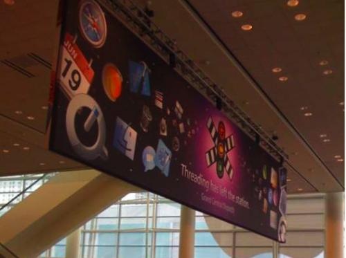
Yeah, i have to say when I first saw the new icon, i was 'oh god', what have they done but it is slowly growing on me like everything else Apple has done and before you know it, it's going to set a trend.
Something of interest i came across was the banner for the WWDC on macrumors – http://www.macrumors.com/2009/06/08/wwdc-keynote-starting-soon-grand-central-banners/. On the banner you can clearly see another version of the Quicktime logo which i actually liked better style wise. Having said all that i think the new icon has more thought in it but less of the over-styling Apple!
On Jun.13.2009 at 06:03 AM
Andreas Lanjerud’s comment is:
I can see an X in there: "Qx" merged.
Miss the blue the most, but not too happy about the merge of pointers either. The beta render was fine!
On Jun.13.2009 at 07:09 AM
Musser’s comment is:
I liked the old one... and I like the new one.
On Jun.13.2009 at 10:21 AM
Lorenzo Morales’s comment is:
Nicely done. I had wondered when they'd integrate the traditional Q design into the new interface. Smooth as silk consistency!
I have to say of the known "Q" logos, QVC's is by far the best execution!
On Jun.13.2009 at 10:29 AM
Dwight’s comment is:
I am interested to see how a completely flat logo without any gradients would look in the mac dock, I think it might work out fine. Seems like any time I end up making 3dish icons, I end up reverting back to the 2d. Call me old fashion, but I get my inspiration from Neurath.
On Jun.13.2009 at 01:47 PM
b.r.o.o.d.y.’s comment is:
I know this logo doesn't respect our traditional design conventions (no gradients/reflection/glossy crap).
But all I can think of is how glorious it will look sitting in Snow Leopard's graphical interface.
As far as glossy icons go, I like that it has significantly more dramatic/moody lightning compared to what we've become used to see.
On Jun.13.2009 at 11:48 PM
Luis’s comment is:
People, you shouldn't treat a LOGO and and ICON the same way. They usually work in very different environments and contexts, plane colors in an icon sitting on the dock? c'mon!
On Jun.14.2009 at 01:06 AM
toqueboy’s comment is:
this looks like follow the trend icon art. it is in keeping with the new look of the overall OS, but i agree with the person who posted the DivX7 and all those who said rotated power button.
i think this is uninspired work and overall concept. apple's look is becoming very "generic future" in a way that reminds me of millennial rave flyers.
On Jun.14.2009 at 04:34 PM
Jan A’s comment is:
I think it's all to dramatic in coloring and steel look - look's like something from a cheap computer game - it lost that friendly feeling!
On Jun.15.2009 at 03:30 AM
Brando’s comment is:
I feel like the "time" aspect has been lost from the icon. I wish they had used the beta version featured in the WWDC signage.
On Jun.15.2009 at 09:42 AM
Matt’s comment is:
A couple strikes against the new Quicktime icon:
1. The visual concept of 'time' is pretty much buried at this point. Really, just a (over)styled "Q".
2. Immediately reminded me of the new AVID brand.
![]()
Alvin’s comment is:
They could have stopped with the second incarnation and everything would have been fine.
On Jun.15.2009 at 10:46 AM
author’s comment is:
I'm glad they updated it. that partially inverse second hand was annoyingly outdated. Keep in mind people, this is more of an application icon than a logo, so in that regard, its a huge improvement.
On Jun.15.2009 at 04:00 PM
Artiepants’s comment is:
I think it's a brilliant evolution and i cannot tell you how happy i am to see the reversed end of the second-hand go away, that's always looked really tacky and "art school project" to me.
the grey and purple is an interesting change, i wonder if that will be the "theme" in the final build of Snow Leopard...
On Jun.15.2009 at 06:00 PM
Artiepants’s comment is:
I also wanted to add that while I'm just as sick of over-rendered gradients as everyone else, i think that it's really well executed on the icon.
On Jun.15.2009 at 06:02 PM
Vonster’s comment is:
Read through all the comments and it is pretty apparent many have no clue when it comes to GUI design. If you handled it in the Paul Rand fashion as some seem to allude to the OS would look like crap.
It'll work great as an iconic branding. It's 3D because it lives in context of a 3D UI.
Von
On Jun.16.2009 at 06:25 AM
Stortz’s comment is:
Gradients add nothing to the brand. Just see how good Coca Cola goes around with their logotype. Adding shiny effects, would really make a pratical change? Pointless.
On Jun.16.2009 at 01:22 PM
Richard Rudy’s comment is:
The new design brings it inline with the Core Technology logos, which parallels the fact that the new Quicktime now leverages the Core Techs. Philosophically this makes sense, any real problems with the logo (ie the gradient happy rendering) are problem endemic to the whole Core Tech identity system.
On Jun.16.2009 at 03:52 PM
decta’s comment is:
Did not like it at first but somehow after some time imagining it in the dock makes it fit very well to os x - even though it lost all its previous meanings.
On Jun.16.2009 at 06:13 PM
Anonymous’s comment is:
On Jun.17.2009 at 02:27 PM
Mark’s comment is:
It looks good but a lot less friendly, looks like it's evil twin, much darker.
I could do without the purple.
On Jun.17.2009 at 08:09 PM
Tom’s comment is:
That purple. That horrible ugly purple. The same purple as the Giant Space Vomit they use on their boot screen. Just woeful.
On Jun.18.2009 at 02:36 AM
Taylor Burkum’s comment is:
I guess for me, I believe that a logo should be able to work nicely onto a one color stamp. This one will always need gradients/reflections. It fits with the new style, but I think that the fad of 3D-shiny will fade out pretty quick and take us back to square one.
On Jun.18.2009 at 03:39 PM
Kristine’s comment is:
I'm sorry. I hate it. All this is to me is a shiny trendy Q, whereas the old quicktime logo I thought was clever in retaining the essence of time. The color doesn't really bother me too much but overall this is a huge disappointment.
On Jun.19.2009 at 11:28 AM
Adrian’s comment is:
This is awful. Its just a Q now and nothing more....
Too flashy for me!
On Jun.19.2009 at 05:23 PM
Brian’s comment is:
Seems like a fair evolution of the logo. In terms of a logo to stand alone "hanging on a wall," it might not be all that great—but for what it is, I think it works. My one beef is the switch from blue to purple. Maybe it's a switch in something that's over my head, but I would have preferred to stick with blue for consistency's sake.
Another thing, I like the fact Apple axed the reversed clock hand thing, that detail always bothered me. Always thought the "Q" was way more important than forcing the metaphor of a clock.
Also wanted to speak to colormist’s post. I agree with him/her that his/her execution looks a whole lot better in the "stands alone" category, but unfortunately does not fit in with the other logos/icons in OSX, so ultimately would not be a good direction—in my opinion.
I love overanalyzing shit. :)
On Jun.20.2009 at 03:22 PM
mikxel’s comment is:
I'm just glad because all I can think of with the old logo is... half a magic wand in a Q. Seriously... don't bevel with the inverted overlap. Update is nice.
On Jun.20.2009 at 08:11 PM
BORABORA’s comment is:
How would it look like in B/W ?
And when are they setting up the new icon officially?
I'm missing "the clock".
Tjeerd van Sas’s comment is:
Hm... I'm not sure if I like it... in an odd way it reminds me of HAL 9000.
"Just what do you think you're doing, Dave?"
On Jun.24.2009 at 07:10 PM
l3utterfish’s comment is:
UGLY! where is the blue?
On Jul.03.2009 at 04:40 AM
Comments in Brand New, V1.0 have been closed.


