

NOTE: This is an archived version of the first incarnation of Brand New. All posts have been closed to comments. Please visit underconsideration.com/brandnew for the latest version. If you would like to see this specific post, simply delete _v1 from the URL.
![]()
Preemptively, I will say that this redesign relatively old, maybe as early as September of 2008 and I have been sitting on these files since at least July, but the change wasn’t public yet so I just filed them. Recently I was driving through somewhere and saw a building for CSC (Computer Science Corporation) and remembered these materials, so here they are. CSC is one of the world’s largest enablers of outsourcing and staffing for IT needs, as well as providing consulting and systems integration on such matters. Founded in 1949, CSC has not had a large public persona and it’s only been in this last year that it has launched an international advertising campaign. Along with the new identity, this is part of CSC’s Project Accelerate (yeah, awesome code name!) of intended growth. The rebranding was done by Interbrand, and while there is plenty of mumbo-jumbo-eye-rolling-reasoning to accompany the identity design, I think in this case the work speaks for itself.
![]()
The logo is contained within a holding shape, where the chopped corners and the angle of the Cs match.
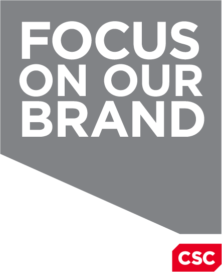
Those same angles are used to create the secondary identity element, “the projection box,” which stems from the logo and can shoot into different directions, sizes and shapes.
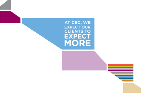
A colorful wallpaper.
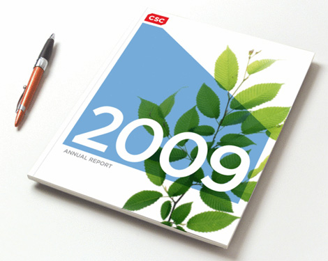
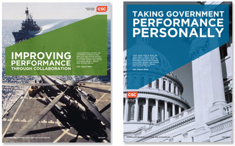
Sample annual report.
Sample brochure covers.
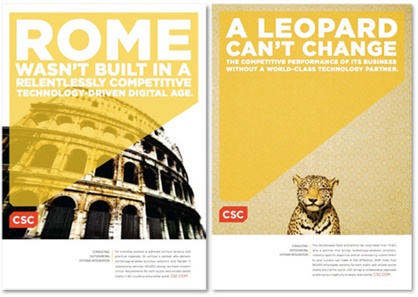
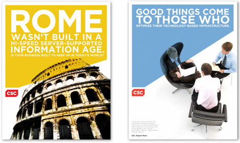
Sample print advertisements.
Brand video.
For large, ambiguous corporations like CSC, a wordmark is typically the most sound and risk-free solution, so this result is the perfect solution, specially with the added bonus of the visual language that is developed around the angles of the letters and the holding shape. This is a really great, solid identity that allows for flexibility and doesn’t feel very repetitive. A simple, comprehensive brand standards site is available for perusal here.


Jump to Most Recent Comment
Jesse Kidwell’s comment is:
I think overall it's a nice upgrade. I can't say I completely agree with the execution of the secondary elements, nor do I find it to be too exciting of a solution. But, it works. Upon first sight it feels like wgbh.


Anonymous’s comment is:
I feel like I've seen this exact branding somewhere before...
On Jan.19.2009 at 09:14 AM
jRod’s comment is:
seriously... I really like this. the color is a great upgrade and i am drawn to it easily. geometric blocks embedded with the word mark, when done correctly, always get my attention. actually, they get my attention if they aren't done correctly either. this one was actually thought out and i appreciate that. i like the marketing pieces as well...
wonderful job.
On Jan.19.2009 at 09:14 AM
sukisouk’s comment is:
i like! nice type animation in the video. Very usable CD.
On Jan.19.2009 at 09:21 AM
Remy Overkempe’s comment is:
It's a fresh upgrade and redesign, though not very spicy overall. The updated colour is a bit more vibrant, though not ADD vibrant. "The projection box" is a bit large in comparison to the logo, though not too large. So, fresh, though a lot of though's.
On Jan.19.2009 at 09:32 AM
coda’s comment is:
I love what they had before, there's something special in how that lower half of the S mirros the lower half of the C, as if representing 1/0 (I/O, on/off, etc.). Or some kind of broken circuit/system that requires a solution. My own interpretation aside, it's unique and memorable.
The new logo does absolutely nothing for me, although I do like the projection box element.
On Jan.19.2009 at 09:40 AM
JonSel’s comment is:
Those who think this is boring have been looking at gigposters for too long. This is a very nice, conservative, well-built wordmark used in a colorful, expressive way. For a big CI project, this is pretty good.
On Jan.19.2009 at 09:47 AM
JonSel’s comment is:
By the way, that auto-playing brand video is driving me CRAZY every time I re-load this page. Khaaaaan!
On Jan.19.2009 at 09:48 AM
Emily Brackett’s comment is:
It's clean, but hardly holds my attention. That video makes it worse: seems like a bunch of mumbo-jumbo with no emotional appeal. Lots of jargon (design-speak regarding the logo and consultant-speak on the video) which I do not connect with at all. However, I can imagine the "corporates" loving this--both inside CSC and their clients. It seems really deep, but in reality it's not that great. After seeing both the logo and the video it's still not clear what they do.
On Jan.19.2009 at 09:51 AM
BWJ’s comment is:
I like the old identity much more.
The new logo seems generic and not very memorable. It isn't bad, but just lacks anything special. I do like the way the secondary element is used on the cover of the annual, but not really anywhere else.
However, it's most important application definitely isn't as strong as the old identity.


dmagy’s comment is:
I like the secondary elements a lot. I am unsure, though, if that makes up for a bland logo.
When I gave the logo a second look, I like the elements and design, but I just cannot shake the feeling that a non-logophile will even see it without the secondary elements present.
On Jan.19.2009 at 10:00 AM
SJ’s comment is:
Agreed--CSC has been involved in the international cycling community for quite some time as the title sponsor for Team CSC since 2001. Unfortunately this year they are not renewing their sponsorship.
On Jan.19.2009 at 10:41 AM
thehappyhuskie’s comment is:
I think the identity is obviously an upgrade, but even after looking at all of the collateral materials...I still don't have a clue as to what CSC does or offers.
It was only after going back through and reading the opening paragraph did I know.
So in that respect, I feel the logo is overall too generic, just a art piece rather than a design (my guess: victim of design by committee)
On Jan.19.2009 at 10:42 AM
Chris Herron’s comment is:
This is a very strong, appropriate mark that will stand the test of time. The angled notches provide just enough detail to distinguish the brand in a subtle manner. And there is a contemporary tone to the verbal and visual elements of the campaign which bring the symbol to life.
On Jan.19.2009 at 10:54 AM
Camryn’s comment is:
How come the projections sometimes have a matching 'missing corner' like the logo (when projecting off that corner) and sometimes they don't?
E.g. Leopard example - missing corner; Battleship example - no missing corner.
I can't decipher any rule of application that would explain this apparent inconsistency.
On Jan.19.2009 at 11:25 AM
Impossibly Stupid’s comment is:
To address Anonymous' feeling of deja vu, I have to say the new logo reminds of a cross between the OGC "projects itself" logo and a generic red tag sale. I'm not sure either is an association that speaks well about CSC's efforts here.
The projection effect is definitely a distinctive addition. I think it is way overdone in the wallpaper and video, though. All said, it will work best if they use it strictly for low-key branding efforts. There is just too much potential for a negative backlash if they get too in-your-face with it.
On Jan.19.2009 at 11:36 AM
twoeightnine’s comment is:
Is that Pennsylvania?
On Jan.19.2009 at 11:53 AM
Andrew Harrington’s comment is:
I sometimes wonder what the over/under timeline is for the complete global switch-over from all other typefaces to Gotham.
On Jan.19.2009 at 12:10 PM
Nate’s comment is:
I think this identity works in a placid, hexagonal way. Really, how could you f**k up this logo, it's so simple and unified.
On Jan.19.2009 at 12:14 PM
CB’s comment is:
I used to work for CSC and collaborated on a few collateral pieces - I was always proud of our logo, and impressed with how functional and versatile it was. Even though the company's image was so generic (at a time when that sort of quality was praised), I felt those three letters were treated magnificently in the logo. The natural symmetry of the letters "C" and "S" was beautifully married with the systematic/modular nature of the company by reflecting/rotating one simple curved shape.
I understand that rebranding is sometimes inevitable, but I'm a little sad to see the logo come down a notch closer to the company's level of ambiguity. But perhaps that type of brand honesty is a good thing?
On Jan.19.2009 at 12:28 PM
Nate’s comment is:
"I sometimes wonder what the over/under timeline is for the complete global switch-over from all other typefaces to Gotham."
Directly proportional to Barack Obama's time in office and SNL's ratings.
On Jan.19.2009 at 12:32 PM
FJ de Kermadec’s comment is:
The new brand is definitely fresh and modern, but I fear it is of the perishable kind.
The color is certainly exciting and the typography is very clean. However, both are destined to go out of style quickly, and the typography alone, with or without bounding box, is hardly memorable. If discreet was the style they were after, I would applaud with all my vim, but, alas, it appears they tried for the opposite.
The bounding box also poses a great problem with collaterals. There are only so many ways the flatiron shape can be repeated on a page, and it will not harmoniously fit all supports. By making it mandatory, the brand seriously constrains the collaterals, and condemns them to look boxy, yet not necessarily structured.
Give me just the type or something else entirely…
On Jan.19.2009 at 01:01 PM
Jim’s comment is:
I like it...My first impression is that it is a business card that is inserted in a presentation folder (the notches did that for me), good for a service organization.
On Jan.19.2009 at 01:09 PM
Ty Halasz’s comment is:
So much Gotham lately, but the brand as a whole is strong.
Note that the large polygons in the print ads are inconsistent. In the first ones, the larger shape has a notch on the weak side corner near where it meets with the CSC logo. On the ads below those, the larger shape takes a 90º angle instead. Error?
On Jan.19.2009 at 01:23 PM
oscar’s comment is:
Quicktime troubleshoot: You need to add scale="aspect" inside the embed code. I think you should turn off autoplay too =)
On Jan.19.2009 at 01:27 PM
Neil’s comment is:
I always love seeing the logo in context. I think logos on their own have the danger of not being understood by their audience because a logo on its own can't be related to anything.
In this case, I think the idea of projection works quite nicely, although as Remy says, it can be a little on the large side.
As I said in a previous comment on the New York Philharmonic logo, you do have to wonder how big design agencies such as Interbrand get away with such simplistic design work when someone who may be lesser known would probably get a harsher critique. That's not to say that the rebrand is bad, I personally like it, but it'd be interesting to see how people's opinions of the logo and the related material are affected by knowing that the branding has been created by a larger agency.
On Jan.19.2009 at 01:38 PM
Armin’s comment is:
Video issue fixed. Thanks Oscar.
On Jan.19.2009 at 01:59 PM
Glenn Sakamoto’s comment is:
The brand message commercial is so generic that it could apply to any company. Who are they and what do they do?
On Jan.19.2009 at 02:21 PM
mm’s comment is:
Overall I like the design.
But the copy in the supporting material sound like it was generated by a website that stitches buzzwords together to make a tech company tag line.
The design looks nice, but the brand says nothing. The text on the ads say nothing. Use words that mean things!
On Jan.19.2009 at 02:55 PM
Geoff Thibeau’s comment is:
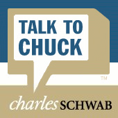
Whenever I see "projection boxes" like that, I immediately think of Charles Schwab.
Kit Grose’s comment is:
This logo change is really discouraging. I loved the old CSC logo; so succinct and distinctive.
I tire of Gotham and I think this logo, while visually attractive, has thrown away far too much brand equity.
The logo could have used a recolour, but this new "we cut corners" logo isn't an upgrade. It'd be a great logo for a new company, but for one with years of developed brand recognition, it's an unnecessary departure.
On Jan.19.2009 at 05:14 PM
Josh’s comment is:
The first thing I thought when I saw the new logo was of CSR Group

![]()
Granted, the only actual similarities are the White on Red scheme and the first two letters, and once I looked at both logos side by side the look different, but my first impression was of a very close copy.
On Jan.19.2009 at 05:32 PM
Paul Lloyd Johnson’s comment is:
big like.
On Jan.19.2009 at 07:18 PM
Joshua’s comment is:
I am definitely not a big fan of Interbrand, but I really dig the projection box element. Sure Gotham is the typeface of the moment, but it is still a great system. Here's where the ball was dropped... the web execution.
Horrible. All that great brand work just seems wasted. Yet again, the web becomes the bastard-child of corporate branding.
On Jan.19.2009 at 07:38 PM
ChrisM70’s comment is:
The new logo and identity looks nice, but the identity elements and video describe their business with such "corporate speak" that you can't really tell what it is that they ACTUALLY DO.
Of course, my guess is that part of their actual message is:
"Tired of all those old, qualified and knowledgeable employees costing you so much money? Sick of dealing with workers that require healthcare? Fire them and send those jobs to less-skilled people that will work at a fraction of the cost with our help!"
That message probably wouldn't create the "synergistic branding growth opportunities" that they are looking for, though.
But hey - nice logo.
On Jan.19.2009 at 10:00 PM
Philip S.’s comment is:
I cringe a bit every time I read or hear the word "synergy". Is that weird?
Not crazy about the logo, but the applications seem to work well over their various applications.
On Jan.20.2009 at 01:29 AM
Philip S.’s comment is:
Replace the first "applications" with "secondary elements". Oops.
On Jan.20.2009 at 01:31 AM
Peter Vidani’s comment is:
The first half of the video looked like a day-time home renovating show you'd see on HGTV. Other than that I think they've done a really nice enhancement.
On Jan.20.2009 at 02:34 AM
Plamen’s comment is:
Reminds me of PSFK:
![]()
Mark’s comment is:
reminds me of TIAA CREF
![]()
looks good.
The old one was WAY WAY WAY outdated, looks like it belongs in a Terminator movie from the 1980's.
On Jan.20.2009 at 07:42 AM
Dale Campbell’s comment is:
Ya know,
I have read the entire article, watched the video and studied the logo - and I have absolutely no idea what this company does.
Is that a good brand identity?
Maybe I'm just missing it all. I haven't had my coffee yet.
Keep well,
Dale
Mongoose’s comment is:
Disclosure: this is a logo with modest personal effect, as my father works for CSC. ... not that that would really stop me from savaging it were it bad.
The old logo had it's charm and cleverness, being that single shape rotated and reflected. But it has stodged up since its reflection, and this new logo clips away all the stodginess and makes it very now. The site material mention the font's a 'Modified Gotham', I'm guessing the modifications are for the 45-degree angles, which work well, echoed across all the letters. There's a hint of the logo being a three-dimensional box shape, with the CSC as part of a back-or-front wall; I wonder if this was played up more in earlier designs.
I really like the 'projection box' work; very simple, clean, and letting you set text apart from graphic nicely in materials. That should work well for them for years.
I'm giving it a B+; it's an upgrade from clever and staid to clever and not so staid, and should serve them very well.
--Mongoose
On Jan.20.2009 at 08:57 AM
Adam’s comment is:
Nothing ground breaking here, but well executed.
On Jan.20.2009 at 09:41 AM
BWJ’s comment is:
Mongoose:
it's an upgrade from clever and staid to clever and not so staid, and should serve them very well.
What is clever about this logo? Is there a hidden arrow that I'm missing? I also don't see the hint of the logo being a three-dimensional box, that seems like a long stretch.
On Jan.20.2009 at 09:42 AM
Mrs. M’s comment is:
I see the implied three-dimensional effect.
Where angled, the top left corner begins the box. Carry an invisible line horizontally to an unseen point and follow it back to the top right corner. After that, you should see the box.
I haven't examined it for sound perspective, but it's close enough that I saw a box. Not sure it's intended or is to the brand's advantage.
I don't like or dislike it. The "s" of the old logo bothers me. I suppose that's because it reminds me of a puzzle game. My gut keeps urging me to flip that silly top half of the "s".
The new logo is clean, but that's about it. I will say the smiling leopard is awfully cute. :)
On Jan.20.2009 at 10:29 AM
Gareth Coxon - Dot Design’s comment is:
What a great example of an identity working well across all of its supporting material. The identity itself isn't anything to write home about, though it works well, but the whole thing comes alive in its use and fitting together within the other promotional materials, I like it alot!
On Jan.20.2009 at 12:59 PM
Kevin’s comment is:
I like i and feel that it works well, especially with the secondary elements, but agree that it blend in with the current landscape of lowercase, sans-serif, enclosed logos.
I guess that is what gives a more contemporary feel to the mark.
On Jan.20.2009 at 01:18 PM
B’s comment is:
Armin, glad that you were "driving through somewhere" and remembered this all by yourself.
You're welcome for the tip, way back in July.
On Jan.20.2009 at 01:21 PM
felix sockwell’s comment is:
You're welcome for the tip, way back in July.
Hah. Well, at least he gave credit to Interbrand, which seems to leak quite a few (and decent) launches here. I recall working on a redesign (exercise in futility) for CSC back in 1994 and this work is far stronger and more realized. Not saying its the greatest (it does bear cues to "Chuck") but this is a quality rebrand.
On Jan.20.2009 at 02:05 PM
cheetah boy’s comment is:
All these "it reminds me of" references that appear on this blog are driving me crazy. Mostly because 99% of them are not even close to being similar.
On Jan.20.2009 at 02:29 PM
Pelsoh’s comment is:
I think the complete package is very solid. Exciting, engaging, practical. But, I too am growing weary of Gotham as it seems to be the Helvetica of the late 2000s. Not that it is a bad typeface, just that ubiquity is never good.
On Jan.20.2009 at 06:01 PM
Simon’s comment is:
It works well.
On Jan.20.2009 at 06:19 PM
ScottS’s comment is:
I just came across a 2-page TIAA-CREFF print ad and was shocked by how similar these ads and brochure covers are to theirs. Also, have to agree with previous posts as to the similarity to the "Talk to Chuck" ads from Schwab. Lack of originality and lame ad slogans earn this one 2/4 stars.
On Jan.21.2009 at 05:43 PM
Mongoose’s comment is:
@BWJ:
The notion of the box, as Mrs M pointed out, with the effect of a Necker Cube from the letters. In addition the echoing angles.. though I'll admit, it's a weaker 'clever' than the rotated shapes of the former logo. I'd rewrite that, upon reflection.
--Mongoose
On Jan.23.2009 at 12:06 AM
Serviceburo’s comment is:
The logo looks like it was designed by a Paul Rand fanboy with a fixation on the NEXT logo. The "projection box" feels like a late 90's Designer's Republic piece. I do see some potential in the ad samples, but they need some serious compositional reworking to better reference anchor points, blah, blah, blah. CSC really lost me when they switched from the old black cycling team jerseys to the white ones.
On Jan.23.2009 at 12:56 PM
Bjorn’s comment is:
Instantly made be think of this:
Andrew Boardman’s comment is:
It's nice. But it looks a whole lot like the logo for RSA, no small company.
![]()
Jerry Seinfeld’s comment is:
Is it possible for designers to be more constructive than... a logo looks a whole lot like this...this logo reminds me of that? I would hope that the practicing professionals out there can be more articulate than just posting a logo that looks similar. Yawn...
Next time ask yourself if your post has a deeper meaning than what any retired crazy grandmother could do. Step it up.
On Jan.26.2009 at 11:34 AM
Brad McCall’s comment is:
I love how this logo was implemented. On it's own, it's very clean, streamlined and simple - but the implementation is WOW!
On Jan.26.2009 at 10:42 PM
Bjorn’s comment is:
Jerry, that was my exact point.
On Jan.26.2009 at 11:19 PM
Bruce’s comment is:
While I'm not all that jazzed about the new mark, it is an improvement over the old one. But still a bit of a yawner. I like the overall branding quite a bit, though, with the projection box.
On Jan.27.2009 at 10:33 PM
Artiepants’s comment is:
really nice ~ i did a bunch of work at a company for CSC 5ish years back, and remember hating on the old logo something fierce.
the only potential downside to the branding/collateral is it might look dated fairly quickly, but it works today.
On Feb.04.2009 at 06:17 PM
Mr Posen’s comment is:
The spacing on the left two characters is too open.
(sigh, where has the craft gone?)
That said, it is an improvement of the previous TRON version.
Comments in Brand New, V1.0 have been closed.


