

NOTE: This is an archived version of the first incarnation of Brand New. All posts have been closed to comments. Please visit underconsideration.com/brandnew for the latest version. If you would like to see this specific post, simply delete _v1 from the URL.
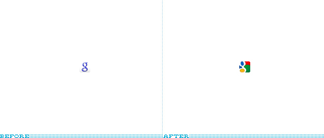
Back in June of 2008, Google changed its Favicon after what seemed like years of use of the original uppercase G, and given Google’s sparse branding, this small change was remarkably big, as if it had changed its logo. So it’s quite surprising to see Google change the Favicon once again, less than a year, which in branding time is like one week of building brand equity. It’s also surprising that, well, it’s terrible. The “g” is barely readable, the aliasing (jaggedy eges) on the rounded corners is crude and the overall feel is pretty pedestrian. This is perhaps too harsh a criticism for something as small as 16×16 pixels, but when it comes to Google every detail counts. The new Favicon is also the result of a weird call for entries encouraged by Google to create a new one, and the design is based on one specific submission (which is better than the final one) and inspired by a few others (which are also better than the final one). All in all, a strange, unnecessary change.
Thanks to all that, nearly at the same time, sent the tip.


Jump to Most Recent Comment
Remy Overkempe’s comment is:
Made me cringe the first time I noticed it, and still does.
On Jan.11.2009 at 08:27 AM
Rodrigo Müller’s comment is:
reminds me of the carrefour logo, which is also difficult to read. the original submission by my compatriate André Resende is so much better, although I think it could be even better.
On Jan.11.2009 at 08:28 AM
Abdul-Rahman Advany’s comment is:
Really? I though the new icon is a great change... even without noticing the G... its totally obvious that its google... much better than the old logo.
On Jan.11.2009 at 08:30 AM
mk’s comment is:
I think it's much better than the previous semi-transparent blurry mess. It was bland and hardly distinctive, nor did it fit it with the brand that is Google. This is stronger and stands out when compared to the competition (and in my browser tabs) and it retains that multi-coloured Google brand.
Having said that, the original was still the best. It was exactly what Google represented, which was being a reliable and 'old-timer' in terms of stability and trust on the internet. The shift to the lower case 'g' is silly and has no real reason, unless all lower case letters is the new trend that Google must follow, despite the big 'G' being far more appropriate.
The worst part? All this brand experimentation dilutes the brand and makes it appear as though it can't make it's mind up and is turning into 'another' standard web company.
On Jan.11.2009 at 08:48 AM
Adam’s comment is:
I think the criticism is a little harsh. I hardly think it is either "terrible" or "barely readable", and people will certainly recognize what it is, at the very least, based on it's immediately recognizable 4-colour combo.
@mk:
Your comments about brand experimentation seem a little contradictory. It would seem to me that if Google is changing its only to *strengthen* its brand as it continues to put out new software and offerings (ie. Chrome). I see no diluting or inability to decide going on here, and it doesn't make anything seem standard.
jdragz’s comment is:
I totally and absolutely agree with everything you said. I'm not excited about this icon at all. It's a disappointment.
On Jan.11.2009 at 10:03 AM
Adam’s comment is:
O god it's horrible. I wasn't a huge fan of the lowercase g as compared to the uppercase one, but this is miles worse. Google - to me - is about neutrality and transparency and this is neither. A favicon doesn't have to work terribly hard to be noticed, especially when you have multiple tabs opened to different google products.
This takes the colors which were more secondary to the forms and inverts the relationship resulting in a 16x16 pile of poo.
And yes, the final entries were way better.
On Jan.11.2009 at 10:04 AM
Bassem B.’s comment is:
At least it's better than the previous one (the "before" in this post's image.) I so hated that one. At least this one is colourful.
However, i really hope the Google logo itself gets an update. That bevel and drop shadow makes me cringe every time I see it. It's cheesy and childish. Not childlike, but childish. What are they waiting for??
On Jan.11.2009 at 10:14 AM
FJ de Kermadec’s comment is:
I actually like the new icon a great deal. It may be cruder and harder to read — both criticisms are very valid — but it loudly echoes two of Google's core concepts: it's colourful and playful.
In that, it translates the company's brand much better than the blue lower-case "g" which always felt like it was apologising for something.
I would also say that, once the shape of the "g" is properly "read" in the design, it's impossible to take it out, meaning the icon isn't nearly as poorly designed as it may originally seem. Certainly, a white letter on such a saturated background — and a lower-case, loopy one at that — won't immediately pop out, but the delay required for it to appear in the reader's eye seems to me perfectly acceptable.
All in all, I give this one a thumbs-up, despite agreeing with you on the overall impression. It would be disastrous for Apple but it suits Google very well. It's also pretty unique, oddly enough, for something so simple.
On Jan.11.2009 at 10:18 AM
Jim MacLeod’s comment is:
I don't have as much of a problem with the logo as others seem to. I think that the "g" sits a little too far to the left. I saw the "g" right away, but that's because I was on Google.com, what other letter would it be?
The amazing part is how much color that 16x16 square adds to the Google home page. This favicon may not perfectly represent Google's sparse look, but it's a good way to add a little bit of color to their overall white webpage, without really disrupting their brand.
blue’s comment is:
It's a vast improvement over the previous, boring icon and re-connects with the 'fun' aspect of Google's main brand, which is pretty poor but probably does a good job of deflecting from the idea that Google is a vast corporate entity, mointoring and recording everyone's online movements and all the negativity that entails - and so does its job.
I could see the 'g' easily. It's cropped off-center and looks like a tiny painting. An improvement.
On Jan.11.2009 at 10:43 AM
edibeTizBeeno’s comment is:
Sorry about that, but we need very urgently to contact the administrator www.wholinks2me.com. There has not been able to find the feedback. Thank you!
On Jan.11.2009 at 11:04 AM
Valentino’s comment is:
Certainly better than the last one. But I still think it should be an uppercase G. The winning entry that it's based on is also better. Not sure why they moved the G to the side. The entry was quicker to recognise and the colours didn't touch each other.
On Jan.11.2009 at 11:12 AM
designscene’s comment is:
Its a good deal more cheerful than the old one, and stands out more when you look at all the tabs in the browser window. It looks more 'google' somehow. Sort of matches with the identity of chrome as well.
On Jan.11.2009 at 11:18 AM
Robb Irrgang’s comment is:
I think you're pushing it by calling the submissions better. The problem is that the favicon doesn't mesh as much with Google's main brand as it does with, say, the Windows flag. If you're going to go "Google flag", it should be pushed out throughout the "Googlesphere" (God, shoot me for even using that term).
On Jan.11.2009 at 11:19 AM
Mark’s comment is:
I hated it when I first noticed it, thinking it was some sort of temporary theme-favicon. However, it's already starting to grow on me...
On Jan.11.2009 at 11:40 AM
Mark’s comment is:
Oops, pressed 'Post' a little too soon.
I hated it when I first noticed it, thinking it was some sort of temporary theme-favicon. However, it's already starting to grow on me...
I like how the g is cropped, and I don't think it's 'barely readable'. And even if it is, that's not a problem; I don't read my favicons, I scan them :)
What concerns me more is the horrible combination of the blue from Google Chrome's browser tabs and the color of the Brand New favicon :S
On Jan.11.2009 at 11:43 AM
Joseph Maguire’s comment is:
It's a favicon it's not a brand change. Neither of them were any good, but the other g was more readable.
On Jan.11.2009 at 11:47 AM
John Mindiola III’s comment is:
I hate it. I hate it when brands put the emphasis on the non-capital letter. Like Powerade used to be so infatuated with the "a" (remember: "go for the a"). Although, Powerade's newest logo/packaging are diseased. Back to Google: this is baaaaad. I can't help but think of the South Africa flag everytime I see it, but not in a good way. Now, that's NOT a racist or insensitive comment. Anyway, the submissions that focused around the "G" were much better, and less, well, striking.
Now, if we could just get Gatorade to take their focus OFF of the G . . .
On Jan.11.2009 at 11:54 AM
Derrick’s comment is:
Meh... I never notice the favicon anyway. Why did they bother changing it anyway?
On Jan.11.2009 at 12:24 PM
Andy Lann’s comment is:
Actually, not every detail counts for Google. They are terrible designers. Yes, the usability is good, sometimes, but that's all. Look at the redesign of Google Reader, which is barely readable at all. Or the new Picasa for Mac, which is barely usable. Heck, they don't only have problems with accessibility, they have problems making their sites validate at all.
Google understand simplicity and usability, but when it comes to design they are most often clueless.
On Jan.11.2009 at 12:28 PM
Eric’s comment is:
All I can think of whenever I see it is "Cosby sweater."
Andy hit it on the nose. I'm sick of hearing praise for Google's design when they're really only getting the usability side of the equation right, and completely ignoring aesthetics.
On Jan.11.2009 at 12:59 PM
lodenmuse’s comment is:
Guess Who wants to be Guess Who.
![]()
Ricky Irvine’s comment is:
Hey weirdos! This is a nice little favicon. The submission of which it is inspired is ugly! Bahh!!!!
Seriously. This is a nice design. What is with all the badmouthing?
On Jan.11.2009 at 01:57 PM
Mongoose’s comment is:
I'm torn. On the one hand, it's not that good. The lowercase G thing has low appeal to me, and the icon to me speaks of food or spice packaging. I'm reminded of the Whole Foods Market 365 brand:

On the other hand, Once I checked my Gmail account I immediately noticed the change, and the bright colors do stand out against the greyness on Firefox's bar background. So it's a functional brightness, and I think the four-color approach, despite this being an ugly favicon, is a good start.
I'm giving it a C, for being a minimal improvement in functionality for a tiny tiny piece of brand impact.
On Jan.11.2009 at 02:16 PM
Andrew Klein’s comment is:
if you took away the yellow, it would be similar to an Ellsworth Kelly painting
On Jan.11.2009 at 03:19 PM
Hajime Chan’s comment is:
Actually I like the "after" more, the previous one is easy to read but the color is very boring and old-fashion, the new one use the colors of Google main logo, fresh, recognizable and younger.
On Jan.11.2009 at 03:25 PM
the macho man’s comment is:
could this mean that a REAL logo change is coming for Goggle?
On Jan.11.2009 at 03:25 PM
Oak’s comment is:
I can't look away from the red shape in the upper right. There's no element of the "g" that defines that area so it seems very arbitrary to me. I also don't think of "green" when I think of Google, so it seems odd to me to devote more then a quarter of the shape to a giant field of green.
On Jan.11.2009 at 04:11 PM
Yves’s comment is:
The old one was there for over 8 years, actually.
It seems the change from uppercase G to lowercase g is a move towards "we're huge but we are not evil", which is probably overkill, but perceived as necessary maybe?
This new favicon looks like they are trying to do something with their brand (as opposed to the old original one which was there because nobody cared about changing it).
As for not adopting any submission exactly as is, I guess they want to make sure they own the final design 100%.
And, in the end, it's only a favicon...
On Jan.11.2009 at 04:39 PM
sukisouk’s comment is:
It is bad, because the old favicon – the little blue g with the whitespace around – it did much more reflect the style of the google search site so many people use. Google’s design is terrible anyway. Did you look at the logo lately? :D
On Jan.11.2009 at 05:39 PM
hall of fame name’s comment is:
I just noticed that the search bar that comes with my firefox browser still has the uppercase G favicon next to it. I'm pretty sure I'm using a pretty up-to-date version of the browser.
On Jan.11.2009 at 05:56 PM
Yeison Agudelo’s comment is:
ughhh gross
On Jan.11.2009 at 07:12 PM
Mark’s comment is:
well it's interesting at least, can't quite be sure if I like it though, does this mean the logo is changing as well?
On Jan.11.2009 at 07:24 PM
Kate’s comment is:
i think this fits with google's 'branding' which i would describe as having a consciously amateurish, if consistent in a general way, design sense. and, despite being a designer myself, i think that works for them because it states that what they do is not design, it is programming, and, therefore, they only need exactly as much design as makes the thing simple, usable, and information centric.
On Jan.11.2009 at 08:08 PM
matt lohkamp’s comment is:
UGLY. The 'before' looks like gmail and igoogle -the 'after' barely resembles elements of chrome. If I didn't know it was a google favicon, I wouldn't even see the 'g' letter form. I'm not a fan.
On Jan.11.2009 at 09:46 PM
Mr Posen’s comment is:
How can you fuck up with only 16x16 pixels?
On Jan.11.2009 at 11:19 PM
Koy’s comment is:
Immediately noticed the favicon change the moment i pulled up google. It grabbed my attention, but in a "what is this?" kind of way. I thought i had accidentally visited a lego website for kids. Its a very playful design imo, and i guess fits google because that is exactly how their work environment is. I still prefer the past favicon version with the simple, yet clearly visible "g".
On Jan.11.2009 at 11:20 PM
Kodie’s comment is:
I'm not a fan of primary color (+green) schemes, but that's what they use, so I don't know what other colors they would be. It also looks too much like the AVG icon in my tool tray. Just sayin'.
The lowercase g before looked more like a g. I can see the g, but the fill makes it look blobby. I think it's because of the way the colors aren't purely blocked, the green takes on a "grassy hill" imagery, but the sky is red and the sun is at the bottom. Even more like a toddler invented it.
In other related news, due to a few other sites changing their favicons in the past couple weeks (and/or my recent firefox upgrade), a few of my favicons spelly "goody!" on the toolbar. This change from google spoils it a little.
On Jan.11.2009 at 11:22 PM
Jon Schleuss’s comment is:
Agreed.
On Jan.12.2009 at 12:26 AM
pablo’s comment is:
Those designs are all visually jarring and awful. And the final one they picked looks like the Burkina Faso flag being eaten by a blue dot, a dark blue nipple and a golden bean.
They need to bring the old design back.
The design for the favicon needs to be less visually jarring, especially since the Google favicon is going to be something you're probably going to have on your screen for a lot of the time. There's a reason why most browsers use blue and white tones.
On Jan.12.2009 at 12:45 AM
Koodoz’s comment is:
Far better IMO. At least this new favicon represents the brands colours. The previous favicon was way off the mark and completely forgettable.
This may not be a perfect favicon (I agree with the aliasing), but I think it has much more presence and impact and therefore does it's job far better then it's predecessor ever could have done.
On Jan.12.2009 at 01:13 AM
Miles’s comment is:
So much better than the blue lowercase g. Still not sure they should have stopped using the capital G, but cripes this is so so so much better.
On Jan.12.2009 at 02:13 AM
robber’s comment is:
not totally sure why, but it reminds me of Cross Colours.
On Jan.12.2009 at 03:44 AM
Michael’s comment is:
Maybe it's their strategy to change the icon more often, like people change their twitter icon every week. Why not? Google has always been playing with their branding (e.g. seasonal logos on their home page) and it led to a broader, richer and still recognizable brand, didn't it?
I immediately recognized the new favicon being a Google icon. That's well done, I guess.
Ronan’s comment is:
Is it a toucan? Like the old Guinness posters? It has a large blue eye, a red beak, yellow plumage and is in a green jungle.
On Jan.12.2009 at 04:42 AM
Mark’s comment is:
hahaha a toucan? if it is it's a very ugly one at that! now it looks like a very ugly miscolored duck with a white body a very large eye a random yellow feather and a red beak!
What the F*** were they thinking when they made this "thing", oh wait I know, Paint By Number.
This type of crap belongs in an art museum not a 16 by 16 internet favicon! geez at least the old one look decent and to the point, this one looks like crap, do they even HAVE any meaning to put the colors where they put them? I bet they didn't. That poor "g" looks bloated. yeech.
On Jan.12.2009 at 07:22 AM
Mark’s comment is:
hahaha a toucan? if it is it's a very ugly one at that! now it looks like a very ugly miscolored duck with a white body a very large blue eye a random yellow feather and a red beak!
What the F*** were they thinking when they made this "thing", oh wait I know, Paint By Number.
This type of crap belongs in an art museum not a 16 by 16 internet favicon! geez at least the old one look decent and to the point, this one looks like crap, do they even HAVE any meaning to put the colors where they put them? I bet they didn't. That poor "g" looks bloated. yeech.
On Jan.12.2009 at 07:23 AM
Mark’s comment is:
I think I know why the "g" is off-center, it's trying to move off the favicon from embarrassment.
On Jan.12.2009 at 07:29 AM
Anonymous’s comment is:
I agree with you on all points, except that the original "winning" entry was better. Centering the lowercase "g" makes it look like a retarded "8" - and shoving it to the left makes the composition slightly more interesting, and makes it look less like an "8" to me for some reason.
It's still pretty awful.
I for one, favor the entry by by Lucian E. Marin. It's much more readable - and it just looks like Google. What's the first thing I see when I go to google.com? A big ole' upper-case blue "G" - not the second ugly half-brother "g".
On Jan.12.2009 at 08:58 AM
Anonymous’s comment is:
I'm not saying to go and start some online petiton, but if you want to shoot Marissa some input
marissa@google.com
On Jan.12.2009 at 09:11 AM
Scott’s comment is:
I'm not sure why, but right now in my browser the old lower-case 'g' is the favicon when I go to the Google homepage. Did they change it back?
On Jan.12.2009 at 09:35 AM
Tim’s comment is:
Just went to the homepage also- looks like they did change it back.
On Jan.12.2009 at 09:48 AM
chris d’s comment is:
The new favicon isn't as bad as some of you claim, but I believe the one submitted by Lucian E. Marin is far superior.

Lucian's version is consistent with the main brand (upper-case G) and the fact that it's centered and readable bring across the idea that Google values solid engineering and usability more than empty aesthetics.
Even Google's characteristic playfulness is maintained with the four colours edging in from the corners.
A missed opportunity for Google; kudos to Lucian anyhow.
On Jan.12.2009 at 09:59 AM
Chris’s comment is:
I find this incredibly fatuous and of little importance at all. Don't marginalize design like this again. Thank you.
On Jan.12.2009 at 10:04 AM
Bruce’s comment is:
Let's be honest: Google has and awful logo to begin with. Why should the favicon be any better? I agree that the submissions shown were better than what they ended up with, but none of them were stellar, either.
On Jan.12.2009 at 10:23 AM
Andrea’s comment is:
I read this blog every day, and just noticed today that most of the commenters are male. Why is that?
Oh, and for the favicon, who cares? There are bigger fish to fry out there.
On Jan.12.2009 at 10:28 AM
Emily’s comment is:
The Google logo itself should've been updated long ago. Is it supposed to be ironic or something?
On Jan.12.2009 at 10:41 AM
Joe’s comment is:
Well Andrea I think you have answered your own question there.
With well thought out, constructive criticism like 'Oh, and for the favicon, who cares? There are bigger fish to fry out there', you aren't really giving female creatives a good name.
On Jan.12.2009 at 10:45 AM
Tyler Sticka’s comment is:
You can restore Google's old (capital "G") favicon with the Greasemonkey script Google's Old Favicon, or use my redesign which replaces the Mondrian colors with blue. Anything to get rid of that red/green juxtaposition.
On Jan.12.2009 at 10:46 AM
IhateDesign’s comment is:
bunch of idiots, i agree with you, the submission is better than the final solution.
On Jan.12.2009 at 11:01 AM
Mrs. Mack’s comment is:
I too would have preferred Lucian's design over this. It's simple and recognizable and inoffensive.
In this new favicon's defense, I will say I noticed the change immediately and wondered if this was some tie-in with Chrome's spheroid icon.
I fear Google's homely little logo is here to stay, though. I think if they wanted to, they could take the time to hire a design firm and create an elegant brand, but who do they choose? What direction suits them best?
Given their penchant for playing with the logo and getting the users involved, they'd probably just hold a contest anyway. Would that be better? ;)
On Jan.12.2009 at 11:03 AM
Goffredo Puccetti’s comment is:
I sometimes think that Google brand is there to remind us that graphic design is important, but NOT so important after all. :-)
Every single brand/tag/graphic/sign they created from GMail to Chrome is, at least, questionable...
The bevel and shadow on the current version of the logo are, well, a bevel and a shadow...
This icon (still better than the previous one) is no exception.
On Jan.12.2009 at 11:05 AM
Harper’s comment is:
With the previous favicon, every time I looked at it I did a double take as to whether or not I was actually still on a google page. It was unnerving and not very Google at all.
The new favicon might not be a shining beacon of good design but the first time I saw it i knew instantly that it was Google. And after all... the objective of a favicon is to identify the page to the user instantly. As far as that objective is concerned this favicon is a huge success.
On Jan.12.2009 at 11:39 AM
jRod’s comment is:
@ Scott - You may need to refresh (like i did) or clear your cache and restart your browser.
Personally, after designing a number of favicons myself, i think its a good look for Google and a step in the right direction for a company that's not so obsessed with design. Favicons are very tough and tend to be unnoticed most of the time, mainly because most of them are either default or poorly designed. We are starting to do them more and more for our clients.
nice, eye catching favicon. keep moving towards good design, Google.
On Jan.12.2009 at 12:12 PM
Darrel’s comment is:
"and we encouraged our users to submit their ideas for this important piece of Google branding"
I love Google, but, yea, Brand Identity has never been their strong point.
Not that it really matters for them. ;o)
On Jan.12.2009 at 01:02 PM
Andrew’s comment is:
I love it. Bravo!
On Jan.12.2009 at 01:29 PM
Kodie’s comment is:
I think the poor graphical representation is a fair exchange for becoming a verb and a legitimate entry in respectable dictionaries.
On Jan.12.2009 at 01:43 PM
Scott’s comment is:
No need to refresh the browser. The icon changed to the new one around 11:00am. Interesting that they went back and forth with the old and new today though.
On Jan.12.2009 at 01:51 PM
Persia’s comment is:
At first I thought the favicon was for my anti-virus program and I'd switched a setting by mistake. I like the Lucian Marin design much better.
On Jan.12.2009 at 02:06 PM
Nathan McKinney’s comment is:

I like it better, but I see a toucan.
George - LogoDesign.org’s comment is:
Not an improvement.
On Jan.12.2009 at 04:02 PM
BWJ’s comment is:
I think it's great.
But either way, it isn't their logo, its a 16x16 icon meant to tag their website. When I see those colors together, the first thing I think of is google.
I think you are placing way to much importance in the equity of a favicon Armin.
On Jan.12.2009 at 04:25 PM
Morning Toast’s comment is:
I don't mind the new favicon at all. I like it far better than the lowercase G on white. I think the G is plenty visible and the colors are honestly more important in my view. In my bookmarks the colors stand out the most and thus quickly tell me it's a Google page.
And it's a favicon. I agree with BWJ. If Google wants to "play" with ideas for their branding and G, the favicon is probably the safest place to do it and get honest feedback.
On Jan.12.2009 at 05:20 PM
Josh’s comment is:
When has google ever been about looking good? When it comes to design, I don't think they really care that much.
On Jan.12.2009 at 05:57 PM
Eric Susch’s comment is:
Q - What happens when you put a lot of strong colors together on a very small square?
A - A mess.
Bring back the capital "G."
On Jan.12.2009 at 09:03 PM
Armin’s comment is:
> I think you are placing way to much importance in the equity of a favicon Armin.
Not really. A favicon is becoming more and more important as they propagate in different online places and it's imperative to get those 16 x 16 pixels right. They are as much an extension of the identity as a business card or sign outside of the building. And, as I said, when it comes to Google no detail is too little or not important, everything is so measured and thought out that a blunder like this shouldn't get a free pass.
On Jan.12.2009 at 09:54 PM
Kodie’s comment is:
BWJ: "When I see those colors together, the first thing I think of is google."
When I see those colors together, the first thing I think of is a lot of things. I think of kindergarten mainly, but I've seen more than one company try and pull off the juvenile scheme. AVG like I mentioned is one that already uses those colors in almost an identical way for their favicon. Microsoft and related msn use it. When I think of Google, I think of a big white page with a simple slight type (which I guess most argue is simple and immature), not a big shout of these colors (which is emphatically simple and immature, without having to know a lot about typography or brand design).
We're not getting right up into the 16x16 pixels and finessing the difference. A favicon's key purpose is recognizing bookmarks very quickly. At a glance, a favicon's job is to stand out from all your other favicons, and if they can all do it without being an incoherent blotch of crayon fug, all the better. Another thing they can do to help is settle on a design so we can find them without having to learn a new splotch ever couple months.
On Jan.12.2009 at 10:50 PM
Famir Shah’s comment is:
Check this post about avg resemblence...
http://www.devilsworkshop.org/googles-new-favicon-inspired-from-avg/
Jessica’s comment is:
So funny you bring this up, because I literally did a double take all day yesterday when the new favicon would be present in the results of my google searches. I kept thinking "where did the horrid little mid 90's thing come from?" and thought it was somehow a mistake.
Now I know it IS a mistake, but regretfully an intentional one. How very sad that google and their billions initiated a contest (!@#$?!) when there are plenty of fine designers in the sweltering recession with mind that can run circles around the new favicon.
On Jan.13.2009 at 09:33 AM
Andrei Gonzales’s comment is:
Sigh.
Google's art direction has been crap since day one.
Unsurprisingly, nothing has changed.
On Jan.13.2009 at 10:13 AM
BWJ’s comment is:
when it comes to Google no detail is too little or not important, everything is so measured and thought out that a blunder like this shouldn't get a free pass.
I would agree when it comes to their programming, but like others have said, Google has never been known for amazing design. For a company who's logo get's redecorated with each season and holiday, I just don't see this change to their favicon as a blow to the company, their products, or their brand equity.
Everything they create is in beta mode and they are constantly experimenting. Many of their products are found in "the lab" and updates are continually being made across the board...Have you seen the new Gmail themes? They are hideous...but Gmail still works wonderfully and it never once affected my opinion of them.
I don't think I'm giving Google a free pass by overlooking this, but Google is a much different type of company than say, Pepsi, who can destroy a long history of brand equity with a single upward sweeping motion.
On Jan.13.2009 at 10:38 AM
Su’s comment is:
Not to defend the icon, because I'm mostly indifferent to it, but:
Google has never been known for amazing design.
No, they aren't particularly known for pretty design. Be careful confusing the two.
For a company who's logo get's redecorated with each season and holiday,
...which again reinforces what you're not understanding here. The blog isn't called "Logo New." You seem to be presenting this as if it were a bad thing in direct contradiction to established opinion that people actually love it.
Everything they create is in beta mode and they are constantly experimenting.
The first part of this is patently false(Maps, Reader, News, Groups, Images, Notebook, should I go on?) And then you fail to explain why exactly "constantly experimenting" is a criticism.
Your examples of the themes is invalid, as they are opt-in.
On Jan.13.2009 at 11:04 AM
BWJ’s comment is:
I wasn't referring to Google's changing logo as a negative. I like it. I was using it to point out that their identity is always in flux within their brand, they are always experimenting with it...so to do the same with their favicon doesn't damage anything.
I'm also not talking about user interface design or the functional design of google's programs, which are quite amazing. I'm talking about the aesthetic nature of their brand...which is far from amazing or pretty. No confusion there.
On Jan.13.2009 at 11:46 AM
mca’s comment is:
Love it and it has grown on me. Oh wait, I guess I can't say that here. Let me rephrase...
I hate it it reminds me of
On Jan.13.2009 at 02:34 PM
Pamela’s comment is:
"lodenmuse’s comment is:
"Guess Who wants to be Guess Who.
"(new google icon here)
"(and microsoft icon here.) "
I TOTALLY agree with you. That's the first thing I thought when I saw it.
On Jan.14.2009 at 01:09 PM
Kenny Córdova’s comment is:
Which is the prevailing letter in the Google logo? Of course the first one: "G" . The search engine started very good applying the favicon with the the capital letter G. And G represents better Google (as it does not have an "isotype"). This has nothing to do with renewal. Instead it has to do with people's perception about the Google brand"
On Jan.14.2009 at 02:31 PM
Bruce’s comment is:
Armin, I have to strongly disagree with you that with Google, every little detail is planned. The logo is worse than an afterthought--it shows no thought at all.
On Jan.16.2009 at 03:48 PM
chris d’s comment is:
The more I see it on my tab bar, the more I grow to hate it :(
On Jan.16.2009 at 11:14 PM
Oisín’s comment is:
I hate it. Is there an attractive option I can replace it with?
On Jan.25.2009 at 10:29 PM
SoulKitchen’s comment is:
it's really bad, and there was no need to change...
On Jan.26.2009 at 04:46 PM
Phil’s comment is:
Gotta admit, the Chrome logo would've been cool.
On Feb.08.2009 at 08:10 AM
Kodie’s comment is:
One thing I wanted to ask or address: a few Firefox versions ago, there was a favicon maker extension and when updated to the next version, it no longer worked. I made up a couple favicons when it was in use, but as far as replacing ugly or easily mixed-up ones (like Google's) or easily identifying sites still using a generic sheet of paper, what can be done? I don't have the skills to invent such an application, but I would sure use it if it were available.
On Feb.08.2009 at 02:44 PM
MClogoID’s comment is:
I also like the new kind of logo-favicon even tiny yet colorful it basically helps me easily pick from my history which site i opened from Google..
On Feb.11.2009 at 01:33 AM
Comments in Brand New, V1.0 have been closed.


