

NOTE: This is an archived version of the first incarnation of Brand New. All posts have been closed to comments. Please visit underconsideration.com/brandnew for the latest version. If you would like to see this specific post, simply delete _v1 from the URL.
![]()
When the e-mail popped into my inbox with the subject “Packard Bell” I was magically transported to my early teenage years, maybe even younger or, at least, to a time before Apple ruled the earth and beige expensive beige PCs were the household norm. I don’t know much about Packard Bell and, all things considered, it’s a brand that is as memorable as the pigeon waddling outside the window of the coffee shop I am writing this from. But I do remember the one kid in my class who had the Packard Bell at home. I can’t remember what brand we had at our home. I know it wasn’t Packard Bell. Because this kid’s computer, a Packard Bell, sucked. Big time. We couldn’t play any games on this computer. It was slow and it was dull. Poor kid. Apparently Packard Bell has a whole other appreciation of its brand.
The Packard Bell brand is where simplicity, trends and technology meets to create fashionably new ways of living and ultra smart forms for working. Across all products and segments, Packard Bell sets the standard for cool, design-driven technology.
— Press Release [PDF]
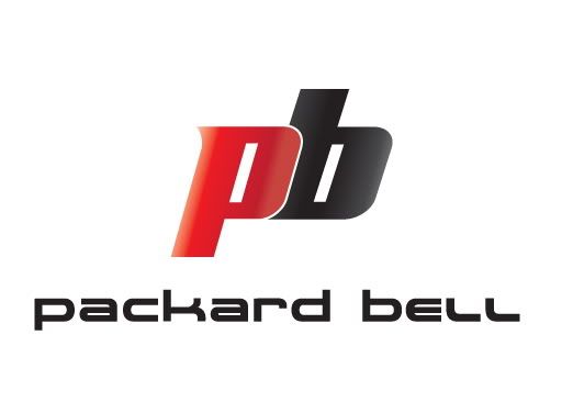
I’m not alone in this low perception of the brand: In a 2007 article ranking the 10 Worst PCs of All Time, PC World ranked not one but the whole oeuvre of Packard Bell from 1986 to 1996 as the number one worst PC(s) of all time. Certainly, that hasn’t stopped it from producing desktops, notebooks, netbooks, MP3 players, monitors and storage devices over the years. And whether Packard Bell recently changed their identity to keep evolving their own, somewhat deluded, image of cool or they were trying to distance themselves from some of these lasting perceptions the new logo is somewhat of a train-wreck. But, of course, Packard Bell does not see it that way.
The Packard Bell brand has undergone an incredible makeover that would leave anybody breathless, adapting its visual identity to the brand value proposition deriving from the group’s multi-brand strategy.
— Press Release
When it comes to things happening to my breath, I really prefer when it is taken away from me… but seriously, “breathless”? Wow. The release goes on:
The new visual identity of Packard Bell is furthermore expressing the brand’s understanding of trends and its ability to reinvent them, understanding the origins of desire and transformation, evolving and creating thanks to its unlimited imaginative mind: the Packard Bell spirit reinvents today’s trends and set the stage for tomorrow’s breakthroughs. This is more than technology. It’s a lifestyle, a life experience, and a reflection of the way we see the world.
And on, now about the change from purple to red:
While purple connotes luxury and sophistication but also mystery, envy and introspection, red is associated with heat, energy and blood, and also emotions such as excitement, passion, love and more. Purple does not energize the outside world, but relaxes and calms it. Red communicates ambition, power, vitality, enthusiasm and a desire to conquer. Red speaks to the outside world in a clear, distinctive and visually appealing language. Red is a personality amplifier, a life enhancer. It draws attention, captures it and keeps it there. Red is colour at its best. Red is the perfect colour to infuse the Packard Bell brand with the personality and strength of identity to position it as the leader in its particular segment.
And what insight may we read on the change from Packard Bell to PB you ask? Well:
Moving from Packard Bell to “PB”: That’s so cool!!
Apologies if I have quoted more than usual from the press release, but it’s not everyday that we get so much hot air in a single PDF. The first thing you will notice about the new logo is just how rounded it is all around, and there is a perfectly good explanation in the press release that states that not just the logo but the whole product line is changing “[from] sharp edges to more rounded ones.” And, boy, it’s rounded. The three-dimensional PB is probably meant to look like a cool notebook or at least that’s what I see. It comes with some gratuitous (or, perhaps, obligatory) shading and it just looks too childish and toy-like, as if it were the latest spaceship for the G.I.Joe troops.

The typography is actually not bad at all, with some looser tracking it would have probably looked better and it could have been tweaked a little like the previous logo and have just the wordmark by itself without the ominous PB looming over it. It’s hard to take a company serious when they attempt to put so much spin on a brand personality they do not actually own. Whether you look at the logo or the language it’s all just a big pose at best.
Thanks to Tom Vanderbauwhede for the tip.


Jump to Most Recent Comment
Anonymous’s comment is:
Love the beige double beige.
On Apr.23.2009 at 06:29 AM
Mondayne’s comment is:
Love the beige double beige.
On Apr.23.2009 at 06:29 AM
stefano picco’s comment is:
What da hell happend? Someone was drunk!
Don't like the new logo, looks like the same shame like compaq :(
On Apr.23.2009 at 06:36 AM
Woke’s comment is:
Rounded, lowercase, red and 3d. Wow such a cool company!
"..an incredible makeover that would leave anybody breathless...". Don't you all agree?
On Apr.23.2009 at 06:50 AM
Erik at Logo Critiques’s comment is:
Good try, maybe give it is another go around...
On Apr.23.2009 at 07:22 AM
Jeff’s comment is:
LOL! Kinda reminds me of the old Fubu logo!
On Apr.23.2009 at 07:49 AM
Jimmy’s comment is:
"Red is colour at its best."
That line left me totally brain-less ... and nearly dropped me from my chair laughing!
On Apr.23.2009 at 07:56 AM
Samantha’s comment is:
Even though it looks like something sci-fi I can't help but think Peanut Butter any time I see the initials PB.
On Apr.23.2009 at 08:11 AM
slashjasper’s comment is:
The change from Packard Bell to PB might not be a horrible idea, given the reputation that is apparantly associated with the name Packard Bell according to that article.
Other than that, the glossy red shaded thing makes me think of cheap plastics.
On Apr.23.2009 at 08:17 AM
Andy’s comment is:
Huge downgrade. I didn't know this company still existed, but that purple logotype was quite attractive.
On Apr.23.2009 at 08:41 AM
Kevin Zwirble’s comment is:
I think it's a great idea to finally rebrand this old beast. I can't believe they were still using that old logo in purple!
In any case good decision to rebrand, but bad rebrand and double-bad explanation. Complete hot air.
On Apr.23.2009 at 08:49 AM
Fish’s comment is:
The red Peanut Butter probably wasn't the best idea ever, but since it has everything to do with a company that made the worst rated PC for 10 consecutive years, I understand. Too bad that type wasn't associated with a more ownable mark, might not have been half bad.
Props for a press release full of fluffy BS though. After a few drinks I might actually start to believe some of that crap.
On Apr.23.2009 at 08:50 AM
Kyle’s comment is:
If you squint your eyes you can read it as "pockord bell".
"That's so cool!"
On Apr.23.2009 at 08:56 AM
Proverbial Thought’s comment is:
I think it is poetic justice that their brand line starting in 1986 was voted worst of all time, and this logo looks like an upside down "86"!!! Not to mention that this "logo" makes me think about peanut butter... P-B Max babeeeeey....
Seriously though, this logo is cheesy.I have no idea why the PB is crooked, it has no synergy with the typography below it. And the shine??? Why a shine???
This looks lik an old, and I do mean old... animation done with Cool 3d that is just one paused frame from an 8-frame loop. One word for this logo... SUX!
On Apr.23.2009 at 09:11 AM
impiri’s comment is:
At first, I didn't like anything about the logo, but the press release convinced me that this is, in fact, the coolest thing I have seen or will ever see in my entire life.
On Apr.23.2009 at 09:21 AM
Jonathan’s comment is:
The year, 2005... The Web 2.0 train slowly leaves the station. WAIT! WAIT! Someone screams. A company named Packard Bell runs towards the tracks, but it's too late.
I actually didn't even know this company still existed. Seriously, that PB logo is awful. How can you compare something to blood and market it as a good thing? The type doesn't do much for me either, decent at best. A's are defined enough, the L's look to have different widths, and its all just too round!
Thanks for including all that BS Armin, it was quite an enjoyable read :)
On Apr.23.2009 at 09:21 AM
Andrew Klein’s comment is:
Beveled, Glossy, 3D perspective ... Graphic designing is fun, you can do it too!
On Apr.23.2009 at 09:23 AM
chacha2000’s comment is:
I've seen way too many logos like this in portfolios from students looking for internships.
On Apr.23.2009 at 09:23 AM
Maya’s comment is:
Not sure it needed the PB, but I agree that 'packard bell' is too tight. Not sure where it needs to be crammed into. I think its fine for a brand most of us haven't even thought of for a while.
On Apr.23.2009 at 09:24 AM
thedesignermike’s comment is:
like the typography, but hate the new "PB" mark - the old logo looked so good on the products - it looked so distinctive - this new logo looks cheap and generic and this follows through on the website where the accompanying type looks like its been downloaded from dafonts.com
the new mark reminds me of one of those cheap surf brands like hot buttered
doesnt look like a strong technology brand
it is interesting that it looks as though they are really trying to own the colour red - will be interesting to see their new packaging
On Apr.23.2009 at 09:35 AM
Nathan McKinney’s comment is:
I don't love it. But I guess I don't hate it either.
The design of the old logo wasn't exactly lacking, but may have gotten tired with a tired old brand. The new logo isn't really an improvement, but it is at least fresh. The question is: will the branding match the company's direction? Splashing a new look on a company won't look fresh forever, and if the excitement coming out of Packard Bell is as wimpy as it seems to be... (frankly I don't know.. I haven't heard from their brand in nearly 20 years.) a new logo won't save them.
As to the logo itself. I like the white type face, but it's juxtaposition with the pb is awkward, especially in the horizontal lock up. Either element by themselves seems manageable, but together they are quite the odd couple.
On Apr.23.2009 at 09:44 AM
Nicole Peterson’s comment is:
The "PB" looks, appropriately, like it's been shoved onto the floor.
On Apr.23.2009 at 10:06 AM
jRod’s comment is:
man, i can't remember ever hearing such fluff dribble from the mouths of a entity this size before. i love how they basically warn everyone else, including Apple, to "watch out! here comes Packard Bell!" its as if they believe that they are the linebacker that's about to blindside the quarterback that is the personal computing world.
PUH-LEEEEEEZE.
The logo on the other hand, is way too kid-friendly to be taken seriously, and the peanut butter reference isn't helping any.
this was as hilarious as it was delusional.
On Apr.23.2009 at 10:18 AM
Peter O'Connell’s comment is:
If you put the new logo next to the old logo, the new logo is better. It's just that simple, kids.
Forget the company's blowhard press release, the new logo is better.
Piling on the hate (as I've read here) is too easy when you make a critique any more complicated than that.
On Apr.23.2009 at 10:27 AM
Lindsay’s comment is:
The press release is so hilarious it makes you think this isn't real. The use of 'cool' this reminds me of the bs people wrote in design school post analysis, but that was because after not sleeping for a few days the 'post' was something you didn't care about it.
Typography is ok, it would be just another yawn nice same old same old if it was kerned a little looser and ditched the PB part.
On the PB it is is horribly disconnected from the packard bell, and why do designers keep going with 3D and glossy over-the-top designs. Also looks like P8. Also there a so many possibilities for a 'p' and a 'b' to be combined in a logo.
On Apr.23.2009 at 10:29 AM
Nathaniel’s comment is:
I wonder if they wanted the PB just to have a "cool" icon to put on their crappy mp3 players in much the same way apple uses their logo?
On Apr.23.2009 at 10:31 AM
thehappyhuskie’s comment is:
Oh man, I gotta agree with Johnathon on this one, I thought Packard Bell went the way of...well...the Packard car.
Any ho, I gotta agree, the typography isn't bad, does it say friendly? yep. Does it say hip? um...yeah I guess in a corporate way. Does it say quality? Nope.
Nice try tho...
On Apr.23.2009 at 10:45 AM
JOe’s comment is:
Nothing says fast computers like Pb.
http://en.wikipedia.org/wiki/Lead
On Apr.23.2009 at 11:06 AM
Camryn’s comment is:
PR sounds like it didn't translate well from the original Taiwanese. Seriously, different languages and cultures have different standards re: the level of acceptable hyperbole. I doubt it was written in the US or even by a native speaker, and these dudes are Taiwanese (a subsidiary of Acer).
On Apr.23.2009 at 11:12 AM
Camryn’s comment is:
Makes the 80's 'head logo' look OK... 
Amanda B’s comment is:
@Peter O'Connell
Just because it's better doesn't mean it's good. Besides, although the typography might be better (although a little too tight), the shiny 3D PB in perspective is just... too much. Over the top and cheesy.
On Apr.23.2009 at 11:20 AM
RA’s comment is:
One of the media contacts is in Italy; the second in France. To be fair...this is obviously translated—perhaps poorly.
On Apr.23.2009 at 11:23 AM
grubedoo’s comment is:
Lipstick on a pig ... cheap, cheap lipstick.
On Apr.23.2009 at 11:23 AM
Proverbial Thought’s comment is:
I do like the PUREDESIRE line on their website. The website itself though reminds me of the old Atari Jaguar. Looks like it started out nice, then once corporate got through with it it is what it is now...
On Apr.23.2009 at 11:25 AM
Goffredo Puccetti’s comment is:
Just PB as a logo? Isn't that acronym worldwide associated with Pitney Bowes?
A risky move and a questionable, over-the-top design choice; to put it mildly, imho.
Brad McCall’s comment is:
When I think of "PB" I think of Peanut Butter. As in "PB&J".
That aside, I don't think the giant red PB does any justice for this logo or brand. I am of the opinion that they should have just stuck with the text treatment and used the PB as a somewhat rare associated branding element. And as far as the treatment of the PB, I am getting so tired of everything being glossy. Glossy is the new drop shadow. Uhg.
On Apr.23.2009 at 11:57 AM
Graham’s comment is:
The text is nice, but even if the logo had been good that press release would have put me right off. Top marks for naff website design too.
On Apr.23.2009 at 12:33 PM
Carlo’s comment is:
The first impression I had was - they're going for a game-console meets high-gloss red Euro-sports car heart-racing approach; and that would definitely come with toyish overtones. I see a 3D "PB", but I also see a 2D semi-diamond with 3 chambers; which also makes it distinctive from other product brands.
I'm not a fan of the "a" or "e" in the typography - but overall I like looking at it more than the previous logo. And perhaps they're also betting on most people not having much of a pre-impression of Packard Bell - which is probably a safe bet.
On Apr.23.2009 at 12:35 PM
Gustavo Cadar’s comment is:
The new logo looks more like a product logo than a company logo. Since they are not very respected as a company (as you gays said), it may not be a wrong choice. If their new products do well, them will change the old image quickly.
On Apr.23.2009 at 12:50 PM
jmk’s comment is:
as if the new logo wasn't already outdated, are those... gasp... 45 degree angle lines on their website??!
On Apr.23.2009 at 12:51 PM
Sally Faust’s comment is:
Good god. I pray that a design firm was not party to the ridiculous positioning put forth in that release. One wouldn't need to be familiar with PB's tragic history to read through the lines here...clearly overcompensation on a grand scale.
As far as the logo is concerned, all I have to say is: badunkadunk...and not it a good way.
On Apr.23.2009 at 12:52 PM
Adam’s comment is:
This screams "tennis" to me, but I can't find the logo. Is it Penn or something?
On Apr.23.2009 at 01:01 PM
Mike G’s comment is:
Hey guys, ease up. Personally, I think it's a huge upgrade from that gaudy purple, and the typography IS decent.
Ah, memories. My very first PC was a Legend series Packard-Bell with a 4x CD-ROM drive, 8MG of RAM and a blistering 75MHz pentium processor. All for only $1,500!
On Apr.23.2009 at 01:05 PM
Samuel’s comment is:
yeah, I still like the old logo better. The typography is much more compact, well-kerned, and has more personality that represent the company.
the new one is just a 3D mashed-up with "21st century" font
BJN’s comment is:
As much as I tend to defend brand equity against the forces of redesign for redesign's sake, I don't think the "Pee Bee" name has any real value. In fact, it combines two words that feel old and irrelevant. Packard is a long defunct car brand, Bell heralds back to the days before AT&T was broken up. While the company has no connection to the old Bell system, Packard autos, or Hewlett-Packard, I think the name itself is musty baggage. The brand was at its apex during the radio era with this badge appeared on Packard-Bell radios:

Even if the latest redesign was good, you can't polish a turd. Pee Bee needs a new brand name, assuming it's serious about making better products than computer junk they've become infamous for.
On Apr.23.2009 at 01:24 PM
Chris W’s comment is:
Wow. I didn't know they existed anymore either. Has anyone else tried to check out their web site? I wanted to see what products they make. In order to view products, you have to select your country from a pulldown menu – the United States is not on the menu. Now what??
Also, in the flash intro, they totally rip off Gap's Product (RED) with their PUREDESIRE.
I am most perturbed by their brand's inauthenticity and lack of originality. Consumers aren't stupid – they know a wanna-be when they see one.
Baffling.
On Apr.23.2009 at 01:30 PM
Andrew Sabatier’s comment is:
Just me. At my best? Maybe... but not with a 'pure red design-driven' Packard Bell.
Packard Bell's new identity is looking to look, not to see. Where is the value? Why would any brand want to own PB? Including and especially Packard Bell. PB doesn't bear Packard Bell. Packard Bell bears Packard Bell. There doesn't appear to be any inherent value in owning PB. PB as a symbol is as superficial and redundant as the gloss effect throughout the new branding.
How is 'Red colour at its best'?! Purple is just as good at being a colour as Red is at being a colour. This sort of hyped-up rhetoric doesn't smooth over the gaping conceptual holes in this inane cosmetic make-over.
There is an attempt at a proprietary branded lifestyle but this is style without much novelty and provides no clue as to why PB might be valuable. Just about every aspirational cliche has been attempted and the sense that Packard Bell represents style without substance is tough to shake.
The new Packard Bell brand identity needs a reboot with the ideas key held down.
A.
NicKLAUS’s comment is:
The entire logo reminds me of what I would expect for a children's bicycle company. In fact, due to my limited knowledge of, and lack of personal interaction with anything Packard Bell, I thought IT WAS for a children's bicycle company. Might have something to do with the bicycle helmet company Bell that confused my judgment, but needless to say, this logo has missed the mark.
By the sounds of it you'd need a helmet to use any Packard Bell computers.. maybe that's the connection.
On Apr.23.2009 at 03:13 PM
Neil’s comment is:
Get rid of the logo, keep the wordmark and you might actually salvage this.
On Apr.23.2009 at 03:17 PM
Rodrigo Müller’s comment is:
it says lame photoshop tutorial all over it.
On Apr.23.2009 at 03:31 PM
greyory’s comment is:
not to mention that the "b" is out of perspective. it makes it look so flaccid - if you're going for the tacky 3D "pb" spaceship COMIN' AT YOU!, at least go all the way
just looks like a Dali clock melting off of nothingness
wait... is it April 1st again?
On Apr.23.2009 at 03:35 PM
damon’s comment is:
OMG, i totally had a packard bell computer back in grade 8. It came with a disc that had a music video on it and i thought that was beyond amazing, but the computer was garbage as we soon learned from using it for a while.
I have nothing to add to the logo conversation because we're not allowed to post it sucks anymore without backing it up, and I really; have better things to do with my time than prove to you why this logo stinks :P
On Apr.23.2009 at 04:34 PM
Paul Cooley’s comment is:
WHOA! That PDF was insane...it almost makes that Pepsi one look conservative...and wasn't that a joke.
Seeing the word "breathless" in any press release is just a bit much.
Packard Bell really needs to take a look at what they have done here.
On Apr.23.2009 at 06:16 PM
Trent’s comment is:
I agree with Neil on loosing the mark. The only thing worse than that mark is their website.
On Apr.23.2009 at 06:52 PM
Seb’s comment is:
The 80's logo, posted by Camryn above, is better than this. This redesign looks dated already.
I'm breathless alright.
On Apr.23.2009 at 06:59 PM
Mark’s comment is:
the big red PB is a bit much, I think a wordmark alone would've been better.
Anybody remember the face logo from the 80's and 90's? That's what I think of when I think of Packard Bell.
I like the typeface they're using though.
On Apr.23.2009 at 08:15 PM
Serviceburo’s comment is:
I really don't get the need for them to create a logomark to go with the new typography. The extrusion and 3D rotation method of creating a mark from brand initials is pretty stale and saturated, particularly in the tech sector. So why put something where there was nothing before? If they had stopped at the new type face, I would have called this one a win, but the addition of the mark just cancels out any of the niceness
Also, does it seem as though the posts themselves on this blog are getting a bit snarky? The outright negativity doesn't really do a lot to foster honest and fair depate. IMO anyway.
On Apr.23.2009 at 08:17 PM
Ryan Adair’s comment is:
really, really ugly. Tacky and corny and ugly. What a disappointment!
On Apr.23.2009 at 08:39 PM
Von Glitschka’s comment is:

First thing that popped into my mind was "PBJ." I suppose the glossy "PB" ironically resembles jelly when it starts to get that skin forming on it when you forget to put it back in the fridge.
Like eating a PBJ sandwich, this design is hard to swallow without a milk chaser.
On Apr.23.2009 at 08:59 PM
Jeff Harris’s comment is:
They still make Packard Bells? I remember my Packard Bell POS. First real computer I've bought with my own money. It worked okay, but it couldn't do anything. Couldn't upgrade it. Couldn't burn CDs, 1 GB hard drive. 120 MB processor. Windows 95. It did the job, but it was a very limited job.
I've got a Dell nowadays. Not exactly top of the line, but it has a DVD burner, 300 GB hard drive, 3 GHz processor. Windows Vista. It does the job better.
Logo does look a lot like Compaq's recent redesign. A little lazy, not unlike the computers themselves.
On Apr.23.2009 at 09:13 PM
Anonymous’s comment is:
That press release is a work of art. The first thing I noticed was TWO grammatical mistakes in the first sentence you quoted:
"where simplicity, trends and technology meets to create fashionably new ways of living"
On Apr.23.2009 at 11:04 PM
Bruno’s comment is:
Wait, April Fools again???
On Apr.24.2009 at 03:00 AM
Ronan McKinless’s comment is:
I think this new logo is a complete step in the wrong direction.
Their old mark, although not the best thing in the world, was at least in the right ball park. They need a logo that is solid, something with contrast that would cut through the competition on the shelves, which full type of crap that they have now employed. Unless they can implement this logo in some very nice way, I think it will get lost in amongst the competition.
"Even if the latest redesign was good, you can't polish a turd. Pee Bee needs a new brand name, assuming it's serious about making better products than computer junk they've become infamous for."
Couldn't agree more, there is nothing good about the Packard Bell name that is worth keeping, but as you say, unless they make better products no new name or logo will help them in the long term.
On Apr.24.2009 at 07:18 AM
pg’s comment is:
Dont you think it's a really similar typography to the bankinter (Spannish bank) one.
https://marca.bankinter.com/www/es-es/cgi/mar+ebaslogotipo
On Apr.24.2009 at 07:51 AM
Dale Campbell’s comment is:
See to me, if you take away the "cool" gradient that makes it look reflective, all you're left with is a sub-par graphic that is difficult to read. Not to mention, the "B" looks like an "8" to me.
I much prefer the original idea as it's simple and doesn't hide behind anything.
keep well,
Dale
Dale Campbell’s comment is:
btw, is it just me or is there no "United States" options in which you can choose to purchase an awesome PB desktop, laptop or anything from them?
Maybe I missed it...
Do they even cater to the US anymore?
On Apr.24.2009 at 08:18 AM
Jacob’s comment is:
No; they no longer market their products in the U.S. In fact, the company no longer exists; like the name Polaroid, it's been purchased by another. I'm surprised there was any value in it.
On Apr.24.2009 at 08:47 AM
Carlo’s comment is:
Adam - actually Penn's logo is closer to the previous logo with the slashed letter "P".
And I'm surprised no one has commented about the other famous Packard computer maker being synonymous with their initials "HP".
On Apr.24.2009 at 10:32 AM
john’s comment is:
Now that Andrew Sabatier hath spoken, I can unequivocably pronounce my displeasure with this new identity as well.
"Packard Bell's new identity is looking to look, not to see."
...that kind of cutting edge insight don't come for free, folks!
On Apr.24.2009 at 10:56 AM
Anonymous’s comment is:
Oh man, you guys are destroying this poor logo. It almost makes me like it, kind of like the sad dog at the pound that nobody wants.
I do agree with what someone posted earlier: If you get rid of the PB, the type is OK. It isn't super-spectacular, but it has a current tech look to it, and that's what Packard Bell is trying to say, "Hey! Seriously, we're current! Give us a chance!" If that look seems dated to 'us' as designers, that means it is probably feels pretty current to the regular folk out there.
On Apr.24.2009 at 11:24 AM
Von K’s comment is:
The PB mark, as other have said, makes them look cheap and pose-y. The wordmark is ok, but that lowercase e needs some work. And it's too tight.
Fun reading, though--thanks! I needed a Friday laugh. ^_^
On Apr.24.2009 at 11:26 AM
Tymn’s comment is:
This what is considered a polished turd.
On Apr.24.2009 at 02:19 PM
Tymn’s comment is:
This is* ooops.
On Apr.24.2009 at 02:20 PM
Anna’s comment is:
Shame.
On Apr.24.2009 at 03:04 PM
Derrick’s comment is:
Awful logo - what does a red shiny "PB" symbolize? How will they put that on the computers? The typography is bad too - it looks stretched.
On Apr.24.2009 at 08:08 PM
Mark’s comment is:
If this company goes out of business in the next few years, I will not be surprised.
How the heck did they manage to last so long????
On Apr.24.2009 at 10:37 PM
trenoops ’s comment is:
I think they must be going into mobile or something, it just doesn't feel like they want to be taken seriously with this logo. If they are goin g for the 16 and over crowd they still missed the mark..er year, maybe in 2000 this would've impressed someone. I guess in the long run they have to live up to the perception of what they think this represents and people will be okay.
-trenoops
check out the new whitepages.com logo built from the brand up.
On Apr.24.2009 at 10:51 PM
Butler’s comment is:
Doing a Graphic Design Degree, I love the new identity,
what annoys me, is Iv'e just had my bike Sprayed and Decaled like V.Rossis 2009 FIAT Yamaha, and ive got the old PB decals and now theyve changed it :O shocking for me lol,
On Apr.25.2009 at 11:38 AM
Viakenny’s comment is:
BTW, Packard Bell is now Acer's main European brand, the same role Gateway has in the US.
On Apr.26.2009 at 02:23 PM
Mongoose’s comment is:
So Packard Bell is apparently still a major brand in Europe, but like eMachines and Gateway, they're owned by Taiwanese Acer. Four computer brands in one company, no wonder there's some identity confusion. That's the only excuse for those crossbars to have lingered.
I think Nathaniel pegs the rebrand: "I wonder if they wanted the PB just to have a "cool" icon to put on their crappy mp3 players in much the same way apple uses their logo?" Exactly. The 'PB' icon is designed for small-space iterations in contrasting metal colors on a black or white background. Thus, the red.
I can't say the 'PB' does much for me though. It looks cheap and plastic-y, and why the heck make the B capital? You've got a lovely letter shape in the wordmark's 'p d b', echo that in the logo, and you've got something nicer. I shall illustrate with an extremely fast and poorly done hackjob in Photoshop:

The wordmark, agreed with Armin, is rather nice. Me, I'm grooving on the tight tight kerning there, and how the 'd' and 'b' oppose each other. (Though looking close, you can see why there's a nice big gap between 'em.)
I give it a B-, for trying too hard but still something a little snazzier. Nice font though.
--Mongoose, still snickering at the press release verbiage.
On Apr.26.2009 at 03:22 PM
Roby Fitzhenry’s comment is:
Yes!! I can now refer to a brand I thought was dead as "PB" instead of the extremely long version: Packard Bell.
On Apr.27.2009 at 10:15 AM
huh?’s comment is:
"what annoys me, is Iv'e just had my bike Sprayed and Decaled like V.Rossis 2009 FIAT Yamaha, and ive got the old PB decals and now theyve changed it :O shocking for me lol,"
I must be getting old. I have no idea what that means.
On Apr.27.2009 at 10:30 AM
Astro’s comment is:
i had no idea they were still in existence!
On Apr.28.2009 at 11:31 AM
Matt’s comment is:
Packard Bell hasn't been around in the U.S. in about 10 years, shortly after NEC, I believe, bought them out. Their name was so badly damaged in the U.S., they are no longer sold here, but I guess have been successful in Europe and other places overseas. As for the logo, it doesn't look great, but it's better than their current dated purple thing.
On Apr.28.2009 at 03:03 PM
Anon Delivers’s comment is:
Seems like the work of sniveling marketing douchebags trying to please their client by feeding them a lot of bullshit.
We criticize it because we're designers and we know about branding, but it'll probably catch on. The Bush administration did the same thing every time they made a policy where somebody goes "hey waitaminute that's not right"......same in the book "1984" where they tell them they RAISED the ration to 5 grams of chocolate a month, even though it was 10 grams the last month. People cheered.
THIS IS SO COOL!!!!
Oh, and does anyone else notice how when a company switches from their classic memorable names to an abbreviation they kind of jump the shark and kind of fade out of cultural context
On Apr.29.2009 at 10:45 AM
Heydays’s comment is:
This is both visually and conseptually BAD. Really, really, really BAAAAAAAAAAAAAAAAAD.
On Apr.30.2009 at 09:49 PM
Joseph’s comment is:
I prefer http://logotypes.designer.am/t/packardbell.png
On May.03.2009 at 05:05 PM
Que’s comment is:
To answer the comments about Packard Bell still existing, they stop releasing products in the US a while ago and focused on Europe. Somewhere along the line Gateway brought eMachines and got shares of Packard Bell then Acer brought Gateway to get Packard Bell, they wanted some patents PB owns or something like that.
Yes Packard Bell is still around it is a subsidary of Acer
On May.07.2009 at 08:55 PM
Daren Guillory’s comment is:
The descenders in the "A" need to be slightly adjusted - opened up - to compensate for gain when printing on various substrates as they are sure to fill in and thus degrade legibility and impact of the logotype.
Otherwise, I'll have some jelly with that pb - grape jelly.
On May.08.2009 at 09:52 AM
Philip’s comment is:
This is one of those zeitgeist logos which will be outdated in one or two years at the latest. Or earlier if Apple will present a new design beyond glossy Aqua reflections.
On May.11.2009 at 06:32 AM
Radi Mihai’s comment is:
OMG, the new design suck. I mean you can find this font for free by searching Google; and that cheap effect... too bad.
On May.16.2009 at 01:50 AM
Andrew Knight’s comment is:
I did this in 15 minutes, now I'm not the most talented photoshopper out there ( I just started learning creative suite ) but I can tell hardly any thought went into that design, it shows nothing about the company. Frail, floppy alphabet soup looking letters on the floor at angle with web 2.0 shine does not say fast or computer.
On Jul.03.2009 at 05:45 AM
Andrew Knight’s comment is:
woops sorry the pic didn't make it into my last post here it is, I did this one in Ai in 15 minutes.
On Jul.03.2009 at 05:49 AM
Comments in Brand New, V1.0 have been closed.


