

NOTE: This is an archived version of the first incarnation of Brand New. All posts have been closed to comments. Please visit underconsideration.com/brandnew for the latest version. If you would like to see this specific post, simply delete _v1 from the URL.
![]()
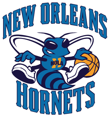
The New Orleans Hornets — celebrating its 20 years in the NBA, shared with the recently nip-tucked Timberwolves — have updated the logo that has basically remained the same since 1989. It even survived the move from Charlotte to New Orleans for the 2002–2003 season. Could we be experiencing a new trend? Of designers, marketers and team owners recognizing equity where there is some? Instead of swatting away known icons for the sake of change? Anyway, there is really not much information about this logo, other than this post, so like the Timberwolves logo, it’s nice to just look at a before and after and dig on the evolution. The old hornet was rather campy with its Mickey Mouse gloves, perplexed expression and funky shows, while the new one is smirkily confident, has better kicks and lost the gloves. The drawing of the basketball is much better too. The typography remains as funky as the old one, it’s neither good nor bad, it just seems to revel in oddity and awkwardness. A nice update all around.
The big logo below looks like it was taken from a Flash animation, which usually mangles vector artwork and would explain the squiggly lines. I really doubt the actual logo would be like that. So I would suggest not railing on the vector work.
Thanks to Jon B. Bradie for the tip.


Jump to Most Recent Comment
jRod’s comment is:
Personally, I am just not a fan of "campy" mascots for major sports teams. This one, despite the fact that its been updated, is still very cartoonish and reminds me of some soccer mom's poor sports obsession on a Thursday night. I see this stuff on the backs of minivans all of the time. Why not just put the word "Haley" or "Tyler" above in Times New Roman above it to complete the look?
Give me something aggressive that fits the attitude of the team.
On Jul.08.2008 at 12:05 PM
jRod’s comment is:
Personally, I am just not a fan of "campy" mascots for major sports teams. This one, despite the fact that its been updated, is still very cartoonish and reminds me of some soccer mom's poor sports obsession on a Thursday night. I see this stuff on the backs of minivans all of the time. Why not just put the word "Haley" or "Tyler" above in Times New Roman above it to complete the look?
Give me something aggressive that fits the attitude of the team.
On Jul.08.2008 at 12:06 PM
Jeff’s comment is:
The guy isn't angry anymore, what the dill?
On Jul.08.2008 at 12:06 PM
billy’s comment is:
The original was bad the and new one is pretty bad too - some of that illustration work in the bee is just awful.
As an aside: because I have nowhere else to say this, Why the hell didn't the hornets change their colors to black and gold when they moved. That is a the color of a hornet, right? and that is also the color scheme of the Saints - the other local team - I would think that would have really endeared the new team to the city and probably boosted sales as well. (and the uniforms would be much better too)
On Jul.08.2008 at 12:11 PM
Amaj’s comment is:
I think the refresh was decent, nothing special, I'll miss the teal. I do think the Hornets have the best secondary logo in sports. Wish this was their main logo.

Darrin Crescenzi’s comment is:
Though it is equally campy and soccer-momish, I've always had a soft spot for the Georgia Tech yellowjacket. Maybe I just like silly mascots.

Darrin Crescenzi’s comment is:
Oh wow, that secondary logo is amazing.
On Jul.08.2008 at 12:20 PM
Brandon’s comment is:
I agree with Darrin, that secondary logo is sooo good. Thanks Amaj for bringing that up.
On Jul.08.2008 at 12:25 PM
Kristin’s comment is:
The secondary logo is neat... but I have to say it reminds me of a fleur-de-lis.
It's kind of a weird association.

Joachim’s comment is:
Kristin: It is based on the fleur-de-lis. New Orleans was named after a French guy.
On Jul.08.2008 at 12:45 PM
Stereo Radiation’s comment is:
Kristin, I do believe that the fleur-de-lis is intentional, because of the historical connection between Louisiana and France... notice too that the New Orleans Saints have a fleur as their logo.
Frankly I dislike the trend toward more aggressive, menacing mascots (even the Chicago Cub has an angry expression). I realize the competitive dimension of sports in general, but it's all about fun anyhow.
On Jul.08.2008 at 12:50 PM
kyle.’s comment is:
1. the new hornet has "nola" instead of "new orleans" on its chest (+1).
2. the new wings look like oversized ears (-1).
3. the new font is busier (-1) but more new orleans (+1).
4. the blue is less teal (+1) and the purple has become navy (+5).
overall, i'd call this a slight upgrade. it's good to see something tweaked for the better rather than scrapped for the current trend in design.
On Jul.08.2008 at 12:53 PM
kris’s comment is:
It's a somewhat surprising statement, but a lot of corporations could learn from pro sports branding.
On Jul.08.2008 at 01:01 PM
Nick’s comment is:
very disappointing as a huge CHARLOTTE hornets fan back in the day....I wish this logo didnt look like a 1st year design student did it with the Harsh Curves and awkward points
I really enjoyed the fleur-de-lis bee what happened to that ?!?
On Jul.08.2008 at 01:16 PM
Stevie K’s comment is:
How come Basketball team's secondary logos are always better and more exciting than their primary logos. Just shows creativity is stifled when it really matters.
On Jul.08.2008 at 01:24 PM
DrBear’s comment is:
Kristin: It is based on the fleur-de-lis. New Orleans was named after a French guy."
Of course it is - in New Orleans, that secondary logo is known as the "Fleur de Bee."
On Jul.08.2008 at 01:28 PM
Andrew Harrington’s comment is:
QUOTE
4. the blue is less teal (+1) and the purple has become navy (+5).
overall, i'd call this a slight upgrade. it's good to see something tweaked for the better rather than scrapped for the current trend in design.
/QUOTE
The current trend in design IS (especially the NBA) light blue and navy blue. The Hornets' purple and teal, while clearly a product of the 90s, was actually among the first, before purple and teal took off on a nightmarish trend cycle. They really own purple and teal in a good and unique way. Plus, the purple, teal and gold really spoke to New Orleans' flair and role as the South's original classy party town.
On Jul.08.2008 at 01:38 PM
Harris’s comment is:
The shoes are way worse.
The wings look stupid and don't even connect to the body.
The colors are generic and should obviously be gold/yellow and black.
The H on the chest looks out of place and undefined.
Downgrade overall.
On Jul.08.2008 at 02:01 PM
Mark’s comment is:
looks less threatening, but really irks me is the BLACK type partly on a YELLOW H but partly overlapping a DARK PURPLE background a bad bad bad color choice for readability. :(
what the hell was wrong with having white type before???
On Jul.08.2008 at 02:37 PM
Mark’s comment is:
I should have looked again it's an orange-ish color not yellow on the H.
On Jul.08.2008 at 02:40 PM
Mark’s comment is:
that secondary logo is so much better. damn.
On Jul.08.2008 at 02:42 PM
Rico’s comment is:
Wow, the bee illustration is horrible. It looks like they autotraced a poor scan of the original logo or something. And even though the typeface is marginally better, some consideration should have been given to the counters plugging up at small sizes in my opinion. Feels cramped.
The secondary logo is far superior.
On Jul.08.2008 at 02:56 PM
jRod’s comment is:
Armin did mention that the logo was pulled from a flash file, which tends to jack up vectors terribly. That would account for the messy lines...
On Jul.08.2008 at 03:29 PM
Morgan Smail’s comment is:
The type on the old logo looks like an upgrade from the "new" one.
...ironic
On Jul.08.2008 at 03:38 PM
Jon Dascola’s comment is:
"Instead of swatting away known icons for the sake of change?"
Get it....Hornets...swatting away. Please tell me that was intended. You're good Armin.
On Jul.08.2008 at 03:38 PM
Ted’s comment is:
About 10 years back I used to get purple and teal rubber bands on my braces because of the (then) Charlotte Hornets. I don't even like basketball.
On Jul.08.2008 at 03:54 PM
Andrew’s comment is:
This logo is an embarrasment to the NBA.
I feel deep regret and embarrassment for anyone associated with it.
SAD SAD SAD.
On Jul.08.2008 at 03:56 PM
Mongoose’s comment is:
Hmmmm. Hmmm. Hmmmmm.
Another modest update, similar to the Timberwolves in an attempt to streamline. agreed, though, it's not the clear improvement. It's a lot more 'modern logo' of a feel, which isn't necessarily great.. but their old logo was never too charming. The 'New Orleans' to 'NOLA' change is wise, though still so small to read, maybe just a 'NO' in a stretched font might be a further iteration. Sneakers, basketball, totally better. The old hornet looked like he was dribbling, this one looks like he's getting set to dunk, and that's a subtle but good change.
And naturally, I'm going to grade it a Bee Plus.
On Jul.08.2008 at 04:22 PM
Doug’s comment is:
The Hornets missed a great opportunity to make the "Fleur de Bee" logo their primary mark. This update just polishes a logo that was weak to begin with and created for another city and fanbase.
The type update is clean; they should have paired a similar treatment with the "Fleur de Bee."
On Jul.08.2008 at 04:23 PM
Mongoose’s comment is:
Change that from a Bee+ to a straightout B. I just noticed the new sneakers lose the 'honeycomb' pattern on the bottom, which I never noticed before now, but is really clever.
On Jul.08.2008 at 04:24 PM
Harris’s comment is:
My biggest problem with the shoes is the loss of the honeycomb.
I don't think NO on the just would work. It would be awkward to have no in large letters in a logo.
I just noticed the words in the logo seem oddly curved. It does not match the curve of the hornet, and there is too much space above the hornet's head.
On Jul.08.2008 at 04:37 PM
SlimMcFavorite’s comment is:
I agree with pretty much everything that Rico had to say as far as the illustration and design. The illustration just looks so sloppy to me. It really isn't an upgrade in my opinion, especially since the original one has nostalgic associations for me when Zo and LJ played for Charlotte. I also agree that they should have just went with the secondary fleur de lys logo.
On Jul.08.2008 at 05:08 PM
dg3’s comment is:
I like the old one.
On Jul.08.2008 at 05:22 PM
Chris Wilson’s comment is:
It will be interesting to see what the new Oklahoma City basketball team's logo will look like. But first they need a name. Any ideas?
On Jul.08.2008 at 05:42 PM
Bendy’s comment is:
Looks livetraced...
I honestly think it's a very poor illustration. Half of the designers on here could have cranked that thing out in under an hour.
On Jul.08.2008 at 05:49 PM
howard2112’s comment is:
I have to say the hornet reminds me of a hornet.
Sorry I didn't want to be the only one that wasn't cloud watching.
On Jul.08.2008 at 06:23 PM
Anonymous’s comment is:

Horrible.
On Jul.08.2008 at 09:08 PM
Von Glitschka’s comment is:
Oops. Hit post by mistake. Sorry about that.
On Jul.08.2008 at 09:09 PM
R’s comment is:
I feel bad for the fans with a logo change so quickly after the team's arrival, but I feel the old one looked kind of awkward , like he knows he shouldn't be around a basketball. The new one is still awkward, but the hornet doesn't give it away. I'm interested to see how the uniforms come out.
On Jul.08.2008 at 09:28 PM
Andrew’s comment is:
Hornets don't make honey or honeycomb but they do build octagonal pods in their paper hives for the youngins.
Also, they aren't known to dunk, dribble, wear 'kicks' or smirk.
They also have 6 appendages, not 4.
The fleur-de-lis design is great.
Lose the BOTH the before and after logo and spare us all.
On Jul.08.2008 at 10:00 PM
Andrew’s comment is:
The EPITOME of TURD POLISHING! –and a horrible attempt at that.
On Jul.08.2008 at 10:09 PM
Corey Buckner’s comment is:
This situation reminds me of the Baltimore Ravens where their secondary logo blows their "new-ish" primary logo out of the water! Dang, it's not even close... Just getting back from Charlotte and visiting the Bobcats arena I am feeling very nostalgic about the old Charlotte Hornets with Bogues, Mourning, and Grand Ma Ma.
They had the best uniforms in the league and by far the best colors. This "downgrade" is unneccessary and I am personally not a fan of the sarifs (TMN). And what is the deal with the floating blob of playdo that has fallen loosely into the shape of an H that is floating in front of the molding bee?
The wings look like wedding bells behind him; who's getting married? and why give the poor guy bucked teeth? I also prefered the octoganol pod gym shoes to his new, generic, XJ-900s; how lame...
My final comment is that it would have made sense to add a little yellow (gold) to the logo seeing that they have adopted gold, alternative, road uniforms. Would have made a lot more since than having an orange (diarhea color) H floating in front of it...
On Jul.09.2008 at 09:35 AM
mongoose’s comment is:
Harris: True, upon reflection. You'd want it to be 'N.O.', but then the periods would get utterly lost. It's such a small space to try and put words in, for anything smaller than a T-shirt.
On Jul.09.2008 at 10:17 AM
Malcolm’s comment is:
That secondary logo is wonderful! I think it would be the bomb in yellow and black, though.
On Jul.09.2008 at 10:18 AM
Hannes’s comment is:
Same issue with the raptors logo: the secondary logo works better.

Justin’s comment is:
I'm a big fan of the typeface outside of the logo. It's about time they worked Council into a sports identity.
On Jul.09.2008 at 11:59 AM
Weiss’s comment is:
Von G – Love the animated GIF as usual – but ant & roach spray for a hornet? Details, details.
Overall, I think this is an improvement, but it really could be so much better.
On Jul.09.2008 at 12:26 PM
Nathan’s comment is:
I think that the art for the hornet is much better. could it be more aggressive? sure. but all sports mascots do not have to be scary or mean looking. the lettering is a really poor choice. i know its a mouthful but it still needs to beef up. from a distance it looks like vertical lines. which is where your going to be viewing it most of the time. and also why do they always have to "wrap" around the image?
On Jul.09.2008 at 12:54 PM
orangetiki’s comment is:
I am not commenting on the poor vector art ONLY because you said so. But it is odd to see how the wings are nice and clean and the basketball , shoes , etc are so bad.
Should have kept the new lettering with the old hornet. The only reason I can see why they did this was to lessen the amount of colors used. Not a reason to redraw anything.
On Jul.09.2008 at 12:56 PM
MADPHILL’s comment is:
Better. Still lame.
The gap between the right wing and the words vs. the other gaps is killing me. Plus, I liked the shape of the head better before how it pointed back at the tail creating a "loop" with your eye instead of now it's kind of a "J" you start with the head swoop down to the stinger and it just kind of flings your eye off into the unknown negative space.
The "H" NOLA is a terrible idea. They should have dropped this. It is IMPOSSIBLE to read at smaller sizes.
I also think the honeycomb sole pattern was thoughtful before vs the boring black
I could go on, but why?
On Jul.09.2008 at 01:16 PM
DC’s comment is:
The NBA charges teams a hefty fee to make significant changes to their primary logo. There are also guidelines on how often they can change the primary logo as well. These changes that you have seen lately are minor tweaks and color changes that save teams cash while refreshing their logo and still staying within the rules of not completely changing their primary.
Think of the Timberwolves who only made slight changes or the Nuggets who are replacing one of their blues in their primary to navy and the Raptors who just eliminated purple in their primary.
Also, many teams have secondary logos that they may even prefer over their primary logos. But to save cash, they still keep their less desired (slightly re-colored or tweaked) primary as part of their design to save cash.
On Jul.09.2008 at 04:22 PM
Andrew’s comment is:
I'm not buyin'. (Pun intended)
What about all the cash that NOLA is LOSING by not having a real logo. Who wants to wear either of those BEFOR and AFTER logos on their head or chest? There's just no toughness there.
Professional teams make MILLIONS on apparel and logo-branded 'stuff'. Especially when a team re-does their identity. There's always a huge fan rush to replace their old gear and own the latest 'stuff'. I see the NBA profiting quite a bit as well.
So DC, how much are we talking here for an NBA team to update their entire logo? How about a color update? Would you like to throw out some figures? It would have to be a really big number (in the multi-millions) for teams to slog along with their old, outdated identities.
On Jul.09.2008 at 05:45 PM
Rico’s comment is:
I had the misfortune of growing up in the Charlotte area when the Hornets originally came into the league and even I didn't remember just how bad the original logo was. Wow, talk about arched type run amuck. And what's with the "motion squiggles" around Hugo? Man the late '80's sucked.

Davekos’s comment is:
the stylized bee is better now. but the 'NEW ORLEANS' is less readable than the old logo. don't you think? overall, still it's an old fashioned logo. a pitty.
On Jul.10.2008 at 10:33 AM
Gentleman Agitator’s comment is:
Another bad sports logo painfully hangs around, in whatever slightly adjusted form. Here you see the leading edge of the plethora of "bad ass" team logos of the '90s. If your mascot did not look like it was a gang memeber on a rampage, or just not plain "aggressive", it was not "in." Is it me, or do the new wings look like huge ears for the head? And the fleur de bee is a killer bee, er I mean hornet. And as some have said, the secondary logo can often look better than the primary. Drop the primary, changes the colors to purple, gold and green for NO and you are set.
On Jul.11.2008 at 10:46 AM
Miha Medvedsek’s comment is:
"New Orleans" and the hornet don't fit well. Space between is to big. Basketball looks much better. Font is worse, color better.
A few weeks ago another NBA team, Denver Nuggets, got a new logo as well.
On Jul.13.2008 at 06:05 AM
Amanda’s comment is:
I don't see this as an update. It's just glossed over.
On Jul.14.2008 at 10:03 AM
Daniel A. Yazvac’s comment is:
I am likely notalone in thinking that it is "reallly" not much of an update. Almost not a change at all! I might not have noticed if I did not see it here.
I did however notice that his kicks are new (or shows) for those who prefer.
On Jul.15.2008 at 02:44 PM
Baki Toktas’s comment is:
I prefer the old logo, the new one is not readable. And why make it darker?
On Jul.25.2008 at 03:41 AM
Chris Mills’s comment is:
eh? ...they paid for this edit? We're not talking about a high dollar "nip tuck" here. C'mon decision makers, get schooled.
On Sep.01.2008 at 11:41 PM
John’s comment is:
this looks like it was live-traced or poorly pen-tooled in illustrator. amateur-ish.
On Sep.15.2008 at 01:45 AM
Anonymous’s comment is:
JOJOJOJOJO POS ME GUSTA MAS EL NUEBO ESCUDO
On Oct.31.2008 at 06:43 PM
Charles(From New Orleans)’s comment is:
As a resident of New Orleans and a huge fan, I love the Hornets new logos and the uniforms are great! However, I love working with computers and my schools mascot is a yellow jacket. I took the old logo and made it black and gold and the new one and the Fleur De BEE! I personally think theyre great:
(Old logo): http://tinypic.com/view.php?pic=sf9oaw&s=4
(Fleur de Bee): http://tinypic.com/view.php?pic=293ug6g&s=4
(New Hornets logo): http://tinypic.com/view.php?pic=m4h8i&s=4
TELL ME WHAT YOU THINK!
On Nov.29.2008 at 05:38 PM
indiana scones’s comment is:
seriously people, the negatives of the design are far outnumbered by the symbolism of the new logo, for one, if you notice they purposely "took the gloves off" so to speak referring to their last outstanding season, and being a native of new orleans i personally love the inclusion of NOLA instead of new orleans, it just helps strike a chord with us locals. Sure i do agree that the secondary fleur de bee logo is far better (personally my favorite sports logo ever designed), but i don't see how anyone can call it a downgrade... i'm no design student ( and frankly most of you are all hating on a design that mostly everyone who isn't going over this with i fine toothed design student's comb finds appealing and relating to their home city much better) and ultimately isn't that what that logo is for, to represent the people who love support and cherish their home teams? and besides if you have issues with campy, poorly drawn, or just plain cartoonish primary logos, just look to the celtics.
in closing, all i have to say is yes, it may have its design flaws, but, it is a proud new orleans icon, just like the nola trumpet proudly displayed on our court its just another uniquely new orleans addition
On Dec.12.2008 at 05:40 AM
Charles’s comment is:
Indiana, your right. It takes a lot of creativity to go into these mascott designs, and the artists is really good. I love the new Logo, and the uniforms are great too. THe court looks amazing, and the Hornets are the best team ever!!
On Feb.10.2009 at 04:17 PM
Comments in Brand New, V1.0 have been closed.


