ADV @ UNDERCONSIDERATION Peek here for details
BROWSE
Client
School of the Art Institute of Chicago
Quantity Produced
14,000
Production Cost
Not Disclosed
Production Time
5 weeks
Dimensions (Width × Height × Depth)
9 in × 10.5 in × 0.75 in
Page Count
240
Paper Stock
Cover: 130 lb., DT Cover, Coronado, Infinite White, Stipple
Body: 100 lb., text Utopia II Matte
Number of Colors
Cover: CMYK + 2 hits of PMS Gray
Body: CMYK
Varnishes
Dull Auqueous Coating
Binding
PUR Perfect Bound Booklet
Typography
Stratum, Process Type Foundry
Paperback, House Industries
Boton, Berthold Type Library
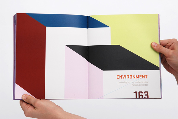
When you think of the Art Institute of Chicago, images of classic fine art from the likes of Georgia O’Keeffe, Edward Hopper, Diego Rivera and Paul Cézanne among many others will first come to mind. And, in my mind at least, I have always had a difficult time separating those images from my perception of the School of the Art Institute of Chicago (SAIC). Of course, this is my fault and no one else’s and it was further disproved by this unflinchingly contemporary admissions catalog by Chicago based Grip Design that paints (pun intended) SAIC as one of the top graduate art programs offering degrees in visual communication, architecture, art and art history, and writing.
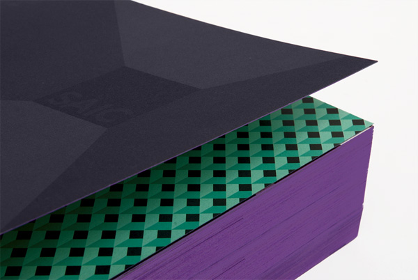
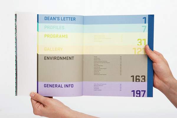
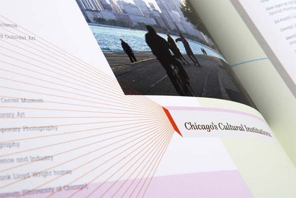
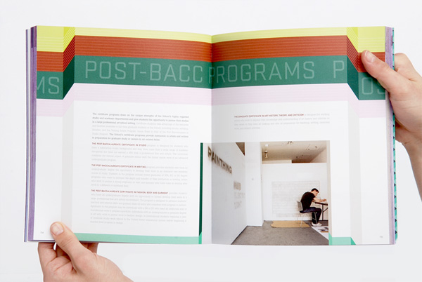
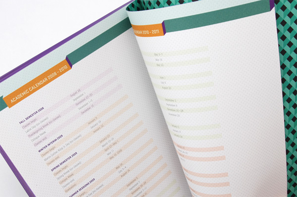
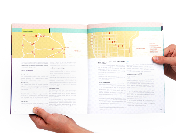
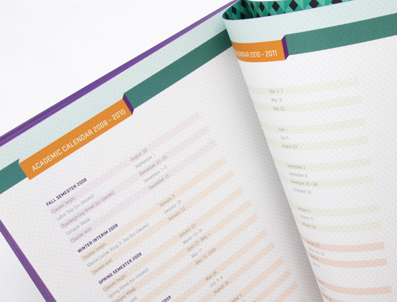
The first thing you notice about this catalog is its purple-printed edge that gives it an immediate presence, but that is only the beginning as you navigate through more than 200 pages with myriad textures and typographic details that give the SAIC quite a visual edge.
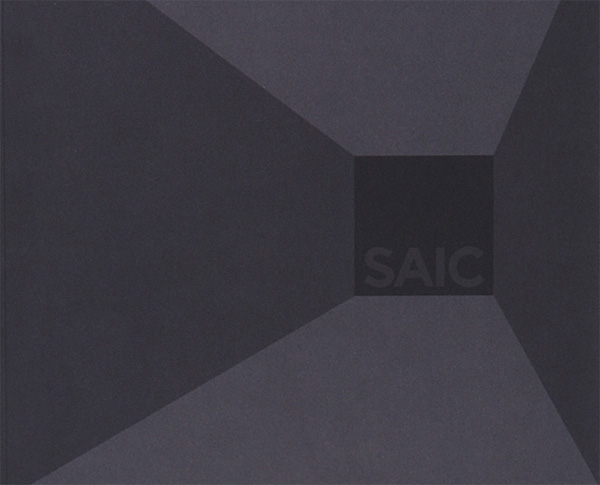

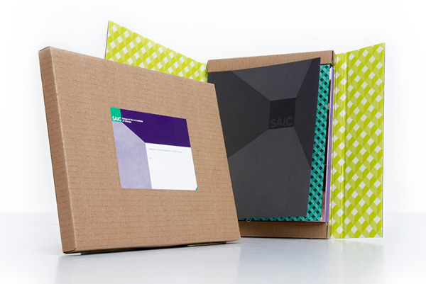
SAIC Admissions Catalog
Production Method
Design
Grip Design
Designers: Joshua Blaylock, Camay Ho
Art Directors: Kelly Kaminski, Kevin McConkey
Printing
Lake County Press
This post was published in the original layout of FPO so all images are smaller. Project descriptions as well as production lessons are quoted in the main content area.
Post Author
Armin

Armin Vit
Editor of FPO and co-founder of UnderConsideration LLC.
More: Online / On Twitter
Date Published
September 11, 2009
Filed Under
Catalogues
Tagged with
edge printing
offset
perfect bound
purple


About
FPO (For Print Only), is a division of UnderConsideration, celebrating the reality that print is not dead by showcasing the most compelling printed projects.
FPO uses Fonts.com to render Siseriff and Avenir Next.
FPO is run with Six Apart’s MovableType
All comments, ideas and thoughts on FPO are property of their authors; reproduction without the author’s or FPO’s permission is strictly prohibited
Twitter @ucllc
Sign-up for Mailing List
Mailing list managed by MailChimp
Thanks to our advertisers
About UnderConsideration
UnderConsideration is a graphic design firm generating its own projects, initiatives, and content while taking on limited client work. Run by Bryony Gomez-Palacio and Armin Vit in Bloomington, IN. More…
blogs we publish
Brand New / Displaying opinions and focusing solely on corporate and brand identity work.
Art of the Menu / Cataloguing the underrated creativity of menus from around the world.
Quipsologies / Chronicling the most curious, creative, and notable projects, stories, and events of the graphic design industry on a daily basis.
products we sell
Flaunt: Designing effective, compelling and memorable portfolios of creative work.
Brand New Conference videos / Individual, downloadable videos of every presentation since 2010.
Prints / A variety of posters, the majority from our AIforGA series.
Other / Various one-off products.
events we organize
Brand New Conference / A two-day event on corporate and brand identity with some of today's most active and influential practitioners from around the world.
Brand Nieuwe Conference / Ditto but in Amsterdam.
Austin Initiative for Graphic Awesomeness / A speaker series in Austin, TX, featuring some of the graphic design industry's most awesome people.
also
Favorite Things we've Made / In our capacity as graphic designers.
Projects we've Concluded / Long- and short-lived efforts.
UCllc News / Updates on what's going at the corporate level of UnderConsideration.

Related entries
Australian Book Design Association Award Catalogue 2016
L.A. Louver Catalog: Charles Garabedian
Andrew Curtis Catalogue
Minus-8 Catalog
“Bright Lights Dark City” Catalog