ADV @ UNDERCONSIDERATION Peek here for details
BROWSE
Arjowiggins Creative Papers Bookmark
Production Method
Emboss
Hot stamp
Design
The Bakery
Printing
Generation Press
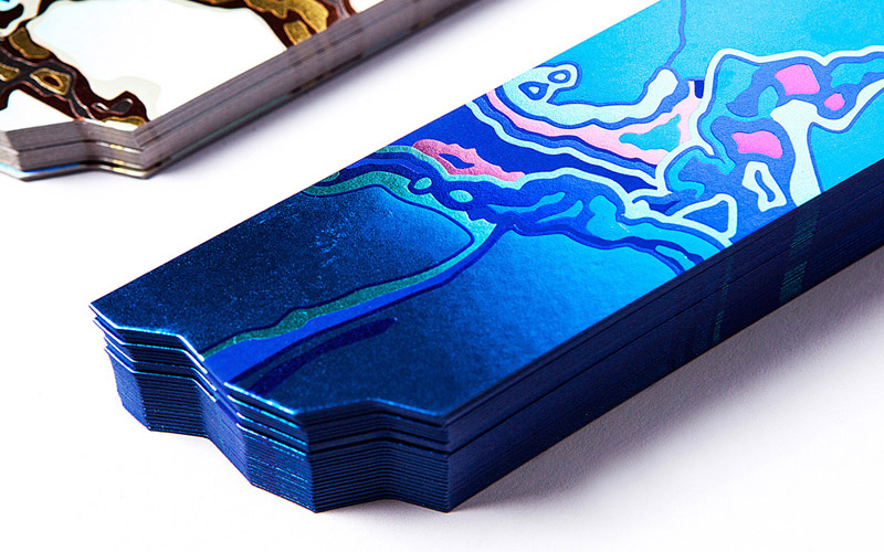
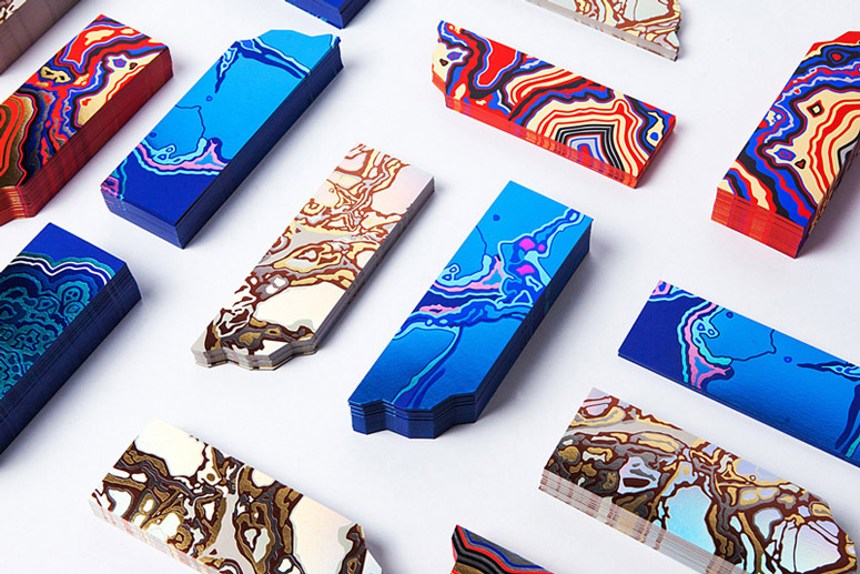
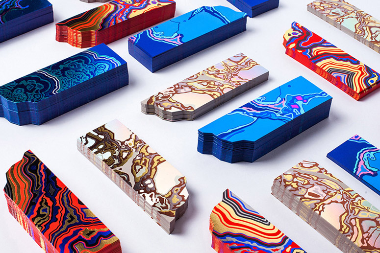
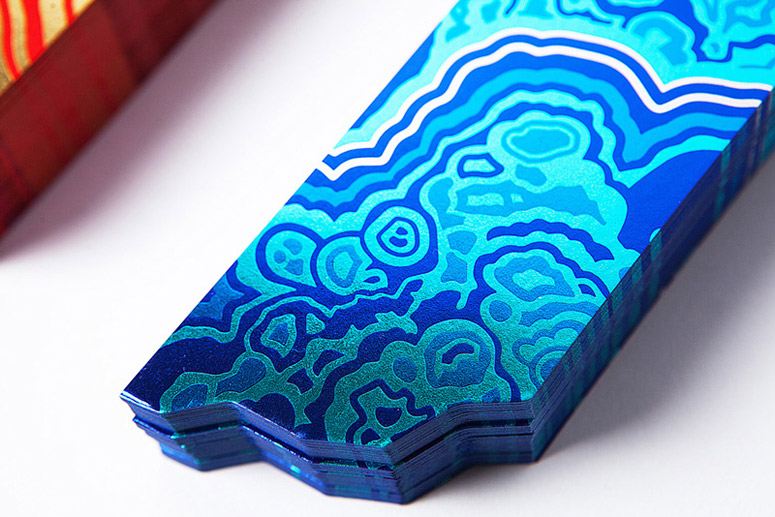
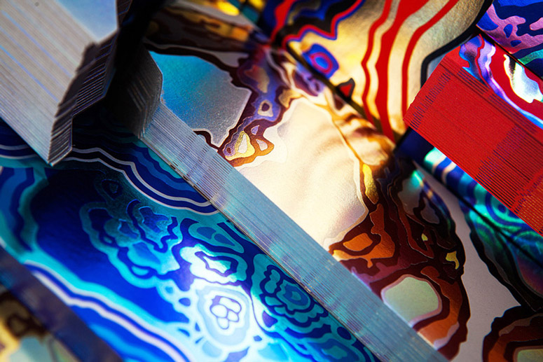
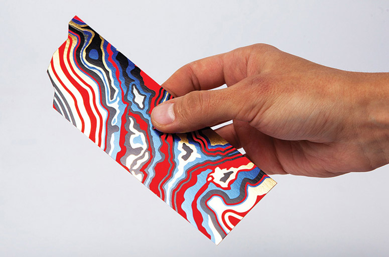
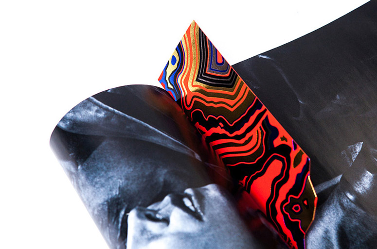
Moscow design studio The Bakery’s business-card-cum-bookmark for French paper distributor Arjowiggins transmutes Curious Matter paper into precious stones using combinations of 5 different foils.
Dimensions (Width × Height × Depth)
–
Page Count
–
Paper Stock
Curious Matter 270gsm
Number of Colors
5
Varnishes
–
Binding
–
Typography
–
Project Description
This project is unique in many ways. Firstly, the function of a bookmark helps highlight tactile sensations of paper, celebrate simple joy of something analog in a world obsessed with digital. Secondly, the diverse geographical context makes it truly special: the bookmark is designed in Russia and printed in UK for a French company. Also, the featured material is remarkable on it's own: raw, uncoated stock in several weights with vibrant colours, produced from recycled potato skin, combined with almost stone-like surface texture, producing a very extraordinary look and feel experience.We build our idea around mining and fossil extraction as they are in a way similar to creative practice. These activities involve processing a lot of raw material before finding what one is looking for. Curious Matter paper surface resembles untreated stone texture and our design is a metaphor for turning ore into something valuable.
Bearing in mind, that Curious Matter is all about sensation and is widely used in luxury print, we brought the idea of discovering beauty in something ordinary into the project via contrasting print finishing. We treated the bookmark as a stone cut. To show the sensation of the stock the front is left almost untouched with just the logo and text embossed, communicating untreated mineral. The reverse is hot-foiled to achieve the look and feel of a precious stone. The resulting design looks eye-catching and luxurious. It is not just beautiful but also functional, as it successfully shows how foil finishing works with the paper and the effects that can be achieved through the use of Curious Matter.
Production Lesson(s)
Located in Moscow we had to source a reliable printer in Europe, who could fit into budget, but produce quality product. We were told, that it'd be easier to find a good one in Eastern Europe, as all British/French printers are quite expensive. But when we got in touch with Generation Press, they were really kin to do the project. We had quite a few obstacles to overcome and they were the only one production company willing to do that.Using up to 5 different foils is a pretty complex task. We had a strict budget and to lower the cost per unit, we had to double the total amount and make some tweaks to the artwork. The most valueble of all lessons comes this one: if you're not able to control the printing on site, choose a company with the best reputation and experience, but also those with a passion for print.

Post Author

Kelly Cree
Writer for UnderConsideration LLC.
More: Online / On Twitter
Date Published
April 6, 2015
Filed Under
Bookmark
Business Cards
Emboss
Hot stamp
Tagged with
bookmark
curious paper
die-cut
foil stamp


About
FPO (For Print Only), is a division of UnderConsideration, celebrating the reality that print is not dead by showcasing the most compelling printed projects.
FPO uses Fonts.com to render Siseriff and Avenir Next.
FPO is run with Six Apart’s MovableType
All comments, ideas and thoughts on FPO are property of their authors; reproduction without the author’s or FPO’s permission is strictly prohibited
Twitter @ucllc
Sign-up for Mailing List
Mailing list managed by MailChimp
Thanks to our advertisers
About UnderConsideration
UnderConsideration is a graphic design firm generating its own projects, initiatives, and content while taking on limited client work. Run by Bryony Gomez-Palacio and Armin Vit in Bloomington, IN. More…
blogs we publish
Brand New / Displaying opinions and focusing solely on corporate and brand identity work.
Art of the Menu / Cataloguing the underrated creativity of menus from around the world.
Quipsologies / Chronicling the most curious, creative, and notable projects, stories, and events of the graphic design industry on a daily basis.
products we sell
Flaunt: Designing effective, compelling and memorable portfolios of creative work.
Brand New Conference videos / Individual, downloadable videos of every presentation since 2010.
Prints / A variety of posters, the majority from our AIforGA series.
Other / Various one-off products.
events we organize
Brand New Conference / A two-day event on corporate and brand identity with some of today's most active and influential practitioners from around the world.
Brand Nieuwe Conference / Ditto but in Amsterdam.
Austin Initiative for Graphic Awesomeness / A speaker series in Austin, TX, featuring some of the graphic design industry's most awesome people.
also
Favorite Things we've Made / In our capacity as graphic designers.
Projects we've Concluded / Long- and short-lived efforts.
UCllc News / Updates on what's going at the corporate level of UnderConsideration.

Related entries
Dominie Press Notebook
Collected Coffee Packaging
Sakao Packaging
Happy White Year 2015 Calendar
Salões de Paris Book Cover