ADV @ UNDERCONSIDERATION Peek here for details
BROWSE
BUILD: Addepar Recruiting Campaign
Production Method
Silkscreen
Design
Nick D'Amico
Craig Gephart, Ryan Smith, the Addepar team, & Mighty Thredz
Printing
Nick D'Amico, Mighty Thredz
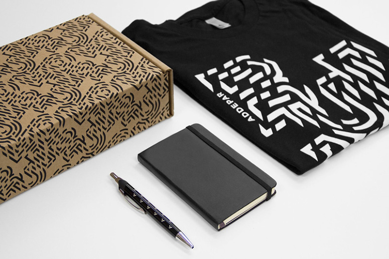
These silkscreened recruitment materials for financial technology company Addepar focus on energetic branding to make the items visually appealing enough to stand on their own.
Client
Addepar
Quantity Produced
1,500 shirts
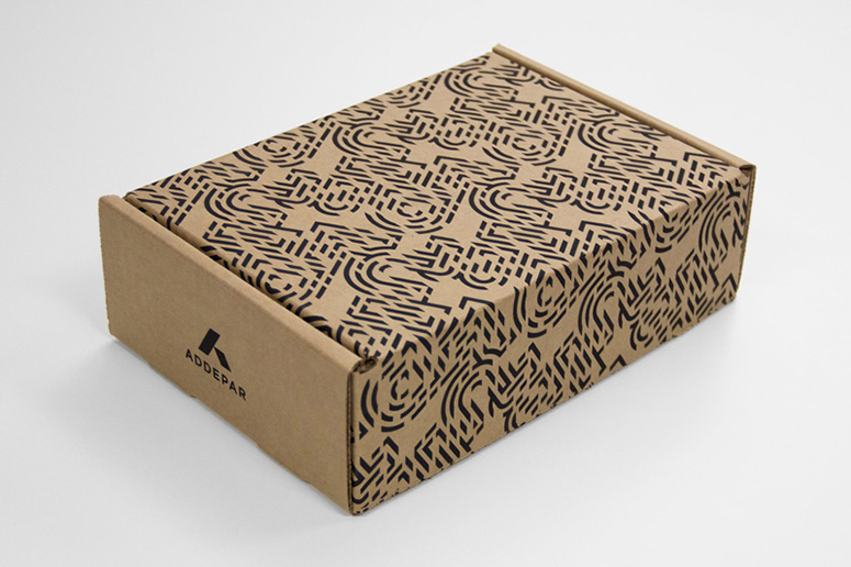
250 boxes
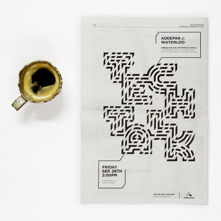
2 newspaper ads
Production Cost
–
Production Time
Shirts: 2 weeks from artwork submission to press check and shirts in hand
Boxes: 2 days printing in-house
Dimensions (Width × Height × Depth)
9 × 6.5 × 2.75 in
Page Count
–
Paper Stock
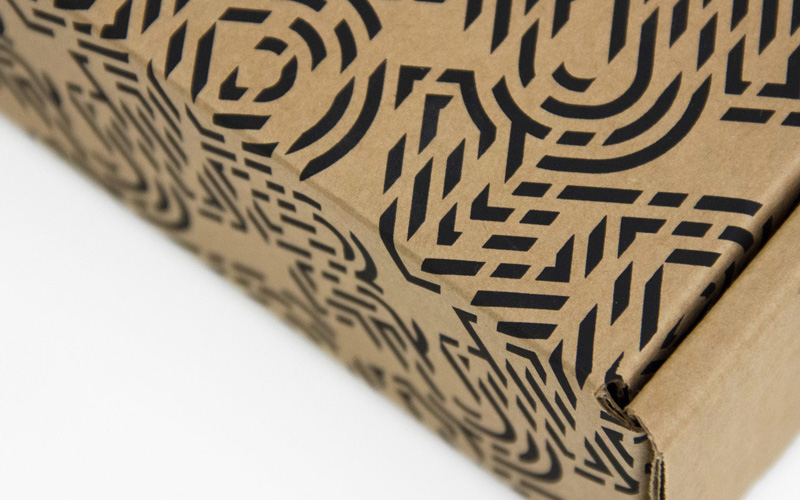
Boxes: singlewall corrugated cardboard
Number of Colors
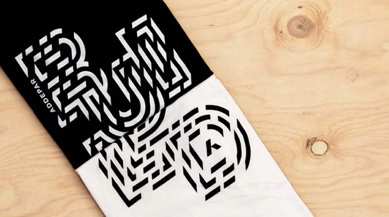
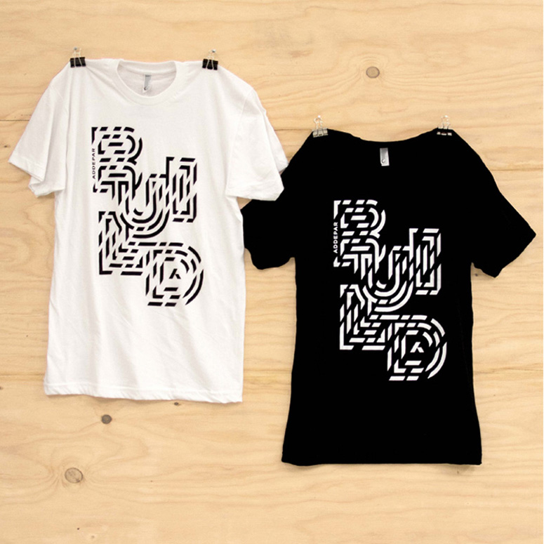
All materials use black or white ink. The shirts were printed with inverse variations.
Varnishes
–
Binding
–
Typography
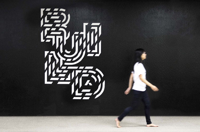
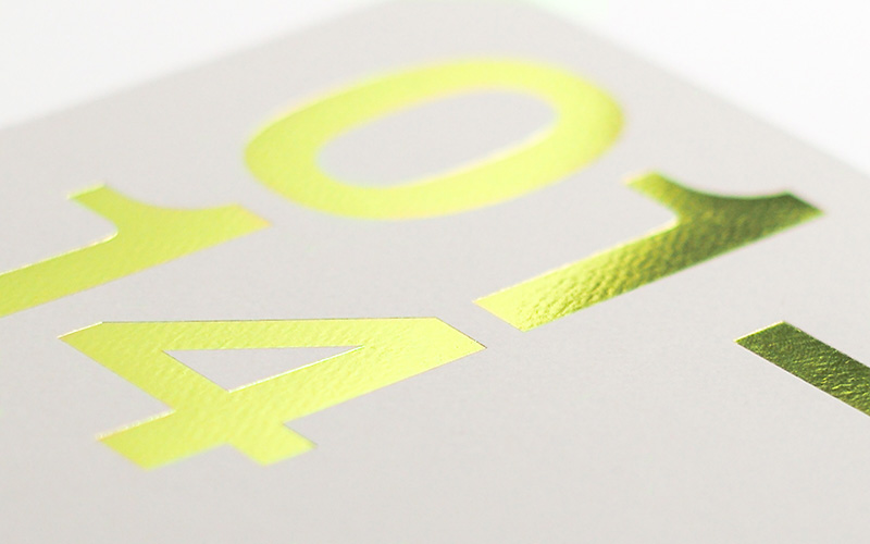
The lettering for the main designs were custom drawn geometric letters on a square grid. They were then arranged to fit the medium and a second angled grid (matching the company logo) was overlaid. The cross-sections were cut to make unique designs.

Project Description
Build is the recruiting arm of the Addepar brand. Every fall season, tech companies flock to college campuses to compete for young talent. In our campaign design, we reacted to a system of branding that feels both generic and oppressive. While many companies treat their logo as status symbols and turn students into walking billboards, we chose to focus first on strong, exciting design.This allowed us to deliver apparel that people were more interested in and apt to wear. They share our story through conversation and the visual identity is able to appear fresh yet consistent. While the shirts are the most popular piece, several other assets were built out for on-campus recruiting, meetups, and the like. We continue to send shirts and swag in packaging screenprinted in-house.
This design focused on a repeatable but tailored system of lettering that uses the geometry of Addepar’s logo to create lettering uniquely our own.
We focused on strong black and white contrast to represent simplicity and energy simultaneously.
Production Lesson(s)
I really wanted the pattern design on the boxes to bleed off all of the edges so it didn't appear to cut off abruptly. This was a little tough though because of the cardboard template shape and its thickness. I was concerned about pulling the squeegee up and over an uneven edge, ultimately missing spots of the print. To resolve this, I simply used excess cardboard to cut a negative shape of the template. This was taped down to my printing table and made a great registration system while letting me start the pull on a flat surface.
Post Author

Jessica Mullen
Writer for UnderConsideration LLC.
More: Online / On Twitter
Date Published
May 6, 2015
Filed Under
Collateral
Silkscreen
Tagged with
advertisement
apparel
box
collateral
newspaper ad
packaging
pattern
screenprint
shoe box
silkscreen
tshirt


About
FPO (For Print Only), is a division of UnderConsideration, celebrating the reality that print is not dead by showcasing the most compelling printed projects.
FPO uses Fonts.com to render Siseriff and Avenir Next.
FPO is run with Six Apart’s MovableType
All comments, ideas and thoughts on FPO are property of their authors; reproduction without the author’s or FPO’s permission is strictly prohibited
Twitter @ucllc
Sign-up for Mailing List
Mailing list managed by MailChimp
Thanks to our advertisers
About UnderConsideration
UnderConsideration is a graphic design firm generating its own projects, initiatives, and content while taking on limited client work. Run by Bryony Gomez-Palacio and Armin Vit in Bloomington, IN. More…
blogs we publish
Brand New / Displaying opinions and focusing solely on corporate and brand identity work.
Art of the Menu / Cataloguing the underrated creativity of menus from around the world.
Quipsologies / Chronicling the most curious, creative, and notable projects, stories, and events of the graphic design industry on a daily basis.
products we sell
Flaunt: Designing effective, compelling and memorable portfolios of creative work.
Brand New Conference videos / Individual, downloadable videos of every presentation since 2010.
Prints / A variety of posters, the majority from our AIforGA series.
Other / Various one-off products.
events we organize
Brand New Conference / A two-day event on corporate and brand identity with some of today's most active and influential practitioners from around the world.
Brand Nieuwe Conference / Ditto but in Amsterdam.
Austin Initiative for Graphic Awesomeness / A speaker series in Austin, TX, featuring some of the graphic design industry's most awesome people.
also
Favorite Things we've Made / In our capacity as graphic designers.
Projects we've Concluded / Long- and short-lived efforts.
UCllc News / Updates on what's going at the corporate level of UnderConsideration.

Related entries
Um Caminho para Santiago CD Package and Diary
36 Days of Type Poster
CNN Digital New Hire Kit
Alivu EVOO Packaging
Ministry of Environment in Colombia Poster