ADV @ UNDERCONSIDERATION Peek here for details
BROWSE
The Substation Poster / Flyer
Production Method
Offset
Design
quâest-ce que câest design
Printing
Winson Press
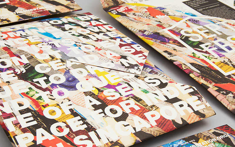
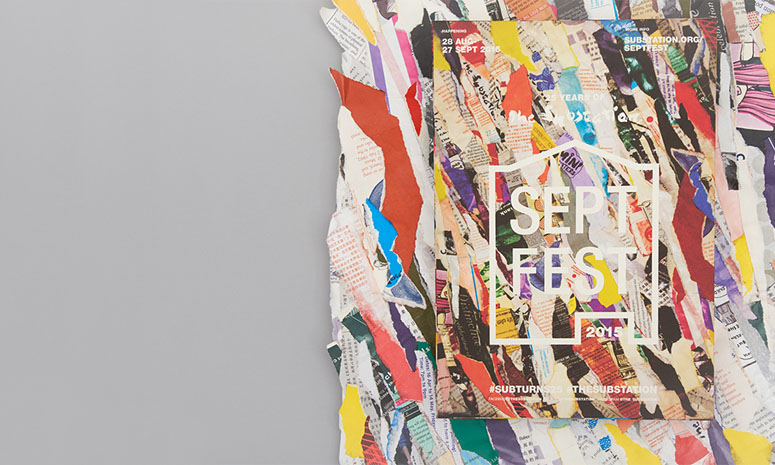
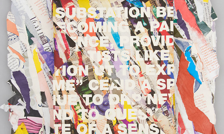
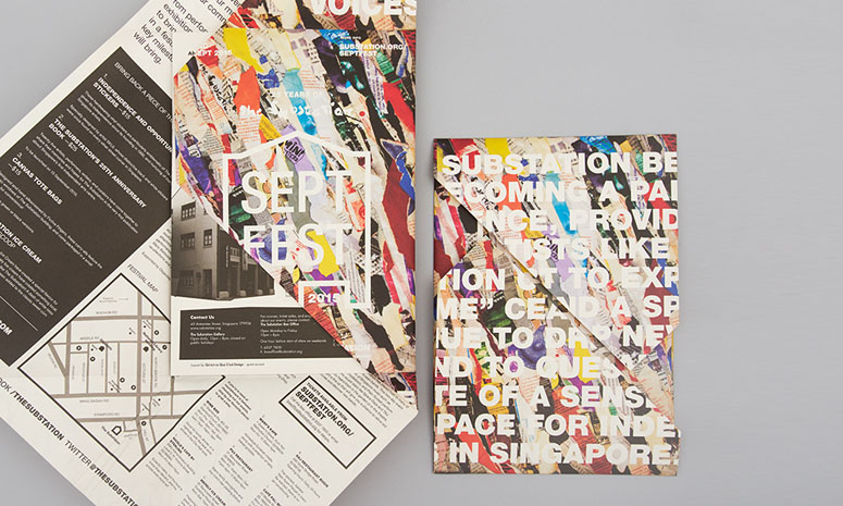
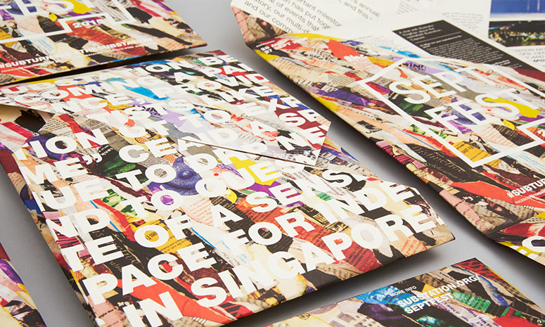
From wall to poster and back to wall with a layering of textures from past events that is guaranteed to spike your interest.
Dimensions (Width × Height × Depth)
–
Page Count
–
Paper Stock
–
Number of Colors
CMYK
Varnishes
–
Binding
–
Typography
Helvetica Neue LT Std, Roman 55
Helvetica Neue LT Std, Heavy 85
Helvetica Neue LT Std, Black 95
Project Description
Septfest is The Substation’s annual anniversary celebration, and it’s their 25th anniversary! For 2015's special line-up, they’ve put together a special festival of events that showcases their history, multidisciplinary nature, and community relationships.The main concept for the identity is developed out of the idea: reconstituting the past for the future. The Substation has played a hugely important role in the art scene in Singapore through its many programs for the past 25 years. At its silver jubilee, The Substation was looking back at its past to rediscovering its place and purpose today and the future, in an art landscape has and will continuous change from when it first started.
Inspired by the image layers of peeling posters plastered over each other on a wall, the key visual is a papier maché texture created out of old printed materials from The Substation. It is a visual metaphor for the supportive role that The Substation has played for emerging and experimental artists in Singapore. 25 years on, the organization is “peeling away its layers” to find its place in the years to come. The logo mark takes reference from handbills and wheat paste graphic posters.
Production Lesson(s)
With the variety of textures and colors formed the papier maché, it was a challenge to have the information stand out so that it can communicate effectively. This was overcome but maintaining a simple layout with clean, and bold typography. This so that, regardless of the mode of reproduction, the information can still be come through.
Post Author

Bryony Gomez-Palacio
Editor of FPO and co-founder of UnderConsideration LLC.
More: Online / On Twitter
Date Published
March 9, 2016
Filed Under
Offset
Posters
Tagged with
cmyk
flyer
Helvetica Neue
offset
poster


About
FPO (For Print Only), is a division of UnderConsideration, celebrating the reality that print is not dead by showcasing the most compelling printed projects.
FPO uses Fonts.com to render Siseriff and Avenir Next.
FPO is run with Six Apart’s MovableType
All comments, ideas and thoughts on FPO are property of their authors; reproduction without the author’s or FPO’s permission is strictly prohibited
Twitter @ucllc
Sign-up for Mailing List
Mailing list managed by MailChimp
Thanks to our advertisers
About UnderConsideration
UnderConsideration is a graphic design firm generating its own projects, initiatives, and content while taking on limited client work. Run by Bryony Gomez-Palacio and Armin Vit in Bloomington, IN. More…
blogs we publish
Brand New / Displaying opinions and focusing solely on corporate and brand identity work.
Art of the Menu / Cataloguing the underrated creativity of menus from around the world.
Quipsologies / Chronicling the most curious, creative, and notable projects, stories, and events of the graphic design industry on a daily basis.
products we sell
Flaunt: Designing effective, compelling and memorable portfolios of creative work.
Brand New Conference videos / Individual, downloadable videos of every presentation since 2010.
Prints / A variety of posters, the majority from our AIforGA series.
Other / Various one-off products.
events we organize
Brand New Conference / A two-day event on corporate and brand identity with some of today's most active and influential practitioners from around the world.
Brand Nieuwe Conference / Ditto but in Amsterdam.
Austin Initiative for Graphic Awesomeness / A speaker series in Austin, TX, featuring some of the graphic design industry's most awesome people.
also
Favorite Things we've Made / In our capacity as graphic designers.
Projects we've Concluded / Long- and short-lived efforts.
UCllc News / Updates on what's going at the corporate level of UnderConsideration.

Related entries
2017 Brand New Conference Program
Severe(d): A Creepy Poetry Collection by Holly Riordan
Um Caminho para Santiago CD Package and Diary
BOYCO Classpack® Book
Antes de Perder la Esperanza Book