

![]()
In and around Auckland, New Zealand there is a lot of controversy surrounding not only the Auckland City Council logo, but also other ratepayer-owned organizations such as Metrowater and the Auckland Regional Council. Criticism of the cost of the logos has been very central to the argument. The Auckland City Council logo was originally announced to have cost NZ$25,000/US$18,840 (which may have been accurate for the cost of the logo development alone) which then inflated to NZ$1 million/US$753,600 (which included market research, staff hours, consultant fees and some signage applications). The cost of the Metrowater logo was noted at NZ$20,000/US$15,072 — without implementation fees (in their defense they claim that the savings on printing in two colors rather than four will easily cover the cost of the new logo). While the Auckland Regional Council logo will cost NZ$165,000/US$124,344 to develop. Meanwhile, Triangle Television is claiming that the new Auckland City Council logo infringes on their intellectual property rights. Of course amidst the cost controversy, Triangle is also proudly noting that their logo “was designed 12 years ago by a student from Whitecliffe College of Arts and Design and cost about NZ$500/$376,” which is not surprising (yikes!). But setting aside the fiscal and IP controversy…
Continue reading this entry
![]()
Poor Wolff Olins. Can’t get a break no matter how hard they try — and lord knows that if anyone tries hard, maybe a little too hard, it’s Wolff Olins. We all know (and most, not me) hate the London 2012 identity and pretty much everyone is baffled by the Wacom color thingie, but it’s perhaps the new New York City taxi logo that everybody, at least in the (212) area code, has hated the most. And with good reason. But, for a change, it’s not Wolff Olins’ fault.
Continue reading this entry![]()
Guest Editorial by James Bowie
When a city or town adopts a new logo, it’s inevitable that at least a few local taxpayers will exclaim, “You paid how much? For that?” Such complaints are typically unwarranted, but in the recent case of Broken Arrow, Oklahoma, the critics may have a point.
Continue reading this entry![]()
Guest Editorial by John Feldhouse
King County is in Seattle, Washington. For those who are unaware of King County do not feel bad, you are not alone. I never heard of this county before (being from Atlanta) but I suddenly found myself wanting to learn more about it.
Continue reading this entry![]()
After not having been to Italy in all of my young life, in 2006 I found myself there twice: First in May when we spent some leisurely time in Rome and then Tuscany and again in September when we went to Venice as guests of the über friendly folks at Università Iuav di Venezia’s for their Teachme3: Comunicare l’oggetto conference. We were there to talk about blogs and the vibrancy, immediacy and connectivity they bring to our (and every other) industry. And these three attributes are strong at play this week. Two of the major Italian design blogs — designerblog and SocialDesignZine — are wildly hosting the discontent of the Italian design community (click on the em-dashed links) immediately after Premier Romano Prodi and Culture Minister Francesco Rutelli unveiled the new logo this past Wednesday.
Continue reading this entry![]()
The Hague — beyond being beautiful in a way that only European cities can and besides being the third largest city in the Netherlands and a cultural haven in its own right — is home to three of the most exciting and wildly innovative type designers/collectives in the world: Peter Bilak, Underware and Letterror. With such a well of talent in that city — because beyond these typographers there are many designers as well — you would think that The Hague’s new marketing identity would reflect a modern, cutting-edge sensibility that catapults it into the 21st century. Not the Middle Ages. As is the case with the new logo designed by “famous pop star photographer, film director and graphic designer” Anton Corbijn and unveiled back in November 1, 2006 (yes, we are a little late) to much fanfare. To briefly explain the logo: The red mark is an outline of the city, the rest… Who knows, but Corbijn wanted his design to “express feelings of security, life, progress and playfulness.” And the stork, the city’s official symbol, was not required, although I could easily picture flying somewhere in that logo. Which would not be a bad place to start actually: If I were in charge of this project — something I like to daydream about on all these projects — I would call UnderWare and say “Please design a typographic logo for Den Haag with the stork as inspiration”. Sit back. Wait for an e-mail with an attachment. Throw big party. Move forward — not backward.
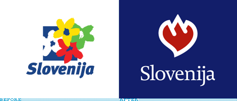
Recently, Slovenia, like many countries and other destinations, decided to undetake a rebranding. Unfortunately, also like many, they decided to make it a competition. Although Fundacija Brumen, the local design organization, protested, Slovenia went forward with separate competitions for the new logo and the new tagline.
Continue reading this entryPrevious Page |
(Total Number of Pages in Destinations: 2)


