


Online
- FPO (For Print Only) / Celebrating the reality that print is not dead by showcasing the most compelling printed projects.
- Art of the Menu / Cataloguing the underrated creativity of menus from around the world.
- Quipsologies / Chronicling the most curious, creative, and notable projects, stories, and events of the graphic design industry on a daily basis.
- Speak Up (2002 – 2009) / Discussing, and looking for, what is relevant in, and the relevance of, graphic design. Archives Only.
- Word It (2003 – 2010) / Encouraging creative diversity in the community through monthly, one-word challenges. Archives Only.
- Brand New Classroom (2010 – 2011) / Providing a space for critique and opinions on student identity work. Archives Only.
Publishing
- The 2010 Brand New Awards / 2011, self-published.
- Flaunt: Designing effective, compelling and memorable portfolios of creative work / 2010, self-published.
Events & Judged Competitions
- Brand New Conference / A one-day event on the development of corporate and brand identity projects by some of today’s most active and influential practitioners from around the world.
- Brand New Awards / Celebrating the best identity work produced around the world.
- FPO Awards / Celebrating the best print work from around the world.
Writing
- Graphic Design, Referenced: A Visual Guide to the Language, Applications, and History of Graphic Design / 2009, Rockport.
- Women of Design: Influence and Inspiration from the Original Trailblazers to the New Groundbreakers / 2008, HOW Books.
- The Word It Book: Speak Up Presents a Gallery of Interpreted Words / 2007, HOW Books.
Graphic Design
- Department of Design / Designing corporate and brand identities and full development of printed and digital matter for clients.

BY Christian Palino
A Glass Half Full
![]()
On June 30th, SABMiller plc and Molson Coors announced their joint venture Miller Coors to consolidate resources and compete with greater combined force in the U.S. market. From their first press release Chief Executive Leo Kiely states “MillerCoors will be entrepreneurial, with the ability to operate with speed and agility in the marketplace, backed by the powerful combined resources of two exceptionally successful companies. We will drive profitable growth and bring new energy to the U.S. beer industry. Our focus now is to deliver on the $500 million in identified annualized cost synergies by improving sourcing across our eight major breweries, building a streamlined organization and leveraging the scale of the new company. Our talented people are experienced and passionate about this business and — importantly — are determined to win.” For the face of this new company, Pentagram’s partner Michael Bierut, and designers Katie Repine and Ben King developed a logo based upon the view of a glass of beer from above.
Continue reading this entry

DATE: Jul.07.2008 POSTED BY: Christian PalinoCATEGORY: Consumer products COMMENTS:

TAGS:

BY Armin
Makeover for the Baker
![]()
Grupo Bimbo, one of the largest food corporations in the world based in Mexico City with a strong presence in Latin America, and famous for its delicious snacks and ubiquitous bread, has been making headway into the baked goods market in the South American country of Uruguay by purchasing El Maestro Cubano (“The Cuban Craftsman” could be a proper translation in meaning), a leader in that category. The new, revitalized logo has been executed by Uruguay-based Kabala, who had previously done packaging for Bimbo and are now heading the design of the packaging. The brief was as simple as it gets: Make the logo fresh and relevant, stick with the same elements. With the complicated discussions around vaguely disclosed strategies we read on press releases, it is rather nice to just be able to look at a no nonsense graphic execution. The old logo was charming and the typography most likely the result of an original sign painting outside of the first store — I’m just romanticizing here, I don’t know the story of the logo — while the new one fits perfectly in today’s world of consumer good packaging and icons. The typography — set in Myriad Pro Black Italic (I never would have guessed) — is clean and friendly, and pretty much the same can be said about the baker. The elements are well integrated and the colors more in tune with the flagship brand of Bimbo. A very hearty update for this purveyor of (what I’m sure are) delicious treats.
Continue reading this entry
DATE: May.21.2008POSTED BY: ArminCATEGORY: Consumer products COMMENTS:
TAGS:
BY Armin
The Camel’s New Clothes

A large percentage of mass consumer packaging has embraced the More is More approach when it comes to packaging design: More starbursts, more swooshes, more information, more graphics, more, more, and more in hopes of getting your attention. Besides fragrances and perfumes, one of the few categories that has amazingly maintained a level of graphic sophistication and restraint is cigarette packaging. From the underrated simplicity of Marlboro, to the indefatigable Lucky Strike, to the sophisticated Gauloises, cigarette packs are remarkably simple — a feat all the more impressive given that most cigarette packs are only seen through heavy armorage behind counters, and next to Tylenol and Alka-Seltzer mini packs. Some cigarette brands haven’t even changed their design in ages, including Camel, whose design has remained mostly consistent since its introduction in 1913. Until this past month when the R.J. Reynolds Tobacco company updated its Camel packaging line as well as updated its blend (here is an article about Camel not running print ads anymore, where you can see a teaser for the new pack and blend) — I am not a smoker, so I can’t vouch for the quality of the new formula.
Continue reading this entry
DATE: Mar.12.2008POSTED BY: ArminCATEGORY: Consumer products COMMENTS:
TAGS:
BY John Feldhouse
Sodexo Turns A Smile

In a world of streamlining, it seems like a lot of companies have gone to the so-called “web 2.0” look. See: xerox, at&t, Holiday Inn, wacom, etc. However, some identities have stuck to the traditional flat color look. Sodexo, one of the largest food services and facilities management companies in the world, recently updated their name and image and is one of the companies to evolve with a more traditional logo, designed by W & Cie in Paris.
Continue reading this entry
DATE: Feb.27.2008POSTED BY: John FeldhouseCATEGORY: Consumer products COMMENTS:
TAGS:
BY Armin
Smart Start, Stupid Finish
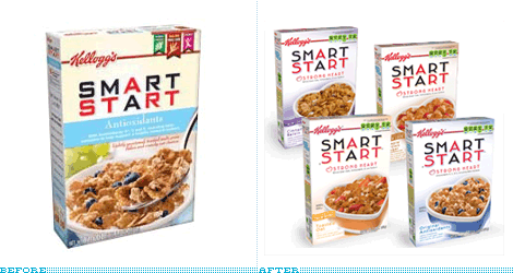
For at least eight years I have regularly eaten Smart Start cereal for breakfast. The first time I tried it, back in my Atlanta days, was simply because I loved the packaging and I thought that anything packaged in such a way could only taste good. It goes without saying that the cereal aisle in a grocery store is simply, and visually, cacophonous. Every color in the rainbow is represented through mascots, beveled typography, and giant spoonfuls of cereal — and the closest thing to white space is the milk dropping from the sky and into the delicious bowl you will enjoy if you decide to pick this, that or the other brand. Smart Start, introduced in 1998 by Kellogg’s, literally stood apart from the competition. Despite the obligatory shot of the product in situ, the box was the whitest thing my cereal-loving eyes had ever seen. Designed by Duffy & Partners, Smart Start also sported another anomaly in cereal box design: A flat logo, without shadows, and was not set on a bulging curve but, instead, on a very straight and horizontal line, and only used red and black. [You don’t have to imagine my description, you can scroll through the rest of the post to see the real thing]. As the years have passed, the Smart Start box has slowly deteriorated with modifications, nutritional-fact add-ons and other cereal-selling, visual paraphernalia, while maintaining a hint of the original design. But on my most recent unpacking of Fresh Direct boxes I gasped at the latest iteration of Smart Start.
Continue reading this entry
DATE: Feb.03.2008POSTED BY: ArminCATEGORY: Consumer products COMMENTS:
TAGS:
BY John Feldhouse
Hip Hip… Boo!
![]()
Laundry detergent: it’s one product you never think about until you need it. As a designer, it’s one of the few products I think of when I hear “consumerism.” I have this picture in my head of all the products looking the same up and down the aisles — it’s quite terrifying. Oh wait, it’s no picture in my head, it’s reality.
Continue reading this entry
DATE: Nov.16.2007POSTED BY: John FeldhouseCATEGORY: Consumer products COMMENTS:
TAGS:
BY John Feldhouse
Excedrin, Cause for More Headaches?

Pain relief comes in many different antidotes. Sometimes pills, maybe music, or even a nap. For designers, it occurs when we see a nice redesign of a tried and true brand. Unfortunately this isn’t the case for the redesign of the headache medicine, Excedrin — a pain reliever that has been around since the 1960s and just underwent a package makeover. The new color palette is toned down from the disjointed colors of the old. It is much easier to choose which product you need at first glance now that the design highlights the product name. There is also a tag line change from “The Headache Medicine” to “The pain stops. You don’t”.
Continue reading this entry
DATE: Oct.07.2007POSTED BY: John FeldhouseCATEGORY: Consumer products COMMENTS:
TAGS:
BY David Weinberger
Saddle Up
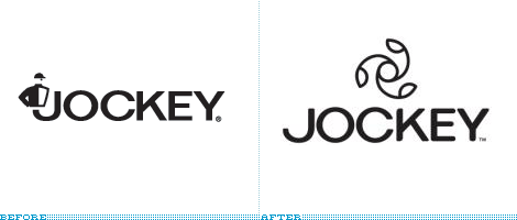
Jockey, the folks that invented men’s briefs in the 1930s have undergone a rebranding. What has traditionally been seen as a men’s underwear company (they didn’t start selling women’s undergarments until 1982) is now going gender-neutral. Their old logo was an actual horse jockey complete with cap although the name jockey was a reference to jock-strap which was the inspiration for their breakthrough underwear design.
Continue reading this entry
DATE: Feb.08.2007POSTED BY: David WeinbergerCATEGORY: Consumer products COMMENTS:
TAGS:


Books about logo design, the designers that create them and the meaning of branding.
