


Online
- FPO (For Print Only) / Celebrating the reality that print is not dead by showcasing the most compelling printed projects.
- Art of the Menu / Cataloguing the underrated creativity of menus from around the world.
- Quipsologies / Chronicling the most curious, creative, and notable projects, stories, and events of the graphic design industry on a daily basis.
- Speak Up (2002 – 2009) / Discussing, and looking for, what is relevant in, and the relevance of, graphic design. Archives Only.
- Word It (2003 – 2010) / Encouraging creative diversity in the community through monthly, one-word challenges. Archives Only.
- Brand New Classroom (2010 – 2011) / Providing a space for critique and opinions on student identity work. Archives Only.
Publishing
- The 2010 Brand New Awards / 2011, self-published.
- Flaunt: Designing effective, compelling and memorable portfolios of creative work / 2010, self-published.
Events & Judged Competitions
- Brand New Conference / A one-day event on the development of corporate and brand identity projects by some of today’s most active and influential practitioners from around the world.
- Brand New Awards / Celebrating the best identity work produced around the world.
- FPO Awards / Celebrating the best print work from around the world.
Writing
- Graphic Design, Referenced: A Visual Guide to the Language, Applications, and History of Graphic Design / 2009, Rockport.
- Women of Design: Influence and Inspiration from the Original Trailblazers to the New Groundbreakers / 2008, HOW Books.
- The Word It Book: Speak Up Presents a Gallery of Interpreted Words / 2007, HOW Books.
Graphic Design
- Department of Design / Designing corporate and brand identities and full development of printed and digital matter for clients.

A B-Side BY Armin
Beobank
![]()
About: (Est. 2013) Formerly Citibank Belgium, Beobank is the new name of this range of banks in Belgium, now owned by Crédit Mutuel Nord Europe.
Design by: Minale Design Strategy.
Ed.’s Notes: It’s kind of interesting, although disappointed that the weight of the stroke of the “O” is thicker than the other letters; it makes it stand out even more that it already does. Bigger view of the logo and a couple of applications below (or after the jump).
Relevant links: Press release (PDF and in French). Minale Design Strategy case study.
Select quote (translated): “The Beobank logo reflects the simplicity of the bank: a bank that finds proximity important and stands entirely at the service of its clients. The letters “Be” point to the Belgian anchoring of the bank. The lively, bright red draws the attention to the letter “O”, that stands as a symbol for the openness to its cleints and the optimism with which the bank looks to the future. The purple colour finally has something surprising en confirms the dynamism of Beobank.”
Continue reading this entry

DATE: Jun.27.2013 POSTED BY: ArminCATEGORY: The B-Side Finance COMMENTS:


A B-Side BY Armin
Bolton Wanderers FC
![]()
About: (Est. 1874) “Bolton Wanderers Football Club is an English professional football club based in Horwich in the Metropolitan Borough of Bolton, who play in the Football League Championship. The club currently competes in the 2012-13 Championship, having been relegated from the Premier League at the end of the 2011-12 season, after finishing 18th.” (Source: Wikipedia)
Design by: N/A.
Ed.’s Notes: I guess it’s an improvement but, holy cow, that is some weird-ass typography.
Relevant links: Press release. Logo history.
Select quote: “The more modern, cleaner and dynamic design has been created following feedback from supporters, who expressed an overwhelming desire to see the long history of the club reflected in the crest. The new design sees the reintroduction of the Lancashire rose alongside the founding year of the club, 1877, in a reworking of the club’s popular crest from the late 1970s. The new crest’s compact design means it will be reproduced both more effectively and more prominently on a variety of Bolton Wanderers elements.
Thanks to Aaron Cotton for the tip.
DATE: Jun.26.2013POSTED BY: ArminCATEGORY: Sports The B-Side COMMENTS:
A B-Side BY Armin
First Advantage
![]()
About: “First Advantage provides comprehensive screening, identity and information solutions that give employers and housing providers access to actionable information that results in faster, more accurate people decisions. With an advanced global technology platform and superior customer service delivered by experts who understand local markets, First Advantage helps customers around the world build fully scalable, configurable screening programs that meet their unique needs. Headquartered in Alpharetta, Ga., First Advantage has offices throughout North America, Europe and Asia.”
Design by: N/A.
Ed.’s Notes: As much as I don’t like globes, or globes with pluses, or transparent globes, or cheesy gradient effects, there is something attractive about this, like a mosquito lamp. Also, that old logo? Pure, big-brother evil. Bigger view of the logo below (or after the jump).
Relevant links: Press release.
Select quote: “The new brand communicates First Advantage’s substantial market leading position, which has grown significantly through the recent acquisition of LexisNexis’ screening solutions. The logo — a stylized globe spinning on its axis — has a crisp, contemporary look that underscores First Advantage’s goal to drive innovation in the screening market.”
Continue reading this entry
DATE: Jun.25.2013POSTED BY: ArminCATEGORY: Corporate The B-Side COMMENTS:
TAGS: blue, globe, plus, sans serif,
A B-Side BY Armin
Air Lituanica
![]()
About: (Est. 2013) “The vision of Air Lituanica is to become a regional base airline providing air transportation services for travellers flying to and from major European destinations. The mission of the company is to facilitate Lithuania’s accessibility by air, therefore Air Lituanica will not only carry passengers on highly demanded direct routes, but also ensure that passengers are capable of using a wider range and more convenient connecting flight network.”
Design by: Lukrecija BBDO.
Ed.’s Notes: It’s alright. Bigger view of the logo and livery shot below (or after the jump).
Relevant links: Lukrecija BBDO case study. World Airline News.
Select quote: “The company’s logo features an old-style Lithuanian cross with two transepts, a symbol which was often used in Lithuanian aviation in the inter-war period. In the Air Lituanica logo this cross is modernised and it becomes stylised aircraft propeller blades. Air Lituanica company symbols also make use of the ducal seal of Vytautas Magnus, Grand Duke of Lithuania, to symbolise the Lithuanian origin of the airline. The company symbol is presented on a rich red background. Historically, red was the most important colour for symbols of nationhood of the Grand Duchy of Lithuania, representing energy and vitality.”
Continue reading this entry
DATE: Jun.24.2013POSTED BY: ArminCATEGORY: Aviation The B-Side COMMENTS:
A B-Side BY Armin
MailChimp
![]()
About: (Est. 2001) “MailChimp supports more than 3 million subscribers worldwide, sending 5 billion messages per month. MailChimp is designed for the do-it-yourself power user — someone looking for all of the power of an enterprise application, but built for anyone to use.”
Design by: Jessica Hische.
Ed.’s Notes: Fantastic evolution that maintains the character of the original with enhanced performance. Bigger view below (or after the jump) and be sure to check the link below to get insight into all the subtle changes made.
Relevant links: Jessica Hische case study.
Select quote: “Overall the weight was lightened, the vector drawing improved, and letterforms were revised for legibility, especially at small sizes. The end result is something new and fresh, more refined but just as playful.”
Continue reading this entry
DATE: Jun.20.2013POSTED BY: ArminCATEGORY: Technology The B-Side COMMENTS:
A B-Side BY Armin
Mountain Equipment Co-Op
![]()
About: (Est. 1971) “An outdoor retail co-operative, MEC exists to encourage and inspire Canadians to live active outdoor lifestyles. From backcountry trails to city streets, MEC supports a range of outdoor activities, including climbing, hiking, camping, snowsports, watersports, cycling, running and yoga. Well known for selling high-quality well-designed products that offer great value, MEC employs outdoor enthusiasts who possess a strong service ethic to provide its members with an authentic and accessible customer experience. MEC has more than 3.5 million members across Canada, whom it serves through 17 stores in 6 provinces as well as mec.ca and the Shop MEC iPhone app. Anyone can join MEC by purchasing a $5 individual lifetime membership in the Co-op.”
Design by: Concrete.
Ed.’s Notes: Wow, major downgrade, going from clearly an outdoors company to some generic pharmaceutical company. Using the logo-as-window maneuver as shown in the video below (or after the jump) does not make it any better.
Relevant links: MEC press release.
Select quote: “The redesigned logo is simple yet bold, and now features the acronym MEC instead of the full name, with the mountain removed, to reflect MEC’s geographical reach across the country, and its wider range of backcountry and urban activities. Vibrant imagery and compelling language complement the new logo as cornerstones of a new brand platform.”
Continue reading this entry
DATE: Jun.19.2013POSTED BY: ArminCATEGORY: Retailers The B-Side COMMENTS:
A B-Side BY Armin
Morrison’s Little Big
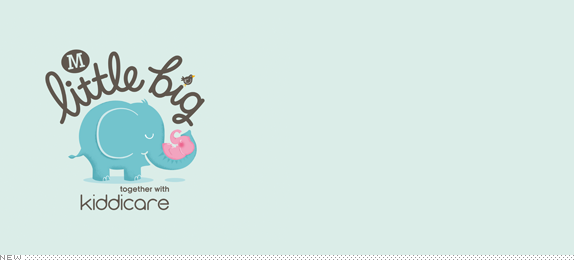
About: (Est. 2013) “For such tiny people, babies come with a lot of kit. And now you can bag all the essentials as you do your weekly shop, thanks to the newest addition to the Morrisons family, Little Big. From nappies to baby wipes, bottles to bibs, Little Big’s got all your baby needs covered. Carefully designed for everything parenthood throws at you, it’s great quality at the great prices you expect from Morrisons.”
Design by: Elmwood.
Ed.’s Notes: Cute! Bigger view of the logo and sample packaging below (or after the jump).
Relevant links: Article in The Drum. Article in Prolific North.
Select quote: “With the objective of connecting with second time parents on an emotional and functional level, the design takes a friendly, empathetic approach to parenting, understanding that it’s all about the little things. […] The design by Elmwood features both photography and an illustration of a soft elephant. This, the agency explained, was to convey the ‘humor and frustrations’ that parenting can bring as well as aiding product navigation.”
Continue reading this entry
DATE: Jun.18.2013POSTED BY: ArminCATEGORY: Consumer products The B-Side COMMENTS:
A B-Side BY Armin
Mike and Ike
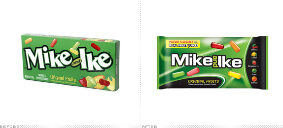
About: (Est. 1940) “Mike and Ike is a brand of fruit-flavored candies by the company Just Born, Inc.. Mike and Ike are oblong, fruit-flavored, chewy candies that come in several colors and varieties including: cherry, orange, lime, lemon and strawberry. In April 2012, the company announced a new ad campaign based on the premise that the characters of Mike and Ike are “splitting up” due to “creative differences”; boxes of the candy will show one or the other name scratched out. The development is intended to capture the interest of younger consumers. In 2013 the company announced Mike and Ike would reunite. In addition to a redesigned logo, the media campaign will also feature a movie style trailer which will appear in national cable TV commercials in June of 2013.” (Source: Wikipedia)
Ed.’s Notes: I wish they hadn’t gone with the futuristic look. It’s a great story line and trailer set-up is fun but the packaging is just too candy-aisle-generic. More images and the Hollywood-style trailer below (or after the jump).
Relevant links: The Shelby Report story.
Select quote: “Last year candy legends Mike and Ike split up because they couldn’t agree on new flavors, colors and packaging for MIKE AND IKE candy. You may have heard the story. If not, watch this short video to see what happened and why they are back together (below). The duo has had quite a year.”
Continue reading this entry
DATE: Jun.17.2013POSTED BY: ArminCATEGORY: Consumer products The B-Side COMMENTS:
A B-Side BY Armin
Mediabistro
![]()
About: (Est. 1996) “Mediabistro is a website that publishes various blogs and job listings for journalists. The site was founded in 1993 by Laurel Touby as ‘a gathering place for professionals in journalism, publishing and other media-related industries in New York City’, mediabistro.com has since grown into an international resource for media professionals. […] mediabistro.com is also home to a number of industry-specific blogs including TVNewser (covering broadcast and cable news), GalleyCat (book publishing), UnBeige (design), AgencySpy (advertising), PRNewser (public relations) and MobileContentToday (mobile apps).” (Source: Wikipedia).
Design by: N/A.
Ed.’s Notes: When people ask “how do you tell bad typography from good typography?” show them this logo and say “This is bad typography”. Then they will understand. If they don’t, and ask for elaboration, just walk away. Bigger view below (or after the jump).
Relevant links: Blog post about the change (no mention about the logo).
Continue reading this entry
DATE: Jun.14.2013POSTED BY: ArminCATEGORY: Publishing The B-Side COMMENTS:
TAGS: lowercase, sans serif,
A B-Side BY Armin
Johns Hopkins University
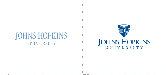
About: (Est. 1876) Johns Hopkins University (informally Johns Hopkins, JHU, or just Hopkins) is a not-for-profit private research university based in Baltimore, Maryland. The university was founded on January 22, 1876, and named for its benefactor, the philanthropist Johns Hopkins. Johns Hopkins maintains campuses in Maryland; Washington, D.C.; Italy; China and Singapore. Johns Hopkins pioneered the concept of the modern research university in the United States and has ranked among the world’s top of such universities throughout its history. As of 2011, thirty-seven Nobel Prize winners have been affiliated with Johns Hopkins, and the university’s research is among the most cited in the world. (Source: Wikipedia).
Design by: N/A.
Ed.’s Notes: Could be worse, I guess. The elements in the shield all seem to come three different logos (or clip art libraries). A few applications below (or after the jump).
Relevant links: Announcement.
Select quote: “The final design for the main university logo is based on existing iconography and is rooted in the official academic seal. The book represents knowledge and discovery, the globe symbolizes the university’s worldwide reach, and the crest of Lord Baltimore indicates the university’s connection to its community. Some schools and divisions, like the Bloomberg School of Public Health and the Applied Physics Laboratory, feature their own unique graphics, enclosed within a shield shape that is common to all the logos.”
Continue reading this entry
DATE: Jun.13.2013POSTED BY: ArminCATEGORY: Education The B-Side COMMENTS:
TAGS: blue, serif, shield, university,


Books about logo design, the designers that create them and the meaning of branding.
