


Online
- FPO (For Print Only) / Celebrating the reality that print is not dead by showcasing the most compelling printed projects.
- Art of the Menu / Cataloguing the underrated creativity of menus from around the world.
- Quipsologies / Chronicling the most curious, creative, and notable projects, stories, and events of the graphic design industry on a daily basis.
- Speak Up (2002 – 2009) / Discussing, and looking for, what is relevant in, and the relevance of, graphic design. Archives Only.
- Word It (2003 – 2010) / Encouraging creative diversity in the community through monthly, one-word challenges. Archives Only.
- Brand New Classroom (2010 – 2011) / Providing a space for critique and opinions on student identity work. Archives Only.
Publishing
- The 2010 Brand New Awards / 2011, self-published.
- Flaunt: Designing effective, compelling and memorable portfolios of creative work / 2010, self-published.
Events & Judged Competitions
- Brand New Conference / A one-day event on the development of corporate and brand identity projects by some of today’s most active and influential practitioners from around the world.
- Brand New Awards / Celebrating the best identity work produced around the world.
- FPO Awards / Celebrating the best print work from around the world.
Writing
- Graphic Design, Referenced: A Visual Guide to the Language, Applications, and History of Graphic Design / 2009, Rockport.
- Women of Design: Influence and Inspiration from the Original Trailblazers to the New Groundbreakers / 2008, HOW Books.
- The Word It Book: Speak Up Presents a Gallery of Interpreted Words / 2007, HOW Books.
Graphic Design
- Department of Design / Designing corporate and brand identities and full development of printed and digital matter for clients.

BY Armin
A&E, Closer Together
![]()
Long gone are the days of A&E being a fly-over channel, with its snoozing biographies and re-runs of Murder, She Wrote. Now, perhaps at the other extreme, it broadcasts fare like Gene Simmons Family Jewels and Dog the Bounty Hunter. While neither incarnation of A&E has ever been my cup of tea, the transformation of the channel has been quite remarkable, and to punctuate the evolution, the channel has recently updated its 12-year-old logo. The old logo had an interesting execution to it, with the “E” being angled to match the “A” and knocking out the “&” from the übertight kerning that, even if not perfect, yielded a nice counterspace with the “E.” The new logo is much more purposeful in the integration of the “&” creating a unit out of the three letters. I like the all sans serif approach better — as the old serif “&” did make the logo feel more academic or historical — and the blending of the “&” and “E” is very well resolved. I am not convinced by the “bridge” extended between the “A” and “E”, but I’m willing to be convinced that that was the best option to resolve the white space left between the two letters. On screen, the new logo looks great, and the few broadcast graphics and animations that I have seen are smooth and fresh — I also spent some time watching the Gene Simmons show and, unfortunately, it convinced me to keep flying over A&E. A refreshingly simple press release can be read here.

DATE: Jun.04.2008 POSTED BY: ArminCATEGORY: Entertainment COMMENTS:

TAGS:

BY Armin
Shiny Happy Logos
![]()
With title apologies to R.E.M..
Yes, you are correct, there is not much new to this logo, and it’s quite likely that you didn’t even notice the change if you happen to be a DIRECTV subscriber. But I find this to be an excellent example of how much identity design has changed and how ubiquitous 3Dimensionalization has become that, now, 3D logos are being revisited and getting redrawn to be more shiny, voluptuous and realistic. One of my favorite designers, typographers and letterers is Jim Parkinson, who, among other talents, has made an art form of redrawing logos that needed more cohesiveness or kick-assedness — i.e. 01, 02, 03, 04 — through a detailed exercise of typographic perfection and nuance. The work of Joe Fino also comes to mind, as someone that can refine letterforms to reveal uniqueness. These, and other designers, are the masters of the nip and tuck. This new iteration of DIRECTV represents the new form of identity nip and tuck: Less about typographic or icon refinement, and more about highlight and shadow enhancement. While it’s easy and expected to cringe at this as a gut reaction, it may be time to accept that this is the new standard, and someone might as well do it right. The old DIRECTV logo was crudely Photoshop’d, and is more reminiscent of early, beveled web graphics. The new one is much more intentional, purposeful and rationalized in the effect, plus it’s probably done with the more powerful and scalable mesh and gradient tools in Illustrator. So I may not find conceptual beauty in these glossy logos, but I can acknowledge when something is better crafted and judge it within the context of current day identity work. The new logo has been redrawn by Capacity.
Continue reading this entry
DATE: May.30.2008POSTED BY: ArminCATEGORY: Entertainment COMMENTS:
TAGS:
BY Armin
America is Watching
![]()
As far as importance, relevance, influence or dissemination goes, the recently renamed WGN America does not rank highly — but as far as bringing the pain, it furiously competes for the top spot. Over the weekend, without much festivities or press releasing, the Chicago-based channel formerly known as Superstation WGN relaunched as WGN America. I haven’t watched WGN since Michael Jordan retired, as they used to broadcast a bunch of the Bulls games, and until this morning I thought their logo was still this simple little thing, which was quite respectable, as opposed to the warped “S” they had until last week. Lee Abrams, chief innovation officer of WGN America’s parent company Tribune Broadcasting Company, stated the following craziness: “[the new brand would] look and sound… like nothing else out there.” Lucky for us, indeed nothing much out there looks like this — except, as pointed out in the article, the Movie Channel’s oldoldold logo, or the thousands of Patrick Nagel’s illustrations. The logo was designed in-house as we learn from this scary sentence in the MediaWeek link above: “In an earlier memo, Abrams said that he had sent WGN’s creative director ‘a few Pink Floyd albums’ after she had turned in some uninspired art/voiceovers.” And there you have it… television branding for the twentyfirst century. Makes you wish they had just lowercased everything and made it roundy.
Thanks to coudal.com for mentioning the change in their Fresh Signals yesterday.
DATE: May.28.2008POSTED BY: ArminCATEGORY: Entertainment COMMENTS:
TAGS:
BY Armin
It’s a Small Globe After All
![]()
With Animal Planet, the Science Channel, and TLC all looking like distant cousins of its parent company, and namesake channel, it was only an eager matter of time before the Discovery Channel would upgrade its tired identity. While not publicly available yet, the logo was unveiled at Discovery’s upfront presentation the last Monday of March in Chicago, as The New York Times reports, where they also showed a TV ad boasting its new tagline and theme, “The world is just awesome.”
Continue reading this entry
DATE: Apr.07.2008POSTED BY: ArminCATEGORY: Entertainment COMMENTS:
TAGS:
BY Armin
Self-Promotion: Dyslexflix
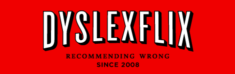
Dear readers, please excuse this brief bout of self-promotion, I hope you don’t find it too intrusive — but it’s irresistible when we have such a great, influential supporting crowd. (Yes, I’m buttering you up). We have a new project from UnderConsideration that is not design related and takes us a little bit out of our comfort zone: Dyslexflix. For a more broad explanation you can read its about page. And, yes, you can critique our parody logo.
DATE: Apr.07.2008POSTED BY: ArminCATEGORY: Entertainment COMMENTS:
TAGS:
BY Armin
Zeeing Starz
![]()
When I was young and vibrant, the way a 20-year-old is, I had a nice routine for my Saturdays: A basketball game or practice in the morning, some design homework in the afternoon, early dinner, followed by a Saturday movie premiere from Starz and then, to top it all off, night-clubbing until 4:00 a.m.. Certainly things have changed. But I do remember (on the times when I wasn’t too imbibed) those Saturdays fondly. So it’s with a slight zeal of nostalgia that I turn my attention to Starz, with its flagship (at least for me) Saturday premieres that were somewhere between Pay-per-view and HBO — not quite first on TV, but not six months after a movie had been released in theaters. This was ten years ago, when Starz had an exclamation point at the end of it (Starz!) and it had only one channel &mdashl for a comprehensive look at the past identities and exclamation point particulars Wikipedia has a nice round-up. Certainly, things have changed for the Starz as well. It is now a six-channel network with HD and On Demand alternatives — and $25 million allocated for a comprehensive campaign, along with a shiny new logo.
Continue reading this entry
DATE: Apr.06.2008POSTED BY: ArminCATEGORY: Entertainment COMMENTS:
TAGS:
BY Armin
Animals gone Wild… Sort of
![]()
I realize you have all been gnarling, clawing, hissing, and otherwise growling to discuss the new Animal Planet logo — and that’s exactly the kind of inner urge that the channel wants to bring out in their viewers. Or better yet, in their own words: The new programming on Animal Planet will tap into the instincts that drive us all — fear, hunger, pleasure, nurture — with compelling stories that resonate with what it means to be human. And what better way to unveil this new approach than with — dun, dun, duuuun — the fierce Puppy Bowl! This past Sunday, to coincide with one of the biggest TV-watching days, Animal Planet launched a new identity that goes beyond a simple identity change, as it attempts to shed its family-friendly image for a more intense experience. I was hoping to get some additional imagery for this launch to be able to provide a better picture of the new identity — and I really wanted to see if this logo had any legs beyond the logo — yet my efforts went unfulfilled, as some e-mails went unanswered and, to my surprise, there was no rollout of a new identity during Animal Planet’s programming. So we will have to settle for the logo.
Continue reading this entry
DATE: Feb.04.2008POSTED BY: ArminCATEGORY: Entertainment COMMENTS:
TAGS:
BY Brand New
We’re Going to Pump… [Clap!]… Your Logo Up!
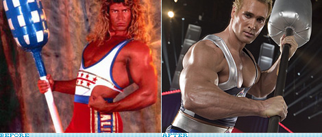
Guest Editorial by Sam Becker
My best friend from high school wants to be the next American Gladiator, and I can’t blame him. He called me last month to mention he was applying, and asked if I would critique his video audition. Now Jon is not the most athletic person (as his video serves to illustrate), but it’s clear to me why he wants to take part in the reincarnation of one of television’s most engaging, wholesome, unpretentious and downright zany entertainment-sports franchises of our time. And as we all know, with new leotards come new brands.
Continue reading this entry
DATE: Jan.14.2008POSTED BY: Brand NewCATEGORY: Entertainment COMMENTS:
TAGS:
BY Armin
New Lg for the Science Channel
![]()
While you were playing with your new gadgets that Santa Claus (or your credit card) brought you this past December 25th, the Science Channel, one of the channels from Discovery Communications LLC, unveiled a new identity that positions it on par with popular sister channel TLC, that has a unique identity, by stripping the parent company’s endorsing globe and letting the eight-year-old channel stand on its own. The old logo was, without a doubt, unflattered by its orbiting swoosh eclipsing the otherwise respectable blocky typography that would make for a nice sci-fi novel cover — it said science without hitting you over the head with it. The new logo (designed in-house), on the other hand, is a little less subtle with the clear-as-helium reference to the periodic table. Truth be told, it makes for a great logo, specially on TV, as it will look great and recognizable when rendered small on screen, but I wonder if it’s slightly clichéd? My first reaction is yes but, after all, it is a channel about science and they can easily own the notion of periodic table element as logo better than others could. The logo is set in Avant Garde with some surgery done to the n’s, giving it an unnecessary (in my opinion) added layer of trendiness… and, until now, I hadn’t realized how condensed and out of place Avant Garde’s s is, specially in contrast to other round characters like the c, but I digress. The new identity feels fresh and lively — unfortunately, since I am vacationing in Mexico at the moment, I can’t check the TV applications, so if anyone would like to vouch for this, I would be very thankful — and an important step for the channel to be perceived independently of its parent company, and its push to create new and original programming.
DATE: Dec.29.2007POSTED BY: ArminCATEGORY: Entertainment COMMENTS:
TAGS:
BY Armin
QVC is Qrrific
![]()
I just spent the seven most painful minutes in recent memory for the love of the rebrand. At 10:54 pm I decided to tune in to QVC to see the new identity in action. First, I had to locate it in my cable line-up: QVC is sandwiched between ShopNBC (I had no clue!) and Brooklyn Community Access Television (sweet!). A lady and a man with an ear-piece were selling a jewelry box. I watched, knowing that at the turn of the hour I would get a chance to see an interstitial or ident showcasing the emperor’s new clothes — which, by the way, you can buy in four easy installments! My patience was rewarded with a white screen coming to life beautifully with a near-cyclic animation of the new, ribbon-like Q that shelters the perfectly classic and simple letters that form the name of the channel, which also animate nicely on screen. Then Joan Rivers’ Classics started and, before I poked my eyes out, I swiveled to my computer to write this.
Continue reading this entry
DATE: Sep.27.2007POSTED BY: ArminCATEGORY: Entertainment COMMENTS:
TAGS:


Books about logo design, the designers that create them and the meaning of branding.
