


Hebrew Translations of Latin Logos
ASSIGNMENT
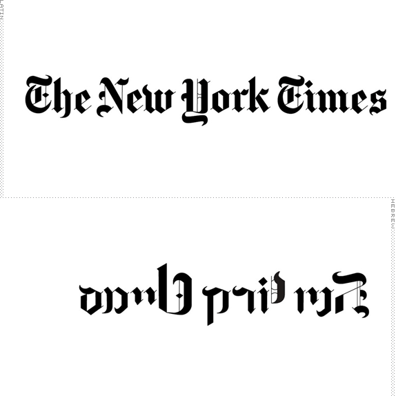
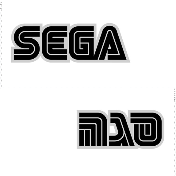
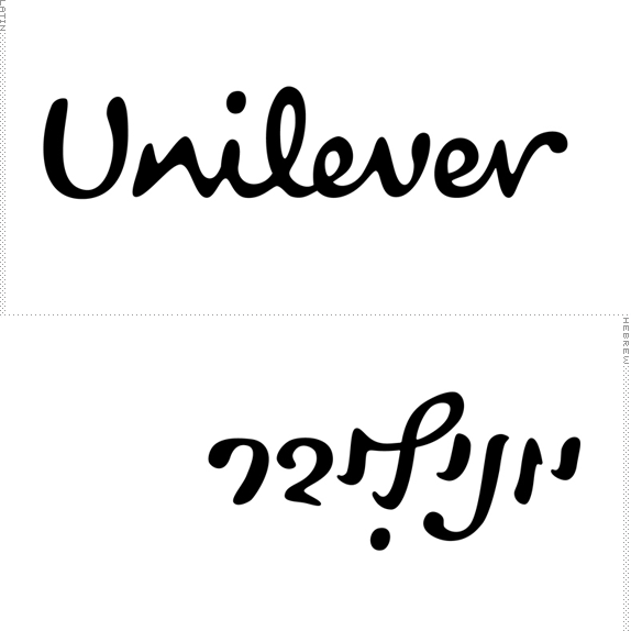
Design a Hebrew logo version for a Latin brand logo.

Design a Hebrew logo version for a Latin brand logo.
SCHOOL
H.I.T (Holon Institute of Technology), Visual Communication Department
Holon, Israel
H.I.T (Holon Institute of Technology), Visual Communication Department
Holon, Israel
COURSE
Advanced Typography Class
Advanced Typography Class
INSTRUCTOR
Oded Ezer
Oded Ezer
Ed.’s Note
This post strays off the basic Brand New Classroom formula in a few ways: It shows the work of various students, it doesn’t include sketches or process, and it’s not a reinvention of a brand. But the results are quite fascinating and it’s really amazing to think that this is student work — the visual translations are delightfully accurate. Even if you don’t read Hebrew, it’s easy to appreciate the exercise. You can see Oded’s students in action (on other projects) here.
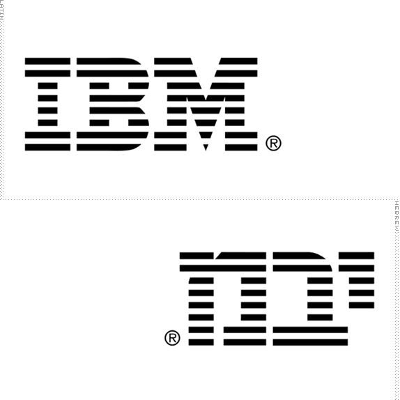
Opening image, Rotem Dayan for IBM.
Solution
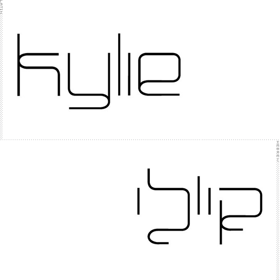
Michal Shani.
Ziv Feldman.
Tamar Roth.
Dudi Braunstein.
Stav Axenfeld.
Daniela Aschenbach.
Orly Dekel.
Oded Ezer’s Website


DATE: Apr.28.2010 POSTED BY: ArminCATEGORY: Typography COMMENTS:

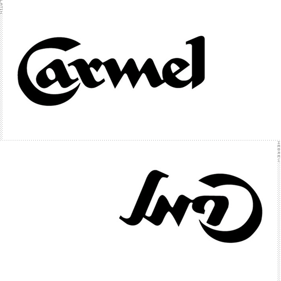
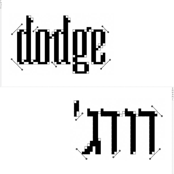
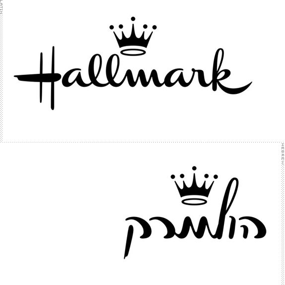
TAGS: carmel, hallmark, hebrew, ibm, Israel, sega, the new york times, typography, unilever,

Comments › Jump to Most Recent


Celebrating the reality that print is not dead by showcasing the most compelling printed projects.

Corraling the most relevant and creative on- and off-line bits that pertain to the design community — and said community is openly invited and encouraged to add their hard-earned links.

Describing, tracking and explaining culture, commerce, politics, media, sports, brands — everything possible, really — through design.

Discussing, and looking for, what is relevant in, and the relevance of, graphic design. [Archives Only]

Encouraging creative diversity in the community through monthly, one-word challenges. [Archives Only]

Designing corporate and brand identities and full development of printed and digital matter for clients and us.