


Mike & Ike by Nicolet Schenck
ASSIGNMENT
The assignment was to select a product that you actually use and enhance the visual design to make a product that is more appealing to college-age users. The process involved redesigning the logotype as well as the overall package design.

The assignment was to select a product that you actually use and enhance the visual design to make a product that is more appealing to college-age users. The process involved redesigning the logotype as well as the overall package design.
SCHOOL
Maryland Institute College of Art
Baltimore, MD
Maryland Institute College of Art
Baltimore, MD
COURSE
Graphic Design I
Graphic Design I
INSTRUCTOR
Ellen Lupton
Ellen Lupton
Approach
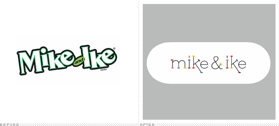
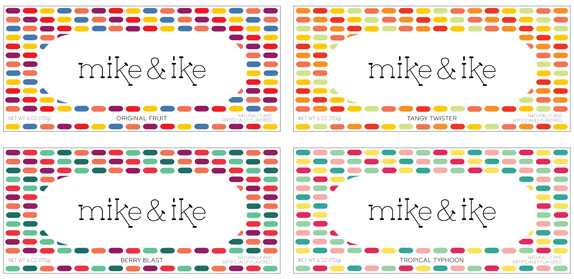
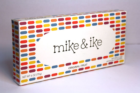
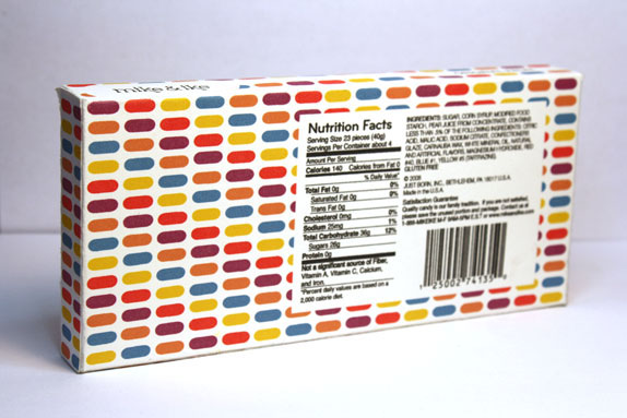
I approached the assignment by finding a product that had potential and visual appeal, without the corresponding effect of the packaging. Mike & Ike candies are very colorful and characteristically shaped, giving me a lot of freedom to work with the appeal of the visual. The existing packaging on the other hand was lacking and drab, and didn’t utilize the charm of the candy as well as it could. Also, the existing package tried to convey that the candies were on the same level as real fruit, but that is obviously not the case. I wanted to stress the artificial qualities and reality of Mike & Ike, yet make it sophisticated in the same way.
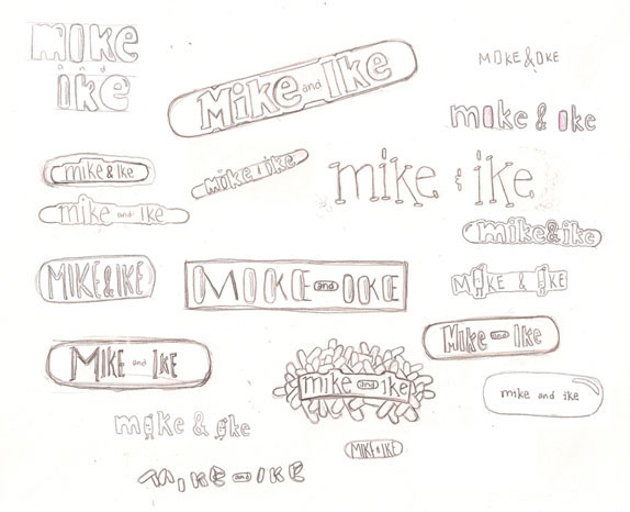
Sketches and Process
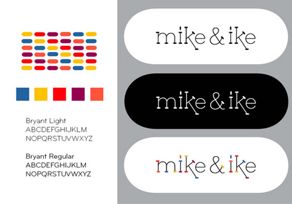
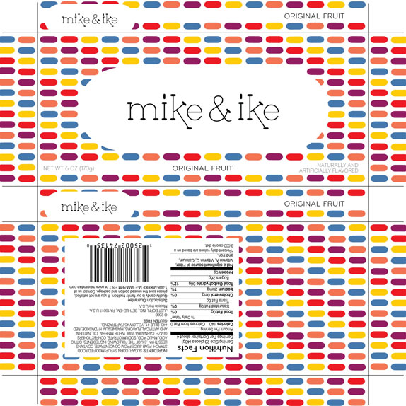
Solution


DATE: Apr.21.2011 POSTED BY: Lauren DickensCATEGORY: Food COMMENTS:


Comments › Jump to Most Recent


Celebrating the reality that print is not dead by showcasing the most compelling printed projects.

Corraling the most relevant and creative on- and off-line bits that pertain to the design community — and said community is openly invited and encouraged to add their hard-earned links.

Describing, tracking and explaining culture, commerce, politics, media, sports, brands — everything possible, really — through design.

Discussing, and looking for, what is relevant in, and the relevance of, graphic design. [Archives Only]

Encouraging creative diversity in the community through monthly, one-word challenges. [Archives Only]

Designing corporate and brand identities and full development of printed and digital matter for clients and us.