
A B-Side BY Armin
The Bishop of London
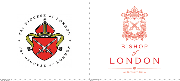
About: (Est. fourth century or so) “The Bishop of London is the ordinary of the Church of England Diocese of London in the Province of Canterbury.”
Design by: Paperjam.
Ed.’s Notes: I wish the typography were something much better than Copperplate and Zapfino because the coat of arms is excellent. Bigger views of the logo and crest and the Bishop’s own business card below (or after the jump).
Relevant links: Paperjam case study.
Select quote: “From this advice Paperjam decided to recreate a historical crest using a modern illustrative style that brings the crest up to date but at the same time reflects the heritage and authoritative qualities. Paperjam employed a professional illustrator, Marcelo Oliveira, from Portugal to help create a coat of arms that contained Amor Vincit Omnia “Love Conquers All”. At request from Richard John Carew Chartres himself.”
Continue reading this entry

DATE: May.09.2013 POSTED BY: Armin
 CATEGORY: The B-Side Religion
  COMMENTS:

TAGS: coat of arms, london,

A B-Side BY Armin
Mission Aviation Fellowship
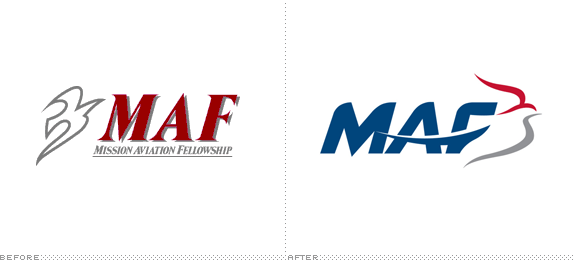
With origins as far back as 1943, Mission Aviation Fellowship (MAF) “serves people who deal with challenges due to isolation in regions such as Africa, Asia, Eurasia, and Latin America by providing aviation, communications, and learning technology services.” Its mission is to share “the love of Jesus Christ through aviation and technology so that isolated people may be physically and spiritually transformed” and that “all people have access to both the Gospel and the resources that advance God’s Kingdom.” MAF introduced a new logo earlier this month. Part of the release states: “The dove — part of MAF-US’s logos since the 1970s — was maintained in the new design and represents the Christian faith, aviation, and MAF history.” No design credit given.
Thanks to Phil Laver for the tip.

DATE: Aug.27.2012 POSTED BY: Armin
 CATEGORY: Religion The B-Side
  COMMENTS:

TAGS: animal, italic, Sans Serif,

Opinion BY Armin
BBYO Lights Up
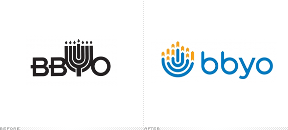
First organized in 1924, BBYO — an acronym for B’nai B’rith Youth Organization, but not formally used anymore as the movement is no longer associated with the B’nai B’rith organization — is a “pluralistic teen movement aspiring to involve more Jewish teens in more meaningful Jewish experiences.” With more than 600 local chapters, and regional outposts throughout the U.S. and the world, BBYO has over 250,000 alumni who have participated in one of the many programs and events the organization offers from travel experiences to social outreach. This past September BBYO introduced a new identity designed by Washington D.C.-based Levine & Associates.
Continue reading this entry

DATE: Oct.04.2011 POSTED BY: Armin
 CATEGORY: Religion
  COMMENTS:

TAGS: blue, icon, Sans Serif,

Opinion BY Armin
A Crusade Against Long Names
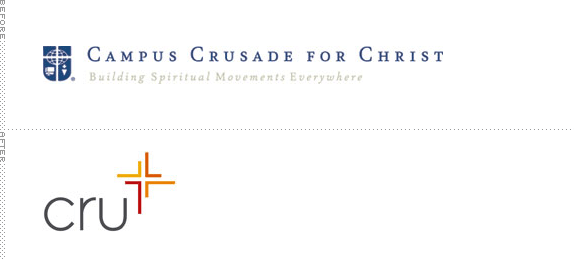
Established in 1951 in the campus of UCLA as an “interdenominational Christian evangelism and discipleship organization” focused on college students, Campus Crusade for Christ has grown to include professionals, families, athletes, and high school students. With active ministries in more than 1,000 colleges in the U.S. and served by more than 25,000 full-time and part-time team members in 191 countries around the world, Campus Crusade for Christ is one of the largest organizations of its kind. This week they announced a name change, Cru, and new logo that will become officially adopted in early 2012. Although Cru states that even though “Our primary and ultimate dependence is on the Lord,” they “enlisted the help of consultants because we don’t have the expertise in brand survey methods and testing that they do.” Prophet and Brandtrust are credited together, with naming by Prophet.
Continue reading this entry

DATE: Jul.21.2011 POSTED BY: Armin
 CATEGORY: Religion
  COMMENTS:

TAGS: icon, sans serif,

Opinion BY Armin
Type is in the Details
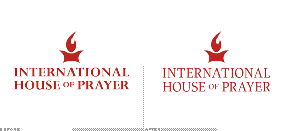
An aspect of identity design that goes unexplored to a certain degree is that for religious organizations, but as everyone becomes more brand aware these spaces and communities must communicate and attract with as much urgency as any major consumer brand or corporation. In this specific case being reviewed today, we are also veering a little off from the typical redesign in that there is no big logo change, rather it’s an identity overhaul through typography for International House of Prayer (IHOP – KC) in Kansas City. Established in 1999, IHOP – KC is a young adult Christian organization that combines 24/7 prayers for justice with 24/7 works of justice, with many outreach programs for different causes. Ten years later the organization has grown to include more than 50 different departments, and with growth and little control comes graphic havoc.
Continue reading this entry

DATE: Aug.25.2010 POSTED BY: Armin
 CATEGORY: Religion
  COMMENTS:

TAGS: sans serif, serif, typography,

This is page 1 of 1
 Or jump to page


