


Patagonia by Justin Lancaster
The assignment as a whole had two parts:
1. To redesign a logo for a medium to large-sized company that fell into one of three categories (financial, sports, or medical).
2. Once we chose a company and redesigned their logo we would be responsible for assembling a comprehensive Identity Manual for our company.
The logo had to have both an icon and a logotype.

The Art Institute of California - Orange County
Branding
Gerry Hampton
Approach
Early on, I decided that I would attempt to do a sports-related company since I had done logos for both financial and medical companies previously and I thought it would be a nice challenge. After some thought, I had narrowed it down to a couple of companies: The South Face and Columbia. It was only after talking with my instructor that he suggested I go with Patagonia; a company I had never heard of but became very enamored with as time went on.
We began by choosing three qualities which we wanted our new logo to convey. After some research on the company, I chose the following:
1. That Patagonia is a high-end quality product.
2. That Patagonia is a trusted company.
3. That Patagonia is an eco-friendly company.
These qualities would serve to keep us on track as we began the redesign.
And with all this in mind, I began.
Sketches and Process
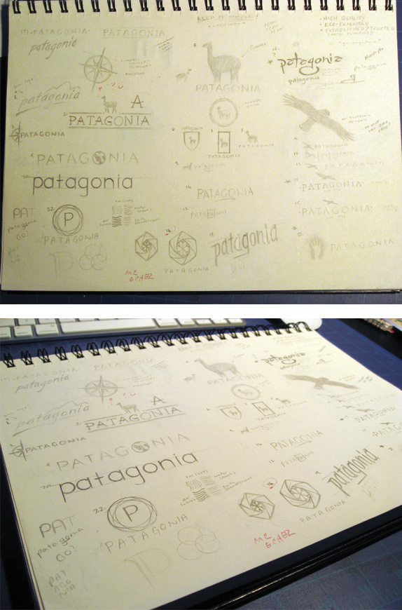
These are the various sketches I did. If you look closely, you can see that a lot of ideas feature animals. At this point, I was going in the direction of trying to come up with possible icons that would both represent the region in South America from which Patagonia gets it’s namesake, and the company itself. From these various sketches, we were to choose three that we would then develop further.
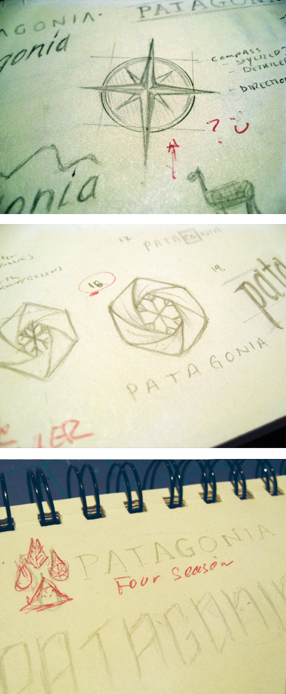
These were the three that I chose to further develop. You’ll notice that I didn’t end up going with any of the ideas that involved animals as I felt that had I done that, I would’ve been designing a logo for the region, rather than a sportswear company. The next step would be to produce full-color compositions which the class as a whole would critique and choose one that would become the final logo.
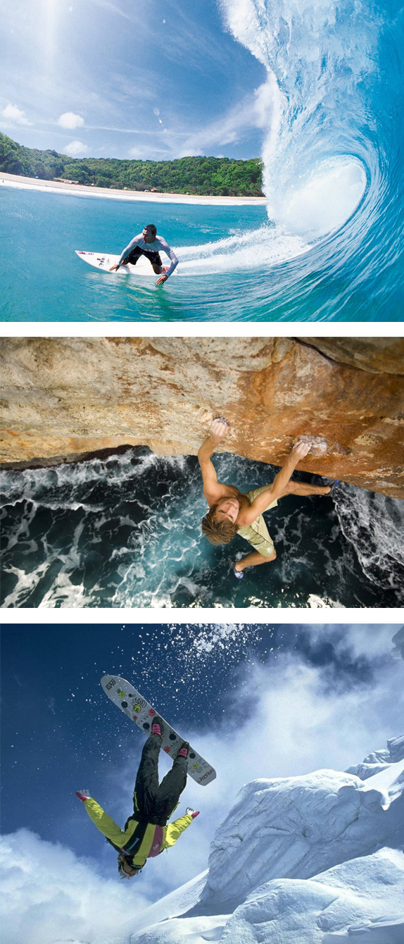
These are some reference images I used during the full-color composition phase. The colors and sports themselves helped me to understand what the company was all about.
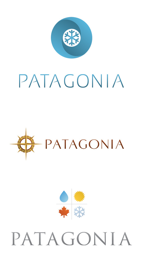
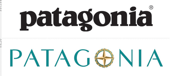
These are the color compositions I came up with and presented to the class for critique. In the end we decided as a class to go with the second one (it was decided that the first one seemed too cold and ‘winter-centric’ and the last one seemed to have been done to death). My instructor immediately advised me to change the points on the compass as they were too sharp. He also said that the icon and the logotype seemed to be two separate things.
For all three compositions, I used existing typefaces while making small alterations to them rather than creating a typeface of my own. For the composition that got chosen (#2), I used COM4T Fine - Regular.
The next step would be to take our chosen composition and do four color variations which would then be presented to the class and critiqued, with one color variation being chosen.
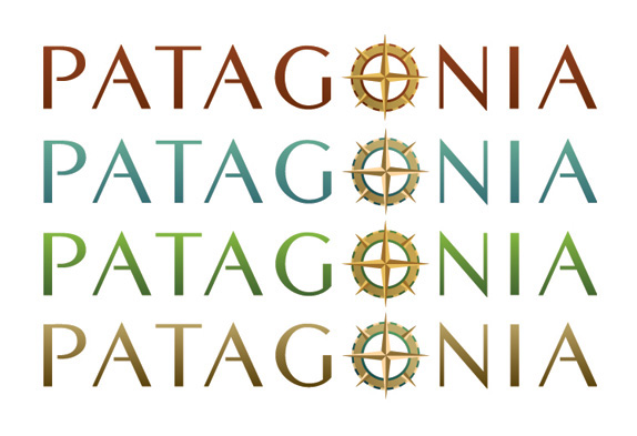
These are my four color variations, with the original color composition being included. While I liked the original red color, I decided that it kept my logo from displaying all of my three chosen qualities (eco-friendliness in particular). My other three variations play more natural color schemes.
I solved the problem of the separation between the compass rose and the type by using the compass rose in place of the “O”. In order to make that look natural, I played with the height of the word so that the “O” was a perfect circle. I also manually adjusted the thickness of the letterforms, as I felt that they were too thin before and caused some hierarchical issues with the compass rose.
During the critique it was decided that we all liked the blue-green variation. The points on the compass rose, however, still posed a problem. Further revision was needed.
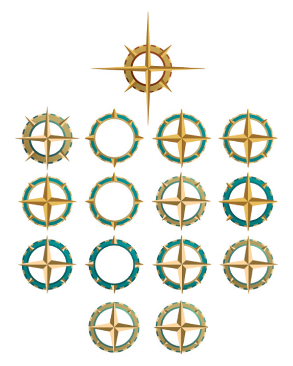
This image shows all of the variations my compass rose went through. The original is at the top and the one I finally settled on is on the bottom right.
Solution
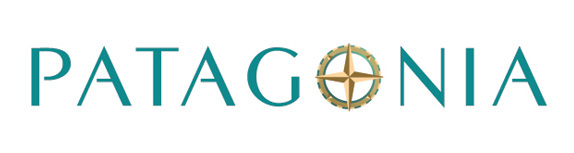
The new logo, with it’s blue-green color typography and brown-toned compass rose, embodies everything I set out to accomplish with the redesign.
–The color scheme itself speaks to the elements in which Patagonia’s products are meant to be used. It also pay homage to the company’s dedication to eco-friendliness and producing products that aren’t harmful to the environment it holds so dear.
–The new typography feels refreshing and contemporary; replacing the clunky, dated typography of the original. It also gives the company a higher-end feel that was missing with the original.
–The new typography is also in all caps rather than being in all lowercase like the original. This instills a sense of trust and establishment. It shows that the company stands firm and will exist for decades to come.
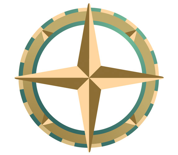
The compass rose itself represents the Patagonia customer and their never-ending search for adventure. It says to them “You can go anywhere with Patagonia”. The compass is also representative of both the trust and security you would find in an actual compass out in the wild.
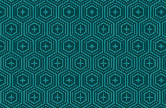
For branding purposes, I created this pattern that could be used on various products, print and web applications. The compass shape is implemented here in order to tie the two design elements together.
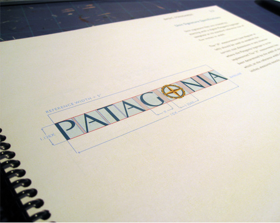
This is one of the first pages of the 40+ Identity Manual I put together for this assignment.


DATE: May.12.2010 POSTED BY: BryonyCATEGORY: Retail COMMENTS:


Celebrating the reality that print is not dead by showcasing the most compelling printed projects.

Corraling the most relevant and creative on- and off-line bits that pertain to the design community — and said community is openly invited and encouraged to add their hard-earned links.

Describing, tracking and explaining culture, commerce, politics, media, sports, brands — everything possible, really — through design.

Discussing, and looking for, what is relevant in, and the relevance of, graphic design. [Archives Only]

Encouraging creative diversity in the community through monthly, one-word challenges. [Archives Only]

Designing corporate and brand identities and full development of printed and digital matter for clients and us.