


ARC by Joanne Walsh
As part of my Design Module for my MA, I undertook an individual project, where I had to select a client in any field who I believed could benefit from a rebrand project.

Dublin Institute of Technology
Dublin, Ireland
MA in Professional Design Practice
John Green
Approach
I chose ARC Cancer Support in Dublin, as I found their communication materials to be very muddled, identity is outdated and there is confusion amongst their target audience about who they are and what they do. Founded in 1994, ARC Cancer Support is a charity, which offers professional support to people affected by cancer and those who care for them. The support is holistic and complements primary medical treatment with education and psychological care. A second ARC recently opened in South Circular Road, Dublin 8, which will serve a majority clients from James’ Hospital. The organization is growing and they would like to bring everyone on board and maintain the essence of the organisation, while growing and developing.
The aim was to design an appropriate identity that address’ ARC’s communication needs. ARC is growing and developing and the aim is to create an identity which reflects the services and the essence of the organisation through an effective brand strategy, which can bring numerous benefits to an ARC, including effectively communicating ARC’s benefits and values in a cohesive manner, differentiating ARC from its competitors, increasing audience share (including stakeholders), boosting internal morale and assist in growth.
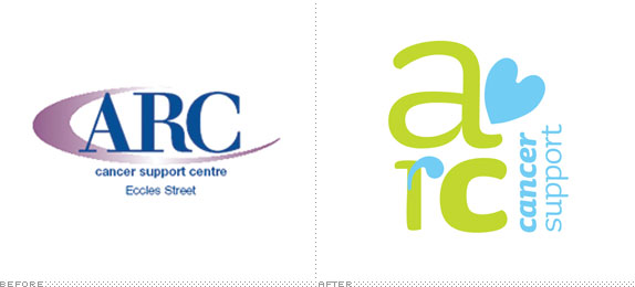
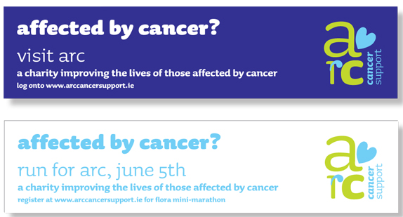
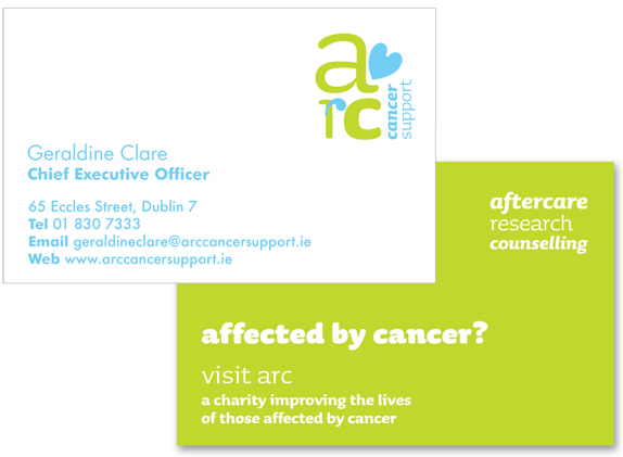
The identity mark is a contemporary approach to symbolize ARC, illustrated through the strong use of typography. The mark is composed of a quote mark to demonstrate the counseling services and friendliness of ARC; it is a place to come and have a chat. A symbol of a heart was also drawn up and placed at an angle, which evokes warmth, friendliness and informality, while also demonstrating the health aspect of the organization. The mark is visually appealing, simple, cheerful, positive and distinctive, which differentiates it in the sector while also conveying the core communication values of ARC: Mindful, Innovative and Restore. Research states males find angular shapes appealing, while females find round shapes appealing, however “symbols that are round / oval have a positive effect on both men and women” (Naploes p.47).
In order to convey ARC’s core communication values and tone of voice, research was carried out on typeface solutions in order to choose the best solution for ARC. The typeface chosen: the Sauna family, conveys emotional content, adds personality to the mark, is highly legible and unique (the typeface has been slightly remodeled), suitable for display and advertising. Sauna is a typeface for all sizes, has a warm and comfortable feeling. The type set in lowercase demonstrates a more welcoming, informal and approachable organization.
In addition to using Sauna, Futura is the secondary typeface used for the communication material. Futura is clear, straightforward and easy to read, this is significant as some members of the target audience will be those who may suffer from low concentration levels due to treatment. Its simple rounded shapes work well with Sauna, and it’s nice and easy to read.
Extensive research was carried out in order to select a colour that facilitates recognition, differentiates in the sector, builds meaning and expand connotation. The colours chosen: Pantone 297C and Pantone 382C are part of a cool colour scheme, a calming colour palette. The cool colour palette of blue and green, are proven to have a calming effect and are comforting and nurturing. These colours also work very well with the chosen supporting colour: Pantone Violet C, part of the mixed cool/warm palette, which adds warmth.
The selected colours reflect the core communication values (Mindful, Innovative and Restore) and the tone of voice (Inclusive, Positive and Straightforward), which ARC seeks to convey. The colour scheme adds personality and warmth and is appealing to both male and female audiences, which was a significant factor. Against a neutral background the mark is instantly recognizable. This will bring the organization into a modern look and feel, differentiate it from it’s competitors, as well as being more approachable to its male and female audiences and overcomes the issues found from the research.
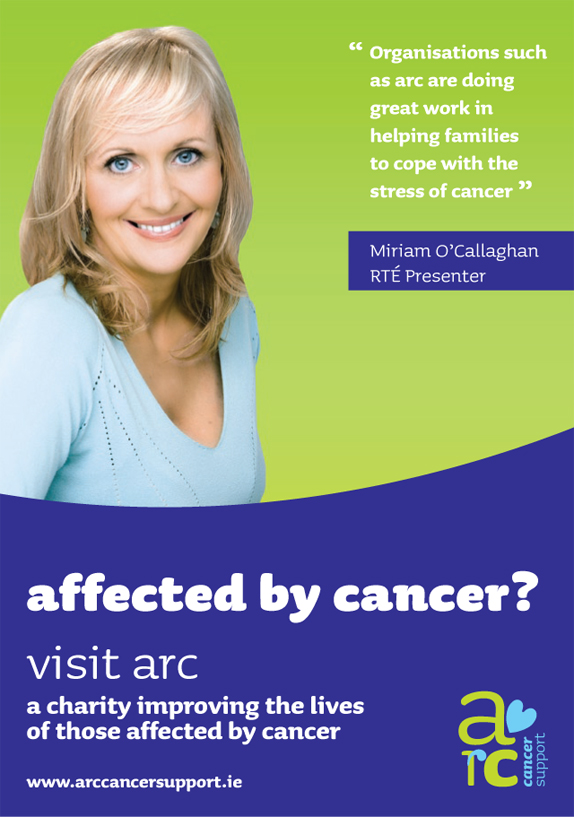
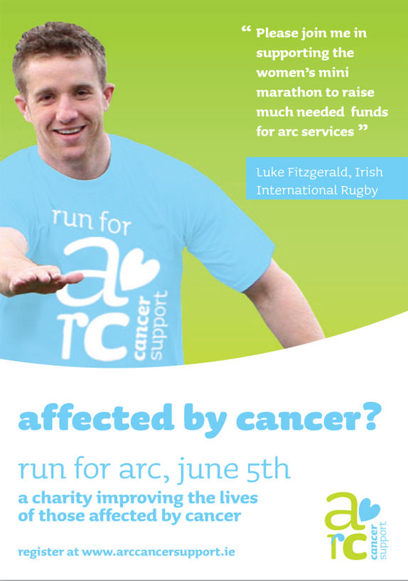
Full colour imagery is used in the advertising communication materials, containing images of the perspective audience in a relaxed pose, bringing warmth and personality, capturing emotion and the values of ‘Mindful, Innovative and Restore’. Also recommend to feature patrons (pending permission) in advertorial. There is an opportunity to increase fundraising and raising awareness of services through devising a media campaign, associated with ARC Patrons.
Solution


DATE: Feb.22.2011 POSTED BY: Lauren DickensCATEGORY: Non-Profit COMMENTS:

TAGS: cancer, heart, organization, student,


Celebrating the reality that print is not dead by showcasing the most compelling printed projects.

Corraling the most relevant and creative on- and off-line bits that pertain to the design community — and said community is openly invited and encouraged to add their hard-earned links.

Describing, tracking and explaining culture, commerce, politics, media, sports, brands — everything possible, really — through design.

Discussing, and looking for, what is relevant in, and the relevance of, graphic design. [Archives Only]

Encouraging creative diversity in the community through monthly, one-word challenges. [Archives Only]

Designing corporate and brand identities and full development of printed and digital matter for clients and us.