


Belfius
BMO Harris Bank
Maybank
OneMain Financial
Banco do Nordeste
All B-Side Archives
Subscribe to B-Side RSS


Online
- FPO (For Print Only) / Celebrating the reality that print is not dead by showcasing the most compelling printed projects.
- Art of the Menu / Cataloguing the underrated creativity of menus from around the world.
- Quipsologies / Chronicling the most curious, creative, and notable projects, stories, and events of the graphic design industry on a daily basis.
- Speak Up (2002 – 2009) / Discussing, and looking for, what is relevant in, and the relevance of, graphic design. Archives Only.
- Word It (2003 – 2010) / Encouraging creative diversity in the community through monthly, one-word challenges. Archives Only.
- Brand New Classroom (2010 – 2011) / Providing a space for critique and opinions on student identity work. Archives Only.
Publishing
- The 2010 Brand New Awards / 2011, self-published.
- Flaunt: Designing effective, compelling and memorable portfolios of creative work / 2010, self-published.
Events & Judged Competitions
- Brand New Conference / A one-day event on the development of corporate and brand identity projects by some of today’s most active and influential practitioners from around the world.
- Brand New Awards / Celebrating the best identity work produced around the world.
- FPO Awards / Celebrating the best print work from around the world.
Writing
- Graphic Design, Referenced: A Visual Guide to the Language, Applications, and History of Graphic Design / 2009, Rockport.
- Women of Design: Influence and Inspiration from the Original Trailblazers to the New Groundbreakers / 2008, HOW Books.
- The Word It Book: Speak Up Presents a Gallery of Interpreted Words / 2007, HOW Books.
Graphic Design
- Department of Design / Designing corporate and brand identities and full development of printed and digital matter for clients.

Opinion BY Sam Becker
Commerzbank Folds
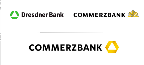
The sweeping consolidation of banks worldwide continues with the merger of Germany’s second and third largest financial institutions: Commerzbank and Dresdner Bank. The new entity, to be named Commerzbank, has enlisted the talented, local and proven (though Erik-Spiekermann-less) design firm Meta to perform the brand alchemy. For all to see, the result is clean, rational and undeniably German.
Continue reading this entry

DATE: Nov.11.2009 POSTED BY: Sam BeckerCATEGORY: Finance COMMENTS:

TAGS:

Opinion BY Armin
People Banking
With six million customers and 35,000 employees across the world but primarily in Australia and New Zealand, ANZ (or Australia and New Zealand Banking Group Limited, for long) is one of the top fifty international banking and financial services groups in the world and certainly one of the top banks in Australia and New Zealand, now with its sight set to expand on Asian markets. After conducting a reportedly “record amount of research — 1550 interviews in seven countries in three successive waves,” ANZ began rolling out a new identity and advertising campaign over the weekend, both created by the Auckland, New Zealand office of M&C Saatchi and its internal identity design group Re.
Continue reading this entry
DATE: Oct.26.2009POSTED BY: ArminCATEGORY: Finance COMMENTS:
TAGS:
Opinion BY Armin
Flight Insurance
Based in Colombia and with a presence there dating back to 1944, Suramericana is an insurance company that is part of one of the larger financial groups in Latin America, Grupo de Inversiones Suramericana. They recently underwent a much needed overhaul of their corporate and consumer-facing identity developed by New York-based Marqas, a branding firm focusing on the Latin American market. One of the biggest brand changes is the formal introduction of the shortened Sura as the consumer-facing name while maintaining Suramericana as the corporate moniker.
Continue reading this entry
DATE: Aug.17.2009POSTED BY: ArminCATEGORY: Finance COMMENTS:
TAGS:
Opinion BY Sam Becker
Don’t Rock the Boat
Last year, when AIG lost $99 billion, its property-casualty division, AIU, turned a modest $2 billion profit. This year, AIG is repackaging AIU and a few other entities into an independent operation that it will most likely sell in order to repay the staggering amount of money it owes the American government and its taxpayers. The new spin-off, introduced last month as Chartis, appears to have been engineered as a straightforward, unremarkable brand that has absolutely nothing to do with AIG.
Continue reading this entry
DATE: Aug.11.2009POSTED BY: Sam BeckerCATEGORY: Finance COMMENTS:
TAGS:
Opinion BY Armin
Fair Sans Serif
I’m a little late on this one, as the news actually took place back in March but is certainly redesign worth talking about even if not entirely fresh. What seems like a funny name to anyone outside the financial industry (or at least to me) Fair Isaac Corporation — named after the 1956 partnership of Bill Fair and Earl Isaac not an ethically and morally superior guy named Isaac — is one of the strongest monikers in it. Well, it’s shortened version is: FICO. Which may be familiar to anyone that has had to delve into the frightening territory of credit scores, since FICO Scores are the most commonly available and tend to be pretty accurate. But Fair Isaac Corporation does more than that, offering a full range of business consulting services that are perhaps not as quickly associated with their name as the credit scores, so the company has been repositioned simply as FICO.
Continue reading this entry
DATE: Aug.03.2009POSTED BY: ArminCATEGORY: Finance COMMENTS:
TAGS:
Opinion BY Armin
A LendingTree Grows in the Web
It’s almost unbelievable that LendingTree is ten years old, it seems just like yesterday when online ventures offering mortgage applications, stock trading and book purchasing seemed like wahoo ideas that would never take hold. Yet, here we are, ten years later and the leanest ideas have survived. Surprisingly among them, given the real estate downturn of the last couple of years, LendingTree which has just launched a completely new range of offerings on top of its mortgage game supported by a new identity, marketing and national advertising campaign, all done by Mullen.
Continue reading this entry
DATE: Jul.21.2009POSTED BY: ArminCATEGORY: Finance COMMENTS:
TAGS:
Opinion BY Armin
Rounded Letterforms Arrive in Perú
Back, way back, in the end of the nineteenth century the Banco Internacional del Perú began its operations and went through numerous changes in the twentieth century, being owned by the state at one point and eventually being bought back in 1994. With too many name changes to make heads or tails of, it first became Interbanc with a “c” in 1980 and in 1996 it was changed to Interbank with a “k,” presumably to make it more international, going from the Spanish “Banco” to the English “Bank.” Interbank now operates more than 150 branches across Perú and is one of the largest financial institutions in the country. And like any growing enterprise, its time had come for a brand refresh.
Continue reading this entry
DATE: Jul.17.2009POSTED BY: ArminCATEGORY: Finance COMMENTS:
TAGS:
BY Armin
Union Bank of Not Just California
![]()
As its original name implied, Union Bank has a big presence in the state of California but as the organization has grown, expanding into neighboring states like Oregon and Washington, and with two international offices and six in other states of the U.S., it was time to drop the “of California.”
Continue reading this entry
DATE: Jul.10.2009POSTED BY: ArminCATEGORY: Finance COMMENTS:
TAGS:
BY Armin
One More Name and this Logo will Implode
![]()
“Two of the most powerful names in wealth management,” begins the About Us page on the newly formed entity that is Morgan Stanley Smith Barney, “have joined forces to create a new industry leader.” It continues, “In a financial world that’s being remade, Morgan Stanley’s global wealth management business and Smith Barney have joined forces to offer you thinking and resources to fit the times.” How about we tell it like it is: “Things have gone horribly wrong and this is the best we can come up with.” As challenging as it may be to run an organization of this complexity is designing a logo that consists of 24 characters making up two names that both need equal attention. The new wordmark derives mostly from Morgan Stanley’s old logo with a subtle evolution and the result is surprisingly decent and even adventurous: Notice the right tapering of the “h, m, n” giving the wordmark a gentle fluidity. There is also something nice about the double “ey” ending, like a happy rhyme. Certainly, by today’s visual standards this is as boring a logo as one can get, but for the industry and the need to appear conservative this is, actually, as exciting as it gets.
DATE: Jun.09.2009POSTED BY: ArminCATEGORY: Finance COMMENTS:
TAGS:
BY debbie millman
With Allies like These, who Needs Enemies?
![]()
“The world doesn’t need another bank, it needs a better bank,” reads the latest well-written press release touting the launch of Ally, “a new brand for a U.S. online bank designed to disrupt the status quo and challenge win-lose practices in the banking industry. We are launching a new brand with a new approach of treating customers with total transparency,” states Chief Executive Officer Al de Molina. Either Mr. de Molina is confused about the definition of the word transparency, or he is simply lying; either way consumers are being duped by this “launch.” The “groundbreaking, disruptive philosophy” at the heart of the new brand is the mastermind of GMAC Financial Services, the 90-year-old holding company that created Ally. The new bank states that they “will not bait and switch depositors;” in fact they are doing exactly that. Ally is simply a tactical, albeit clever, name change for the older, less reputable bank. The friendlier nomenclature is accompanied by a fairly sturdy, well-designed lowercase logo, with just the slightest hint of�Web 2.0 peeking through. While the new identity is certainly an improvement, sadly, it seems the holding company’s values have remained intact. “Given the recent financial market turmoil, people are looking for a safe, honest and efficient place to save and grow their money.” Perhaps, in a truly concerted effort to be “honest,” GMAC should rethink the use of the word “honest.”
DATE: Jun.04.2009POSTED BY: (Display Name not set)CATEGORY: Finance COMMENTS:
TAGS:


Books about logo design, the designers that create them and the meaning of branding.
