
Opinion BY Armin
A Spark in the Wrong Place
Founded in 1849 and originally named The Australian Mutual Provident Society, AMP is a 6,000-employee financial services providing banking, home loans, insurance, retirement, and investment options to over 3.8 million customers in Australia and New Zealand. In March, AMP merged with AXA Asia Pacific Holdings — previously part of French insurance giant AXA — and yesterday introduced a new logo, designed by the Sydney office of Landor to represent the new company.
Continue reading this entry

DATE: May.23.2011 POSTED BY: Armin
 CATEGORY: Finance
  COMMENTS:

TAGS: australia, icon, landor, new zealand, slab serif,

Opinion BY Armin
Bank of Melbourne, Redux
We will be closing this week with yet another Australian brand. (I swear I didn’t plan it this way!). The Bank of Melbourne is the second coming of, well, the Bank of Melbourne. Its first iteration came in 1989 when the Bank of Melbourne became the first bank to open in many decades and went up against the “Big Four” banks until 1997 when one of those big players, Westpac, purchased and closed it. This August, Westpac will be re-launching Bank of Melbourne as a subsidiary and, in turn, it will replace all the branches of another Westpac subsidiary, St George, which has a bigger presence and association with Sydney — and if Brand New has taught me anything, it is that Melbourne and Sydney go together like Mentos and Diet Coke, it’s explosive. A new logo for Bank of Melbourne was unveiled earlier this month.
Continue reading this entry

DATE: Mar.25.2011 POSTED BY: Armin
 CATEGORY: Finance
  COMMENTS:

TAGS: australia, bank, melbourne, shield, slab serif,

A B-Side BY Armin
Banco do Nordeste
Servicing the northeast region of Brazil Banco do Nordeste is a government owned, public bank. Its new logo, designed by Sao Paulo-based Top Brands, features a Coqueiro (a coconut palm tree). A bit more on the new logo, in Portuguese, can be found here.
Thanks to Rafael Gondim for the tip.

DATE: Jan.13.2011 POSTED BY: Armin
 CATEGORY: Finance The B-Side
  COMMENTS:

TAGS: bank, brazil, icon, sans serif,

Opinion BY Armin
Financial Quilt
Conseco was originally established in 1979 as an insurance provider, becoming a publicly traded company in 1985 when it started to operate as a holding company for its customer-facing subsidiaries Bankers Life and Casualty Company, Colonial Penn Life Insurance Company, Washington National Insurance Company, and 40|86 Advisors. The company was mired in bad publicity when it loaned millions of dollars to its own executives in the late 1990s and it later went through bankruptcy in the early 2000s. Looking to establish some distance from its past, Conseco changed its name to CNO Financial Group this past March and introduced a new identity.
Continue reading this entry

DATE: Jun.17.2010 POSTED BY: Armin
 CATEGORY: Finance
  COMMENTS:

TAGS: cno financial group, icon, quilt,

INTL. REVIEW BY Mark Holtmann POSTED BY Brand New
Dawn of the Doodle
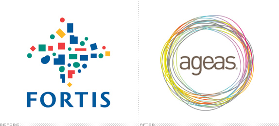
As the financial crisis rages over the world, its consequences are becoming evident in identities too. One of them is the disappearance of the iconic Fortis bank logo from the streets of the Benelux (the economic union of Belgium, the Netherlands, and Luxembourg), with its final name carrier Fortis Insurances being rebranded as Ageas. Created from Dutch and Belgian financial institutions in the 1990s, Fortis at some point ranked number 20 on the Fortune 500 list. After a string of unfortunate events Fortis found itself effectively collapsing and its parts were sold. This past April, the remaining stand-alone insurance activities renamed itself Ageas — derived “from the Latin word ‘agere,’ meaning action, drive, and a conviction to forge ahead,” according to this lengthy name explanation. Still being a considerable business, Ageas now employs 11,000 people with an annual inflow of around EUR 16 billion.
Continue reading this entry

DATE: Jun.11.2010 POSTED BY: Brand New
 CATEGORY: Finance
  COMMENTS:


Opinion BY Armin
Like Reverence, but not

When it comes to financial and insurance services I like big, national companies with thousands upon thousands of customers. For others, smaller institutions that cater not only to their financial and insurance needs but also to their religious beliefs is the way to go. Since there is no Mexican-Almost-American-Jewish financial and insurance company I stick with the aforementioned. But for those that follow the Anabaptist faith — “a Protestant Christian reform movement in Europe during the 16th century” with various denominations like the Mennonite, Brethren, and Amish church groups related to it — the Mennonite Mutual Aid (MMA) has allowed “individuals, organizations, and businesses integrate faith and values into their financial decisions” since 1945, when it served only those that belonged to the Mennonite Church. Today customers don’t have to belong to the Mennonite Church and are not required to adhere Anabaptist beliefs to be able to use MMA, so having Mennonite in its name was starting to become limiting and they decided to change it.
Continue reading this entry

DATE: Apr.12.2010 POSTED BY: Armin
 CATEGORY: Finance
  COMMENTS:

TAGS:

Opinion BY Sam Becker
Circle Gets the Square
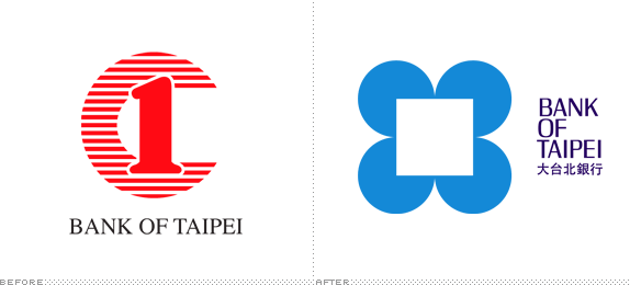
It’s been fifty years since Chermayeff & Geismar unleashed their modern Chase logo on the stodgy, unsuspecting world of bank branding. They were unique to suggest an institution like Chase use an austere, geometric and non-literal symbol as their mark. To help celebrate this momentous anniversary Chermayeff is launching their newest creation, the redesign of the Bank of Taipei brand—half a century later—with another four-sided trademark, this time with softer shapes and a softer shade of blue.
Continue reading this entry

DATE: Mar.15.2010 POSTED BY: Sam Becker
 CATEGORY: Finance
  COMMENTS:

TAGS:

Opinion BY Armin
Brother, can you Spare a Square?
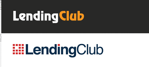
The process of asking for a loan from a bank sucks. Simple as that. Short of a cavity search, they want to know everything about you and then they will hit you with an interest rate higher than your cholesterol level. Add to that the economic slump of the last two years and getting a loan was harder than spotting a yeti. These circumstances might help explain the burgeoning practice of peer-to-peer lending and at the forefront is Lending Club, which has funded $93,634,075 in loans and $6,487,621 in paid interest to investors since its inception in 2007. The premise is simple, Lending Club brings “together investors and creditworthy borrowers eliminating the high-cost and complexity of traditional banks. This allows people to invest in and borrow from each other in a way that is financially sound and rewarding for both parties. Lending Club offers borrowers better rates and investors higher returns.” A short three years after launch and ready to shed its start-up label, Lending Club has adopted a new logo created in collaboration with Mule.
Continue reading this entry

DATE: Mar.12.2010 POSTED BY: Armin
 CATEGORY: Finance
  COMMENTS:

TAGS:

INTL. REVIEW BY FREDRIK JÖNSSON POSTED BY Brand New
A Merger that Doesn’t Add Up
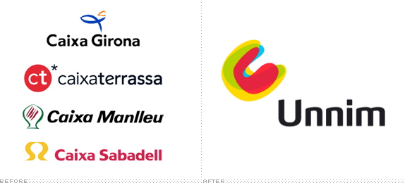
Caixa Sabadell has handled all my banking for the past five years or so. Although I’ve been quite satisfied with their service overall, I have become increasingly irritated by the lack of cashpoints available. So, when informed that the bank was merging with three other Catalan banks, I was hoping this would result in an improved service and especially more free-of-charge ATMs. However, earlier this year, my local office was suddenly closed down and now it seems resources have instead been spent on rolling out a new umbrella brand for the four banks involved in the new merger. Even if the merger would result in more cashpoints, having seen the first examples of the new brand image, I’m not too sure I would like to be seen using one.
Continue reading this entry

DATE: Mar.02.2010 POSTED BY: Brand New
 CATEGORY: Finance
  COMMENTS:

TAGS:

InTL. REVIEW BY Alexander Iosad POSTED BY Brand New
Russia’s Sunny Bank
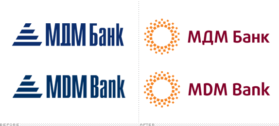
When Russian leaders talk about the recession, they invariably call it “the global financial crisis” - and the emphasis is always on “global”. It is a way of shifting the blame away from themselves. I am not going to initiate a political debate here: there are other, better places for this. But for one reason or another, Russian banks didn’t suffer too much from the recession. And now one of them has even launched a rebranding campaign. I always felt MDM Bank was one of those banks which people kind of know about, but don’t really go to for personal banking. Or, to put it differently, I know that the bank exists; I must have used its ATMs at some point, but I honestly don’t know anyone who has an account with them. Yet evidence suggests it is, in fact, one of the more successful Russian banks: its credit ratings are some of the best in the country.
Continue reading this entry

DATE: Feb.19.2010 POSTED BY: Brand New
 CATEGORY: Finance
  COMMENTS:

TAGS:


